The CSS offset property positions and moves elements along a path. Combined with the animation or transition property, it makes animations that look complex surprisingly easy to create.
This article is for anyone who wants to create animations with intricate-looking motion without extensive knowledge of SVG or JavaScript, as well as anyone who wants to review the basics of properties such as animation.
The offset property
offset is a shorthand property for positioning and moving an element along an arbitrary path. It combines the following five properties. See the MDN documentation for details about each one.
offset-path: The path along which the element is positioned or moved. (MDN)offset-distance: The element’s position along theoffset-path. (MDN)offset-rotate: The orientation and angle of an element positioned along theoffset-path. (MDN)offset-anchor: The anchor point of an element positioned or moving along theoffset-path. (MDN)offset-position: The initial position of theoffset-path. (MDN)
Among the CSS functions accepted by offset-path, this article uses the path() function to explain the basics of the offset property and present several animation examples.
How to use the offset property
1. Prepare the element to animate
Prepare an element to animate, such as an image, text, or shape.
<div class="offsetElement"></div>
2. Prepare a path for positioning and moving the element
Next, prepare an SVG path along which the element will be positioned or moved. The basic characteristics of SVG and ways to create SVG assets are covered in SVGで始めるマイクロインタラクション入門 (Japanese). The demo uses a path exported from a vector graphics editor for maximum flexibility.
The element and path used in the example:
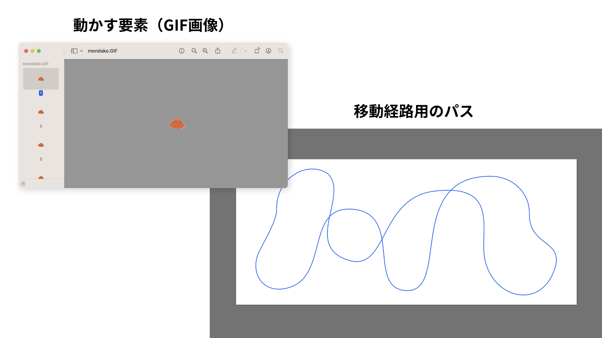
Copy the value of the d attribute from the <path> element in the exported SVG, then paste it into the path() function assigned to offset-path.
<svg xmlns="http://www.w3.org/2000/svg" width="560" height="240" viewBox="0 0 560 240">
  <!-- Copy the value in d="" below -->
  <path d="m151.363,24...(omitted)..." fill="none" stroke="#156EF3" stroke-width="1"/>
</svg>
.offsetElement {
  /* Paste the value into the path() function */
  offset-path: path("m151.363,24...(omitted)...");
}
3. Create the animation with offset-distance and offset-rotate
To move the element from the beginning to the end of the path, create a move keyframe animation whose final keyframe specifies offset-distance: 100%;. The animation below uses linear easing, completes one cycle in 40 seconds, and repeats indefinitely with infinite.
The GIF’s original orientation made it travel sideways along the path. To correct this, the 90deg value adjusts its orientation, while auto changes its angle to follow the direction of the path.
CSS excerpt:
.offsetElement {
  offset-path: path("m151.363,24...(omitted)...");
  offset-rotate: auto 90deg;
  animation: move 40s linear infinite;
}

@keyframes move {
  to {
    offset-distance: 100%;
  }
}
Demo in which a flapjack octopus swims by animating offset-distance:
Note: The SVG must use a <path> element
If a path created from a basic shape is exported directly from a vector graphics editor, the SVG may use a shape element such as <circle> or <polygon> instead of a <path> element.
To use its data with the path() function, the shape must be exported as a <path> element, which requires one additional step.
Tip: Exporting basic SVG shapes as <path> elements in Adobe Illustrator
- Create any basic shape.
- Cut the path at any point with the Scissors tool (keyboard shortcut: C).
- Export it as SVG as usual.
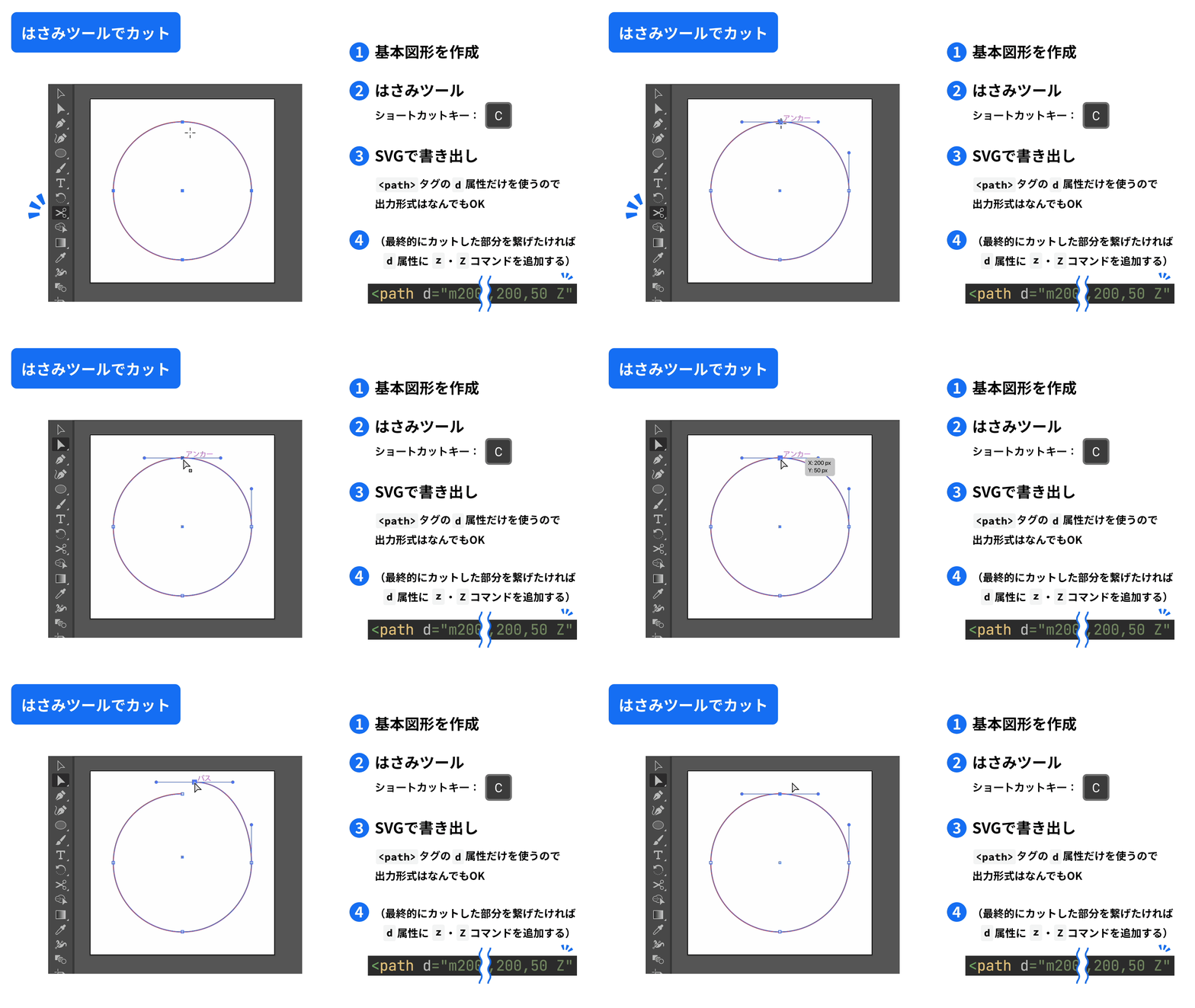
The example above uses a perfect circle created as a basic shape. Cutting it at one point with the Scissors tool causes Illustrator to export it as a <path> element rather than a <circle> element.
Unless you can edit SVG path data manually, the size and proportions of a path written in path() cannot easily be adjusted later with CSS. It is best to create the path at the size at which it will actually be displayed.
Examples using the offset property
Here are several examples built by experimenting with the offset property.
Amusement park example
In this example, the Ferris wheel in the center rotates slowly while a roller coaster travels through the background. Hovering over a Ferris wheel gondola also triggers a gentle swaying animation.
The roller coaster is implemented in the same way as the flapjack octopus animation described above, so this section focuses on the Ferris wheel. Its animation involves several key points.
- Assign a circular path to
offset-path. Add aZcommand to close the path. - Use the
sibling-index()function to obtain each gondola’s position among its siblings. - In the
fromkeyframe ofrotate-gondola, position each gondola by increasingoffset-distancein 10% increments, starting at0%. - In the
tokeyframe ofrotate-gondola, add100%to theoffset-distancevalue used infrom, producing values greater than100%where needed. - Set
offset-rotateto0degto keep each gondola upright. - Adjust the position with
translate: 0 20px;.
The first point requires a little more explanation. SVG path data supports the Z command, as well as its lowercase form, z. An SVG path is constructed with commands that place points at coordinates, while the Z and z commands connect the current point to the path’s starting point.
Note: The Z and z commands take no parameters, so the uppercase and lowercase forms have the same effect.
Closing the path allows values greater than 100% to be specified for offset-distance. In this example, a Z command is appended to the end of the d attribute so that the endpoint connects back to the starting point.
The sibling-index() function is used to determine the order of the gondolas. For more information, see CSS staggered animations with sibling-index() and sibling-count().
As a playful extra, hovering over a gondola makes it sway. To keep the motion visually clean, each gondola SVG is placed inside a wrapper element, div.gondola, and the wrapper is animated. See the source code for the complete animation.
HTML excerpt:
<div class="ferrisWheel">
  <div class="ferrisWheel_gondola">
    <div class="gondola">
      <svg width="40" height="40" viewBox="0 0 40 40">
        <use href="./images/amusementPark/ferriswheel_gondola.svg#gondola"/>
      </svg>
    </div>
  </div>
  <!-- Additional markup omitted. There are ten gondolas in total. -->

  <span class="ferrisWheel_wheel"></span>
  <span class="ferrisWheel_frame"></span>
</div>
CSS excerpt:
.ferrisWheel_gondola {
  position: absolute;
  width: 40px;
  height: 40px;
  translate: 0 20px;
  fill: hsl(
    calc(15deg + (sibling-index() - 1) * 36deg),
    100%,
    80%
  ); /* Shift the hue based on sibling order to create a rainbow */
  offset-path: path("M100,0 A100,100 0 1,1 100,200 A100,100 0 1,1 100,0 Z");
  offset-rotate: 0deg;
  animation: rotate-gondola 40s linear infinite;
}

@keyframes rotate-gondola {
  from {
    offset-distance: calc(10% * (sibling-index() - 1)); /* 0%, 10%, 20%, ... 90% */
  }
  to {
    offset-distance: calc(100% + 10% * (sibling-index() - 1)); /* 100%, 110%, 120%, ... 190% */
  }
}
Coffee break example
This example makes text rise from a cup like steam.
The animation combines movement along a spiral path with changes in opacity and scale to produce a steam-like effect. Each character is wrapped in a <span> element, and the animation-delay is staggered by 0.1s so that the letters appear to move together in sequence.
HTML:
<div class="coffee">
  <div class="coffee_text">
    <span>L</span>
    <span>e</span>
    <span>t'</span>
    <span>s</span>
    <span></span>
    <span>T</span>
    <span>a</span>
    <span>k</span>
    <span>e</span>
    <span></span>
    <span>a</span>
    <span></span>
    <span>b</span>
    <span>r</span>
    <span>e</span>
    <span>a</span>
    <span>k</span>
  </div>

  <span class="coffee_cup"></span>
</div>
CSS excerpt:
.coffee_text {
  > span {
    position: absolute;
    display: block;
    font-size: 16px;
    offset-path: path("m61.498,27...(omitted)...");
    opacity: 0;
    animation:
      move-text 3.2s ease-in-out infinite,
      distort-text 3.2s linear infinite;
    animation-delay: calc(sibling-index() * 0.1s);
  }
}

@keyframes move-text {
  0% {
    offset-distance: 100%;
    opacity: 0;
  }
  10%, 90% {
    opacity: 1;
  }
  100% {
    offset-distance: 0;
    opacity: 0;
  }
}

@keyframes distort-text {
  45% {
    scale: 1 1;
  }
  65% {
    scale: 1 1.8;
  }
  85% {
    scale: 1 1;
  }
  100% {
    scale: 1 0.5;
  }
}
Flower example
In this example, flowers bloom one after another along a heart-shaped path.
Each flower receives a different offset-distance value so that the flowers are distributed evenly along the path. The animation-delay property then adds a 0.05s delay for each successive flower. To create a more vibrant effect, the animation changes opacity, scale, and rotation.
HTML excerpt:
<div class="flower">
  <span class="flower_purple"></span>
  <span class="flower_sakura01"></span>
  <span class="flower_blue"></span>
  <!-- Additional markup omitted. There are 30 flowers in total. -->
</div>
CSS excerpt:
.flower {
  > span {
    offset-path: path("m98.754,196...(omitted)...");
    animation: bloom 1.5s ease-out infinite;
    animation-delay: calc(sibling-index() * 0.05s); /* Stagger each flower by 0.05s */
    offset-distance: calc(100% * sibling-index() / sibling-count()); /* Distribute the flowers evenly along the path */
  }
}

@keyframes bloom {
  0% {
    transform: rotate(180deg) scale(0);
    opacity: 0;
  }

  30% {
    transform: rotate(0deg) scale(1);
    opacity: 1;
  }

  70% {
    transform: rotate(20deg) scale(1);
    opacity: 1;
  }

  100% {
    transform: rotate(180deg) scale(0.5);
    opacity: 0;
  }
}
Floating ghost example
In this example, a ghost floats along a path and flips to change direction when it reaches the right or left edge. Hovering over the ghost stops its movement and makes it tremble.
By testing offset-distance in increments of 1%, it is possible to identify which percentages correspond to the path’s leftmost and rightmost positions. When the ghost reaches the right side, at 16% and 64% in this example, scale: -1 1; flips it horizontally. When it reaches the left side, at 41% and 88%, scale: 1 1; restores its original orientation, producing the turning motion.
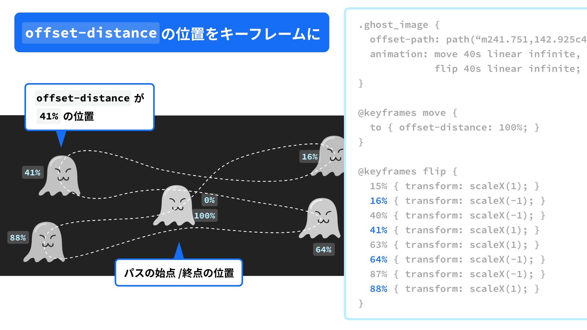
As an extra detail, the hover state changes animation-play-state from running to paused, keeping the ghost in place while also triggering its trembling motion.
Handwriting animation with a pen that follows the strokes
Handwriting effects that reveal text with an SVG mask are popular. This example makes the effect feel even more like real writing by having a fountain pen follow the strokes.
Note: JavaScript is used to control when the animation starts.
The effect is created by using the same path data for both the <mask> that reveals the letters and the path followed by the pen, then animating them at the same time.
Reference: SVGアニメーション、mask要素で手書き風テキスト。 - フーノページ (Japanese)
HTML excerpt:
<div class="letters" data-wrapper-id="letters">
  <div class="letters_line">
    <svg xmlns="http://www.w3.org/2000/svg" width="300" height="270" viewBox="0 0 300 270">
      <g id="letters-svg-text">
        <path d="m50.281...(omitted)..." />
        <!-- Additional path elements omitted. -->
      </g>

      <mask id="letters-svg-mask">
        <!-- Same path data used for the fountain pen's offset-path -->
        <path d="m2.348,80...(omitted)..." fill="none" stroke="white" stroke-width="5.5"/>
      </mask>
    </svg>
  </div>

  <span class="letters_pen"></span>
</div>
CSS excerpt:
.letters_pen {
  position: absolute;
  display: block;
  width: 140px;
  height: 140px;
  translate: 50% -50%; /* Align the nib with the lettering */

  /* Same path data used for the SVG <mask> */
  offset-path: path("m2.348,80...(omitted)...");
  offset-rotate: 0deg;
}
Apple-style animation
When an Apple device is turned on for the first time, an animation drawing a word such as “hello” appears on the screen. The same logic as the handwriting example can be used to implement an Apple-style effect.
Browser support
The offset property is available in Chrome 55 (December 2016), Edge 79 (January 2020), Safari 16.0 (September 2022), Firefox 72 (January 2020), and later versions.
Reference: Can I use…
Conclusion
The CSS offset property makes it easy to create animations in which elements follow a path, even when the result looks complex. Depending on the needs of a project, it may also be worthwhile to explore SVG in greater depth or combine offset with JavaScript to build more advanced animations. Consider using the offset property to give web content a more distinctive feel.