The CSS corner-shape property lets you specify how the corner area defined by border-radius should be shaped.
Until now, implementing designs that changed the shape of corners often required combining multiple techniques depending on the desired result.
- Rounded corners:
border-radius - Diagonally cut corners: pseudo-elements or
clip-path - Inward scooped corners: SVG or CSS Masking (
mask-image)
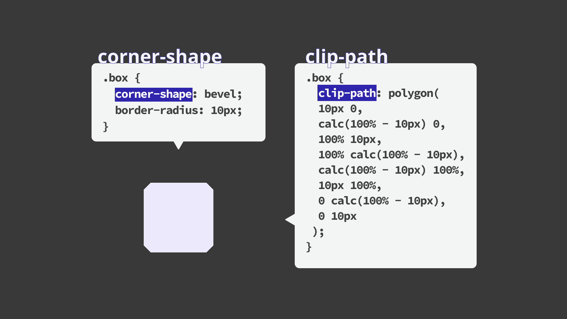
For example, one way to create a button with diagonally cut corners is to define a polygon with clip-path.
/* Cut off all four corners diagonally */
button {
  clip-path: polygon(
    10px 0,
    calc(100% - 10px) 0,
    100% 10px,
    100% calc(100% - 10px),
    calc(100% - 10px) 100%,
    10px 100%,
    0 calc(100% - 10px),
    0 10px
  );
}
With this approach, the coordinates need to be recalculated every time the corner size or shape changes, which can make adjustments cumbersome. The meaning of each coordinate is also hard to grasp at a glance, making it difficult to infer the intended appearance from the code.
With the corner-shape property, you can implement similar styles more intuitively by simply specifying how the corner area reserved by border-radius should be shaped.
1. Basics: available values
Keep the following points in mind when using the corner-shape property.
- The
corner-shapeproperty does not work on its own. It must be used together with theborder-radiusproperty. - If the value of
border-radiusis0, there will be no visible change. - The larger the radius, the more distinctive the corner design becomes.
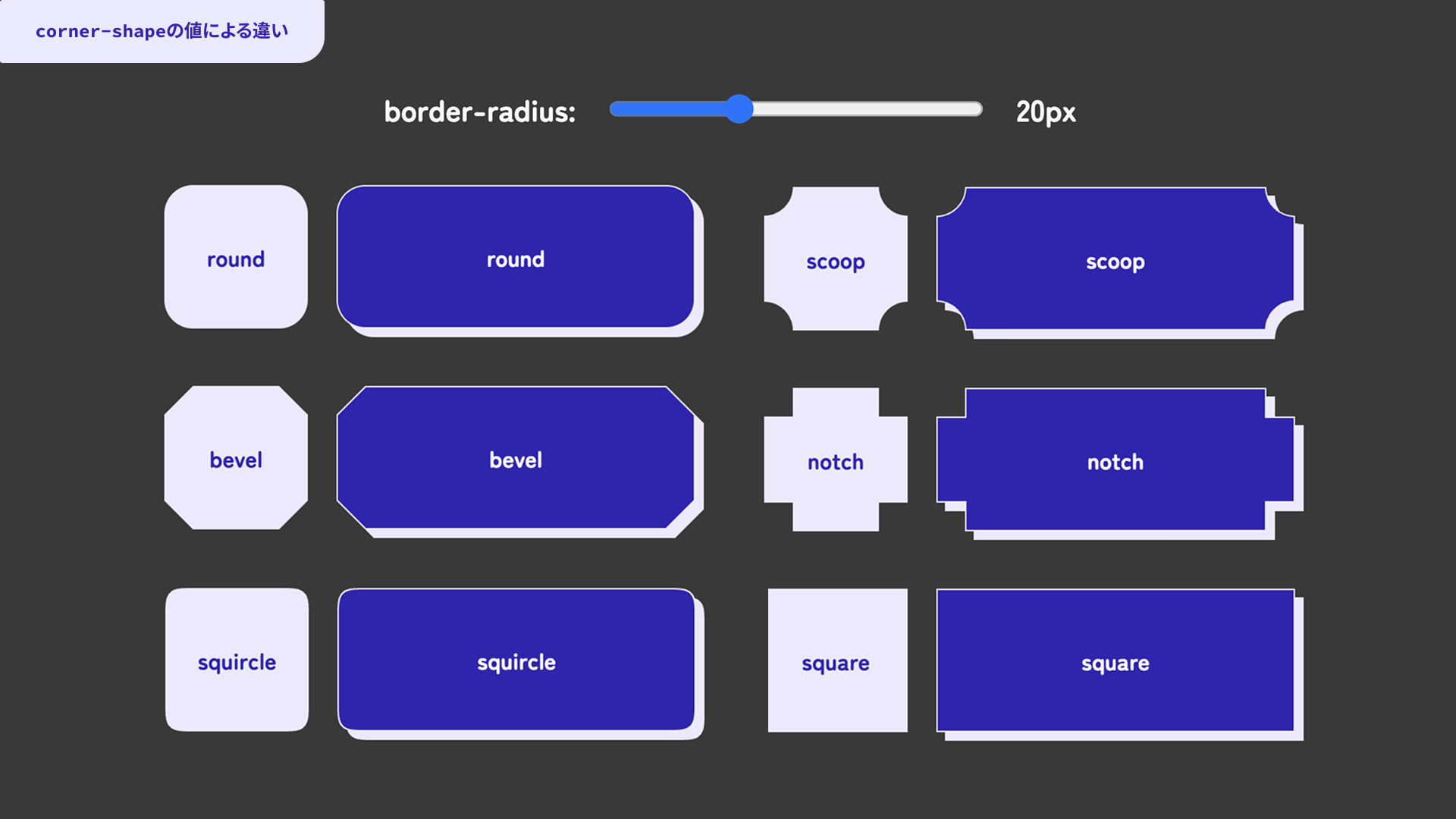
The demo below shows how each corner-shape value affects the result. You can also change the border-radius value with a slider. Try adjusting it and comparing the differences.
Note: Please view the demos in this article in Chrome or Edge 139 or later.
Here is the basic syntax for the corner-shape property.
button {
  border-radius: 12px;
  corner-shape: bevel;
}
The available values and their shapes are as follows.
round: the usual rounded cornerbevel: a corner cut off with a straight linescoop: a corner that looks scooped inwardnotch: a corner that looks like a square cut-outsquare: a right angle that cancels out the rounded cornersquircle: a smooth curve somewhere between a circle and a square, as a type of superellipsesuperellipse(): a shape that lets you specify the curvature of a superellipse numerically, ranging from circle-like to square-like depending on the value
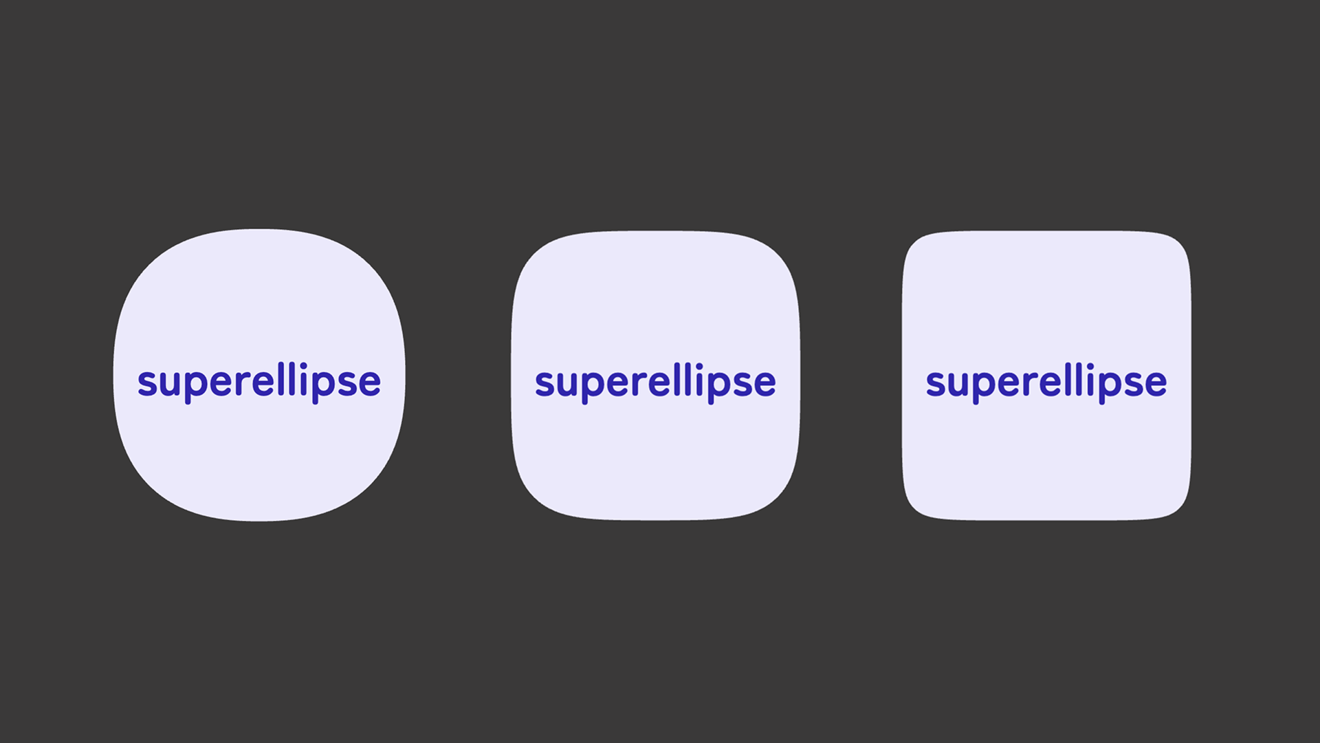
Superellipses
One especially notable feature of the corner-shape property is that it can specify superellipses.
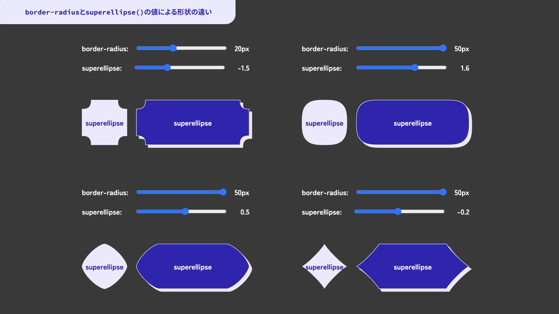
When superellipse() is specified as the value, the corner is drawn using a curve called a superellipse. You can adjust the curvature by passing a number as the argument. Values closer to 1 produce a more circle-like shape. Around 1, the shape looks close to a circle. Smaller values create a shape that scoops inward, while larger values move the shape closer to a square.
squircle is one representative superellipse shape. It can express the kind of “rounded but not too round” corner often seen in recent UI design. With superellipse(), you can fine-tune that curve in more detail.
In the following demo, you can adjust both the border-radius value and the argument passed to superellipse() with sliders.
2. Applied examples: demos
The corner-shape property can define all corner shapes at once. It also has related properties for specifying individual corners or pairs of corners on a side.
You can use corner-top-left-shape, corner-top-right-shape, corner-bottom-left-shape, and corner-bottom-right-shape to configure each of the four corners individually. There are also properties such as corner-left-shape and corner-right-shape, which let you specify the two corners on the left or right side together, as well as corresponding properties for the top and bottom sides.
For example, you can cut only the left-side corners diagonally while keeping the right-side corners rounded.
.label {
  border-radius: 12px;
  /* Same as writing `corner-shape: bevel round round bevel` */
  corner-left-shape: bevel;
  corner-right-shape: round;
}
Here are several implementation examples that use the corner-shape property in different ways.
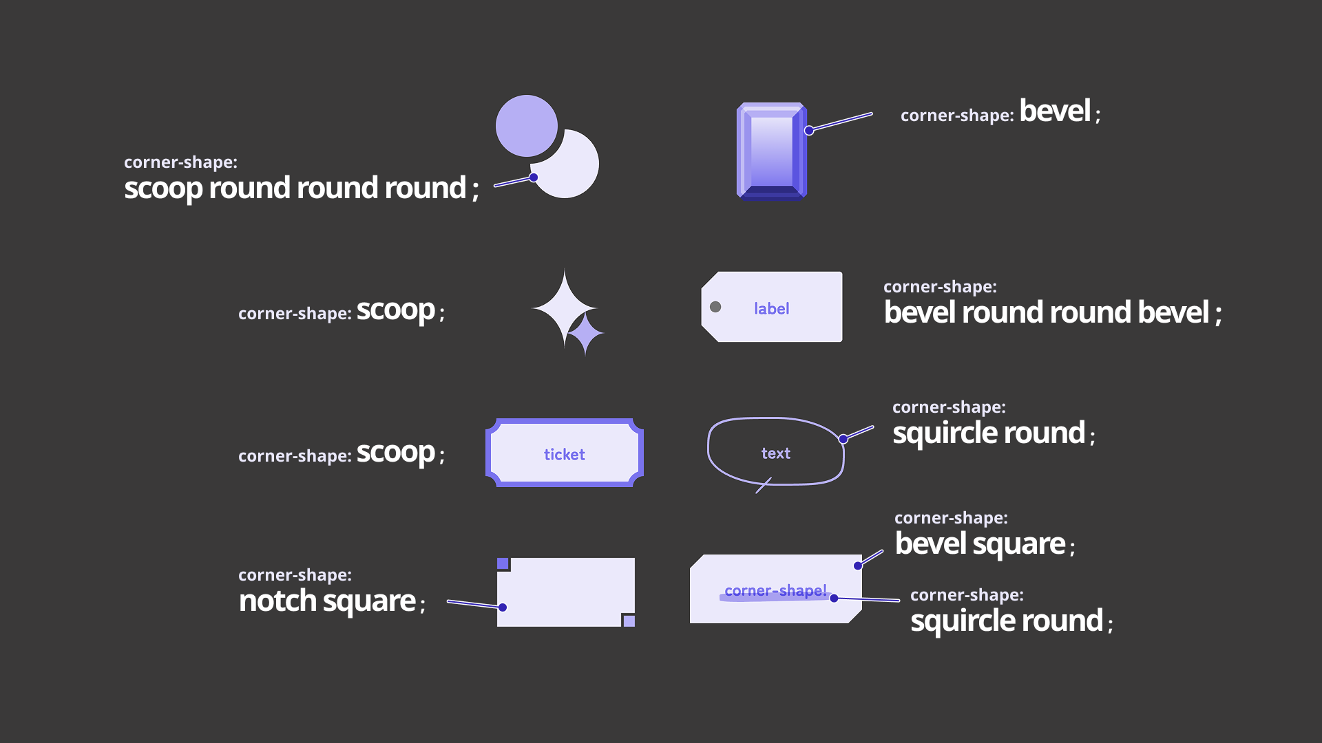
In addition to changing the corner shapes of buttons and creating decorative accents, the property can also be used for effects such as hand-drawn speech bubbles and marker-like lines. With a bit of imagination, there should be many more ways to adapt it.
Browser support
The corner-shape property is available in Chrome and Edge 139 (August 2025) or later.
Reference: Can I use…
Conclusion
Compared with using SVG or clip-path, the corner-shape property makes it easier to understand what the code is doing at a glance. Shapes, colors, sizes, and other details can also be changed easily as CSS values. It should be useful for animation as well.
For implementers, it is encouraging to see the range of designs that can be expressed with CSS alone continue to expand. Keep an eye on browser support, and consider using corner-shape actively where it fits.