Microinteractions are actions triggered by user behavior, such as clicking a button or drawing attention during form input. They are not just decorative animation. They improve usability and give users a more enjoyable experience, helping them use websites and services more comfortably.
For example, microinteractions are used in many places, including the Like button on X, timeline refreshes, and snackbar notifications when a new notification arrives. However, creating a wide range of microinteractions from scratch takes considerable effort.
This article introduces CSS microinteractions that you can copy and paste and customize easily. All of them were created by ICS and are published on GitHub under the MIT License, so feel free to use them for websites and content creation.
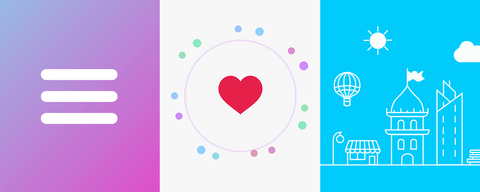
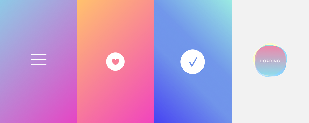
Morphing animation from a hamburger menu to a close icon
This animation changes a “hamburger menu” icon, made of three horizontal lines, into a close icon. When clicked, the lines transform into an “X”.
The top and bottom bars rotate to form diagonal lines, while the middle bar fades out as it rotates slightly.
When implementing a hamburger menu with three bars, a common mistake is to position the bars from an upper-left reference point. If you then rotate the bars diagonally, their center positions tend to shift.
Bad example
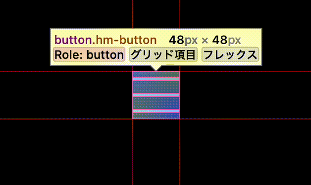
The key is to place the three bars around the center first.
Bad example
Hover animation for a circular button
This is a hover animation for a circular button with an icon in the center. The heart rotates and changes color, while the background circle becomes transparent and changes into a rotating dotted line.
The heart rotation uses transform and rotate3d to create a natural rotation with depth. The circle rotation uses animation instead of transition; by setting infinite as an option, it creates an animation that continues indefinitely.
Checkmark animation
This animation draws a checkmark. An outlined circle is drawn first; then the background fills in as the checkmark appears.
The line-drawing animation is implemented by placing a rectangle the same color as the background over the line to hide it, then rotating the rectangle so the line gradually becomes visible. The fill motion is created by making the line grow thicker toward the inside. Since border can only draw a line outward, box-shadow is used instead.
Wobbling loading icon
This loading icon has an irregular background that gently rotates around the “LOADING” text.
The wobbling effect is created by slightly deforming circles into ellipses, then rotating them with their transform origins shifted slightly away from the center. Layering three of them and rotating each at a different speed creates an irregular motion that looks like it is swaying.
The blinking “LOADING” text uses animation and @keyframes to continuously change opacity. The key to giving the blink more character is to set the opacity values so they change irregularly.
Conclusion
In recent years, microinteractions have become essential in websites and applications. This article introduced examples that are easy to adopt, but do not stop at simply copying and pasting them. Reading the code and understanding the logic should reveal techniques and discoveries that you may not have known before. Take time to read through the source code so the microinteractions introduced here become part of your own toolkit.
If you are interested in creating animations themselves, the article “あえてズレを! ウェブのアニメーションを「いい感じ」に魅せる手法” introduces useful techniques. It will help you get a feel for what makes animation work well, so take a look at that article as well.
If you want to add a pleasant bounce to UI, the article “Using CSS linear() for spring animations in UI” shows how to create spring animations with CSS’s linear() function. It makes UI feel more lively and gives users a positive impression.