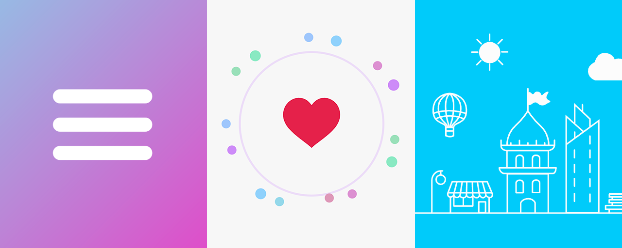
SVG animations can create engaging microinteractions on displays of different sizes. Microinteractions can also help improve user interfaces; see SVGで始めるマイクロインタラクション入門 (Japanese). SVG animation can be implemented in several ways, including CSS, JavaScript, and motion graphics software.
This article explains practical ways to implement SVG animation, organized by role: HTML coders, front-end engineers, and designers.
For HTML coders: creating SVG animations with CSS
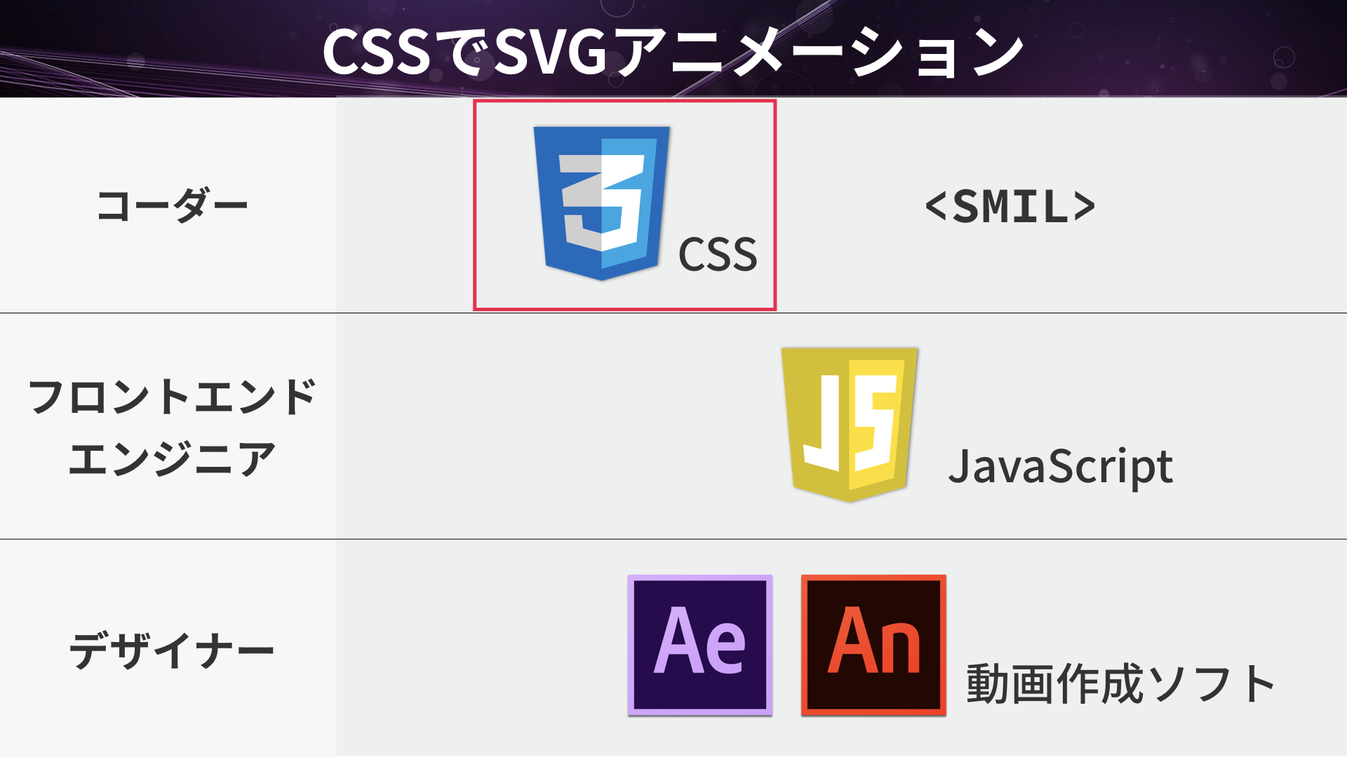
CSS properties can change the appearance and shape of SVG graphics. The following code uses CSS to update the style of a circle defined in HTML.
<circle id="myCircle" r="50" cx="270" cy="270" />
▲ index.html
#myCircle {
  fill: blue;
}
▲ style.css
This capability can be combined with CSS Transitions and CSS Animations to animate SVG properties gradually. For example, the following CSS transitions the fill color of the circle (#myCircle) to red over one second on hover.
#myCircle {
  transition: fill 1s;

  &:hover {
    fill: red;
  }
}
▲ style.css
The following video shows the coding process.
CSS animation example 1: hamburger menu
The following demo is a hamburger menu implemented entirely in CSS. Hovering over the button morphs it into a close icon.
The following CSS moves and rotates the three lines while making the middle line transparent. CSS transitions are used for the hover state.
.menu {
  cursor: pointer;

  .border {
    stroke: #fff;
    stroke-width: 45px;
    stroke-linecap: round;
    transition: var(--time);
    transform-origin: center center;
  }

  /* Initial positions */
  .border1 {
    transform: translateY(-100px);
  }
  .border3 {
    transform: translateY(100px);
  }

  &:hover {
    /* Rotate the first line on hover */
    .border1 {
      transform: translateY(0px) rotate(45deg);
    }
    /* Make the second line transparent on hover */
    .border2 {
      opacity: 0;
    }
    /* Rotate the third line on hover */
    .border3 {
      transform: translateY(0px) rotate(-45deg);
    }
  }
}
CSS animation example 2: Like button
The following demo combines a circle, particles, and a heart. Click the button to play the animation. The animation resembles the effect used by the Like button on X.
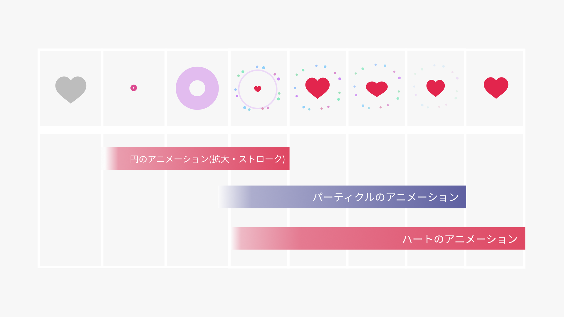
The explosion effect animates the stroke-width property (line thickness) and the scale() function (scale factor) to make the circle expand.
/* Start the explosion animation when clicked */
.likeButton.clicked .explosion {
  animation: explosionAnime var(--animate-time);
  animation-fill-mode: forwards;
}

/* Explosion animation keyframes */
@keyframes explosionAnime {
  0% {
    opacity: 0;
    transform: scale(0.01);
  }
  1% {
    opacity: 1;
    transform: scale(0.01);
  }
  5% {
    stroke-width: 200;
  }
  20% {
    stroke-width: 300;
  }
  50% {
    stroke: #cc8ef5;
    transform: scale(1.1);
    stroke-width: 1;
  }
  50.1% {
    stroke-width: 0;
  }
  /* Omitted */
}
For the heart, irregular changes to the vertical and horizontal scale create organic motion. For more examples of this technique, see CSS Animationだけで実現するキャラクターアニメーション (Japanese).
/* Start the heart animation when clicked */
.likeButton.clicked .heart {
  animation: heartAnime var(--animate-time);
  animation-fill-mode: forwards;
}

/* Heart animation keyframes */
@keyframes heartAnime {
  0% {
    transform: scale(0);
  }
  /* Omitted */
  75% {
    transform: scale(1.1, 0.9) translate(0%, 5%);
  }
  80% {
    transform: scale(0.95, 1.05) translate(0%, -3%);
  }
  100% {
    transform: scale(1, 1) translate(0%, 0%);
  }
}
For the particles, the sibling-index() function obtains the position of each of the 14 circles among its siblings, while the CSS cos() and sin() functions calculate their destinations. Offsetting the angle and radius of each circle creates an irregular spreading effect.
Advantages and disadvantages of CSS animation
One advantage of SVG animation with CSS is that it requires almost no JavaScript. Animations that change fills, strokes, scaling, rotation, or translation are easy to implement when those values are accessible through CSS properties. The offset-path property also supports motion along a specified path.
For HTML coders: creating SVG animations with SMIL
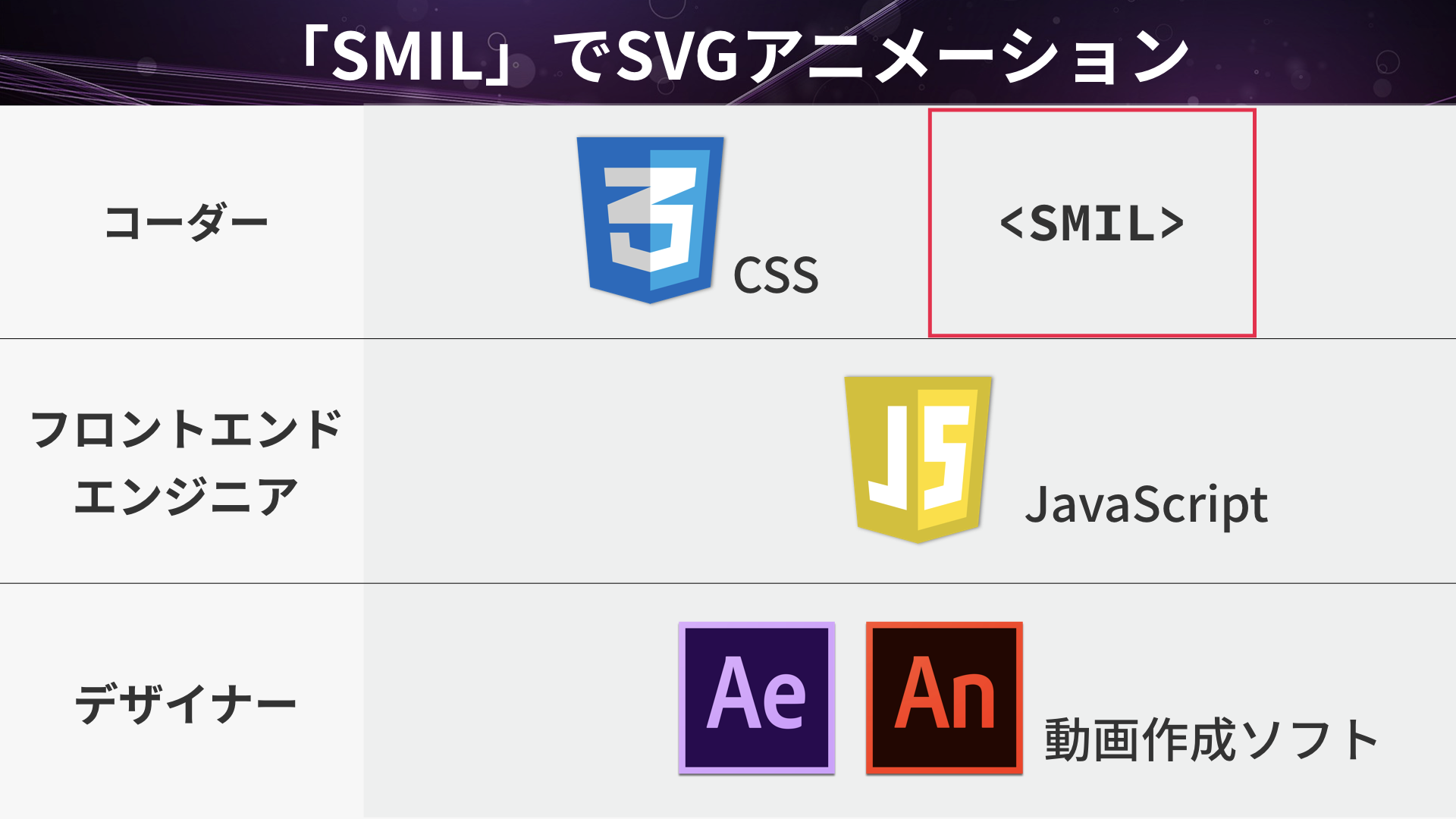
SVG provides animation elements based on SMIL (pronounced “smile”). You can create animations entirely within the SVG markup, without using CSS or JavaScript.
Here is an example that changes a circle’s fill to red over one second.
<circle>
  <animate attributeName="fill" to="red" dur="1s"></animate>
</circle>
▲ index.html
When the start and end states use the same sequence of path commands, animating the d attribute can also produce “morphing,” in which one shape gradually changes into another.
Use the <animate> element to change attribute values, <animateTransform> for transformations such as rotation, translation, and scaling, and <animateMotion> to move an element along a path.
Characteristics of SMIL
SMIL keeps the entire animation inside the SVG markup. It supports changes to fills and strokes, scaling, rotation, and translation, as well as path morphing and motion along a path.
For engineers: animating SVG with JavaScript
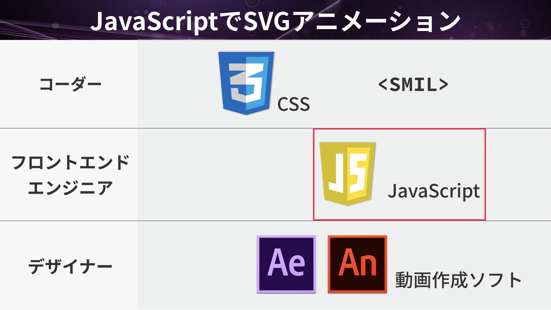
SVG elements are DOM nodes, so JavaScript can change their attributes and styles. For animation, you can use the browser’s built-in Web Animations API.
For example, the following code changes a circle’s fill from blue to red over one second.
const myCircle = document.querySelector("#myCircle");
const animation = myCircle.animate(
  [
    { fill: "blue" },
    { fill: "red" },
  ],
  {
    duration: 1000,
    fill: "forwards",
  },
);
Like CSS animations, the animate() method accepts keyframes and a duration. The returned Animation object provides playback control through methods such as pause(), reverse(), and cancel().
The advantage of JavaScript is that values and timing can be changed dynamically in response to user input or application state. CSS is well suited to simple state changes, while JavaScript is a better choice when playback control or data-driven behavior is required.
JavaScript libraries can also make timeline control and complex easing easier to implement. For an overview of major libraries, see Comparing JavaScript animation libraries for production use - GSAP, Anime.js, Motion and Web Animations API.
Advanced: creating line-drawing animations with CSS
As an advanced example, the following demo is inspired by a real estate website. The outlines of the buildings and cityscape are drawn gradually, and a map pin then drops from above.
Drawing lines with stroke-dashoffset
Add the pathLength="1" attribute to each SVG shape to normalize the path length used by the browser to 1.
<path pathLength="1" d="M57.4 528.1h1003.3" />
In CSS, set the initial values of stroke-dasharray and stroke-dashoffset to 1, then animate stroke-dashoffset to 0. The sibling-index() function obtains the position of each SVG element among its siblings, allowing the start times to be staggered across the lines.
#city > :is(path, circle),
#map > path,
#mapPin > path {
  stroke-dasharray: 1;
  stroke-dashoffset: 1;
  animation: drawLine var(--draw-duration) ease var(--draw-delay, 0s) forwards;
}

#city > :is(path, circle),
#map > path {
  --draw-delay: calc((sibling-index() - 1) * var(--draw-delay-step));
}

@keyframes drawLine {
  to {
    stroke-dashoffset: 0;
  }
}
Dropping the pin with a motion path and linear()
For the map pin, the offset-path property defines a vertical motion path. Changing the offset-distance property moves the pin along that path.
The easing uses the CSS linear() function. By allowing the progress value to exceed 1 and then settle back, the animation creates a bounce after the pin lands.
#mapPin {
  offset-path: path("M 462.5 -206.7 V 258.3");
  offset-distance: 0%;
  offset-rotate: 0deg;
  offset-anchor: 463px 193px;
  transform-origin: 463px 382px;
  animation:
    dropMapPin
    0.7s
    /* Create motion overshoot and a squash-and-stretch rebound */
    linear(0, 0.189, 0.557, 0.89, 1.092, 1.162, 1.141, 1.083, 1.026, 0.989, 0.974, 0.976, 0.985, 0.994, 1.001, 1.004, 1.004, 1.003, 1.001, 1, 1)
    1s
    both;
}

@keyframes dropMapPin {
  from {
    offset-distance: 0%;
    scale: 0.4 1.6;
  }
  to {
    offset-distance: 86.02%;
    scale: 1;
  }
}
For more details about CSS motion paths, see Using the CSS offset property for path animations.
For designers: creating SVG animations with motion graphics software
Adobe After Effects lets you create animations without writing code.
Exporting SVG animations from After Effects with Bodymovin
Combining After Effects with the Bodymovin extension lets you export animations in JSON format. On a web page, the Lottie JavaScript library loads the JSON data and renders the animation as SVG or on a <canvas> element.
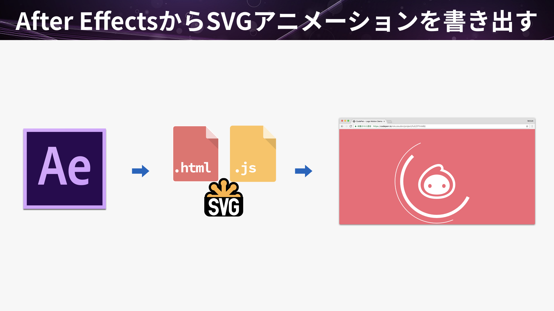
For detailed instructions, see Creating Lottie animations with After Effects.
Characteristics of SVG animation with Lottie
Lottie’s main advantage is that designers can adjust the motion in After Effects. Because the JSON data is difficult to edit by hand, changes are generally made in After Effects and then exported again.
Get started with SVG animation
High-resolution displays are now the norm, and SVG animation works well with flat design, so it has many practical applications. Give SVG animation a try.