Menu UIs on the web can benefit from a technique known as a safe triangle. When front-end engineers account for it during implementation, they can improve the usability of nested menus for mouse users.
When users move diagonally toward a target submenu, the pointer often crosses another menu item, causing the submenu to switch before they reach it. To avoid this, users must first move horizontally toward the submenu and then move up or down.
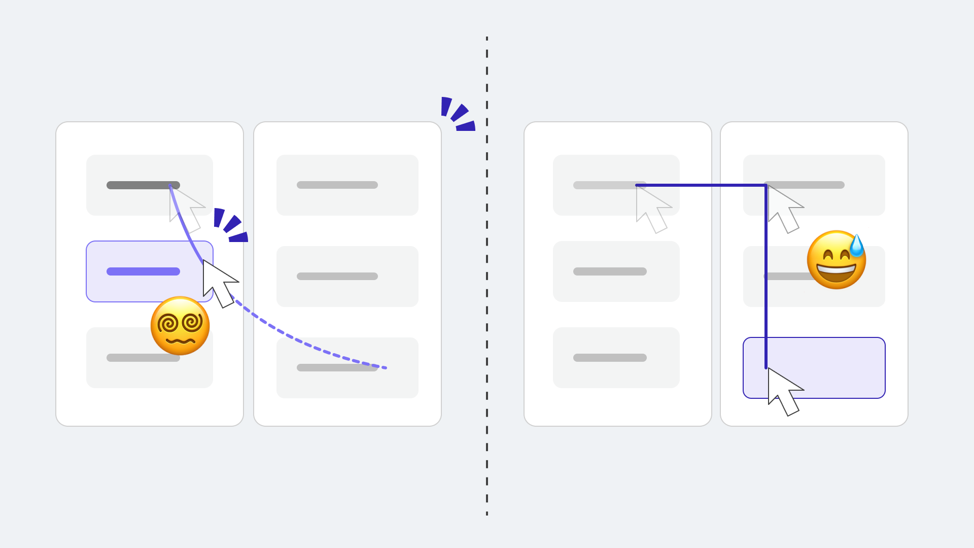
▲ A nested menu without a safe triangle. On the left, diagonal pointer movement activates an item along the way. To avoid accidental activation, the pointer must follow a grid-aligned path (Manhattan distance), as shown on the right.
What is a safe triangle?
To solve this at the implementation level, draw a triangle between the pointer position and the submenu’s top-left and bottom-left corners. Extending the hit area in this way prevents another menu item from activating while the pointer moves diagonally.
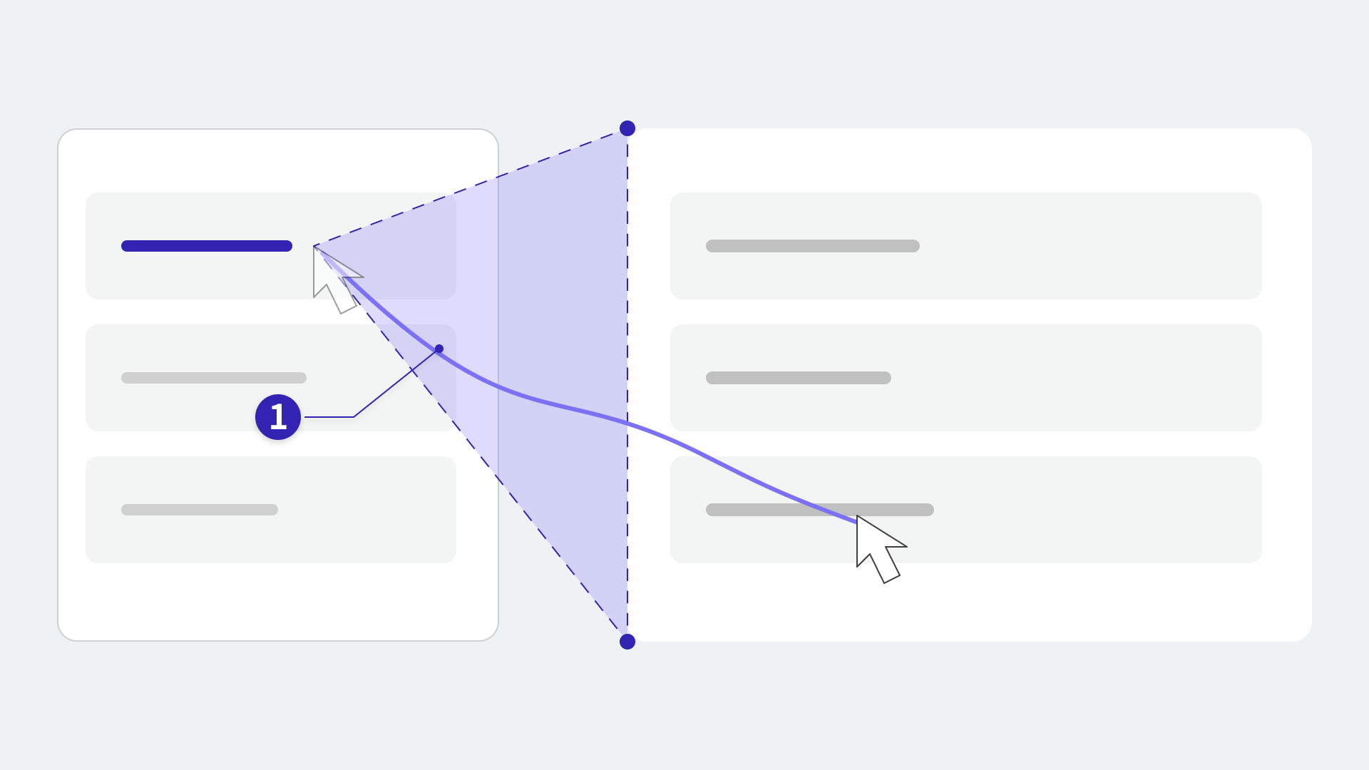
▲ With a safe triangle, the other menu item marked ① does not activate.
This technique is also known as a “safe area,” “safe polygon,” menu-aim, or “prediction cone.”
Creating a triangle with CSS clip-path
Combining CSS clip-path: polygon() with CSS custom properties provides a simple way to implement a safe triangle. Try moving the pointer diagonally in the following demo.
In the demo, Enable turns the safe triangle on or off, while Show shows or hides it.
Note: The safe triangle is disabled on mobile devices for the reasons described later. Please view the demo in a desktop browser.
The demo uses CSS Anchor Positioning to place the submenu. It lets one element be positioned relative to another, which is useful for laying out hierarchical menus.
Defining the triangle with clip-path: polygon()
The pseudo-element uses position: fixed. Its rectangular position and dimensions are supplied through CSS custom properties, and clip-path clips it into a triangle.
.action-item {
  /* A triangle connecting the pointer to the submenu's upper and lower edges. */
  &::before {
    content: "";
    position: fixed;
    /* Place it behind the trigger and submenu. */
    z-index: 2;
    top: var(--safe-top);
    left: var(--safe-left);
    width: var(--safe-width);
    height: var(--safe-height);
    /* Hidden by default so it is active only while hovered. */
    display: none;
    clip-path: polygon(
      0 var(--safe-y), /* ① */
      100% 0,  /* ② */
      100% 100% /* ③ */
    );
  }
}
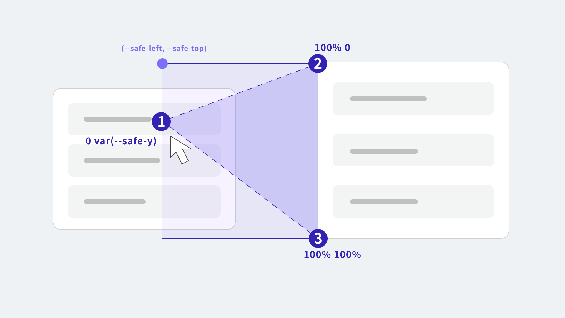
▲ The triangular pseudo-element.
The ::before pseudo-element is rectangular, but clip-path clips it into the safe triangle. Only the area inside the clipped triangle receives pointer events (CSS Masking Module Level 1).
Passing the pointer position to CSS custom properties
On every mousemove event, JavaScript passes the pseudo-element’s enclosing rectangle—its position, width, and height—and the position of the vertex nearest the pointer to CSS custom properties.
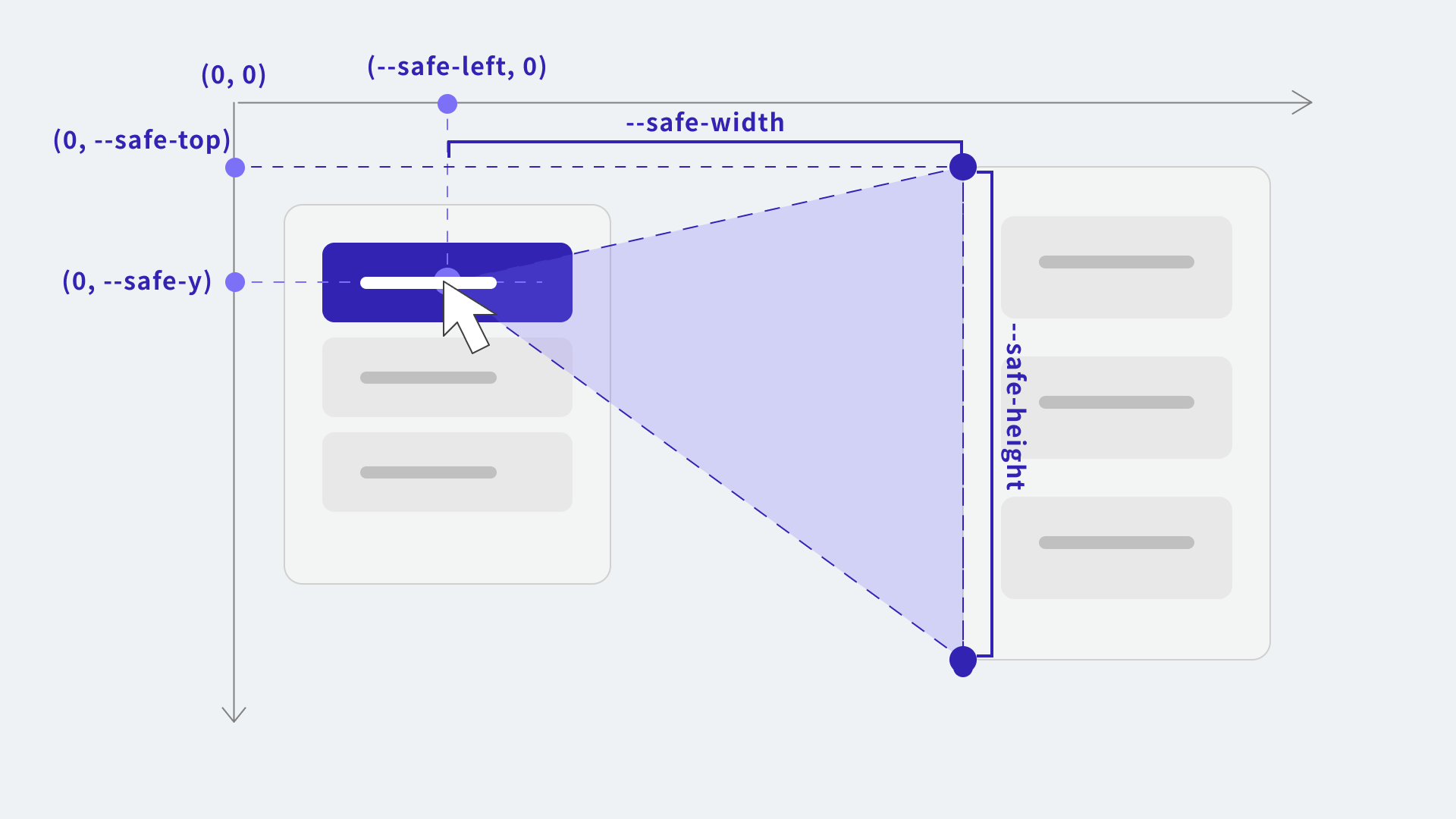
▲ The starting point is near the pointer on the trigger. The other two points are the submenu’s top-left and bottom-left corners.
trigger.addEventListener("mousemove", (event) => {
  // Calculate the triangle from the positioned submenu's bounding box.
  // (Omitted)

  // Slightly overlap the starting point so the pointer does not leave the triangle at its edge.
  item.style.setProperty("--safe-top", `${menuRect.top}px`);
  item.style.setProperty("--safe-left", `${safeLeft}px`);
  item.style.setProperty("--safe-width", `${Math.max(menuRect.left - safeLeft, 0)}px`);
  item.style.setProperty("--safe-height", `${menuRect.height}px`);
  item.style.setProperty("--safe-y", `${safeY}px`);
});
Enabling the safe triangle only for mouse input
A safe triangle is useful only for hover interactions. To avoid placing the triangle on mobile devices, control it with a CSS media query.
.action-item {
  @media (hover: hover) and (pointer: fine) {
    &:hover::before {
      /* Enable the transparent triangular hit area. */
      display: block;
    }
  }
}
The conditions mean the following:
-
(hover: hover)- The primary input device supports hover.
-
(pointer: fine)- The primary input device has a fine pointer capable of precise targeting.
Column: Using the Popover API and interestfor
So far, CSS has used :hover to toggle the submenu. With HTML and CSS features available as of 2026, the implementation can be made a little simpler.
The popovertarget attribute can replace the logic for opening the submenu on click, while interestfor can replace the logic for opening it on hover. When both attributes reference the same popover="hint" element, they can open and close the submenu.
See the following demo.
<!-- Reference the same id for click/tap and hover/focus. -->
<button
  popovertarget="share-submenu"
  interestfor="share-submenu"
>Share</button>
<ul id="share-submenu" popover="hint">
  <!-- Submenu items -->
</ul>
For more details about the interestfor attribute, see Using HTML command and interestfor to reduce JavaScript for modals and tooltips.
Examples
Mega menu
A safe triangle can also be used in a UI with categories on the left and corresponding lists on the right.
Opening downward
The same approach also works for submenus placed below the trigger.
Libraries make implementation easier
Implementing this from scratch may sound like a lot of work. Fortunately, some UI libraries already support safe triangles.
React Aria
Adobe’s React Aria is a headless UI library for building accessible interfaces. Among headless UI libraries, it is arguably one of the most successful—and one of the few Adobe-developed web libraries to achieve such broad adoption. It also provides behavior similar to a safe triangle.
▼ Implementation excerpt
<SubmenuTrigger delay={0}>
  {/* The first child is the parent item, and the second is the submenu. */}
  <MenuItem id="share">Share</MenuItem>
  <Popover>
    <Menu>
      <MenuItem id="email">Email</MenuItem>
      <MenuItem id="sms">SMS</MenuItem>
    </Menu>
  </Popover>
</SubmenuTrigger>
Unlike the CSS approach, React Aria does not create a triangle in the DOM. Instead, JavaScript uses the pointer’s direction together with a timeout, keeping the parent item open while the pointer is moving toward the submenu.
This article introduced a transparent hit area built with a pseudo-element. Because that approach can still misclassify pointer movement, React Aria appears to have explored a JavaScript-based method to improve accuracy.
In other words, there is no single way to implement a safe triangle. It is a surprisingly deep technique that has inspired many different approaches.
Floating UI
The React package for Floating UI includes the safePolygon() function and the useHover() hook. Used together, they create a dynamic polygon during hover interactions. Floating UI calls this a safe polygon.
▼ Implementation excerpt
// `context` is returned by `useFloating()`.
const hover = useHover(context, {
  mouseOnly: true,
  // Also block hover on other items behind the pointer path.
  handleClose: safePolygon({ blockPointerEvents: true }),
});
const { getReferenceProps, getFloatingProps } =
  useInteractions([hover]);
safePolygon() also considers the pointer’s direction and creates a polygon only when needed.
Other libraries, including MUI and shadcn/ui, also support safe triangles because the submenu libraries they use internally provide the behavior.
Safe triangles have existed for decades
The safe triangle concept dates back decades. It was used in hierarchical menus on the Mac in the mid-1980s. An article looking back at the Mac’s interface design uses the phrase “a buffer zone shaped like a <” to describe it.
On the web, a 2013 article analyzing Amazon’s mega menu drew attention. At the time, delaying submenu display was one way to prevent accidental switching. The article explained that a safe triangle let the menu respond immediately instead, making it feel more responsive. The jQuery plugin jQuery-menu-aim, released alongside it, also attracted attention.
Conclusion
When working with HTML and CSS, it is easy to think only in rectangular boxes. A diagonal hit area is therefore easy to overlook. Mobile-first design has been standard for years, but mouse input remains useful in many contexts, including tablets that can be used with a mouse.
Even if it seems like a small improvement, consider using a safe triangle on the web to make menus easier to use.