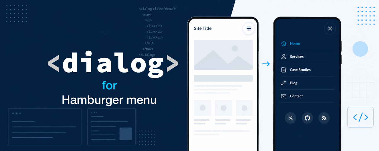
A hamburger menu is a navigation UI commonly used on mobile websites. When the “≡” button in the header is pressed, a list of links appears over the current page.
The three-line button resembles a hamburger, with buns and a patty stacked together, so it is commonly called a “hamburger menu.”
There are many old and new ways to build one.
For current implementations, using the HTML <dialog> element is recommended.
It can be implemented cleanly with CSS features that have become available in the 2020s.
Why older implementations are worth avoiding
Hamburger menus have been widely used on websites since around the late 2000s, when smartphones began to spread. Let’s look back at the issues older implementations had. You may even find cases where one was used without realizing it 😨.
A div that only looks like a menu
Examples of hamburger menus have long used code that adds and removes classes on a <div> element to switch visibility. For example, the visible state may be controlled only by a class name.
<!-- Manage visibility with a class name -->
<button class="...">Menu</button>
<div class="... is-open">
  <a href="#">Work</a>
</div>
One disadvantage of using a <div> element is that when the menu is open, pressing the Tab key can still move focus to links and forms behind it.
The creator did not intend those background elements to be operable. Still, users can reach them in an unintended way, which can lead to unexpected problems.
The checkbox hack
Another approach uses a checkbox with an <input> element and a <label> element to switch visibility. Its advantage is that it works without JavaScript.
For example, the checked state is used as the menu’s visible state.
<!-- Toggle the menu with the checked state -->
<input id="menu-toggle" type="checkbox" />
<label for="menu-toggle">Menu</label>
<nav class="...">...</nav>
However, this is not recommended as a way to open and close navigation. A checkbox is a form control, so assistive technologies announce it as a checkbox, not as “a button that opens a menu.”
Benefits of the dialog element
This is where the <dialog> element is useful. The <dialog> element includes standard features for building modal UIs.
Benefits:
- It can be shown in the top layer with
showModal(), so there is no need to adjustz-index. - While the hamburger menu is open, the Tab key does not move focus to the background.
- The standard behavior for closing with the Escape key can be used.
- The dark backdrop layer can be styled with the
::backdroppseudo-element. - It is announced to screen readers as a dialog.
- It can be implemented with concise code.
The focus trap works, so focus does not move to the underlying layer.
Full-screen menus and drawers are layers that cover the current page, so the <dialog> element works well as a modal UI. The name <dialog> often makes people think of alert dialogs. The element is also useful for modal UIs in general.
For details on the <dialog> element, see the article HTML dialog element for modal UIs.
Basic implementation with the dialog element
Let’s look at a hamburger menu implementation. The sample can be operated with the “≡” button in the upper-right corner.
Here is an excerpt from the HTML.
<!-- Open button -->
<button id="button-open" class="..."></button>
<dialog id="menu" class="...">
  <!-- Close button and navigation -->
  <button id="button-close" class="..."></button>
  <nav class="...">...</nav>
</dialog>
In JavaScript, use the showModal() method to open the menu and the close() method to close it.
buttonOpen.addEventListener("click", () => {
  // Open as a modal
  menu.showModal();
});
buttonClose.addEventListener("click", () => {
  // Close the menu
  menu.close();
});
The hamburger menu is also closed when the backdrop is clicked and when a link inside the menu is clicked. For details, see the following JavaScript code.
CSS for a full-screen menu
To use the <dialog> element as a hamburger menu, several adjustments are needed in the stylesheet. See the shared CSS.
- Override the browser’s default styles for the
<dialog>element - The
::backdroppseudo-element - Preventing background scrolling
Preventing background scrolling is handled in the shared CSS.
body:has(dialog[open]) {
  /* Prevent the background page from scrolling */
  overflow: hidden;
}
Motion
Adding motion to a modal’s open and close states softens the impact of the screen transition and helps guide the user’s attention.
In older implementations, opening and closing motion for modals required JavaScript and was complex and difficult. Recent CSS makes this kind of motion easier to implement. The key points are CSS @starting-style and allow-discrete.
@starting-style
@starting-style is an at-rule that lets you specify the starting state of a CSS transition. The <dialog> element transitions from an initial state (hidden) to visible, then to a closed state (hidden). @starting-style is useful for defining the first initial state (hidden). It is a significant feature worth remembering.
The starting opacity and translate values can be grouped inside @starting-style.
.full-menu[open] {
  opacity: 1;
  translate: 0 0;
  @starting-style {
    /* Place it slightly above when opening starts */
    opacity: 0;
    translate: 0 -24px;
  }
}
transition-behavior: allow-discrete
The other feature, transition-behavior: allow-discrete, is a separate concept, but it plays an important role in implementing motion. opacity and translate change continuously as numeric values. For example, values from 0.0 to 1.0 are continuous. By contrast, display is a property without intermediate values, such as block, inline, and none. These are called discrete values.
Switching the discrete display property used to work poorly with CSS transitions. With transition-behavior: allow-discrete, the switch can wait until the motion completes.
.menu-dialog {
  transition:
    /* Also wait for discrete value switches */
    display 1s allow-discrete,
    overlay 1s allow-discrete;
}
The idea behind @starting-style is also explained in a video. For details, see the YouTube video かんたんなCSSで入退場アニメーションを! @starting-styleとallow-discreteを学ぼう.
For people who are sensitive to motion, the prefers-reduced-motion media query can also be used. See the article CSSでもアクセシビリティに配慮しよう! モーション軽減・文字サイズ変更・ダークモードの実装方法 - ICS MEDIA for details.
Preventing repeated input during transitions
One thing not to forget is preventing repeated input while the modal’s open or close motion is running. A button inside a modal can be activated during the opening or closing motion. Front-end developers have likely seen that kind of bug.
The following two styles are specified to suppress clicks while the dialog is closing.
pointer-events: none: blocks only pointer device inputinteractivity: inert: blocks pointer and keyboard input. It is the CSS counterpart of HTML’sinertattribute.
.menu-dialog {
  /* Stop input during motion */
  interactivity: inert;
  pointer-events: none;
}
In principle, interactivity: inert alone is enough, but because some browsers do not support it, pointer-events: none is also specified as a fallback. See the browser support section below.
Preventing scroll
While the menu is open, scrolling on the main page is stopped. If the page behind the menu moves, the visible position changes after the menu is closed.
If there are many menu items, only the inside of the menu should scroll. Create the scroll area according to the layout: the entire menu in the full-screen version, the panel in the drawer version, and so on.
The scroll-control approach is covered in detail in overscroll-behaviorがお手軽! モーダルUI等のスクロール連鎖を防ぐ待望のCSS.
Drawer menu
A drawer is a menu UI that appears from the edge of the screen. It may be called “drawer navigation,” “slide navigation,” or other names, but it can also be considered a type of hamburger menu. In the drawer version, the outer element is also a <dialog> element.
<dialog id="menu" class="...">
  <!-- Panel that appears from the right -->
  <div class="...">...</div>
  <!-- Close button in the same position as the three-line button -->
  <button id="button-close" class="..."></button>
</dialog>
The full-screen and drawer versions run with the same JavaScript.
Menu contents
The contents of a hamburger menu can be implemented freely as part of the site layout. The following variations are examples.
Example: hamburger menu with an accordion
The accordion is built with the <details> element.
<details>
  <!-- Heading area -->
  <summary><span class="...">Residents</span></summary>
  <!-- Links shown when expanded -->
  <a href="#">Certificates</a>
  <a href="#">Health services</a>
</details>
Example: hamburger menu with a search form
Drawbacks of the dialog element
There are also drawbacks to building this UI with the <dialog> element. A common animation where the three-line menu button continuously morphs into an X close button becomes difficult.
Demo: Micro interactions with CSS animation
The “≡” button in the header and the “×” button inside the <dialog> element are on separate layers. This approach does not pair well with a continuously transforming single button.
Column: will JavaScript control soon become unnecessary?
In current browsers, the command / commandfor attributes on the <button> element can perform operations equivalent to showModal() and close(). If closedby="any" is specified on the <dialog> element, the dialog also closes when the ::backdrop pseudo-element is clicked. This can greatly reduce the amount of code.
The basics of the command attribute are introduced in the article Using HTML command and interestfor to reduce JavaScript for modals and tooltips.
In the future, the following HTML alone will be able to control the dialog.
<!-- Open dialog with HTML only -->
<button commandfor="menu" command="show-modal"></button>

<dialog id="menu" closedby="any">
  <!-- Close dialog with HTML only -->
  <button commandfor="menu" command="close"></button>
</dialog>
As of May 2026, the previous-generation iOS 18 Safari does not support attributes such as command. While iOS 18 is still in use, controlling the menu with JavaScript is the safer choice. Around 2027 to 2028, it seems likely that an era will arrive when hamburger menus can be built without JavaScript.
Browser support
The <dialog> element is available in Chrome 37 (August 2014), Edge 79 (January 2020), Safari 15.4 (March 2022), and Firefox 98 (March 2022) and later. Therefore, it is reasonable to treat the <dialog> element as available in all current browsers.
Reference: <dialog> element | Can I use…
The display motion uses the following CSS features.
@starting-styleis available in Chrome and Edge 117 (September 2023), Safari 17.5 (May 2024), and Firefox 129 (August 2024) and later.transition-behavioris available in Chrome and Edge 117 (September 2023), Safari 17.4 (March 2024), and Firefox 129 (August 2024) and later.- The
interactivityproperty is available in Chrome and Edge 135 (April 2025) and later. As noted above,pointer-eventsis used together with it as a fallback.
References:
Column: when to use the popover attribute
For simple menus that do not cover the whole screen, the popover attribute can be used instead of the <dialog> element. The popover attribute is non-modal, so links and forms behind it remain operable. It is suited to cases such as showing a small list from the upper-right of a header or temporarily showing a list of categories.
For a small menu, the popover and popovertarget attributes can be used.
<!-- The button points to the element to show -->
<button popovertarget="menu-compact"></button>
<div id="menu-compact" popover>...</div>
What about UI frameworks?
Menus in UI frameworks are often built with <div> elements rather than the <dialog> element. But there is no need to worry. The large amount of JavaScript on the framework side often handles details such as focus trapping.
Reference article:
Conclusion
This article introduced how to build a hamburger menu with the <dialog> element. If you see a site that still uses a plain <div> element, try operating it with the Tab key and check whether focus is handled properly. If the background can be operated, that is a sign the implementation should be improved.
Using the <dialog> element makes it possible to build a high-quality hamburger menu with less effort, so consider it for your next implementation.