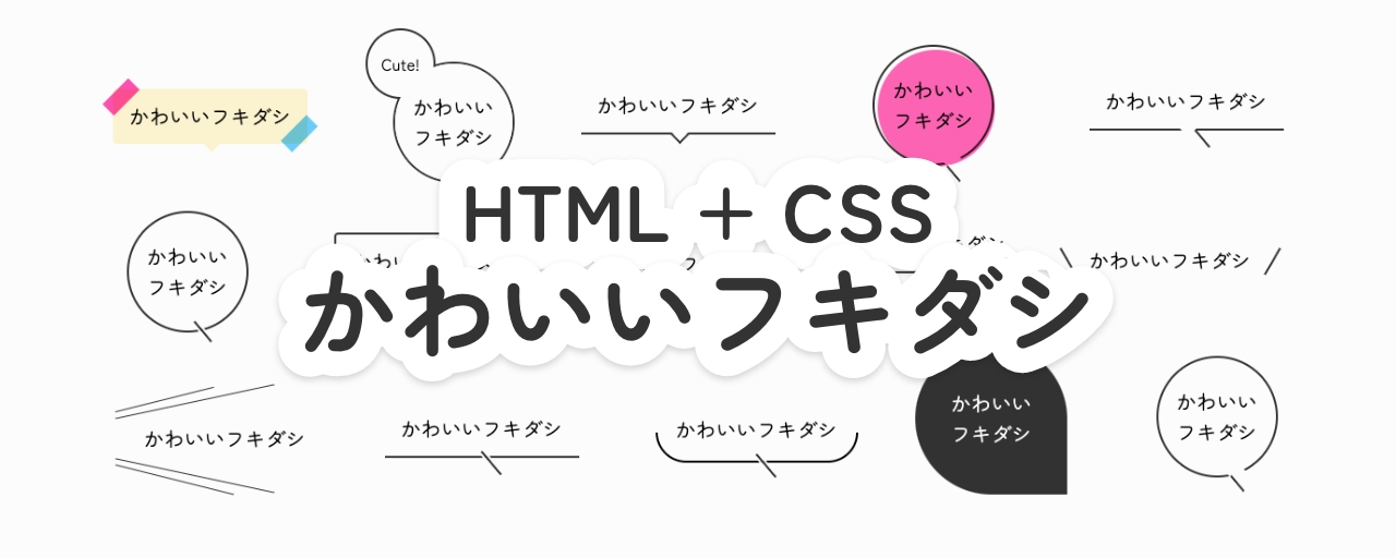
見出しなどのテキストを目立たせたいときに便利なフキダシ(吹き出し)。この記事では、HTMLとCSSだけで簡単に実装できる、シンプルなデザインのフキダシをご紹介します。
雑誌やポスターなどで見かける可愛いあしらいをウェブサイトにも取り入れたいと思ったことが、今回のテーマを選んだきっかけです。とくにフキダシは、少ないコードで表現でき、見出しなどのテキストに華やかな印象を与えられます。ウェブサイトを制作する際に、ぜひ取り入れてみてください。
また、この記事のほとんどの作例で、CSSの疑似要素『::before』と『::after』を利用しています。疑似要素を使うと、不要なHTMLタグを増やさずにCSSで装飾できます。
::before= 選択した要素の最初の子要素として疑似要素を生成::after= 選択した要素の最後の子要素として疑似要素を生成
これらは、要素に装飾的な内容を追加するために用いられることがよくあります。
1. 線と余白を活用したフキダシ
1-1 線半分のフキダシ
下半分のみに枠のあるフキダシ。borderをtopのみ削除し、左下と右下に角丸(border-radius)を指定することで実装しています。
ナナメの線は::after疑似要素で描いています。ここでは、box-shadowに背景色と同じ色を指定することで、線が途切れたような表現をしています。
▼ HTML
<div class="fukidashi-01-01">
  <div>かわいいフキダシ</div>
</div>
▼ CSS
.fukidashi-01-01 {
  position: relative;
  width: fit-content;
  padding: 12px 16px;

  &::before {
    content: "";
    position: absolute;
    bottom: -6px;
    left: 50%;
    width: 100%;
    height: 50%;
    box-sizing: border-box;
    border: 2px solid #333333;
    border-top: none;
    border-bottom-right-radius: 50px; /* 右下の角丸 */
    border-bottom-left-radius: 50px; /* 左下の角丸 */
    translate: -50% 0;
  }

  &::after {
    content: "";
    position: absolute;
    top: calc(100% + 8px); /* フキダシのサイズに応じて調整してください */
    left: 50%;
    width: 30px;
    height: 2px;
    box-sizing: border-box;
    background-color: #333333;
    box-shadow:
      0 2px 0 #ffffff,
      0 -2px 0 #ffffff;
    rotate: 50deg;
    translate: -50% 0;
  }
}
1-2 下線 + 線のフキダシ
下線のみのフキダシ。::after疑似要素でナナメの線を描画し、フキダシの枠部分に重ねています。
▼ HTML
<div class="fukidashi-01-02">
  <div>かわいいフキダシ</div>
</div>
▼ CSS
.fukidashi-01-02 {
  position: relative;
  width: fit-content;
  padding: 12px 16px;
  border-bottom: 2px solid #333333;

  &::after {
    content: "";
    position: absolute;
    top: calc(100% + 5px);
    left: 50%;
    width: 30px;
    height: 2px;
    box-sizing: border-box;
    background-color: #333333;
    box-shadow:
      0 2px 0 #ffffff,
      0 -2px 0 #ffffff;
    rotate: 50deg;
    translate: -25% 0;
  }
}
1-3 下線 + 三角つまみのフキダシ
下線の中央に三角のつまみをつけたフキダシ。::after疑似要素でつまみ部分を描画しています。さらにその上に背景と同じ色の::before疑似要素を重ねることで、不要な線を隠しています。
▼ HTML
<div class="fukidashi-01-03">
  <div>かわいいフキダシ</div>
</div>
▼ CSS
.fukidashi-01-03 {
  position: relative;
  width: fit-content;
  padding: 12px 16px;
  border-bottom: 2px solid #333333;
  background-color: #ffffff;
  isolation: isolate;

  &::before {
    content: "";
    position: absolute;
    bottom: -5px;
    left: 50%;
    width: 15px;
    height: 15px;
    box-sizing: border-box;
    background-color: #ffffff; /* 背景色と同じ色を指定 */
    rotate: 135deg;
    translate: -50% 0;
  }

  &::after {
    content: "";
    position: absolute;
    bottom: -8px;
    left: 50%;
    z-index: -1;
    width: 15px;
    height: 15px;
    box-sizing: border-box;
    border: 2px solid;
    border-color: #333333 #333333 transparent transparent;
    background-color: #ffffff;
    rotate: 135deg;
    translate: -50% 0;
  }
}
1-4 下線 + 線(隙間あり)のフキダシ
下線のみのフキダシ。背景と同じ色の::before疑似要素を下線に重ねることで、隙間が空いているようなデザインを表現しています。
▼ HTML
<div class="fukidashi-01-04">
  <div>かわいいフキダシ</div>
</div>
▼ CSS
.fukidashi-01-04 {
  position: relative;
  width: fit-content;
  padding: 12px 16px;
  border-bottom: 2px solid #333333;
  background-color: #ffffff;
  isolation: isolate;

  &::before {
    content: "";
    position: absolute;
    bottom: -5px;
    left: 50%;
    width: 15px;
    height: 15px;
    box-sizing: border-box;
    background-color: #ffffff; /* 背景色と同じ色を指定 */
    rotate: 135deg;
    translate: -50% 0;
  }

  &::after {
    content: "";
    position: absolute;
    top: calc(100% + 5px);
    left: calc(50% - 4px);
    z-index: -1;
    width: 30px;
    height: 2px;
    box-sizing: border-box;
    background-color: #333333;
    box-shadow:
      0 2px 0 #ffffff,
      0 -2px 0 #ffffff; /* 背景色と同じ色を指定 */
    rotate: 50deg;
  }
}
1-5 下線 + 線 + ポイントのフキダシ
下線のみのフキダシ。::after疑似要素で、線の伸びた先に黒丸を配置しています。
▼ HTML
<div class="fukidashi-01-05">
  <div>かわいいフキダシ</div>
</div>
▼ CSS
.fukidashi-01-05 {
  position: relative;
  width: fit-content;
  padding: 12px 16px;
  border-bottom: 2px solid #333333;

  &::before {
    content: "";
    position: absolute;
    right: -24px;
    bottom: -13px;
    width: 30px;
    height: 2px;
    box-sizing: border-box;
    background-color: #333333;
    rotate: 50deg;
  }

  &::after {
    content: "";
    position: absolute;
    right: -23px;
    bottom: -28px;
    width: 8px;
    height: 8px;
    box-sizing: border-box;
    border: 1px solid #ffffff; /* 背景色と同じ色を指定 */
    border-radius: 50%;
    background-color: #333333;
  }
}
1-6 枠 + 三角つまみのフキダシ
下線の中央に三角のつまみをつけた四角いフキダシ。1-3と同様に、::after疑似要素でつまみ部分を描画しています。さらにその上に背景と同じ色の::before疑似要素を重ねることで、不要な線を隠しています。
▼ HTML
<div class="fukidashi-01-06">
  <div>かわいいフキダシ</div>
</div>
▼ CSS
.fukidashi-01-06 {
  position: relative;
  width: fit-content;
  padding: 12px 16px;
  border: 2px solid #333333;
  border-radius: 4px;

  &::before {
    content: "";
    position: absolute;
    bottom: -5px;
    left: 50%;
    width: 15px;
    height: 15px;
    box-sizing: border-box;
    background-color: #ffffff; /* 背景色と同じ色を指定 */
    rotate: 135deg;
    translate: -50% 0;
  }

  &::after {
    content: "";
    position: absolute;
    bottom: -8px;
    left: 50%;
    width: 15px;
    height: 15px;
    box-sizing: border-box;
    border: 2px solid;
    border-color: #333333 #333333 transparent transparent;
    rotate: 135deg;
    translate: -50% 0;
  }
}
1-7 枠 + 線のフキダシ
下線のナナメの線を重ねた四角いフキダシ。1-2と同じ方法で、ナナメの線を実装しています。
▼ HTML
<div class="fukidashi-01-07">
  <div>かわいいフキダシ</div>
</div>
▼ CSS
.fukidashi-01-07 {
  position: relative;
  width: fit-content;
  padding: 12px 16px;
  border: 2px solid #333333;

  &::after {
    content: "";
    position: absolute;
    top: calc(100% + 5px);
    left: 50%;
    width: 30px;
    height: 2px;
    box-sizing: border-box;
    background-color: #333333;
    box-shadow:
      0 2px 0 #ffffff,
      0 -2px 0 #ffffff; /* 背景色と同じ色を指定 */
    rotate: 50deg;
  }
}
1-8 立体感のあるフキダシ
下線のナナメの線を重ねた四角いフキダシ。こちらは背景に::before疑似要素で同じサイズの図形を作成し、ズラして配置することで、立体感のあるデザインになっています。
▼ HTML
<div class="fukidashi-01-08">
  <div class="text">かわいいフキダシ</div>
</div>
▼ CSS
.fukidashi-01-08 {
  position: relative;
  width: fit-content;
  isolation: isolate;

  > .text {
    position: relative;
    z-index: 1;
    border: 2px solid #333333;
    background-color: #ffffff;
    padding: 12px 16px;
  }

  &::before {
    content: "";
    position: absolute;
    top: 6px;
    left: 6px;
    z-index: -2;
    width: 100%;
    height: 100%;
    box-sizing: border-box;
    border: 2px solid #333333;
    background-color: #ffffff;
  }

  &::after {
    content: "";
    position: absolute;
    top: calc(100% + 8px);
    left: 50%;
    z-index: -1;
    width: 20px;
    height: 2px;
    box-sizing: border-box;
    background-color: #333333;
    box-shadow:
      0 2px 0 #ffffff,
      0 -2px 0 #ffffff; /* 背景色と同じ色を指定 */
    rotate: 50deg;
  }
}
1-9 円 + 線のフキダシ
下線のナナメの線を重ねた丸いフキダシ。こちらも::after疑似要素でナナメの線を描画し、フキダシの枠部分に重ねています。
※テキストの量に応じて、widthやheightを調整してお使いください。
▼ HTML
<div class="fukidashi-01-09">
  <div>かわいい<br />フキダシ</div>
</div>
▼ CSS
.fukidashi-01-09 {
  position: relative;
  display: grid;
  place-items: center;
  width: 120px;
  height: 120px;
  border: 2px solid #333333;
  border-radius: 50%;

  &::after {
    content: "";
    position: absolute;
    top: 100%;
    left: 50%;
    width: 26px;
    height: 2px;
    box-sizing: border-box;
    background-color: #333333;
    box-shadow:
      0 2px 0 #ffffff,
      0 -2px 0 #ffffff; /* 背景色と同じ色を指定 */
    rotate: 50deg;
  }
}
1-10 円 + 線(隙間あり)のフキダシ
下線のナナメの線を重ねた丸いフキダシ。こちらも背景と同じ色の::before疑似要素を下線に重ねることで、隙間が空いているようなデザインを表現しています。
※テキストの量に応じて、widthやheightを調整してお使いください。
▼ HTML
<div class="fukidashi-01-10">
  <div>かわいい<br />フキダシ</div>
</div>
▼ CSS
.fukidashi-01-10 {
  position: relative;
  display: grid;
  place-items: center;
  width: 120px;
  height: 120px;
  border: 2px solid #333333;
  border-radius: 50%;

  &::before {
    content: "";
    position: absolute;
    bottom: -5px;
    left: 58%;
    width: 15px;
    height: 15px;
    box-sizing: border-box;
    background-color: #ffffff; /* 背景色と同じ色を指定 */
    rotate: 135deg;
  }

  &::after {
    content: "";
    position: absolute;
    top: calc(100% + 5px);
    left: 54%;
    width: 20px;
    height: 2px;
    box-sizing: border-box;
    background-color: #333333;
    box-shadow:
      0 2px 0 #ffffff,
      0 -2px 0 #ffffff; /* 背景色と同じ色を指定 */
    rotate: 50deg;
  }
}
1-11 ふたつの円 + 線のフキダシ
左上にさらに円形の要素を重ねた丸いフキダシ。こちらはspanタグを追加することで実装しています。雪だるまのように配置しても可愛いかもしれません。
※テキストの量に応じて、widthやheightを調整してお使いください。
▼ HTML
<div class="fukidashi-01-11">
  <div class="text">かわいい<br />フキダシ</div>
  <span class="ornament">Cute!</span>
</div>
▼ CSS
.fukidashi-01-11 {
  position: relative;
  display: grid;
  place-items: center;
  width: 120px;
  height: 120px;
  border: 2px solid #333333;
  border-radius: 50%;

  &::after {
    content: "";
    position: absolute;
    top: 100%;
    left: 58%;
    width: 26px;
    height: 2px;
    box-sizing: border-box;
    background-color: #333333;
    box-shadow:
      0 2px 0 #ffffff,
      0 -2px 0 #ffffff; /* 背景色と同じ色を指定 */
    rotate: 50deg;
  }

  & > .text {
    position: absolute;
    z-index: 3;
    display: grid;
    place-items: center;
    width: 100%;
    height: 100%;
    border-radius: 50%;
    background-color: #ffffff;
  }

  & > .ornament {
    position: absolute;
    top: -30%;
    left: -25%;
    z-index: 1;
    display: grid;
    place-items: center;
    width: 60%;
    height: 60%;
    font-size: 16px;
    border: 2px solid #333333;
    border-radius: 50%;
    background-color: #ffffff;

    &::before {
      content: "";
      position: absolute;
      bottom: -5px;
      left: 70px;
      width: 15px;
      height: 15px;
      box-sizing: border-box;
      background-color: #ffffff;
      rotate: 135deg;
    }
  }
}
1-12 下から呼びかけるフキダシ
2本の線でテキストを挟んだようなフキダシ。セリフのような表現に便利です。::before&::after疑似要素をdisplay: flexで左右に並べるだけで簡単に実装できます。
▼ HTML
<div class="fukidashi-01-12">
  <div>かわいいフキダシ</div>
</div>
▼ CSS
.fukidashi-01-12 {
  display: flex;
  justify-content: center;
  align-items: center;
  gap: 10px;
  padding: 12px 16px;

  &::before {
    content: "";
    width: 30px;
    height: 2px;
    box-sizing: border-box;
    background-color: #333333;
    rotate: 60deg;
  }

  &::after {
    content: "";
    width: 30px;
    height: 2px;
    box-sizing: border-box;
    background-color: #333333;
    rotate: -60deg;
  }
}
1-13 横から呼びかけるフキダシ
4本の線で飛び出すようなデザインのフキダシ。こちらもセリフのような表現に便利です。空のspanタグを追加し、外側の2本の線を実装しています。
▼ HTML
<div class="fukidashi-01-13">
  <div>かわいいフキダシ</div>
  <span class="ornament"></span>
</div>
▼ CSS
.fukidashi-01-13 {
  position: relative;
  padding: 12px 16px 12px 30px;

  &::before {
    content: "";
    position: absolute;
    top: -12px;
    left: 0;
    width: 100px;
    height: 1px;
    box-sizing: border-box;
    background-color: #333333;
    rotate: -14deg;
  }

  &::after {
    content: "";
    position: absolute;
    bottom: -14px;
    left: 0;
    width: 120px;
    height: 1px;
    box-sizing: border-box;
    background-color: #333333;
    rotate: 14deg;
  }

  & > .ornament {
    position: absolute;
    top: 0;
    left: 0;
    width: 100%;
    height: 100%;

    &::before {
      content: "";
      position: absolute;
      top: -10px;
      left: 0;
      width: 160px;
      height: 1px;
      box-sizing: border-box;
      background-color: #333333;
      rotate: -12deg;
    }

    &::after {
      content: "";
      position: absolute;
      bottom: -10px;
      left: 0;
      width: 160px;
      height: 1px;
      box-sizing: border-box;
      background-color: #333333;
      rotate: 12deg;
    }
  }
}
2. 塗りアリのフキダシ
2-1 塗り + 三角つまみのフキダシ
下線の中央に三角のつまみをつけた、塗りアリの四角いフキダシ。1-3と同様に、::after疑似要素でつまみ部分を描画していますが、こちらではclip-pathプロパティを使用しています。
clip-pathプロパティは、「要素のどの部分を表示するか」を設定し、クリッピング領域を作るCSSプロパティです。このCSSプロパティは、以下の記事で詳しく紹介しています。
▼ HTML
<div class="fukidashi-02-01">
  <div>かわいいフキダシ</div>
</div>
▼ CSS
.fukidashi-02-01 {
  position: relative;
  width: fit-content;
  padding: 12px 20px;
  color: #ffffff;
  border-radius: 10px;
  background-color: #333333;
  isolation: isolate;

  &::after {
    content: "";
    position: absolute;
    top: 100%;
    left: 50%;
    z-index: -1;
    width: 20px;
    height: 12px;
    box-sizing: border-box;
    background-color: #333333;
    clip-path: polygon(0 0, 100% 0, 50% 100%);
    translate: -50% 0;
  }
}
2-2 しずく形のフキダシ
右下から話しかけているようなフキダシ。border-radiusを右下以外に指定することで実装しています。
※テキストの量に応じて、widthやheightを調整してお使いください。
▼ HTML
<div class="fukidashi-02-02">
  <div>かわいい<br />フキダシ</div>
</div>
▼ CSS
.fukidashi-02-02 {
  display: grid;
  place-items: center;
  width: 150px;
  height: 150px;
  color: #ffffff;
  border-radius: 100% 100% 0 100%; /* 右下以外に角丸を指定 */
  background-color: #333333;
}
2-3 背景色のある円のフキダシ
下線のナナメの線を重ねた、背景色のある丸いフキダシ。こちらは1-10の応用です。
ここで使われているmix-blend-modeは、DOM要素を重ねた時の見え方を指定するCSSプロパティです。このCSSプロパティは、以下の記事で詳しく紹介しています。
※テキストの量に応じて、widthやheightを調整してお使いください。
▼ HTML
<div class="fukidashi-02-03">
  <div>かわいい<br />フキダシ</div>
  <span class="ornament"></span>
</div>
▼ CSS
.fukidashi-02-03 {
  position: relative;
  display: grid;
  place-items: center;
  width: 120px;
  height: 120px;
  border: 2px solid #333333;
  border-radius: 50%;

  &::before {
    content: "";
    position: absolute;
    bottom: -5px;
    left: 70px;
    width: 15px;
    height: 15px;
    box-sizing: border-box;
    background-color: #ffffff;
    rotate: 135deg;
  }

  &::after {
    content: "";
    position: absolute;
    top: 108%;
    left: 68px;
    width: 20px;
    height: 2px;
    box-sizing: border-box;
    background-color: #333333;
    rotate: 50deg;
  }

  & > .ornament {
    position: absolute;
    width: 100%;
    height: 100%;
    border-radius: 50%;
    background-color: hotpink;
    pointer-events: none; /* クリック不可にする(下のテキストに触れるように) */
    mix-blend-mode: multiply; /* 乗算 */
    translate: 3px 3px; /* 位置をややズラす */
  }
}
2-4 マスキングテープの貼られたフキダシ
左上、右下にマスキングテープ風のあしらいがついたフキダシ。こちらのあしらいでもmix-blend-modeのmultiply(乗算)を利用することで、透け感を表現しています。
▼ HTML
<div class="fukidashi-02-04">
  <div class="text">かわいいフキダシ</div>
  <span class="ornament"></span>
</div>
▼ CSS
.fukidashi-02-04 {
  position: relative;
  width: fit-content;

  & > .text {
    position: relative;
    padding: 12px 16px;
    border-radius: 4px;
    background-color: #fff3d1;

    &::before {
      content: "";
      position: absolute;
      bottom: -5px;
      left: 50%;
      width: 15px;
      height: 15px;
      box-sizing: border-box;
      background-color: #fff3d1;
      rotate: 135deg;
    }
  }

  & > .ornament {
    position: absolute;
    top: 0;
    width: 100%;
    height: 100%;
    pointer-events: none; /* クリック不可にする(下のテキストに触れるように) */

    &::before {
      content: "";
      position: absolute;
      top: 0;
      left: -10px;
      width: 36px;
      height: 16px;
      box-sizing: border-box;
      background-color: #ff57b1;
      mix-blend-mode: multiply; /* 乗算 */
      rotate: -45deg;
    }

    &::after {
      content: "";
      position: absolute;
      top: calc(100% - 15px);
      right: -10px;
      width: 36px;
      height: 16px;
      box-sizing: border-box;
      background-color: #64d1ff;
      mix-blend-mode: multiply; /* 乗算 */
      rotate: -45deg;
    }
  }
}
まとめ
HTMLとCSSで作成する、シンプルなデザインのフキダシを紹介しました。CSSで実装することには、以下のようなメリットがあります。
- 文字数の変化に対応しやすい
- レスポンシブウェブデザインに対応しやすい
- アニメーションがつけられる
当記事のコードは、コピー&ペーストで自由にご活用いただけます。お好みの色やサイズに調整して使ってみてください。
※この記事が公開されたのは2年前ですが、4か月前の3月に内容をメンテナンスしています。