As web technologies have evolved in recent years, masking effects that show only part of an image have become increasingly common. Although “masking” may sound like a single technique, it can produce many different effects when combined with animation and interaction.
Choosing the right technology is also important. Masking effects can be implemented with technologies such as CSS, SVG, and the Canvas API, each with its own strengths.
The first half of this article explains the technologies used to implement masking effects. The second half introduces several practical masking effects and explains how to build each one. These examples may offer hints for achieving effects that may have seemed technically difficult before.
What is masking?
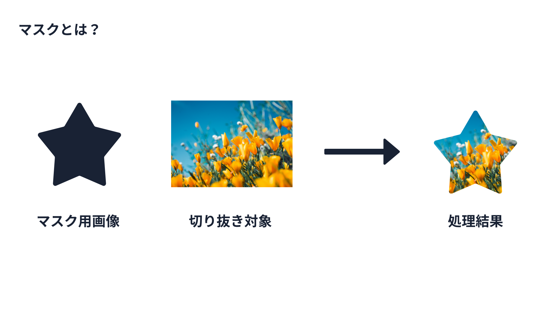
The masking effects introduced in this article are techniques for clipping out part of an image. Some readers may be more familiar with the term “masking.” A masking effect requires a mask image and an object to be masked.
Masking in the browser offers the following advantages:
- You can specify the crop position and size in the browser, so the source image itself does not need to be edited. This makes adjustments and revisions easier.
- Masking can combine not only images with other images, but also screen elements such as text.
- Rendering can be linked to interactions such as scrolling and clicking.
The following sections introduce web technologies for implementing masks. Start with CSS masks, the most widely used option.
CSS masks
The main advantages of CSS masking are ease of use and small code size. CSS properties that can be used for masking effects include the following:
mask-imageclip-pathbackground-clip
mask-image
The mask-image property lets you set an image to use as a mask. The following example crops a photo using a star-shaped mask image.
Related properties include the following:
mask-repeat: repetition of the mask imagemask-position: position of the maskmask-size: size of the mask image
These properties work in much the same way as the related properties for background-image, which lowers the learning cost and makes them easy to use.
Code example:
.mask-img {
  mask-image: url("./images/star.svg");
  mask-repeat: no-repeat;
  mask-position: 0 0;
  mask-size: 50%;
}
The mask-image property is available in Chrome 120 and later, Edge 120 and later, Safari 15.4 and later, and Firefox 53 and later.
Reference: Can I use…
clip-path
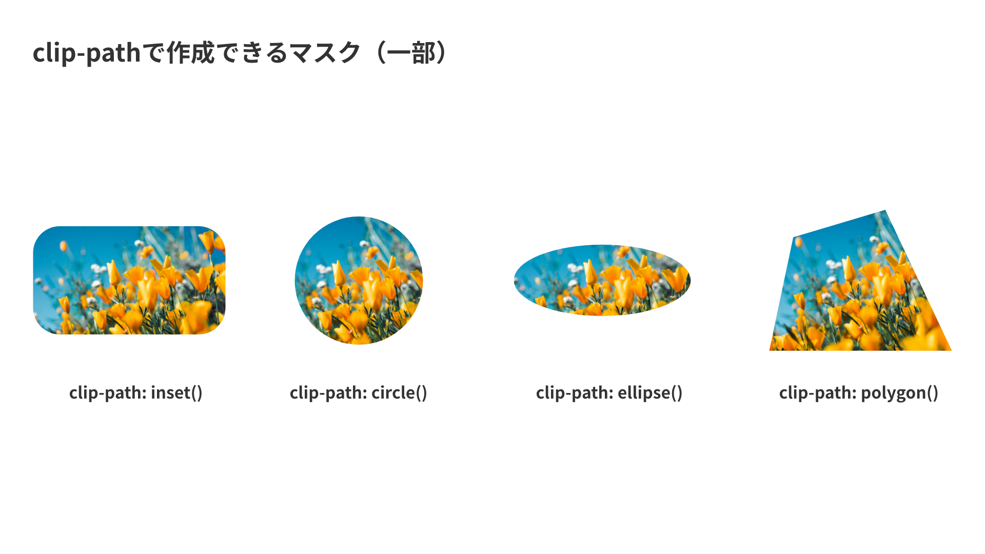
Next is the clip-path property. The clip-path property takes functions such as circle(), ellipse(), and polygon() as arguments. In other words, simple masks do not require a separate mask image. With polygon, you can easily trim an element into shapes that would otherwise be tedious to cut out, such as triangles, pentagons, and parallelograms.
A demo is also available so you can try it yourself.
Example: masking an element into a circle
.clip {
  width: 20px;
  height: 20px;
  background-color: skyblue;
  clip-path: circle(50px at center);
}
As with mask-image, the argument to clip-path can also specify an image URL. You can also clip to the shape of an inline SVG, or use a path to create curved shapes.
background-clip
The last CSS property covered here is background-clip. Clipping with the background-clip property is most often written as background-clip: text.
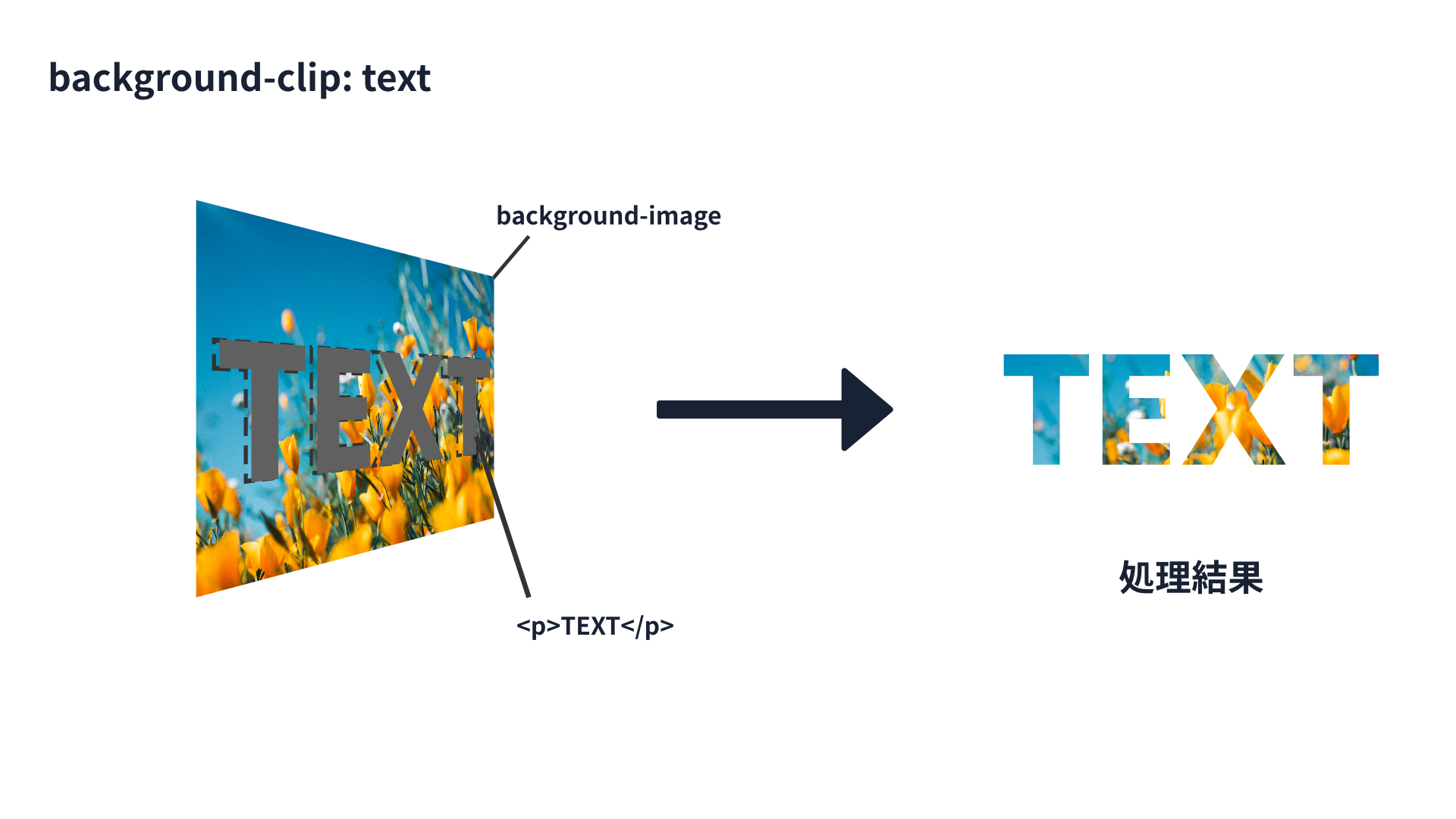
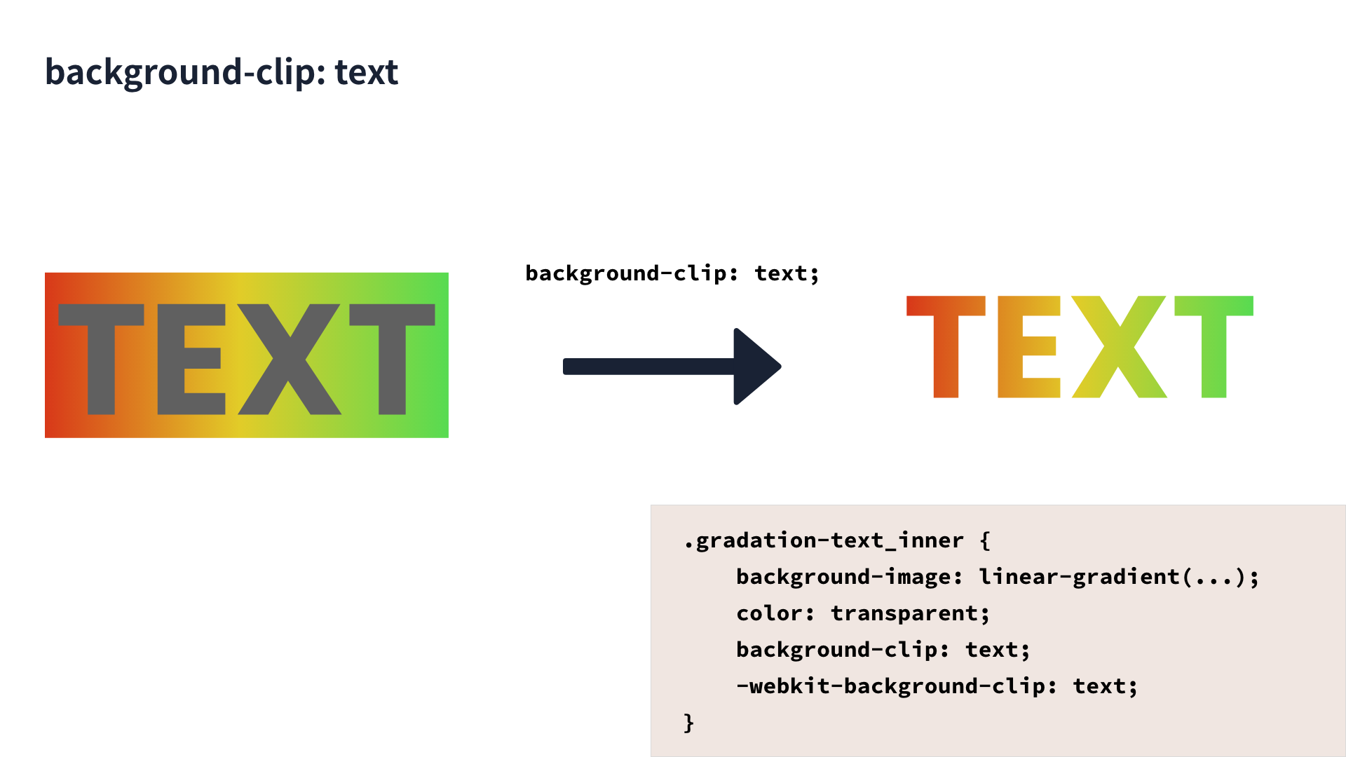
An element with background-clip: text is clipped by its text content. In the example below, the background image is clipped to the word “TEXT.” If the text has a visible text color, the mask will not appear. For that reason, color: transparent is specified.
<div>
  <p>TEXT</p>
</div>
div {
  background-image: url("./bg.png");
  background-clip: text;
  color: transparent;
}
background-clip: text is available in Chrome 120 and later, Edge 120 and later, Safari 15.5 and later, and Firefox 49 and later.
Reference: Can I use…
That concludes the introduction to CSS properties for masking effects.
SVG masks
SVG masking uses SVG elements as the mask. You can prepare a <mask> element inside an <svg> element, and shapes drawn inside that <mask> can be used as the mask image.
The following code shows an example that clips a black rectangle into a circle. The id attribute of the <mask> element is specified in the mask attribute of the <rect> element that draws the rectangle. This masks the rectangle with the <circle> element written inside the <mask> element.
<!-- Mask SVG -->
<svg>
  <defs>
    <!-- Mask shape -->
    <mask id="circle">
      <circle cx="100" cy="100" r="80" fill="#fff"></circle>
    </mask>
  </defs>
  <!-- Element to be clipped -->
  <rect x="0" y="0" width="100%" height="100%" mask="url(#circle)" fill="#000"/>
</svg>
As with the <mask> element, masking is also possible with the <clipPath> element. This also requires both the masking SVG and the SVG element to be masked.
<!-- Mask SVG -->
<svg>
  <defs>
    <!-- Mask shape -->
    <clipPath id="circle">
      <circle cx="100" cy="100" r="80" fill="#000"></circle>
    </clipPath>
  </defs>
  <!-- Element to be clipped -->
  <rect x="0" y="0" width="100%" height="100%" clip-path="url(#circle)"/>
</svg>
SVG masks can be implemented in these two ways. A demo is available so you can try them visually.
Difference between clip-path and mask
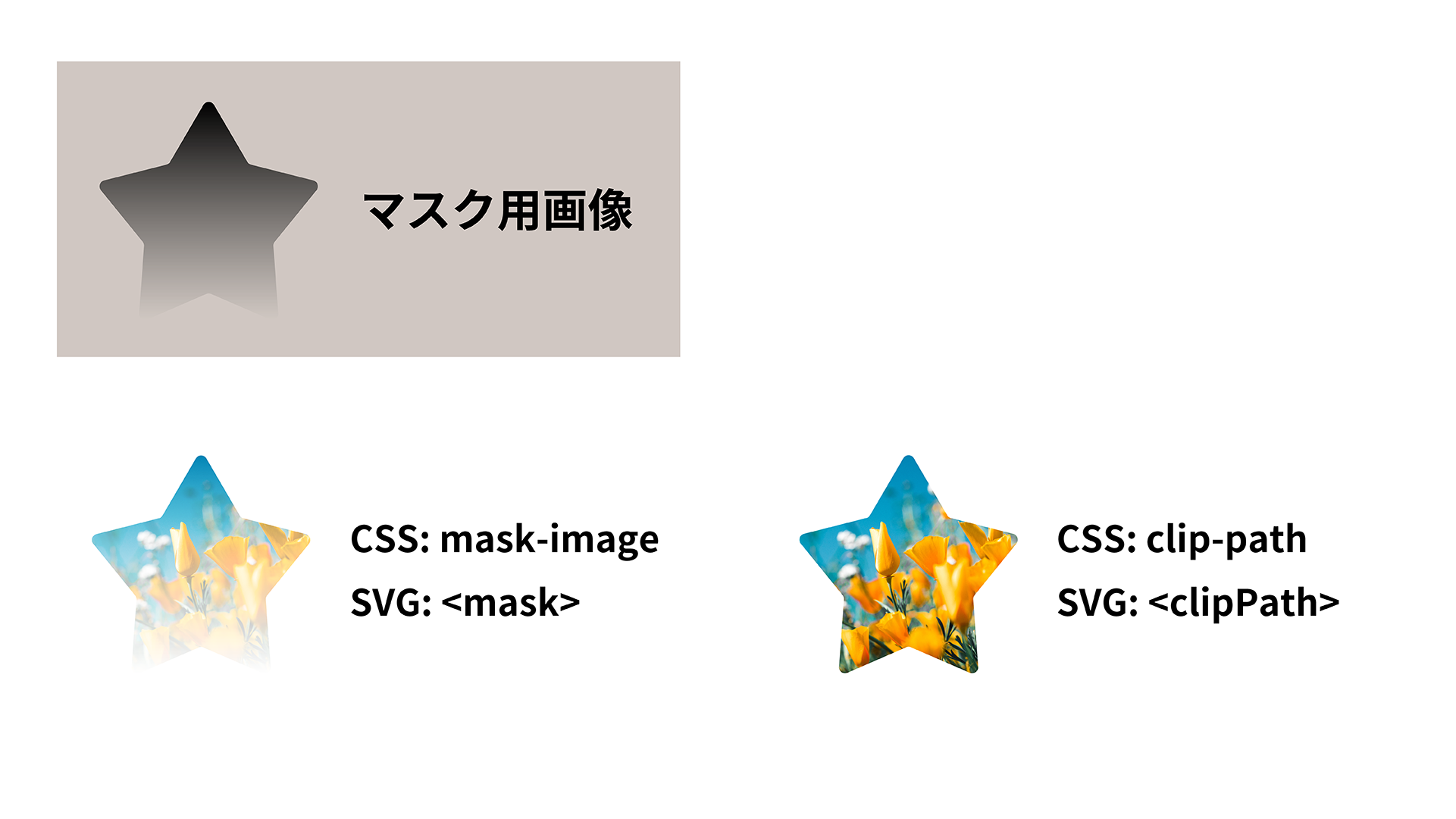
In both CSS and SVG, masks can use either mask or clip-path. This section explains the difference between them. Both are used to clip out part of an element. The key difference is whether transparency information can be applied. mask applies the transparency information of the mask image, while clip-path does not.
For example, applying each method to an image with transparency produces the following difference. The mask applies transparency, while the clip path does not.
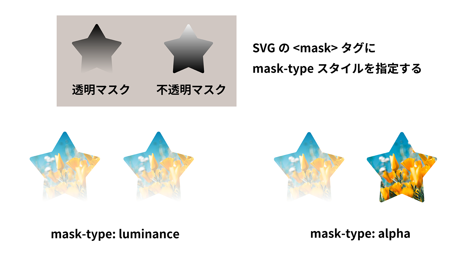
In SVG, the mask-type property can also be set as a CSS property on the <mask> element. You can choose between a luminance mask and an alpha mask. A luminance mask determines mask transparency from the brightness of the mask image. An alpha mask uses the mask image’s alpha information.
They are specified as mask-type: luminance and mask-type: alpha, respectively. The default is a luminance mask, so areas of the mask image closer to black become more transparent.
<!-- Mask SVG -->
<svg>
  <defs>
    <!-- Mask type: use luminance -->
    <mask id="circle" style="mask-type: luminance">
      <circle cx="100" cy="100" r="80" fill="#fff"></circle>
    </mask>
  </defs>
</svg>
The following CSS syntax also works.
mask {
  mask-type: luminance;
}
In CSS masks, the mask-mode property lets you choose between luminance masks and alpha masks. It is supported in Chrome 120 and later, Edge 120 and later, Safari 15.4 and later, and Firefox 53 and later.
Reference: Can I use…
To summarize:
mask: Supports effects that use transparency. There are luminance masks, which use the brightness of the mask image as transparency, and alpha masks, which use only transparency information.clip-path: Does not support expressions with transparency.
Use mask for effects that rely on transparency, and clip-path for effects with a clearly defined outline.
Masking with canvas
Masking with the Canvas API is a little different from CSS and SVG. It is handled from the perspective of how overlapping images should be processed.
CanvasRenderingContext2D.globalCompositeOperation specifies how overlapping images are processed. By default, source-over is used, which draws over the existing content. When destination-in is specified for globalCompositeOperation, the compositing mode changes. Only the overlapping area between content drawn so far and the newly drawn shape remains.
const canvas = document.getElementById("canvas");
const ctx = canvas.getContext("2d");
const img = new Image();
img.src = "https://picsum.photos/800/600";

await img.decode();

// Draw the background
ctx.globalCompositeOperation = "source-over";
ctx.drawImage(img, 0, 0, canvas.width, canvas.height);
// Specify the compositing mode
ctx.globalCompositeOperation = "destination-in";
// Draw a circle as the mask
ctx.beginPath();
ctx.arc(canvas.width / 2, canvas.height / 2, 100, 0, 2 * Math.PI, false);
ctx.fillStyle = "#000000";
ctx.fill();
The advantage of using the Canvas API for masking is less about using masking on its own. It is more useful when combined with interactive effects or other Canvas API features. The demo below creates a cutout that follows the mouse.
In addition to source-over, there are many other options for image compositing. For example, multiply multiplies the overlapping parts, and screen inverts the result after multiplication. Trying these options can lead to interesting effects beyond masking.
Practical masking effects
From here, this article looks at practical effects that make use of masks.
The code in the article has been simplified for explanation. See the repository if you want to review the actual code.
Gradient masks
So far, image files such as photos have been used as masking targets, but the target does not have to be an image file. In CSS, you can draw gradients by specifying linear-gradient or radial-gradient for background-image.
A common technique is to clip a gradient background with text or a shape. In the demo, the p element has background-clip: text set, and linear-gradient is specified for background-image. The parent element also has background-image: linear-gradient set to create the border.
<p class="gradient-text_inner">GRADATION SAMPLE</p>
.gradient-text {
  background-image: linear-gradient(to right, #d83819, #e2cc28, #57db51);
}

.gradient-text_inner {
  background-image: inherit;
  /* Mask with text */
  background-clip: text;
  color: transparent;
}
Gradient animation
This demo is another applied example that combines gradients and masking effects.
At first glance, it may not seem related to gradients or masks. Broken down, however, it uses a two-color rectangle split down the center as the background-image. Moving that background creates the color transition.
The text and background use separate gradients. For the text alone, a background created with background-image: linear-gradient is split 1:1 between white and black. It is then masked with background-clip: text. On hover, background-position is moved to make it look as though the text color changes from the right.
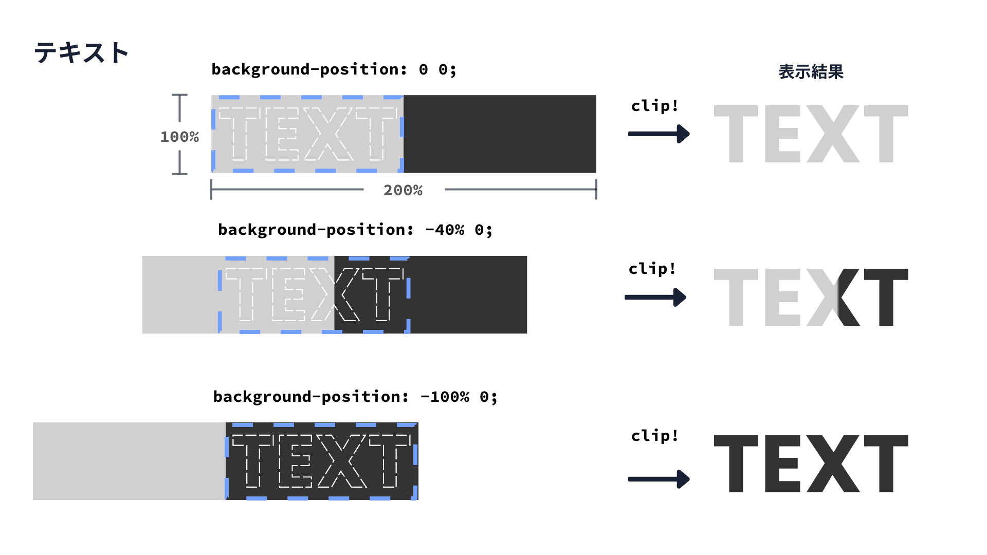
For the background color, create a gradient in the opposite direction from the text gradient, then move background-position. The key point is that the background itself is not masked.
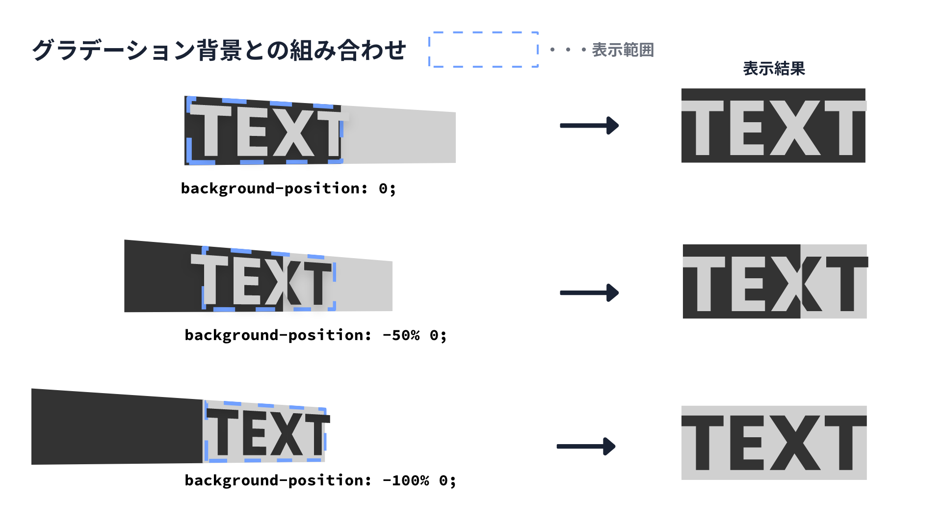
See the sample code for details.
Note that in CSS animation, the gradient colors themselves cannot be animated. For example, you cannot animate numeric changes from linear-gradient(white 10%, black 50%) to linear-gradient(white 80%, black 100%).
radial-gradient and masks
This animation in the demo layers two images and converts the rear image to black and white. It masks the front image with radial-gradient, then expands the mask on hover. The explanation is omitted here, but see the code if you are interested.
Sprite images and masks
How can the following hand-drawn masking effect be implemented?
Video files such as MP4 cannot be used as mask elements, so one option is to use a GIF image or a sprite image as the mask-image.
A sprite image is a single image that combines animation frames split frame by frame, as shown below.
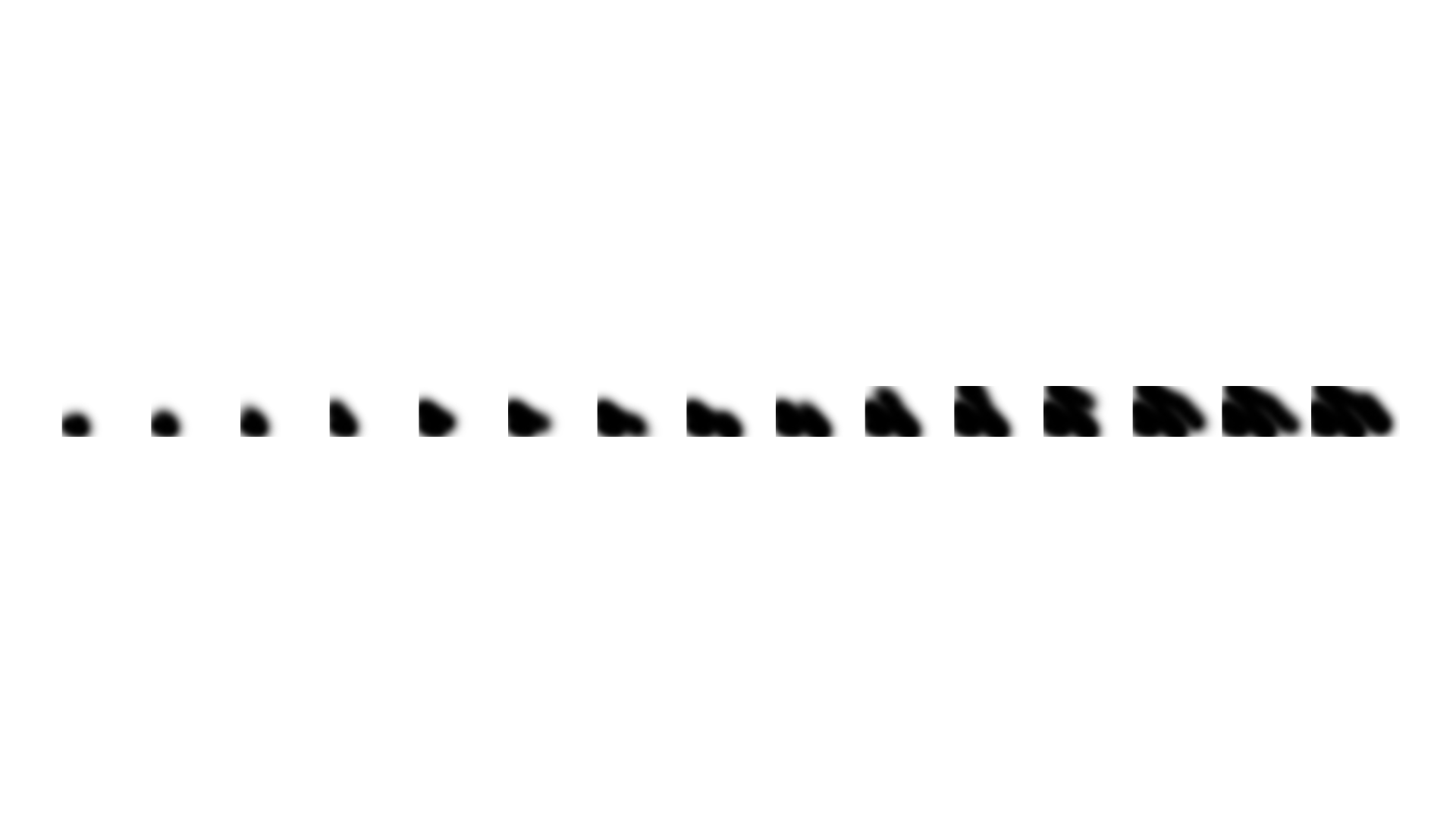
If you create a frame with the size of one sprite frame and move the background using steps(), you can create a frame-by-frame animation. The result is similar to a flip book.
Original sprite animation:

By setting a sprite image as the mask image and running a step animation, only the opaque areas are masked. This produces the animation shown in the demo.
Here is the code sample.
<div class="sprite-animation">
  <img
    class="sprite-animation_image"
    src="https://picsum.photos/960/540"
    alt="Sprite animation sample image"
    width="480"
    height="270"
  />
</div>
/* Sprite image animation */
.sprite-animation_image {
  display: inline-block;
  width: 480px;
  height: 270px;
  mask-image: url("./images/css_sprites.png");
  mask-repeat: no-repeat;
  mask-position: 0 0;
  mask-size: cover;
  animation: sprite-animation 2.5s steps(29) infinite;
}

@keyframes sprite-animation {
  0% {
    mask-position: 0 0;
  }
  100% {
    /* Total sprite image width - one frame width */
    mask-position: calc(-14400px + 480px) 0;
  }
}
Masks independent of the background
The masking effects covered so far have had a fixed masking target. In other words, they cannot create effects that span multiple elements.
This section introduces an implementation of a window-like masking effect, as shown in the following demo.
SVG is useful for complex masks like this. Create a rectangular surface with a <rect> element, then create clipping shapes with a <mask> element. The code looks like this.
<svg
  xmlns="http://www.w3.org/2000/svg"
  width="1920"
  height="1080"
  class="parallax-cover_clip"
>
  <defs>
    <!-- Mask shapes -->
    <mask id="cross">
      <rect width="100%" height="200%" fill="#ffffff"></rect>
      <rect x="0" y="5%" width="50%" height="20%" fill="#000000"></rect>
      <rect x="5%" y="45%" width="10%" height="10%" fill="#000000"></rect>
      <circle cx="80%" cy="45%" r="10%" fill="#000000"></circle>
      <circle cx="60%" cy="40%" r="5%" fill="#000000"></circle>
      <rect x="10%" y="65%" width="60%" height="20%" fill="#000000"></rect>
    </mask>
  </defs>
  <!-- Target to be clipped -->
  <rect width="100%" height="200%" mask="url(#cross)" fill="#ffffff"></rect>
</svg>
The shapes inside the <mask> element correspond to the mask SVG in the figure below. It is made of black rectangles and circles placed on a white background. A white <rect> element is prepared as the clipping target.
When the mask SVG is assigned to the mask attribute of the clipping target, mask-type defaults to a luminance mask. As a result, the rectangle is clipped only in the black areas.
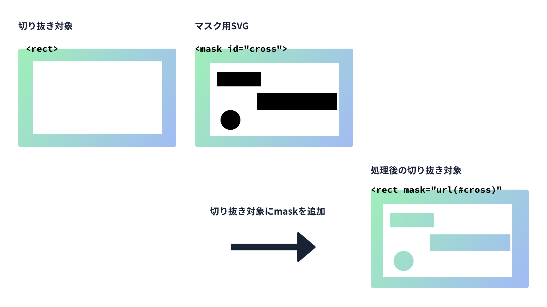
If you fix the entire element with position: fixed or position: sticky, only the background visible through the window scrolls. This enables an effect similar to parallax.
Conclusion
This article introduced various masking effects and how to implement them. Even though masking sounds like a single technique, it can produce many different effects.
The right tool depends on the goal. Use CSS for quickly adding a mask to a UI, SVG for complex shapes and window-like cutouts, and Canvas for mouse-driven rendering. It is also important to understand when to use mask, which makes use of transparency. Use clip-path when you need to clip a clear outline.
When you see an interesting masking effect on a website, try incorporating it into your own projects.