CSS’s conic-gradient() gradient function draws gradients around a center point, as the word “conic” suggests. With conic-gradient(), you can easily implement not only conic gradients but also effects such as speed lines and checkerboard patterns.
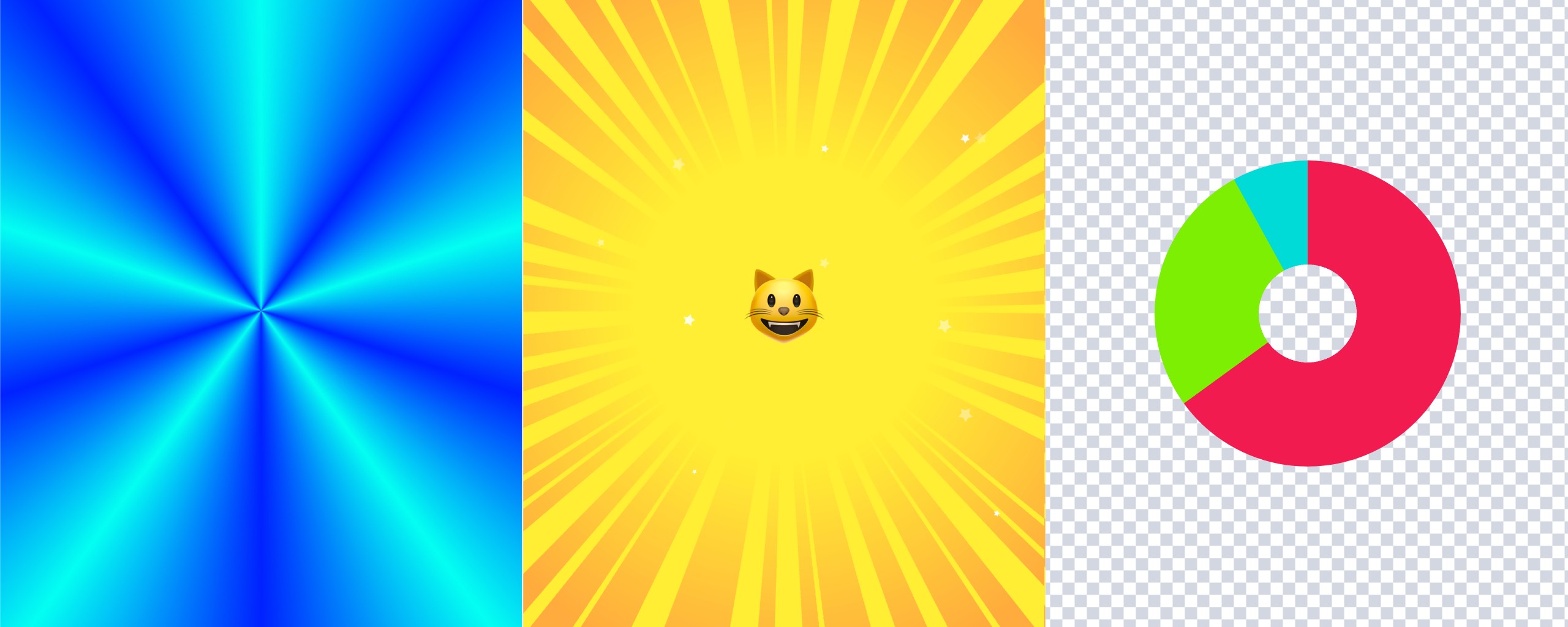
Examples of gradients implemented with conic-gradient()
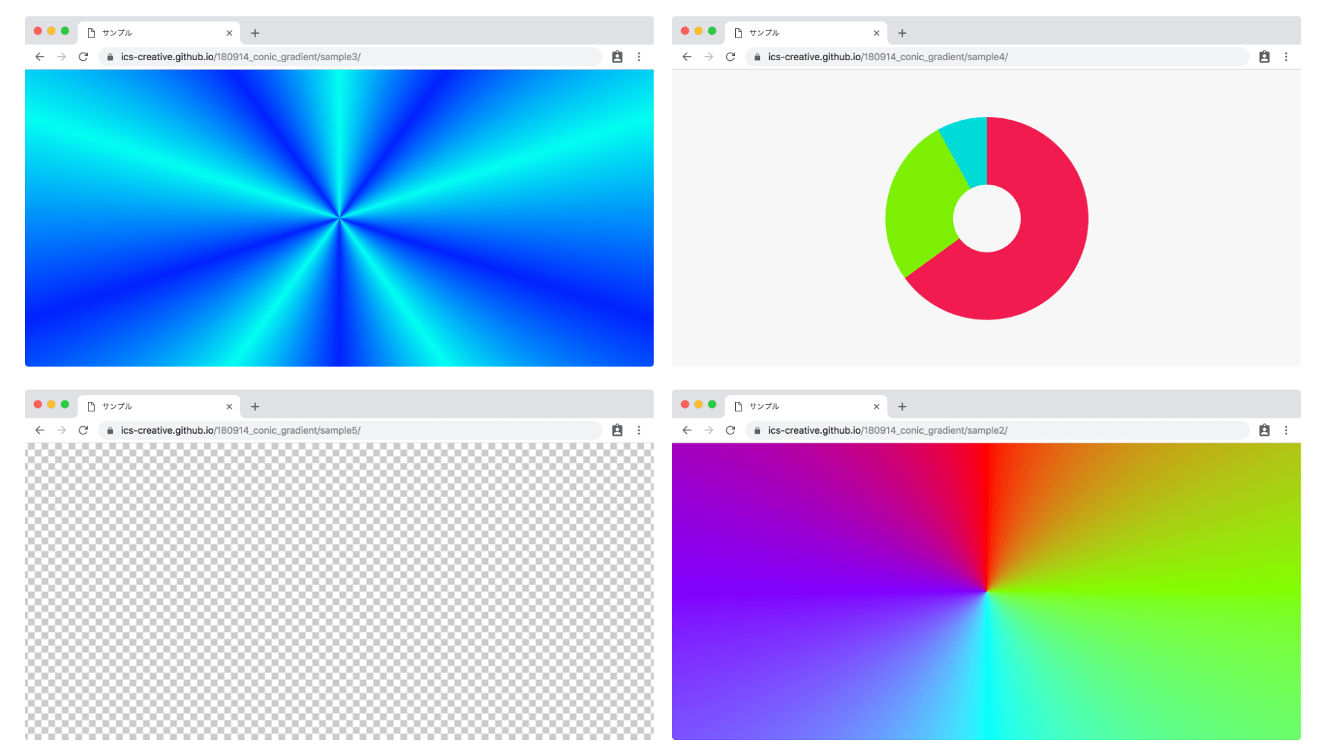
Example effect implemented with conic-gradient()
This article explains the basic usage of conic-gradient(), then introduces more advanced expressions, browser support, and implementation notes.
Basics of conic-gradient()
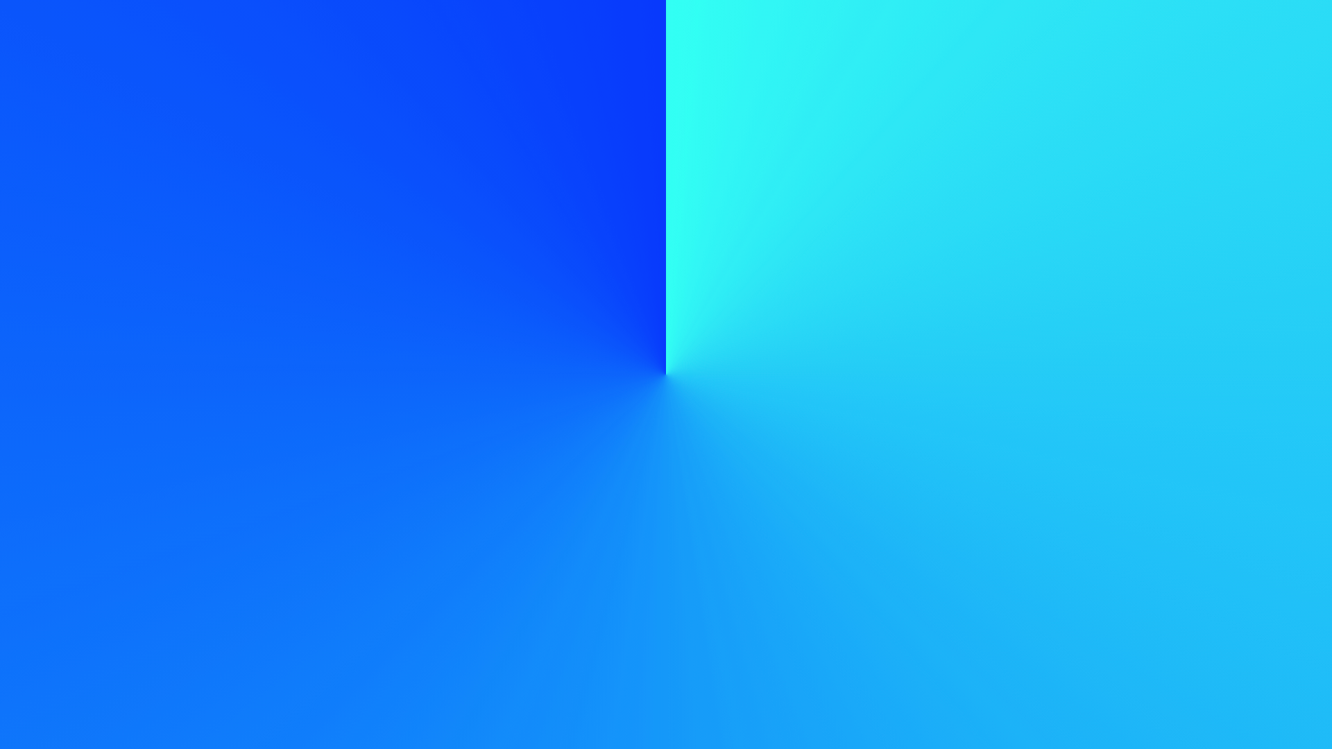
Comparing it with linear-gradient() and radial-gradient()
CSS provides three types of gradient functions:
linear-gradient(): linear gradientsradial-gradient(): radial gradientsconic-gradient(): conic gradients
The conic-gradient() function covered in this article creates conic gradients. Let’s compare the differences between the three CSS gradient functions through code.
linear-gradient()
.box {
  background-image: linear-gradient(
    to right,
    hsl(177 100% 50%),
    hsl(232 100% 50%)
  );
}
radial-gradient()
.box {
  background-image: radial-gradient(
    hsl(177 100% 50%),
    hsl(232 100% 50%)
  );
}
conic-gradient()
.box {
  background-image: conic-gradient(
    hsl(177 100% 50%),
    hsl(232 100% 50%)
  );
}
Basic syntax for conic-gradient()
Here is the basic syntax for the conic-gradient() function. In the previous code, only the start and end colors were specified.
.box {
  background-image: conic-gradient(
    hsl(177 100% 50%),
    hsl(232 100% 50%)
  );
}
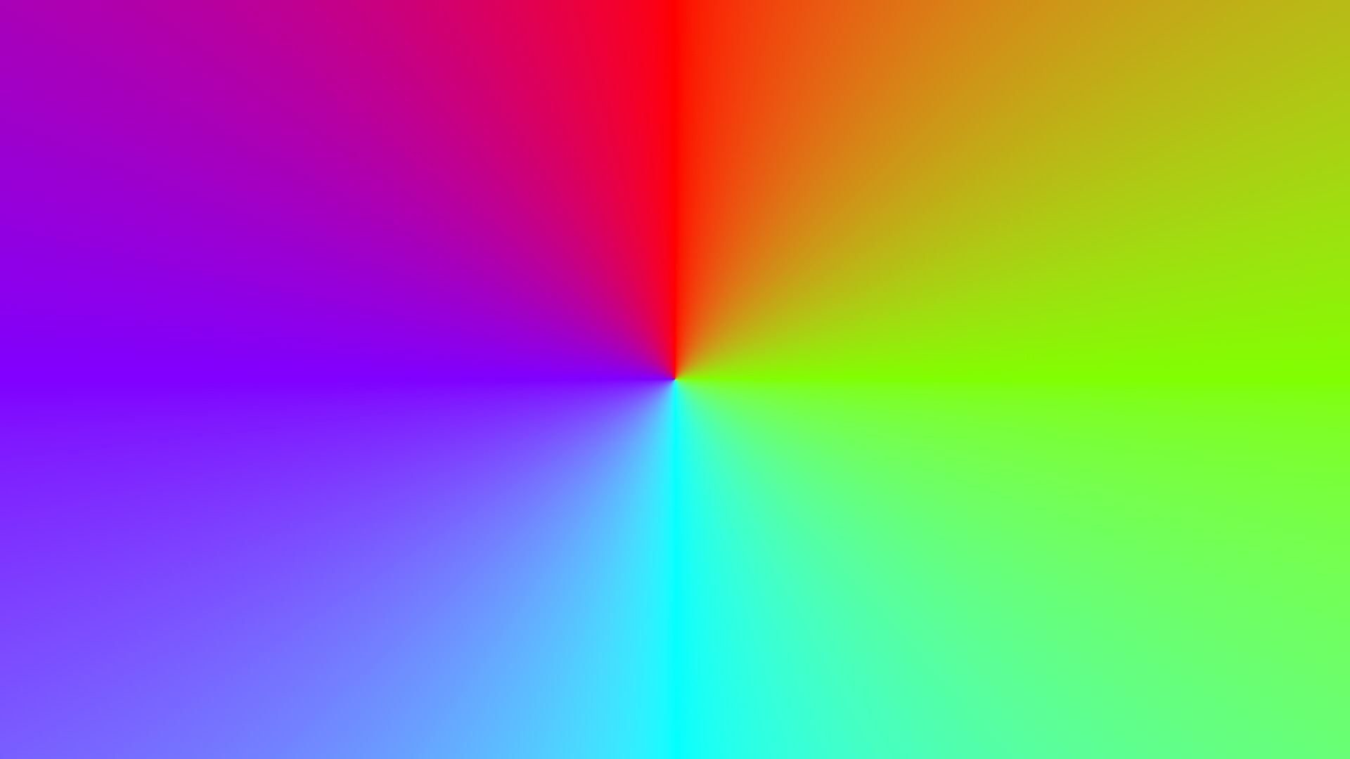
As with other gradients, you can specify multiple color stops. You can also specify the position of each color stop using units such as deg (angle), % (percentage), and turn (number of turns).
.box {
  background-image: conic-gradient(
    hsl(0 100% 50%) 0,
    hsl(90 100% 50%) 90deg,
    hsl(180 100% 50%) 180deg,
    hsl(270 100% 50%) 270deg,
    hsl(360 100% 50%) 360deg
  );
}
Result
At the beginning of the conic-gradient() argument list, you can specify the gradient’s starting angle or center position.
.box {
  /* Use 100px, 100px as the center of the conic gradient */
  background-image: conic-gradient(
    at 100px 100px,
    blue,
    red
  );

  /* Start the gradient at 30deg */
  background-image: conic-gradient(from 30deg, blue, red);
}
Current CSS gradients also let you specify an interpolation method. For example, in hsl longer hue interpolates colors in the HSL color space by rotating through the longer hue arc.
.box {
  background-image: conic-gradient(
    in hsl longer hue,
    red,
    blue,
    green,
    red
  );
}
Interpolation methods can be specified with linear-gradient(), radial-gradient(), conic-gradient(), and repeating-conic-gradient().
For details, see this article about CSS gradient interpolation.
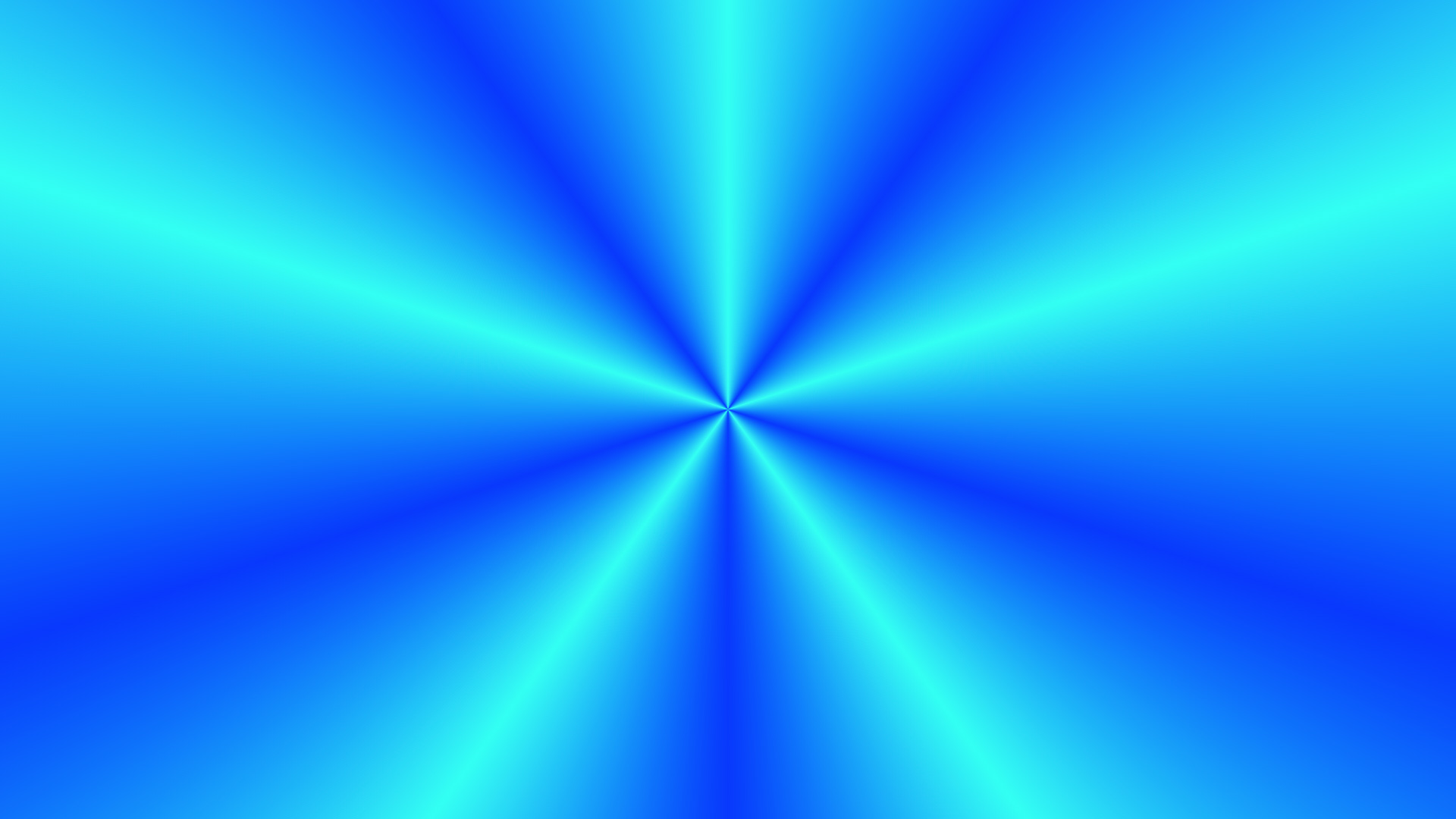
Repeating gradients with repeating-conic-gradient()
Linear gradients have repeating-linear-gradient(), and radial gradients have repeating-radial-gradient(). In the same way, conic gradients have repeating-conic-gradient() for repeated patterns.
The following example shows how to use it by repeating a light blue, blue, and light blue conic gradient.
.box {
  background-image: repeating-conic-gradient(
    hsl(177 100% 50%) 0,
    hsl(232 100% 50%) 10%,
    hsl(177 100% 50%) 20%
  );
}
Result
The next sections introduce what you can create with conic-gradient().
Pie chart expression
The following sample is useful when you want to display a pie chart on a web page.
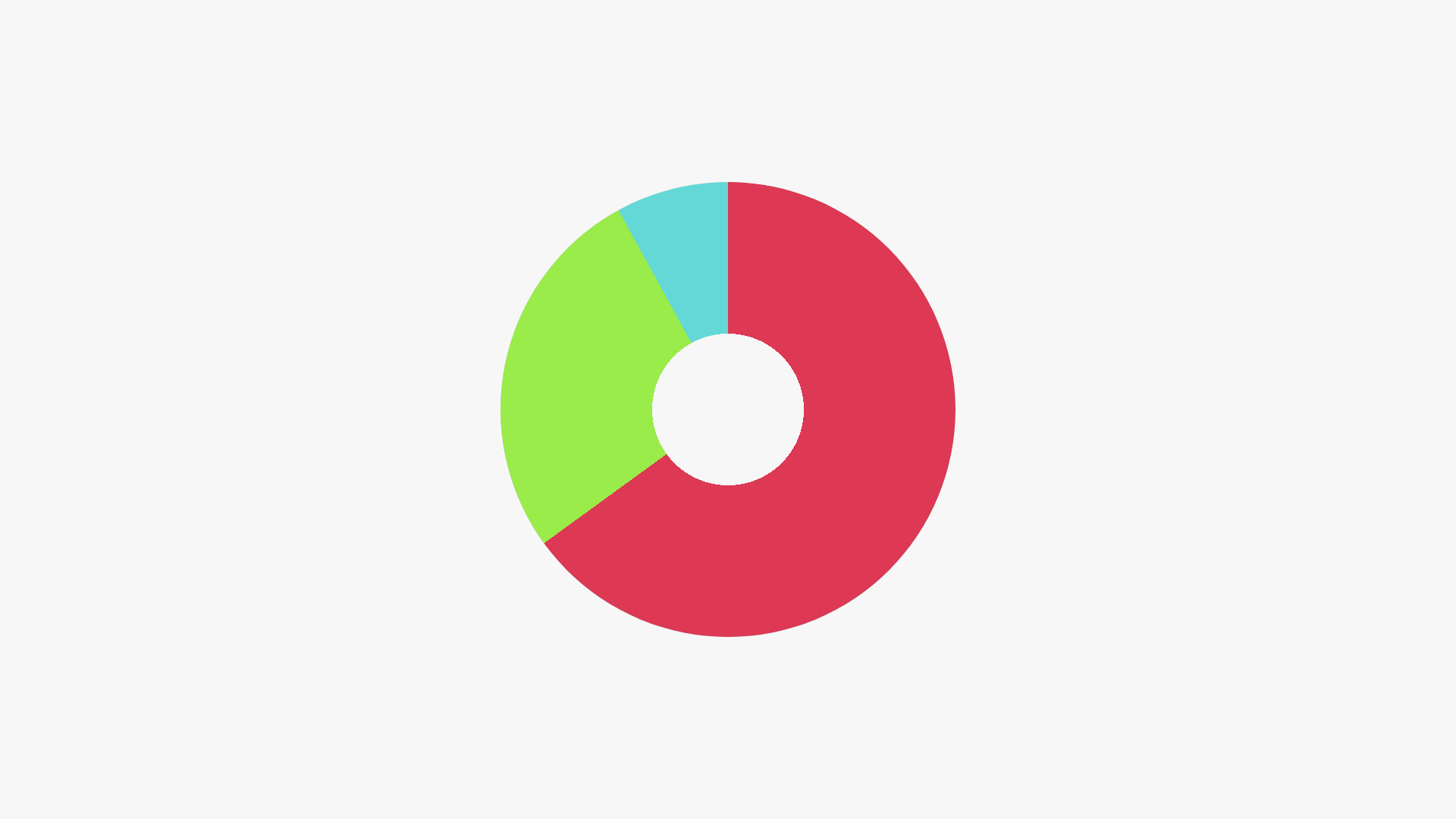
The key is how the color stops are written. The 0% to 65% range is red (#f11a50), and 65% to 92% is green (#7cef00).
The remaining range is light blue (#00dbd9), making the result look like a pie chart.
.graph {
  background-image: conic-gradient(
    #f11a50 0,
    #f11a50 65%,
    #7cef00 65%,
    #7cef00 92%,
    #00dbd9 92%,
    #00dbd9 100%
  );
}
You can write the same expression more concisely by using multi-position color stops. Combining this with CSS variables also makes it easier to see where the percentages are changed.
.graph {
  --red-end: 65%;
  --green-end: 92%;

  background-image: conic-gradient(
    #f11a50 0 var(--red-end),
    #7cef00 var(--red-end) var(--green-end),
    #00dbd9 var(--green-end) 100%
  );
}
Keep in mind that a pie chart created with conic-gradient() is a CSS background image.
Note: The center is cut out with the mask-image property. See the Column later in this article.
Advanced: animating a progress ring
The pie chart technique can also be adapted into an animated progress ring by combining it with CSS @property. @property is an at-rule that lets you define the type, initial value, and inheritance behavior of a CSS custom property. For details, see the article “意外? @propertyがCSSアニメーションを激変させる理由”.
@property --progress {
  syntax: "<percentage>";
  inherits: false;
  initial-value: 0%;
}

.progress-ring {
  --progress: 65%;

  background-image: conic-gradient(
    #f11a50 0 var(--progress),
    #eeeeee var(--progress) 100%
  );
  animation: fill 1.5s linear forwards;
}

@keyframes fill {
  from {
    --progress: 0%;
  }

  to {
    --progress: 65%;
  }
}
Checkerboard pattern
The following sample creates a checkerboard pattern by alternating squares in two colors.

Setting the color stop positions in repeating-conic-gradient() to 0%, 25%, and 50% creates a checkerboard pattern. Use background-size to set the tile size you want.
body {
  background-image: repeating-conic-gradient(
    white 0,
    white 25%,
    #cbcbcb 25%,
    #cbcbcb 50%
  );

  background-size: 20px 20px;
  background-position: center center;
}
Speed-line effect
The following sample creates speed lines like those used in game effects or manga panels.
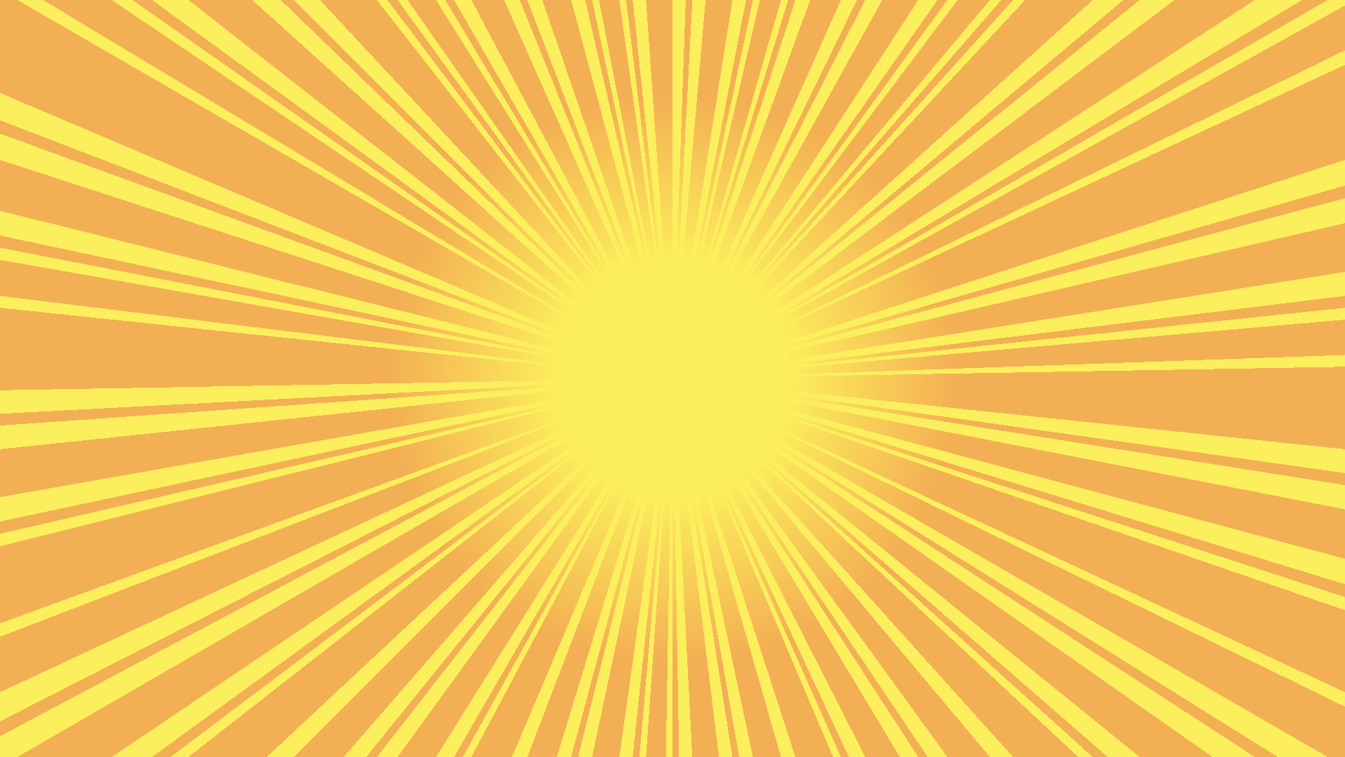
Several repeating-conic-gradient() layers are stacked to give the line widths a random feel. The line color uses a CSS variable so it can be changed easily.
:root {
  --background-color: #ffee33;
  --circle-width: 100vw;

  @media (orientation: portrait) {
    --circle-width: 100vh;
  }
}

body {
  background-color: var(--background-color);
  overflow: hidden;
}

.line-container {
  position: absolute;

  --border-color: #ffab3c;
  --half-circle-width: calc(var(--circle-width) / 2);

  width: var(--circle-width);
  height: var(--circle-width);
  left: calc(50% - var(--half-circle-width));
  top: calc(50% - var(--half-circle-width));

  /* Stack lines with varying widths */
  background-image: repeating-conic-gradient(
      transparent 0,
      transparent 13deg,
      var(--border-color) 13deg,
      var(--border-color) 16deg
    ),
    repeating-conic-gradient(
      transparent 0,
      transparent 20deg,
      var(--border-color) 20deg,
      var(--border-color) 23deg
    ),
    repeating-conic-gradient(
      transparent 0,
      transparent 5deg,
      var(--border-color) 5deg,
      var(--border-color) 8deg
    ),
    repeating-conic-gradient(
      transparent 0,
      transparent 2deg,
      var(--border-color) 2deg,
      var(--border-color) 3deg
    );
}
To make the speed lines expand from a circle rather than an ellipse, the sample uses the following adjustments:
- When the viewport is landscape, the effect width is
100vw - When the viewport is portrait, the effect width is
100vh - The effect’s center point is aligned with the viewport’s center
:root {
  --background-color: #ffee33;
  --circle-width: 100vw;
}

.line-container {
  position: absolute;

  --half-circle-width: calc(var(--circle-width) / 2);

  width: var(--circle-width);
  height: var(--circle-width);
  left: calc(50% - var(--half-circle-width));
  top: calc(50% - var(--half-circle-width));
}
With CSS nesting, the variable override for portrait viewports can be grouped inside :root.
:root {
  --circle-width: 100vw;

  @media (orientation: portrait) {
    --circle-width: 100vh;
  }
}
Column: the center cutout uses mask-image
The pie chart and speed-line examples cut out the center. This is done with the mask-image property. mask-image applies a mask using the shape of the specified image. In these examples, radial-gradient is written as follows.
.box {
  /* Cut out the center */
  mask-image: radial-gradient(
    transparent 0%,
    transparent 12%,
    white 30%,
    white
  );
}
mask-related properties have become easier to use as standard properties in browsers since 2023.
By combining multiple mask images with mask-composite, you can also create more complex mask effects.
For details, see this article about mask-composite.
Browser support
The conic-gradient() function is available in Chrome 69 (September 2018) and Edge 79 (January 2020) or later.
It is also available in Safari 12.1 (March 2019) and Firefox 83 (November 2020) or later.
Reference: Can I use…
Speed-line effect with animation and randomly placed stars
The effect shown at the beginning of this article is based on the speed-line expression, with a rotation animation and randomly placed stars added.
In the current demo, the speed-line element is a 200vmax square fixed in the center.
It rotates with the line-spin animation.
The stars are placed as .star elements under .stars.
sibling-index(), sin(), cos(), and CSS variables control their shape, size, position, rotation, and timing.
Examples using conic-gradient()
Here are some unique examples posted on CodePen that use conic-gradient(). They may provide ideas for conic gradient expressions.
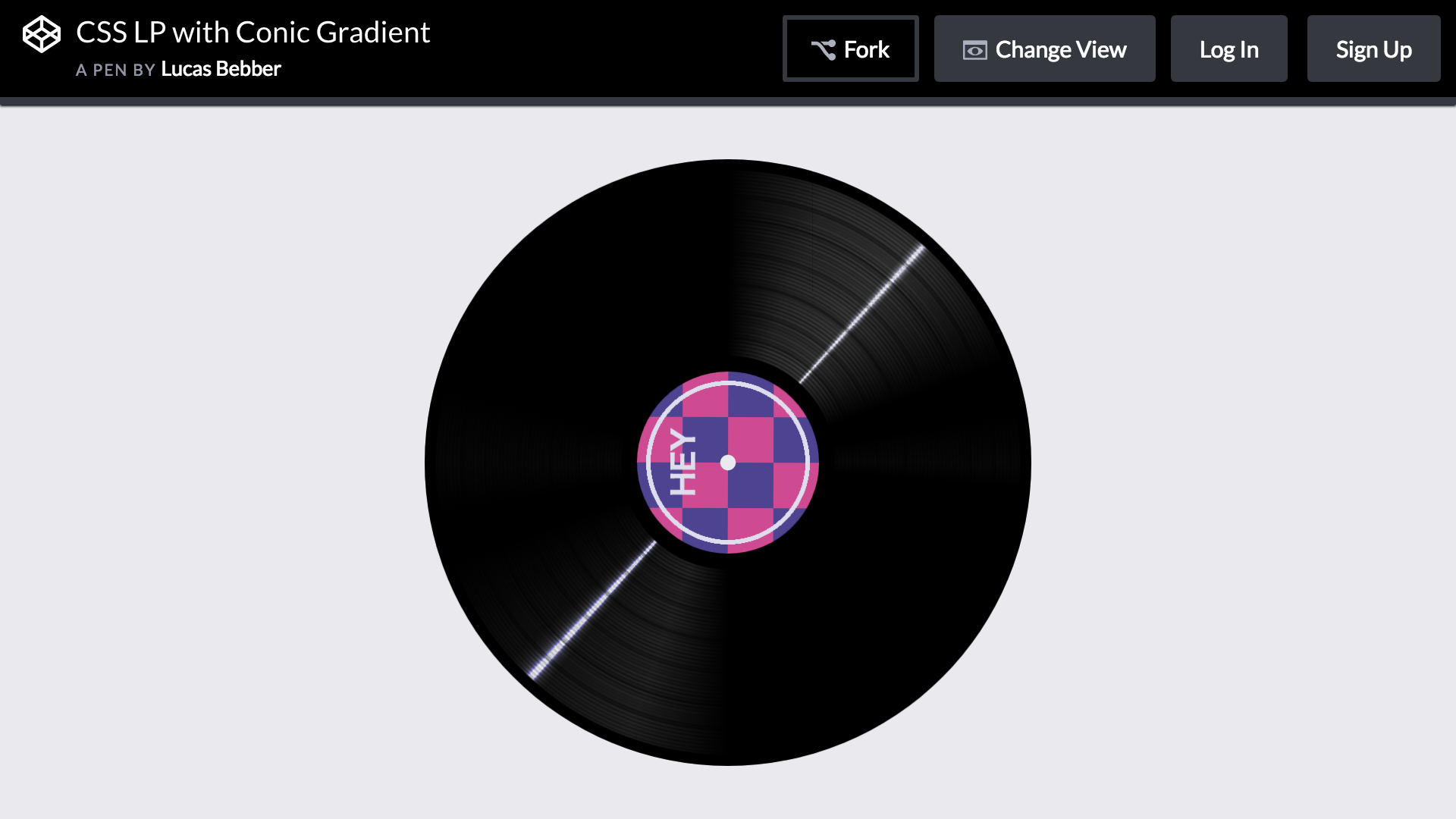
The following example recreates a record player. It combines conic-gradient() and radial-gradient() to represent the grooves of a record.
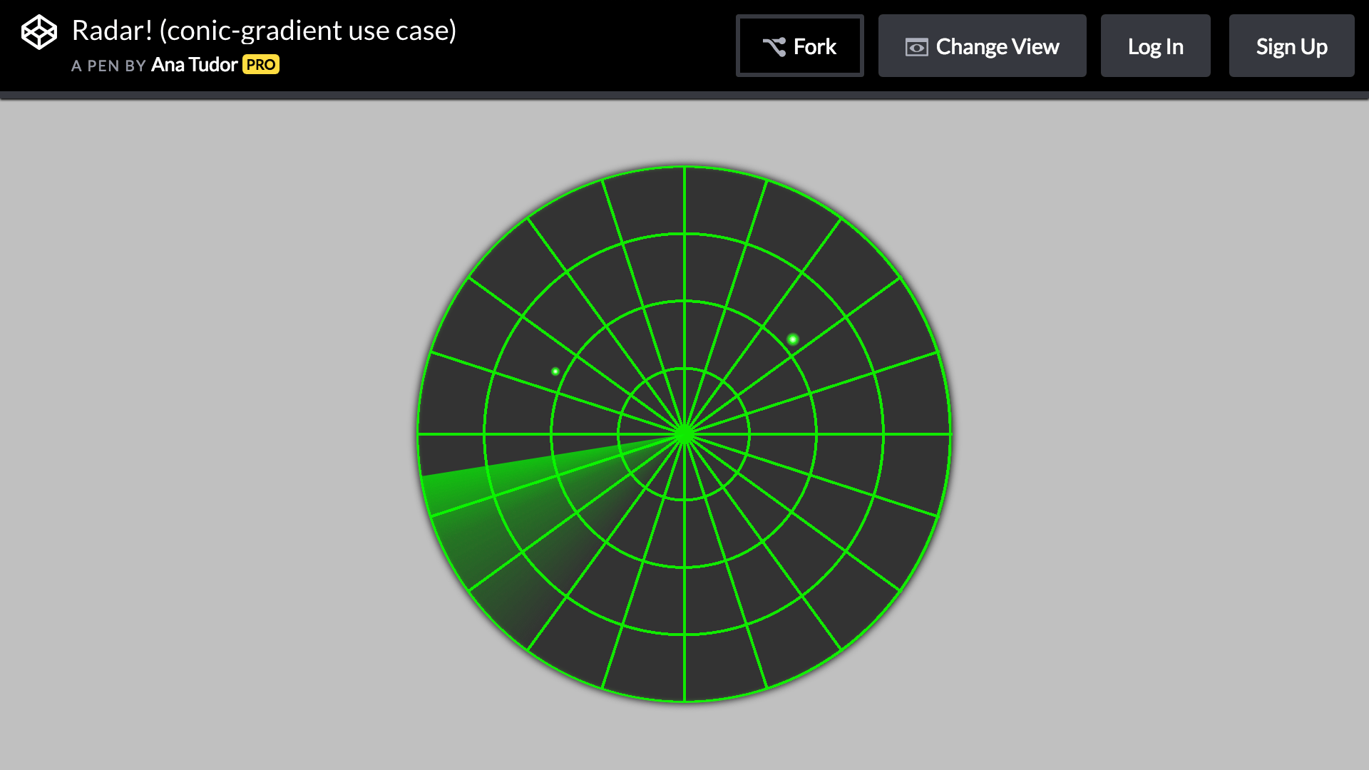
The following example recreates a radar display. conic-gradient() is used for the rotating light, flashing light, and tick marks.
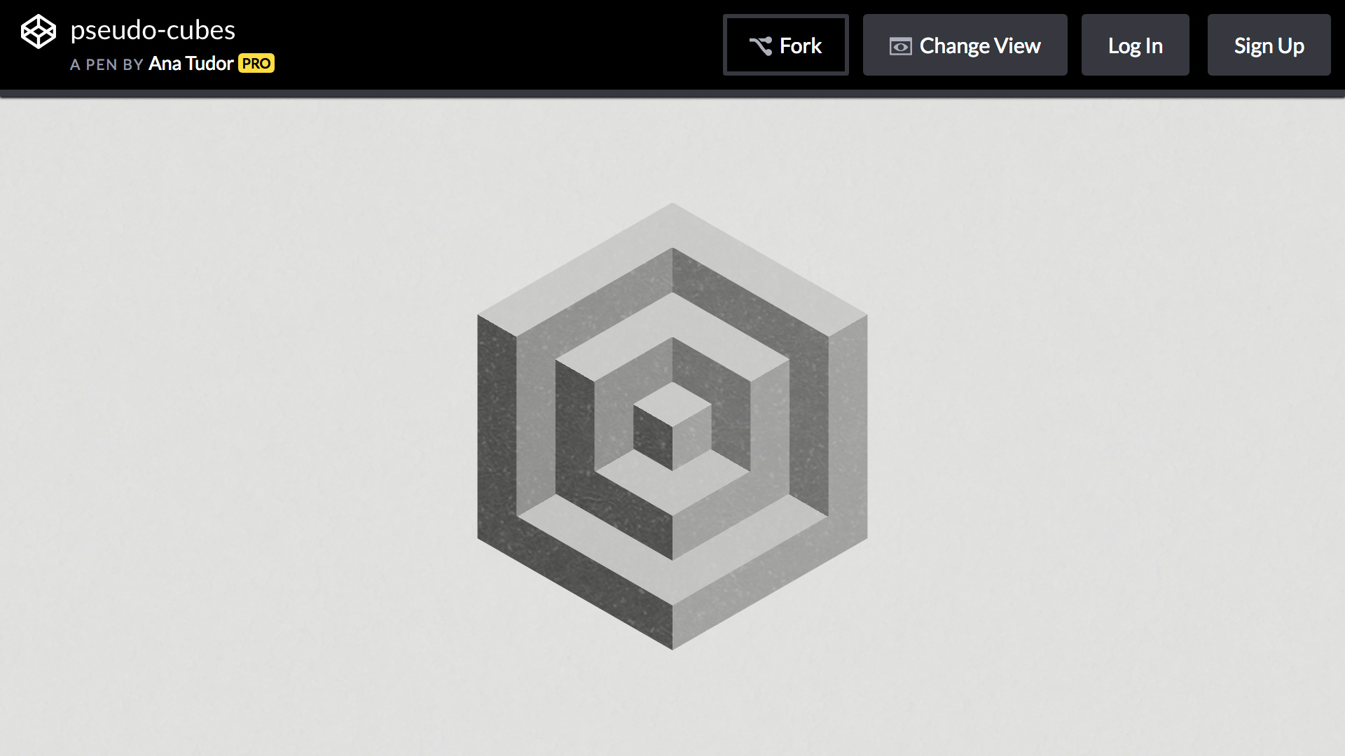
The following example creates a pseudo-cube. It combines the color stop technique used for the pie chart and checkerboard pattern with clip-path.
Use conic and wedge-shaped gradients with CSS alone
CSS supports conic gradients through conic-gradient(), alongside linear and radial gradients.
The author often creates game content, so being able to create speed-line effects using only CSS is especially appealing. Combining interpolation methods and CSS masks makes the technique useful for an even wider range of visual expressions.