mix-blend-mode is a CSS property** that controls how overlapping DOM elements are displayed. From a designer’s perspective, blend modes are a familiar feature. mix-blend-mode is a noteworthy CSS property because it expands the expressive possibilities of the web and gives designers more freedom. This article introduces the appeal and usage of mix-blend-mode with demos.
What is a blend mode?
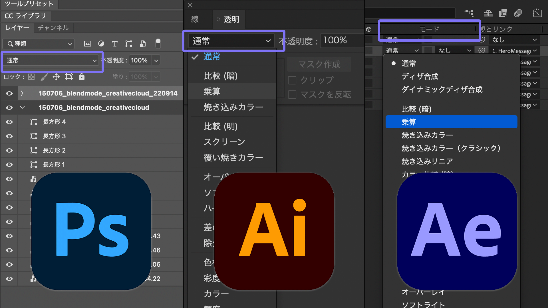
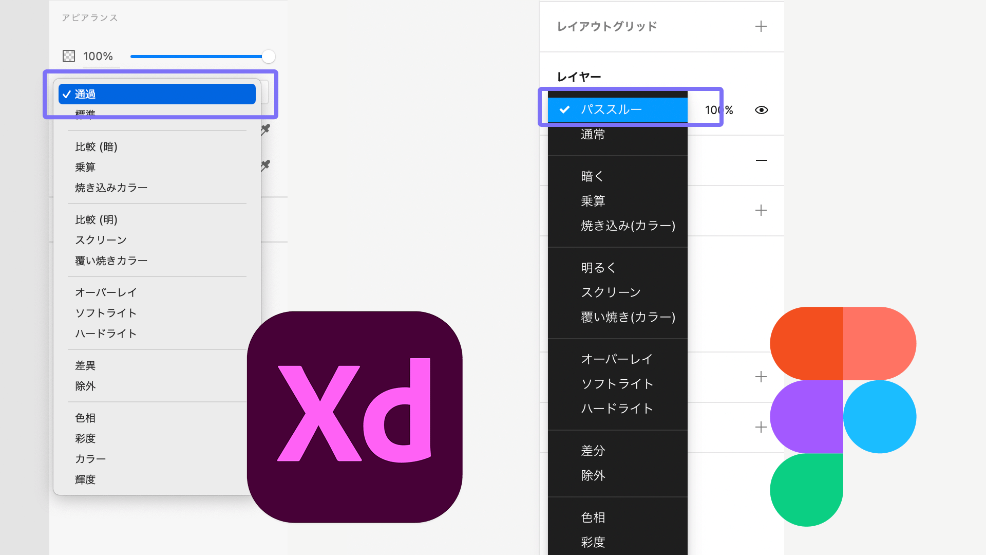
Blend modes are one of the basic features used to create visual expression. They are available in design tools such as Adobe Photoshop, Illustrator, After Effects, and Figma. Names, available options, and compositing behavior within groups differ depending on the tool, but the underlying idea is the same: controlling how layers look when they overlap. In this article, the term blend mode is used to match the CSS terminology.
Try CSS blend modes
Here is a demo for trying CSS blend modes. You can change the value of mix-blend-mode from the dropdown menu on the left, so compare how the display changes. Turn on the checkbox in the upper right to see the relationship between the image and the layer placed over it.
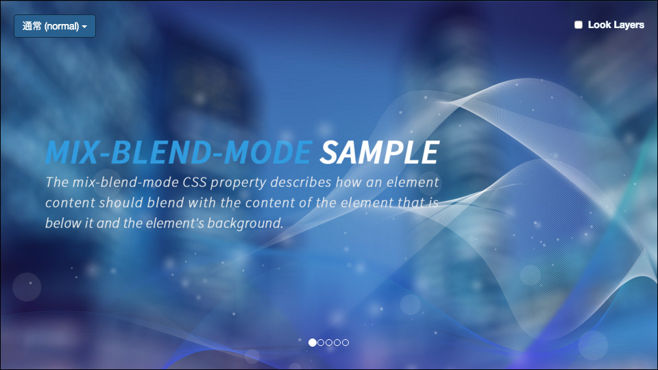
This demo was created with Vue 3 and is published as open source. It was originally created in 2015 with AngularJS and TypeScript, then rebuilt with Vue 3 in 2022.
How to use mix-blend-mode
The following example explains how to use it with simple HTML and CSS.
Because this property specifies how two elements look when they overlap, first prepare two or more DOM elements and place them on top of one another with absolute positioning. Apply mix-blend-mode to the element that sits higher in the stacking order, as with z-index. In code, the CSS looks like this:
.text {
  position: absolute;
  mix-blend-mode: overlay; /* Specify overlay */
  color: white;
  font-size: 150px;
  font-weight: bold;
  top: 200px;
  left: 30px;
}
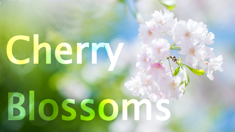
<div class="box">
  <img src="imgs/photo.jpg" width="960" height="640" alt="" />
</div>

<div class="text">Cherry<br />Blossoms</div>
Trying this code produces the following result. The text blends with the photo and appears as beautiful typography.
Blend mode cheat sheet
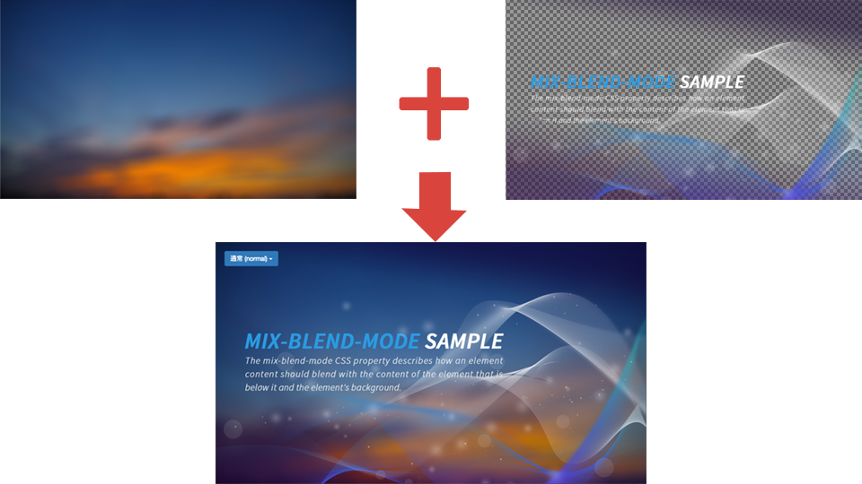
There are many effects that can be specified as blend modes, so this section introduces each one. Use it as a cheat sheet for CSS blend modes. The following two images are layered: a photo is placed on the lower layer, and an ambient graphic is placed on the upper layer. CSS blend modes are applied only to the upper layer.
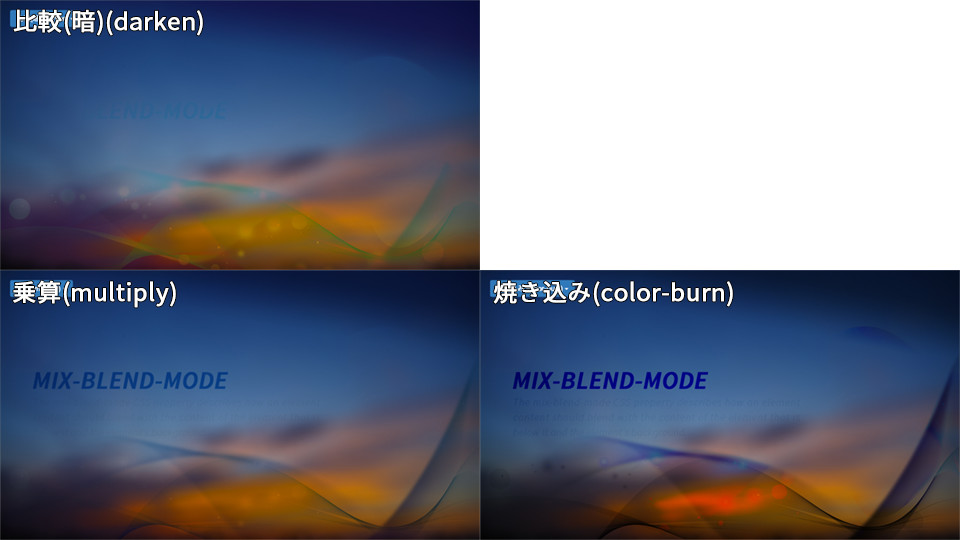
CSS blend modes for darker effects
| Effect | Property value | Description |
|---|---|---|
| Darken | darken |
Compares the upper and lower images and displays the darker pixel. |
| Multiply | multiply |
A blend mode used to create darker visual effects. |
| Color burn | color-burn |
A blend mode that produces a darker result than multiply. |
CSS blend modes for lighter effects
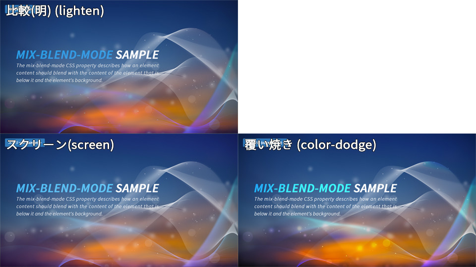
| Effect | Property value | Description |
|---|---|---|
| Lighten | lighten |
Compares the upper and lower images and displays the lighter pixel. |
| Screen | screen |
Used to create brighter visual effects. This is very practical. |
| Color dodge | color-dodge |
Produces a brighter result than screen. It creates a strong impact, so it is also commonly used when creating effects. |
CSS blend modes for both light and dark effects
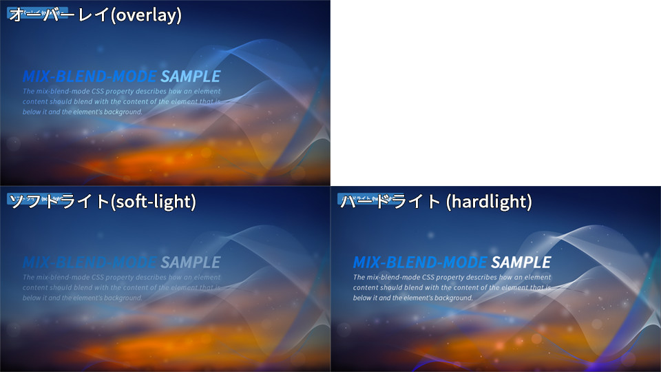
| Effect | Property value | Description |
|---|---|---|
| Overlay | overlay |
Produces an effect close to both multiply and screen. Because it increases contrast, it often makes the result look more vivid. |
| Soft light | soft-light |
Makes bright areas brighter and dark areas darker. |
| Hard light | hard-light |
Produces a stronger effect than soft light. |
CSS blend modes for difference effects
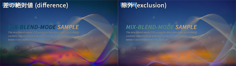
| Effect | Property value | Description |
|---|---|---|
| Difference | difference |
Useful for visualizing the difference between two images. |
| Exclusion | exclusion |
Produces a weaker effect than difference. |
Color-based CSS blend modes
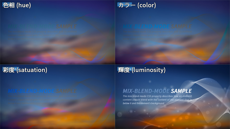
| Effect | Property value | Description |
|---|---|---|
| Hue | hue |
Composited in the HSL color space. The result has the luminosity (L) and saturation (S) of the lower layer and the hue (H) of the upper layer. |
| Saturation | saturation |
Composited in the HSL color space. The result has the luminosity (L) and hue (H) of the lower layer and the saturation (S) of the upper layer. |
| Color | color |
Composited in the HSL color space. The result has the luminosity (L) of the lower layer and the saturation (S) and hue (H) of the upper layer. |
| Luminosity | luminosity |
Composited in the HSL color space. The result has the saturation (S) and hue (H) of the lower layer and the luminosity (L) of the upper layer. |
CSS blend mode useful for cross-fades
| Property value | Description |
|---|---|
plus-lighter |
Useful when cross-fading two elements that share overlapping pixels. |
plus-lighter has a different use case from the other blend modes. It is useful for cross-fade effects. The following explanation starts with the situation where it becomes necessary.
With the normal blend mode, if the opacity of two elements is transitioned simultaneously from 0 to 1 and from 1 to 0, both elements have an opacity of 0.5 at the midpoint. At that point, both elements are translucent, which can make the result look unnatural.
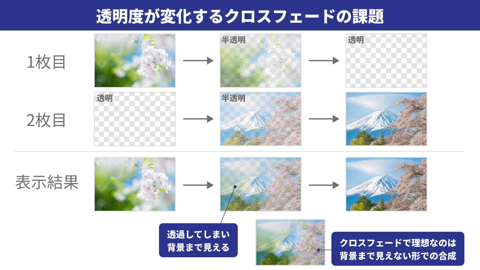
When two elements cross-fade, plus-lighter composites them while taking opacity into account. As a result, the cross-fade appears cleaner.
A practical recent example is the default cross-fade in the View Transition API, which also uses plus-lighter. The View Transition API overlays snapshots from before and after a transition and changes their opacity. By using mix-blend-mode: plus-lighter;, it reduces the unnatural effect of the entire screen darkening and creates a more natural cross-fade. For details, see the article “Introduction to the View Transition API for seamless page transitions”.
Here is a demo for checking the effect.
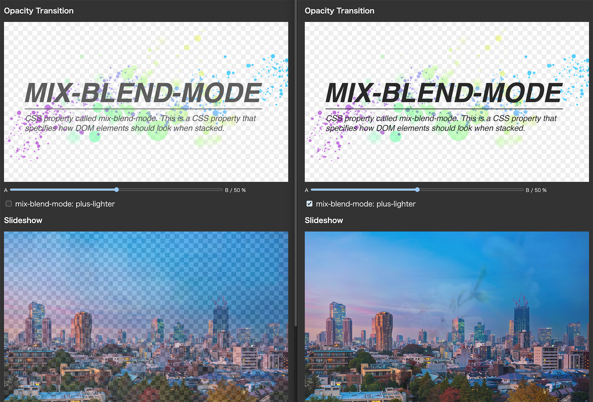
The left side shows the result with normal; the right side shows the result with plus-lighter.
Use isolation: isolate when elements do not blend as expected
mix-blend-mode composites the target element with the rendered content behind it. As a result, unintended backgrounds or parent elements can become part of the compositing target and change the appearance. To limit the blending scope, specify isolation: isolate; on the parent element to create a new stacking context.
.blend-group {
  isolation: isolate;
  position: relative;
}

.blend-group__item {
  mix-blend-mode: screen;
}
Browser support
The mix-blend-mode property is available in Chrome 41 (March 2015), Edge 79 (January 2020), Safari 8 (October 2014), Firefox 32 (September 2014), and later.
The plus-lighter value is available in Chrome 100 (March 2022), Edge 100 (April 2022), Safari 9.1 (March 2016), Firefox 99 (April 2022), and later.
References: Can I use…, Can I use… - mix-blend-mode: plus-lighter
Conclusion: designers and HTML coders can collaborate more easily
In web production during the 2010s, blend modes and HTML were not a good match. Many markup engineers probably sighed after discovering that a designer had quietly used a blend mode in a Photoshop design file or similar comp. To preserve the appearance of Photoshop blend modes, they likely had to work around the issue by merging layers carefully or adjusting how assets were sliced.
Today, however, mix-blend-mode can be used in most browsers. That makes it easier to use blend modes in design software and reproduce them in coded web pages.
The follow-up article “CSSのmix-blend-modeで実現するドローイング表現” introduces interaction design techniques for the web using mix-blend-mode. It also presents examples showing how combining it with the HTML <canvas> and <video> elements can expand the range of expression.
Supplement: how it differs from background-blend-mode
A property similar to mix-blend-mode is background-blend-mode. background-blend-mode is a CSS property for compositing multiple background images assigned to an element, or a background image and a background color. It does not composite with content outside the element. Use mix-blend-mode when you want the element itself, text, images, SVG, or similar content to blend with the background.