When arranging box elements horizontally or vertically with CSS, CSS Flexbox is useful. Flexbox makes it possible to create layouts that align elements in one direction with concise code. This article explains the features and usage of Flexbox by walking through the creation of a web page.
What you’ll learn in this article
- Basic Flexbox usage
- The concepts of the main axis and cross axis
- How to use
justify-content,align-items, andflex-wrap - Responsive support for mobile devices
- How to choose between Flexbox and CSS Grid
Flexbox is CSS for one-dimensional layouts
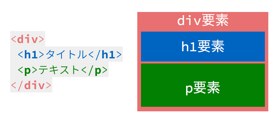
Flexbox is a CSS feature for handling one-dimensional layouts in either the horizontal or vertical direction. It can arrange boxes horizontally, stack them vertically, center them, or wrap them onto multiple lines. A box is the area generated by each element in HTML. In the web page shown in the HTML code below, the div, h1, and p elements each generate a box.
With Flexbox, you can arrange boxes horizontally or vertically, center them, distribute them evenly, and more with a small amount of code. It is especially well suited to layouts that align elements in one direction, such as navigation menus and card lists.
Demo overview
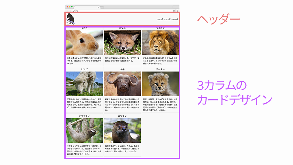
This article explains Flexbox through the example of coding a responsive page. First, take a look at the finished page. A simple column layout is implemented with Flexbox.
How to lay out elements with Flexbox
First, let’s code the header.
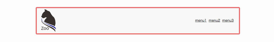
The HTML code is as follows.
<header>
  <img src="images/logo.png" alt="">
  <ul>
    <li><a href="">menu1</a></li>
    <li><a href="">menu2</a></li>
    <li><a href="">menu3</a></li>
  </ul>
</header>
Coding the header requires the following three steps.
- Specify the box as a Flexbox layout
- Place the logo and menu on opposite sides
- Vertically center the content inside the header
Specifying a Flexbox layout and understanding the two axes
When specifying a Flexbox layout, such as arranging boxes horizontally or vertically, set the display property of the parent element’s style to flex. In this example, the parent elements are the header and ul tags.
header {
  display: flex;
}

ul {
  display: flex;
}
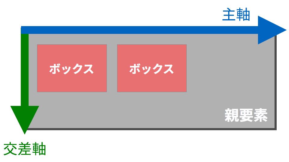
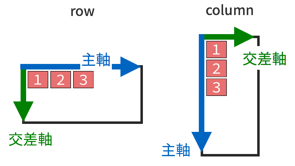
In Flexbox, the layout of boxes is determined by two axes: the main axis and the cross axis. In a horizontally written page using the default value flex-direction: row, the main axis runs from left to right, and the cross axis runs from top to bottom.
Arranging boxes horizontally and vertically
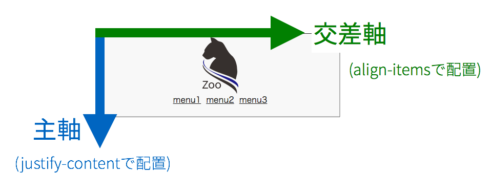
The alignment along the main axis, which is horizontal by default, is set with the justify-content property. The representative values covered in this article are as follows.
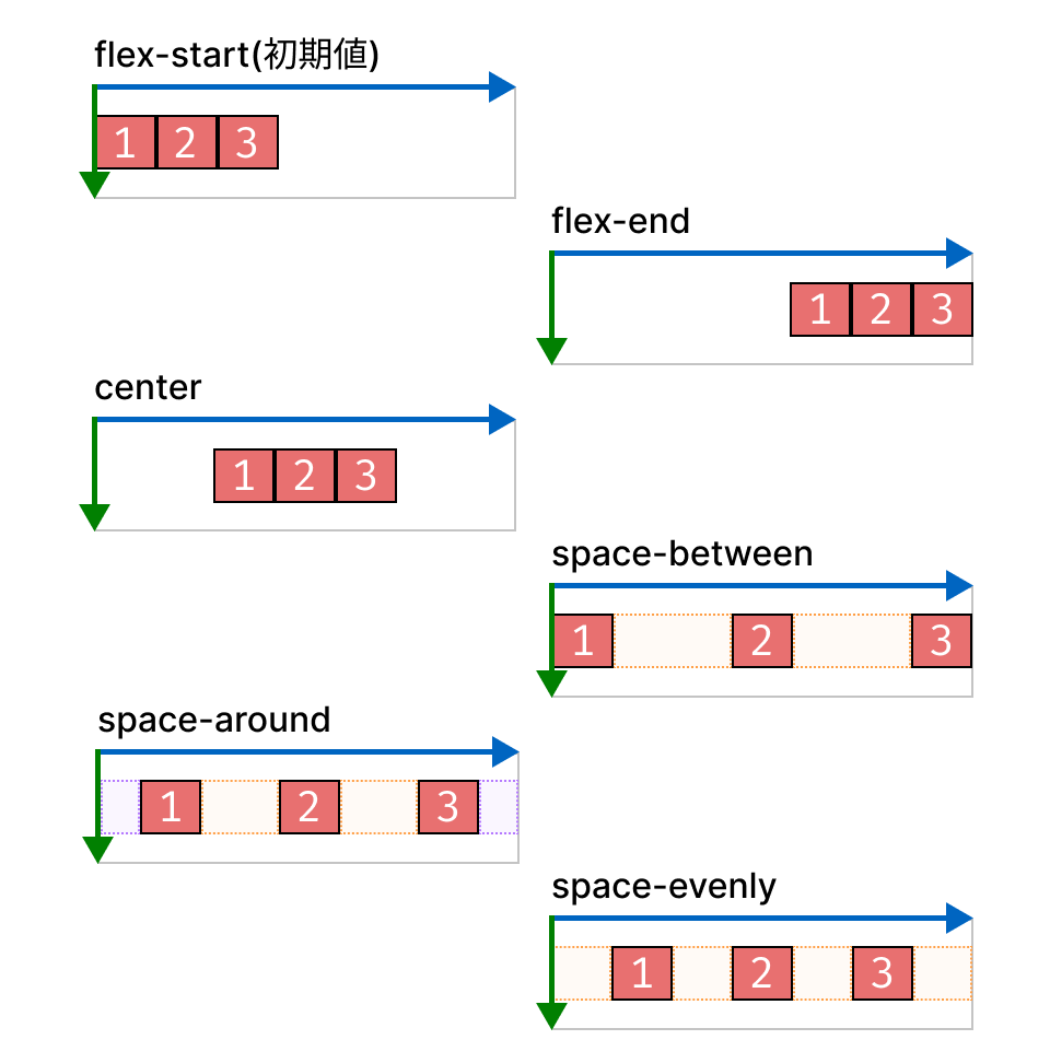
flex-start-> Align to the start edge (left-aligned, default)flex-end-> Align to the end edge (right-aligned)center-> Centeredspace-between-> Evenly distributed, with the first and last boxes placed at the start and end edgesspace-around-> Evenly distributed, with the first and last boxes placed half a box interval away from the start and end edgesspace-evenly-> Evenly distributed, with the first and last boxes placed one full box interval away from the start and end edges
The alignment along the cross axis, which is vertical by default, is set with the align-items property. The representative values covered in this article are as follows.
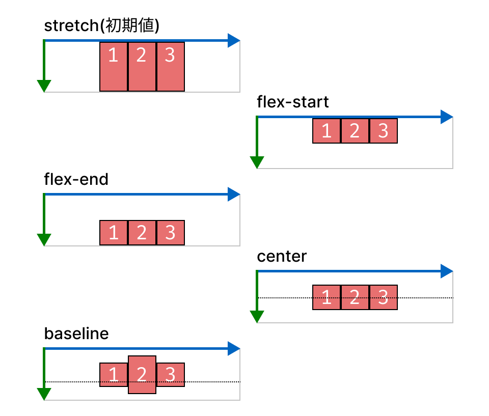
stretch-> Stretch to the same height as the parent element (default)flex-start-> Align to the start edge (top-aligned)flex-end-> Align to the end edge (bottom-aligned)center-> Centeredbaseline-> Baseline-aligned
In the header, the logo and menu are placed on opposite sides, and the menu is vertically centered. Set the CSS as follows.
header {
  justify-content: space-between; /* Distribute to the left and right */
}

ul {
  align-items: center; /* Vertically center */
}
Arranging boxes across multiple lines
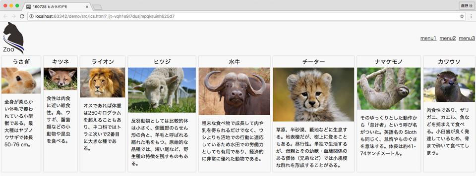
Next is the layout for the three-column card section. The following is an HTML code example. The main tag contains eight .animal elements.
<main>
  <div class="animal">
    <h2>Rabbit</h2>
    <img src="images/animal1.jpg" alt="">
    <p>A small mammal covered in soft fur over its entire body. The largest species is the European hare, which reaches 50-76 cm in length.</p>
  </div>
  <div class="animal">
    <h2>Fox</h2>
    <img src="images/animal2.jpg" alt="">
    <p>Its diet is omnivorous but leans carnivorous. It eats birds, rabbits, rodents, insects, and other small animals.</p>
  </div>

  <!-- Omitted -->

</main>
To make each .animal element one-third the width of the parent element and arrange them horizontally, set the styles as follows.
The spacing between cards is specified with the gap property. For details on the gap property, see the following article.
main {
  display: flex;
  gap: 8px;
}

.animal {
  /* Divide (the full width - total spacing added with gap) by the number of columns */
  flex-basis: calc((100% - 16px) / 3);
}
flex-basis is a property that specifies the initial size of a flex item along the main axis. Here, the base size of each card is set so that three columns fit in one row. To also specify how the item grows or shrinks, you can use the flex shorthand property, such as flex: 0 0 calc((100% - 16px) / 3).
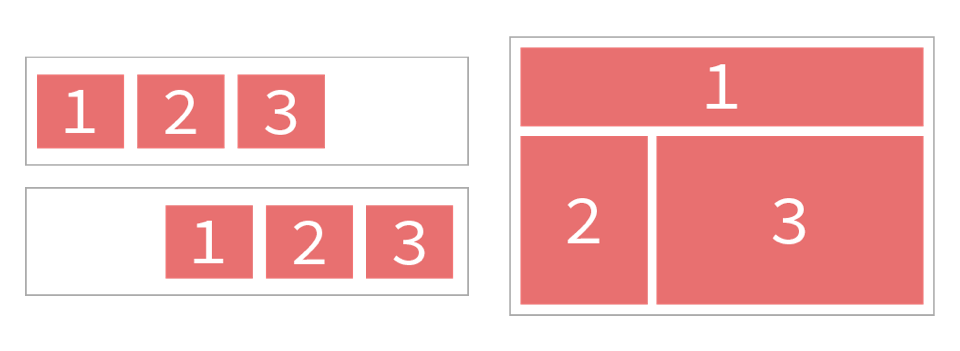
However, when this code is run, the cards do not wrap into three columns. They remain arranged in a single row. This is because the default value in Flexbox is flex-wrap: nowrap, so items do not wrap.
To create a multi-line layout, set the flex-wrap property to wrap.
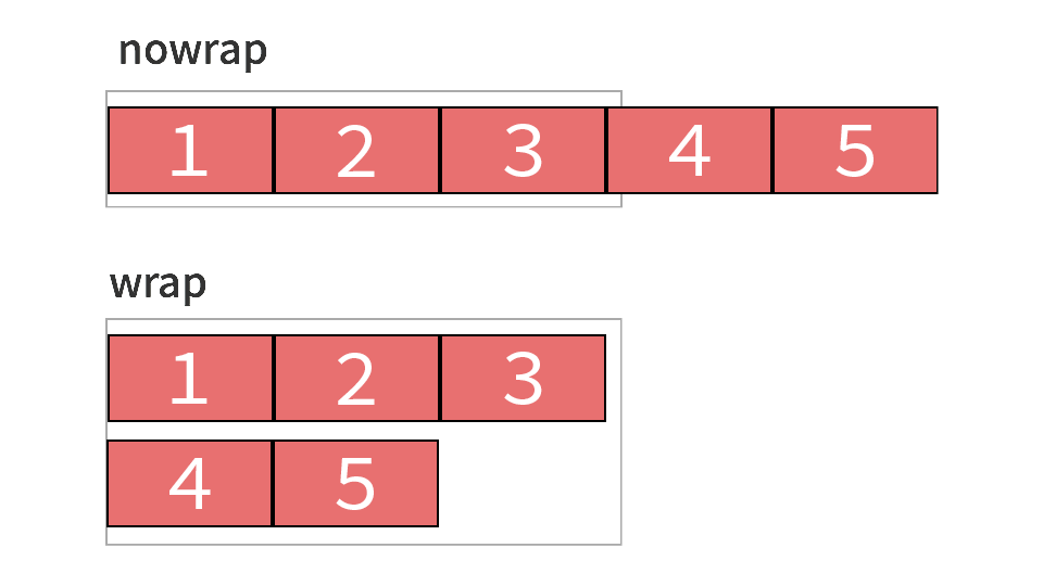
nowrap-> Place boxes on a single linewrap-> Place boxes across multiple lines
In this example, specify it as follows.
main {
  flex-wrap: wrap;
}
This completes the three-column card layout.
The height of each card is also aligned. This is because the default value of the align-items property is stretch. In a multi-line layout, the height of boxes with align-items: stretch applied expands to match the tallest box in the same line.
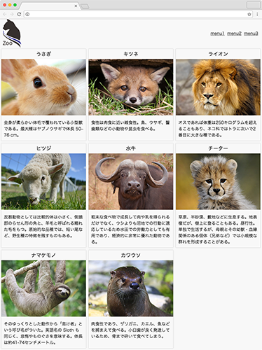
The CSS code and demo up to this point are as follows.
Responsive layouts with Flexbox
Let’s look at an example of a responsive layout with Flexbox.
In this example, when the viewport width is 768px or less, the header is stacked vertically and the card section changes to two columns.
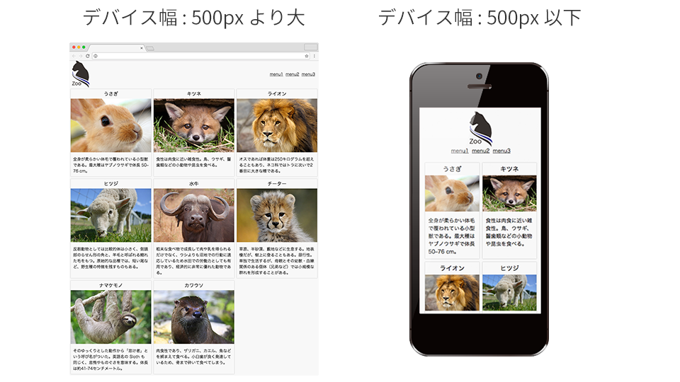
A two-column card layout can be created by changing the base size of each card.
@media (width <= 768px) {
  .animal {
    /* Divide (the full width - total spacing added with gap) by the number of columns */
    flex-basis: calc((100% - 8px) / 2);
  }
}
The tricky part is stacking the header elements vertically.
Changing the direction of boxes
By default, Flexbox arranges boxes horizontally. To change the direction, use the flex-direction property. flex-direction changes the direction of the main axis and cross axis.
In this example, set flex-direction: column to stack the elements inside the header vertically. When column is specified, the main axis becomes vertical and the cross axis becomes horizontal. Therefore, to center the elements horizontally, specify align-items: center.
@media (width <= 768px) {
  header {
    flex-direction: column;
    align-items: center;
  }
}
justify-content and align-items are not simply properties for specifying horizontal and vertical alignment. justify-content specifies alignment along the main axis, while align-items specifies alignment along the cross axis. The directions of the main axis and cross axis change depending on the value of flex-direction.
The CSS code and demo up to this point are as follows.
Conclusion
With Flexbox, you can specify how elements are arranged, whether they wrap, their direction, centering, and more with concise code. It is useful when you want to align elements in one direction, such as in navigation menus and card lists.
On the other hand, CSS Grid is better suited to grid-like layouts where rows and columns need to be controlled at the same time. To learn the basics of CSS Grid, also see Getting started with CSS Grid, Grid Lanes, and Subgrid.