This article introduces CSS Gap Decorations, available in Chrome and Edge 149 (June 2026). Until now, adding divider lines to the empty space in Grid Layout or Flexbox often required pseudo-elements or the border property on child elements. You also had to adjust the lines on each item while accounting for wrapping and changes in the number of columns. CSS Gap Decorations make divider lines in gaps much more straightforward to handle.
What are CSS Gap Decorations?
CSS Gap Decorations are a mechanism for adding lines and other decorations to the gap areas in Grid Layout, Flexbox, and Multi-column Layout. The key point is that they target the space between elements, rather than the elements themselves. They are less likely to break when the layout changes and work well with responsive UIs.
With Gap Decorations, it becomes easier to manage divider lines between child items from the parent element, improving code readability and maintainability. Support for wrapping at fluid widths is especially useful.
First, take a look at the demos below (view them in Chrome or Edge 149 or later). Each gap is given a divider line with Gap Decorations, showing how a simple declaration can make decorations more flexible.
Basic usage
The rule property
This shorthand property specifies the appearance of the line shown in the center of a gap (rule-width, rule-style, and rule-color). It may help to think of it like the border property.
.grid-01 {
  rule: 3px solid green; /* Shorthand for row and column rules */
}
You can use the column-rule and row-rule properties to style row and column rules separately. You can also specify multiple values or use the repeat() function.
.grid-02 {
  row-rule-width: 3px; /* Row rule width */
  row-rule-style: repeat(2, dashed), solid; /* Row rule styles */
  row-rule-color: orange; /* Row rule color */
  column-rule:
    3px solid green,
    3px dashed green,
    6px double green; /* Column rules */
}
The rule-break property
This property controls whether lines are connected or split at T-junctions and cross intersections. You can style row and column rules separately with the column-rule-break and row-rule-break properties.
| Value | Description |
|---|---|
| normal | Splits T-junctions, but keeps cross intersections connected. (Initial value) |
| none | Keeps lines connected at intersections. |
| intersection | Splits both T-junctions and cross intersections. |
.grid {
  row-rule: 3px solid orange;
  column-rule: 3px solid green;

  /* 01 */
  &.grid-01 {
    rule-break: intersection; /* Split row and column rules at intersections */
  }

  /* 02 */
  &.grid-02 {
    row-rule-break: normal; /* Split row rules only at T-junctions */
    column-rule-break: intersection; /* Split column rules at intersections */
  }
}
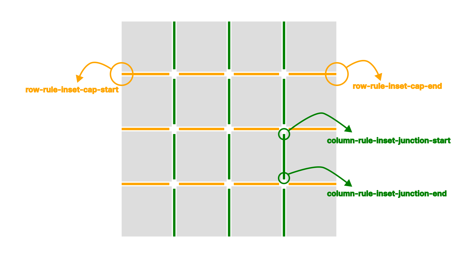
The rule-inset property
This property specifies how much to shorten the ends of a line. You can style row and column rules separately with the column-rule-inset and row-rule-inset properties. You can also adjust only the line ends or only the intersections with the rule-inset-cap and rule-inset-junction properties. Adjusting rule length can make table contents easier to read.
.grid {
  row-rule: 3px solid orange;
  column-rule: 3px solid green;
  rule-break: intersection;

  /* 01 */
  &.grid-01 {
    rule-inset: 12px; /* Shorten row and column rules by 12px */
  }

  /* 02 */
  &.grid-02 {
    row-rule-inset-junction: 12px; /* Shorten only row rule intersections by 12px */
    column-rule-inset-cap: 24px; /* Shorten only column rule ends by 24px */
  }
}
The rule-visibility-items property
This property controls whether rules adjacent to empty areas are displayed. You can style row and column rules separately with the column-rule-visibility-items and row-rule-visibility-items properties. Four values can be specified.
| Value | Description |
|---|---|
| normal | Same as all in Grid Layout.Same as between in Multi-column Layout. (Initial value) |
| all | Shows all rules. |
| around | Shows the rule if either adjacent area contains an item. |
| between | Shows the rule if both adjacent areas contain items. |
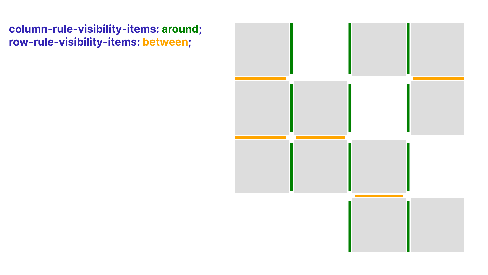
In the following demo, around is set for columns, so a rule appears when there is an item on either the left or right. between is set for rows, so row rules appear only when there are items both above and below.
.grid {
  row-rule: 3px solid orange;
  column-rule: 3px solid green;
  rule-break: intersection;
  row-rule-visibility-items: between; /* Show row rules when items exist both above and below */
  column-rule-visibility-items: around; /* Show column rules when an item exists on either the left or right */
}
The rule-overlap property
This property controls whether row or column rules are painted on top. Check the area around rule intersections. Two values can be specified.
| Value | Description |
|---|---|
| row-over-column | Paints row rules over column rules. (Initial value) |
| column-over-row | Paints column rules over row rules. |
.grid {
  column-rule: 3px solid green;
  row-rule: 3px solid orange;

  /* 01 */
  &.grid-01 {
    rule-overlap: row-over-column; /* Initial value */
  }

  /* 02 */
  &.grid-02 {
    rule-overlap: column-over-row; /* Paint column rules over row rules */
  }
}
Examples
Link list
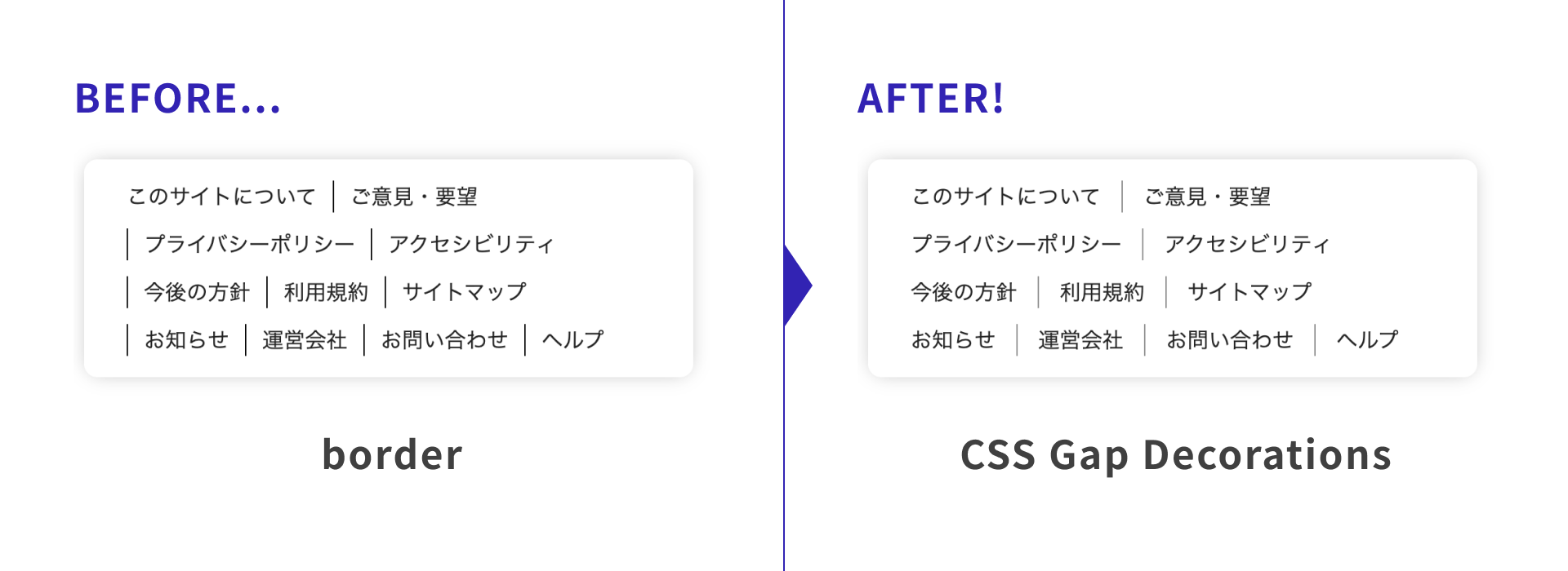
The following demo shows a horizontal link list with divider lines. Until now, this was commonly implemented by setting border-left or pseudo-elements on child items. With the column-rule property, you can display lines in the gaps instead, which keeps the CSS simple.
.list {
  display: flex;
  gap: 12px 32px;
  flex-wrap: wrap;
  column-rule: 1px solid rgb(0 0 0 / 0.45); /* Column rule */
}
News list
The following demo is a news list commonly seen on websites. Gap Decorations are used for the rules between the date, category, title, and arrow.
.news-list {
  display: grid;
  grid-template-columns: max-content max-content 1fr 40px;
  column-gap: 24px;
  row-rule: 1px solid rgb(0 0 0 / 0.3); /* Row rule */
  row-rule-inset-end: 40px; /* Shorten the right side by 40px */
}
row-rule and row-rule-inset-end set the row rules that separate each news item in the list. The news layout uses subgrid. Subgrid is introduced in the article “Getting started with CSS Grid, Grid Lanes, and Subgrid.”
.news-list__item {
  display: grid;
  grid-template-columns: subgrid; /* subgrid */
  grid-column: 1 / -1;

  .news-list__item--anchor {
    column-rule-width: repeat(2, 1px), 4px; /* Repeat two 1px rules, then one 4px rule */
    column-rule-style: repeat(2, dashed), double; /* Repeat two dashed rules, then one double rule */
    column-rule-color: rgb(0 0 0 / 0.3);
    column-rule-inset: calc((var(--padding) - 8px) * -1); /* Extend column rules vertically */
  }
}
Passing a negative value to column-rule-inset extends the rules. This is useful when top and bottom padding would otherwise make the lines too short.
On hover, the styles for column-rule-color and column-rule-inset change. The background that follows the hovered item uses CSS Anchor Positioning. The article “CSS アンカーポジショニング入門” covers this in detail.
.news-list {
  /* Background element that follows hover and focus */
  &:after {
    position: absolute;
    inset: anchor(--anchor inside); /* Match the background element's position and size to the anchor element */
  }

  .news-list__item--anchor {
    /* Hover and focus styles */
    &:is(:hover, :focus-visible) {
      anchor-name: --anchor; /* Set as the anchor element referenced by the background element */
      column-rule-color: rgb(0 0 0 / 0.8);
      column-rule-inset: 0;
    }
  }
}
Schedule table
The following demo builds a schedule table. By defining rules with the rule properties, you can easily create a UI that adapts to layout changes and merged cells.
Cell placement in the schedule uses the attr() function. For more details, see “CSS の attr()関数が進化!HTML 属性値を参照する新しい使い方”.
.calendar {
  .calendar-body {
    row-rule-width: 1px;
    row-rule-style: dashed, solid;
    row-rule-color: var(--color_primary-pale);
    row-rule-break: intersection;
    row-rule-inset: var(--inset_offset);
    column-rule: 1px solid var(--color_primary);
  }
}
Browser support
The rule property in CSS Gap Decorations is available in Chrome and Edge 149 (June 2026) and later.
Reference: Can I use…
Conclusion
CSS Gap Decorations let you write decorations for gaps in Grid Layout and Flexbox more straightforwardly. They are also easy to adopt without changing existing layout techniques. UIs that used to require more work than expected can now be created more easily, so try them first in supported environments while looking forward to broader browser support.