@container scroll-state() is a type of CSS container query. It lets you implement interactions such as “change the header style after the page has been scrolled” using only CSS, without the JavaScript that was previously required.
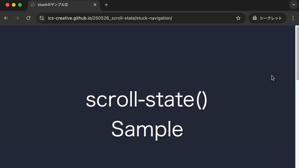
This article introduces how to use scroll-state() and what it can do through a series of demos.
Container queries are introduced in “要素の幅でレスポンシブ対応を行える! コンテナークエリーの使い方”. They are useful not only for controlling layouts based on container width, but also for building interactive UIs. This article should give you a sense of the broader possibilities of container queries.
View the demos in this article in Chrome or Edge.
How to use @container scroll-state()
This query can be used on descendant elements of an element with container-type: scroll-state. Inside the parentheses of @container scroll-state(), you can specify stuck, scrollable, snapped, or scrolled. Each one can be used under the following conditions.
stuck- The element is stuck with
position: sticky
- The element is stuck with
scrollable- The element can be scrolled in one of the four directions
snapped- The element snaps into place with the
scroll-snap-typeproperty
- The element snaps into place with the
scrolled- The most recent scroll direction can be detected
After the colon (:), specify the edge, direction, or axis to detect.
Example of stuck
<div class="item-container">
  <div class="item"></div>
</div>
.item-container {
  container-type: scroll-state;
  position: sticky;
  top: 0;
  left: 0;
}

.item {
  @container scroll-state(stuck: top) {
    /* Write styles for when .item-container is stuck */
  }
}
The following sections show what kinds of UI can be built with stuck, scrollable, snapped, and scrolled.
stuck: detect when an element becomes stuck
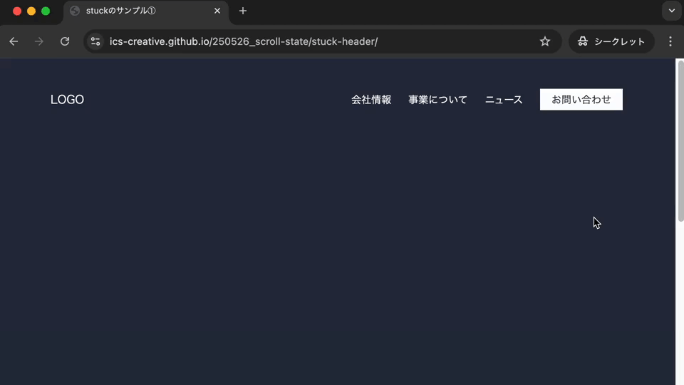
With @container scroll-state(stuck: top), styles can be applied at the moment an element becomes stuck to the top of the viewport with position: sticky. In the following demo, the header background color changes depending on whether the page is at the very top. As soon as the page is scrolled even slightly from the top, the background changes to white.
Reveal additional content when the element becomes stuck
In the following demo, the button width expands when the button reaches the top of the viewport.
Note: This demo may not work well with keyboard operation or screen reader announcements.
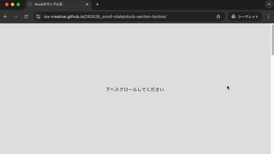
Apply styles when sticking ends
By combining @container scroll-state(stuck: bottom) with a not condition (@container not scroll-state(stuck: bottom)), styles can be applied at the moment position: sticky stops sticking. In the following demo, a button placed in “Section 01” is stuck to the bottom of the viewport, and styles are added to the button after the user scrolls past it.
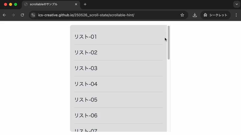
scrollable: detect when an element can be scrolled
With @container scroll-state(scrollable: top), styles can be applied when an element can be scrolled upward. The following demo shows an additional hint message at the top of the viewport when upward scrolling is possible.
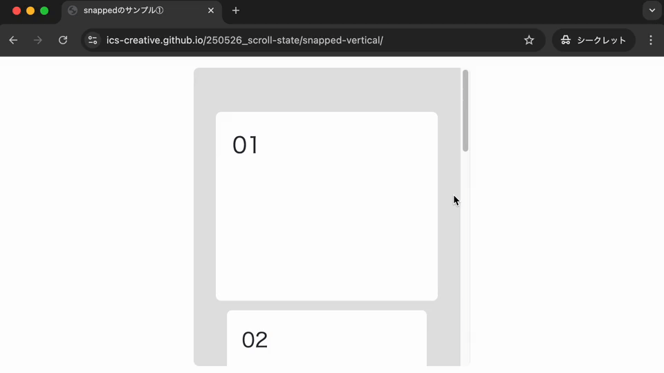
snapped: detect when an element snaps into place
With @container scroll-state(snapped: y), styles can be applied when the target element is snapped, or is about to be snapped, on the y-axis inside a scroll container that uses the scroll-snap-type property. In the following demo, the element is slightly enlarged to make it stand out.
Applying it to a carousel UI
The following demo applies this feature to the carousel UI introduced in “Creating a carousel UI with HTML and CSS without JavaScript”. When the “▶” button is clicked, the photos slide horizontally, and an effect reduces their size only while they are sliding. The value passed to snapped is inline, which refers to the inline direction.
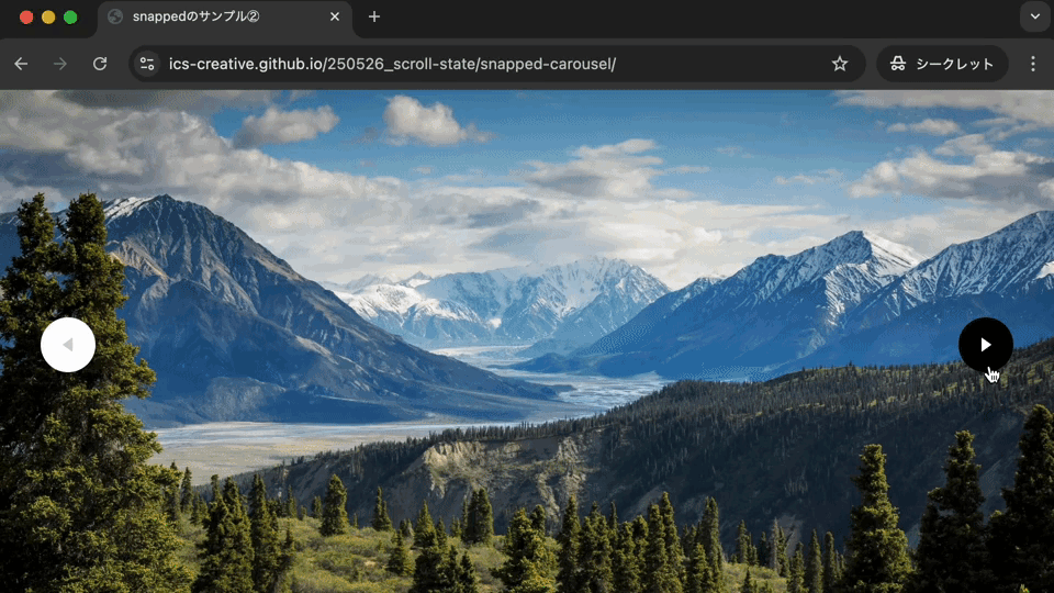
Excerpt from the added CSS
.item {
  container-type: scroll-state;
  img {
    transition: scale 0.3s;
    transition-delay: 0.2s;

    @container not scroll-state(snapped: inline) {
      scale: 0.85;
      transition-delay: 0s;
    }
  }
}
scrolled: detect the most recent scroll direction
With @container scroll-state(scrolled: bottom), styles can be applied when the container was most recently scrolled downward. Use top to detect a recent upward scroll.
For example, to hide the header only when scrolling down and show it only when scrolling up, write the following.
html {
  container-type: scroll-state;
}

.site-header {
  position: sticky;
  top: 0;
  translate: 0 0;
  transition: translate 0.3s;
}

@container scroll-state(scrolled: bottom) {
  .site-header {
    translate: 0 -100%;
  }
}

@container scroll-state(scrolled: top) {
  .site-header {
    translate: 0 0;
  }
}
Browser support
For scroll-state(), stuck, scrollable, and snapped are available in Chrome 133 and Edge 133 or later (February 2025). scrolled is available in Chrome 144 and Edge 144 or later (January 2026).
Reference: Can I use…
Conclusion
This article introduced what you can do with @container scroll-state(). Style changes based on scroll state, which previously required JavaScript, can now be implemented with CSS alone.
Browser support is still limited, but this feature can be useful in many situations. Use it when you want to add simple CSS effects based on scroll state.