
There are many ways to style a UI on the web, including plain CSS, CSS Modules, CSS-in-JS, and UI libraries. Among these options, Tailwind CSS is a CSS framework that has gradually gained adoption since the late 2010s.
Its use has continued to grow in recent years, with weekly downloads on npm exceeding 100 million in 2026. Tailwind CSS makes design tokens visible in your code and can serve as the foundation of a design system.
This article introduces the basics of Tailwind CSS through a gallery UI demo. It covers layout, variants, theme definitions for maintaining design consistency, and potential pitfalls during development.
Note: This article assumes Tailwind CSS v4.
What is Tailwind CSS?
Tailwind CSS is a CSS framework built around a utility-first approach. Instead of defining custom classes, you style a UI by combining utility classes, each with a small, specific purpose.
Utility classes apply small pieces of styling, such as spacing, colors, font sizes, and positioning. Each class corresponds to one or more CSS properties, and adding it to the class attribute applies those styles.
For example, the following code styles a button:
<button
  class="rounded-lg bg-blue-900 px-4 py-2 font-bold text-white"
  type="button"
>
  Button
</button>

The same styles written in CSS would look like this:
.button {
  border-radius: 0.5rem; /* rounded-lg */
  background-color: oklch(37.9% 0.146 265.522); /* bg-blue-900 */
  padding-inline: 1rem; /* px-4 */
  padding-block: 0.5rem; /* py-2 */
  font-weight: 700; /* font-bold */
  color: #fff; /* text-white */
}
In this example, each utility class corresponds to a single CSS property, but some classes set several properties at once. For example, the transition class applies default values to the following three CSS properties:
transition-property: color, opacity, transform, display, and many otherstransition-timing-function: cubic-bezier(0.4, 0, 0.2, 1)transition-duration: 150ms
Benefits and trade-offs of Tailwind CSS
A key benefit of Tailwind CSS is that it introduces styling constraints so you can focus on building components.
Utility classes let you style elements using Tailwind CSS’s design tokens for spacing, colors, font sizes, and more, making it easier to keep the UI consistent. Theme definitions also make it easier to manage styles specific to your project. You spend less time coming up with class names such as .basic-button and .button-wrapper whenever you style a UI, and you do not have to worry about duplicate class names causing unintended styles.
Another benefit is that styles are written in the class attribute, so you can review them without switching back and forth between CSS files and component code. This makes it easier to see which styles apply to each component and identify styles that should be shared. These benefits can also be valuable when developing with AI.
However, using Tailwind CSS requires an understanding of both CSS and Tailwind CSS, which increases the knowledge developers need. Also, unless you establish constraints through theme definitions and other conventions, any style remains possible. Keeping styling manageable requires deliberate choices.
Building a gallery UI
The following sections highlight important styling techniques through a gallery UI built with Tailwind CSS and React. The demo recreates a type of gallery often seen on award-winning websites in recent years. As you hover over an image title, the preview moves to follow that title and switches to the corresponding image. View the demo on a desktop computer.
The demo uses React and Vite. For setup instructions, see Vite guide - HTML, TypeScript, React, Vue, and Tailwind CSS.
Layout
The demo UI consists of gallery titles (GalleryTitle) and an image preview (GalleryPreview). The flex class places the area containing the vertically stacked GalleryTitle components next to GalleryPreview. It corresponds to display: flex in CSS.
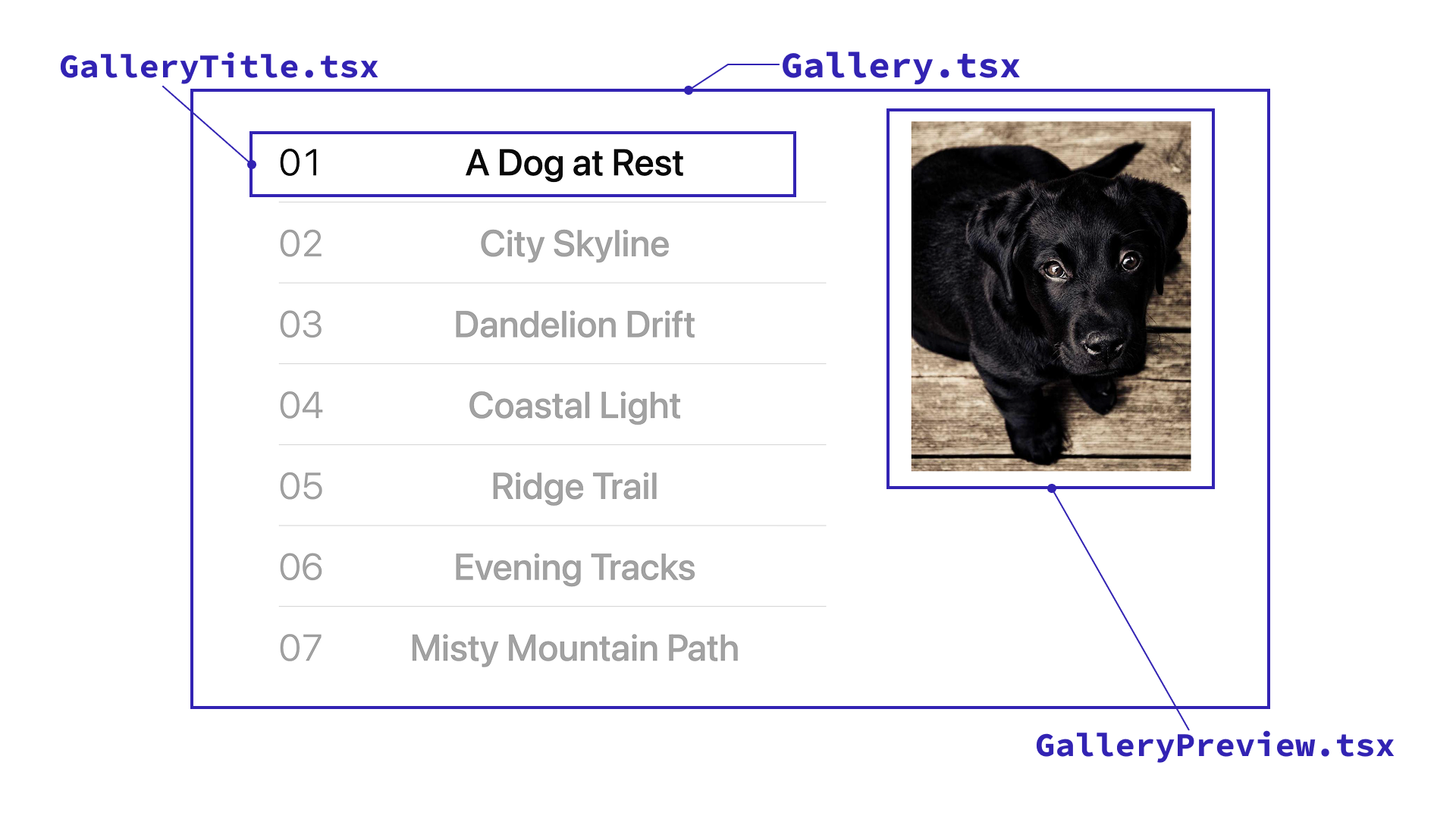
By default, Tailwind CSS calculates spacing values using 0.25rem as the base unit. For example, py-10 applies 0.25rem × 10 = 2.5rem of padding to both the top and bottom. As you become familiar with these class names, you can start to recognize the CSS properties they represent.
/* src/components/Gallery.tsx */
  <div className="... flex ...">
    <ol className="... py-10 ...">
      {galleryItems.map((item, index) => (
        <GalleryTitle ... />
      ))}
    </ol>
    ...
    <GalleryPreview ... />
    ...
  </div>
Responsive design
Tailwind CSS lets you apply styles based on conditions such as breakpoints and pseudo-classes. This feature is called variants. To use a variant, prefix a utility class with a condition followed by :. For example, sm: is a breakpoint variant that applies styles when the viewport is at least 40rem (640px) wide.
On desktop, sm:w-3/5 sets the title area to 60% width, and sm:block displays the image preview. On mobile, w-full expands the title area to 100% width, while hidden hides the image preview.
/* src/components/Gallery.tsx */
...
  <ol className="w-full ... sm:w-3/5">
    ...
    <GalleryTitle ... />
    ...
  </ol>
  ...
  <div className="hidden sm:block">
    <GalleryPreview ... />
  </div>
...
Pseudo-classes
Variants also support pseudo-classes. The image titles are gray by default, but hover:text-foreground uses the hover: variant to turn them black on hover. The text-muted and text-foreground classes are custom classes for gray and black text, defined in the theme described later.
/* src/components/GalleryTitle.tsx */
<div className="... text-muted ... hover:text-foreground ...">
  ...
</div>
Positioning the image
CSS anchor positioning makes the image follow the title. Tailwind CSS v4.3.3, which this demo uses, does not include utility classes for this feature, so the demo defines custom ones using the @utility directive. For details on CSS anchor positioning, see CSSアンカーポジショニング入門.
When a title is hovered, the demo moves the gallery-anchor class to that title, making it the active anchor. The image preview’s gallery-preview-position class aligns the center of the image with the anchor while using clamp() to keep the image within the preview area.
/* src/index.css */
/* Custom utilities */
@utility gallery-anchor {
  anchor-name: --gallery-active;
}

@utility gallery-preview-position {
  --gallery-preview-width: clamp(12rem, 25vw, 23rem);
  --gallery-preview-height: calc(var(--gallery-preview-width) * 5 / 4);
  position-anchor: --gallery-active;
  /*
    Align the center of the image with the anchor.
    Use clamp() to keep it within the top and bottom edges of the preview area.
  */
  top: clamp(
    calc(var(--spacing) * 10),
    calc(anchor(center) - var(--gallery-preview-height) / 2),
    calc(100% - var(--gallery-preview-height) - var(--spacing) * 10)
  );
}
Tailwind CSS also lets you specify arbitrary CSS properties directly in class names. However, defining custom classes with @utility is recommended here because it keeps these exceptional values together in one place.
Tailwind CSS updates sometimes add utility classes, so it is worth reviewing your custom utilities and considering whether to replace them with built-in alternatives. For example, Tailwind CSS v4 added the starting: variant, making @starting-style available through a variant.
Theme definitions and arbitrary values
Tailwind CSS supports arbitrary values, which let you specify any value inside []. In the demo, GalleryPreview uses the class h-[var(--gallery-preview-height)] to set the image height to a CSS variable. This is a convenient way to style elements flexibly, but overusing it can introduce values that fall outside your design rules and make UI consistency harder to maintain.
To prevent inconsistent styling, define a theme and share values across the project. The @theme directive lets you define project-specific colors, font sizes, and other values as theme variables. Color variable names begin with --color-, while font size variable names begin with --text-. For example, --color-foreground can be used through text-foreground and bg-foreground, while --text-gallery-title sets the font size through text-gallery-title.
The demo defines its background color, text colors, border color, and gallery title size as follows:
/* src/index.css */
/* Project theme definitions */
@theme {
  --color-canvas: #fff;
  --color-foreground: #0a0a0a;
  --color-muted: #a3a3a3;
  --color-border-subtle: rgb(10 10 10 / 15%);
  --text-gallery-title: clamp(1.25rem, 4vw, 3rem);
}
These theme variables are used to generate classes such as bg-canvas, text-foreground, border-border-subtle, and text-gallery-title.
How theme definitions are applied to the UI:
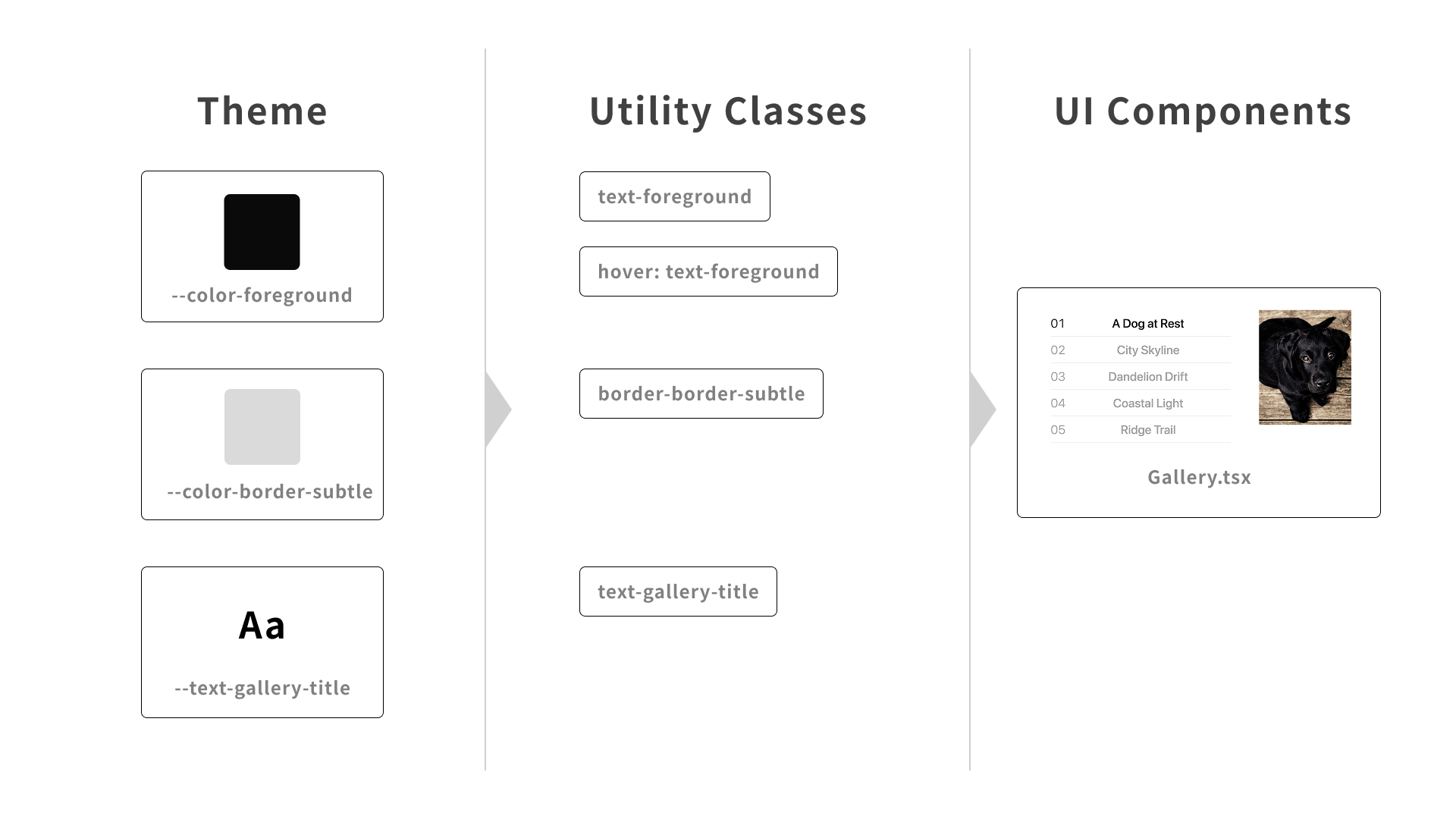
Using theme variables as design tokens lets you manage colors, font sizes, and other values centrally, making it easier to keep the entire UI consistent. It also makes values that fall outside your design tokens easier to spot in AI-generated styles.
Still, there are cases where arbitrary values are necessary, such as when reproducing a design faithfully. Establish conventions for these cases: use theme values by default, and define classes for exceptional styles as needed.
Common pitfalls when using Tailwind CSS
Tailwind CSS is useful, but there are several things to watch out for.
Dynamically constructed class names are not detected
Tailwind CSS scans source code as plain text and generates CSS for the class names it detects. As a result, it cannot recognize complete class names when parts of them are supplied through JavaScript variables.
/* ❌ Using a JavaScript variable as part of a class name */
function Badge({ type, children }) {
  return <span className={`bg-${type}-500 text-white`}>{children}</span>;
}
For cases like this, define the complete class names in advance and switch between them based on the value.
/* ✅ Define complete class names in advance and switch between them */
const badgeClasses = {
  info: "bg-cyan-500",
  warning: "bg-rose-500",
};

function Badge({ type, children }) {
  return <span className={`${badgeClasses[type]} text-white`}>{children}</span>;
}
Typos in class names do not cause runtime errors
Tailwind CSS class names are strings, so a typo does not cause a JavaScript runtime error. For example, to arrange the children of a flex container vertically, you use flex-col. If you mistakenly write flex-column, no corresponding CSS is generated because that class does not exist.
One way to catch these mistakes is to use a linter that detects unrecognized class names. For example, the tailwindcss/no-custom-classname rule in eslint-plugin-tailwindcss, a plugin for ESLint, can detect them. For more about ESLint, see Using ESLint effectively with the right rules and workflow.
Conflicting utility classes can produce unintended styles
When multiple classes set the same CSS property, the result may not look as intended. Which class takes precedence depends not on its position in className, but on the order of the rules in the generated CSS. Moving the class you want to apply to the end of className may therefore not produce the expected result.
Libraries such as tailwind-merge can resolve utility class conflicts. They identify conflicting classes and remove unnecessary ones from the class list.
Conclusion
This article introduced layout, variants, and theme definitions in Tailwind CSS through a gallery UI demo. Although there are some pitfalls to watch out for, defining a theme to share colors, font sizes, and other values makes it easier to maintain a consistent UI.
In my view, styling with utility classes encourages you to ask, “Are these the right styles for this component?” That question provides an opportunity to revisit the implementation and rethink the component’s design. Try Tailwind CSS and experience utility-first styling for yourself!