Chrome and Edge 156 (October 2026) extended the overflow property to support single-axis scroll containers. This allows elements with position: sticky; to follow different scroll containers on the horizontal and vertical axes.
The behavior we want to achieve
Consider a table on a web page. If it is wider than the browser window, horizontal scrolling lets readers see the whole table. Keeping the row headers on the left fixed while scrolling makes the content easier to read.
For a tall table, vertical scrolling usually happens inside the table. The table sits in a container that scrolls in both directions, separately from the page’s vertical scroll.
The goal here is to scroll horizontally inside the table while keeping the row headers fixed on the left, and let the table’s vertical movement follow the page scroll, rather than scrolling inside the table. At the same time, the column headers at the top should stick to the top of the viewport.
Before single-axis scroll containers were supported, the row headers could remain fixed, but the column headers would move out of view as the page scrolled vertically. This combination can now be implemented using CSS alone.
The following sections explain why the previous approach could not combine these behaviors and how the updated specification works.
Why the previous approach cannot keep both sets of headers fixed
Previously, setting overflow-x to auto or scroll to allow horizontal scrolling also made the element a scroll container on the vertical axis, even if it did not actually scroll vertically. The same applied in reverse when using overflow-y.
The CSS declaration position: sticky; keeps an element in place as scrolling occurs. However, when an ancestor is a scroll container, the element sticks relative to that container’s area.
As a result, applying position: sticky; to an element inside a scroll container still makes that container the reference for its sticky position. The two axes could not be treated separately, with horizontal scrolling inside the table and vertical sticking relative to the page.
In the following demo, the parent element has a set height. Scrolling vertically inside it keeps the column headers at the top of that scroll area. They do not, however, follow the page’s vertical scroll.
What single-axis scroll containers make possible
The behavior of overflow has changed when a value that allows scrolling is combined with clip. The element becomes a scroll container only on the specified axis, which is horizontal in this example. Because it does not become a vertical scroll container, position: sticky; can follow the page’s vertical scroll. Use the following declaration:
overflow: auto clip;
/*
  Equivalent to:
  overflow-x: auto;
  overflow-y: clip;
*/
When clip is specified on just one axis, as in overflow: auto clip;, browsers that do not support single-axis scroll containers treat it as hidden. In those browsers, specifying clip on one axis does not produce the intended behavior.
The following diagram compares the scroll containers on each axis when the table’s parent element has overflow-y set to hidden or clip.
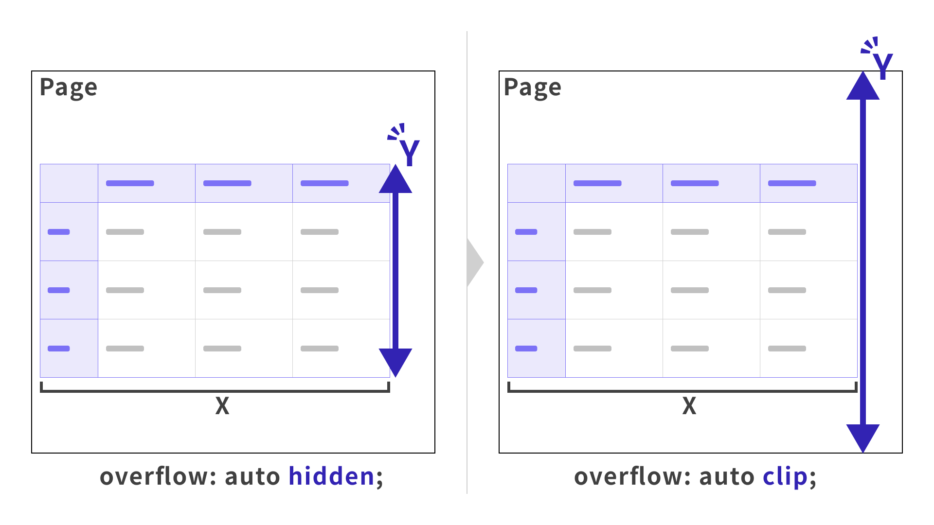
With position: sticky;, an element sticks relative to its nearest ancestor scroll container. In this example, the value of overflow-y changes the reference for the vertical axis as follows:
-
overflow-y: hidden;(previous behavior)The parent element becomes a vertical scroll container. When the page scrolls vertically, the column headers move along with their parent, so they cannot stick to the top of the viewport.
-
overflow-y: clip;(updated behavior)The parent element does not become a vertical scroll container, so a scroll container further up the ancestor chain becomes the reference. In this example, the column headers follow the page’s vertical scroll and can stick to the top of the viewport.
This lets the row headers stick to the left edge when the table scrolls horizontally, while the column headers stick to the top of the viewport when the page scrolls vertically.
The following demos show how this declaration works with position: sticky;.
Demo 1: project schedule
Note: View the demos in this article in Chrome or Edge 156 or later.
This project schedule keeps the top and left headers fixed. The key is that the row headers stick to the table’s left edge, while the column headers stick to the top of the viewport.
The first and second columns use scope="rowgroup" and scope="row", respectively. To prevent the row headers from overlapping when they stick, the second column is offset to the right by the width of one cell.
.table-scroll {
  overflow: auto clip; /* Allow scrolling on the horizontal axis only. */

  thead {
    th {
      position: sticky; /* Keep column headers at the top of the viewport. */
      top: 0;
    }
  }

  tbody {
    th[scope="rowgroup"] {
      position: sticky; /* Keep row headers at the table's left edge. */
      left: 0;
    }

    th[scope="row"] {
      position: sticky; /* Keep row headers at the table's left edge. */
      left: 160px; /* Offset by the width of one cell. */
    }
  }
}
Setting overflow: auto clip; on .table-scroll makes it a scroll container on the horizontal axis only. Because no vertical scroll container is created, the column headers’ position: sticky; follows the page scroll rather than .table-scroll, keeping them at the top of the viewport.
Demo 2: country comparison table
The next demo combines single-axis scroll containers with scroll-state() in a country comparison table. It changes styles, such as the text size and the visibility of shadows, according to whether the row and column headers are stuck.
scroll-state() is a container query that can detect whether scrolling is possible and whether an element with position: sticky; is stuck. For the basics, see “Using CSS @container scroll-state() for sticky headers and scroll effects”.
.table-scroll {
  overflow: auto clip; /* Allow scrolling on the horizontal axis only. */
  container-type: scroll-state; /* Enable scroll state queries. */
  container-name: table-scroll; /* Name this container for queries. */

  table {
    thead {
      position: sticky; /* Keep column headers at the top. */
      top: 0;
      container-type: scroll-state; /* Enable scroll state queries. */
      container-name: column-heading; /* Name the column header container. */

      th {
        @container column-heading scroll-state(stuck: top) {
          .country-heading {
            .country-flag {
              grid-template-columns: 1fr;
            }
          }
        }
      }
    }

    tbody {
      th {
        position: sticky; /* Keep row headers at the left edge. */
        left: 0;
      }
    }
  }

  .scroll-shadow {
    /* When the container can still scroll to the right. */
    @container table-scroll scroll-state(scrollable: right) {
      opacity: 1;
    }
  }
}
Browser support
Single-axis scroll containers using the CSS overflow property are available in Chrome and Edge 156 or later (October 2026).
Reference: Can I use…
Conclusion
Single-axis scroll containers may seem like a small feature, but they can improve the user experience. They make layouts that once took extra work simpler to implement with CSS alone. Try them in your own projects.