Components built with React and similar frameworks can look different depending on the data they receive. The following states, for example, may not appear in the data used during everyday development.
- A list contains no items
- A list contains enough items to require scrolling
- Text in a card or similar component is exceptionally long
Checking each state can also be cumbersome because it requires navigating to the relevant screen and preparing suitable data.
Storybook is a tool for reviewing these states without running the entire application. It displays individual components in the browser and lets you switch among their visual states. Sharing the URL of a displayed screen makes it easier for designers and project managers to review it. It also helps communicate the expected appearance when asking a coding agent to implement the component.
Storybook also helps developers quickly understand which reusable components exist in a project and how to use them. It can also be used for component-level testing and visual regression testing. In my experience, it is now difficult to imagine developing a large application without Storybook.
Storybook supports multiple frameworks, including React and Vue.js. This article uses React and TypeScript.
▼ Example Storybook screen
Example: a notice list
This article uses a notice list containing dates and titles. The following demo shows how it looks when running as an application.
Install Storybook
Storybook is added to an existing frontend project. To demonstrate the setup process, create a project with Vite + React + TypeScript.
Note: This article is based on Storybook 10.5, Vite 8.1, and Node.js 24 as of August 2026.
npm create vite@latest
After entering the project name, select the framework and project configuration. This example uses React and TypeScript. Once the project has been created, move to its directory and install the dependencies.
cd project-name
npm install
For more details on setting up Vite, see “Vite guide - HTML, TypeScript, React, Vue, and Tailwind CSS.”
Add Storybook to the project. The following command automatically detects the project configuration and creates the required settings.
npm create storybook@latest
The command displays several prompts.
- New to Storybook?: Selecting “Yes” starts an on-screen guided tour and adds example files for learning
- What configuration should we install?: “Recommended” installs documentation, accessibility, and testing features. “Minimal” installs only what is required for component development
- Would you like to install AI features (MCP addon and prompt suggestions)?: Select whether to install the MCP add-on for coding agents and prompt suggestions
Note: The prompts may change between versions.
After the prompts have been answered, the following two scripts are added to package.json. storybook dev starts Storybook for development, while storybook build generates static files.
▼ package.json
"scripts": {
  "storybook": "storybook dev -p 6006",
  "build-storybook": "storybook build"
}
Storybook itself and its add-ons are also added to devDependencies.
In Storybook, each visual state of a component is called a story, and stories are defined in files such as .stories.tsx. The .storybook/main.ts configuration file specifies where Storybook searches for story files and which add-ons are enabled.
▼ .storybook/main.ts
import type { StorybookConfig } from "@storybook/react-vite";

const config: StorybookConfig = {
  stories: ["../src/**/*.mdx", "../src/**/*.stories.@(js|jsx|mjs|ts|tsx)"],
  addons: [
    "@chromatic-com/storybook",
    "@storybook/addon-vitest",
    "@storybook/addon-a11y",
    "@storybook/addon-docs",
    "@storybook/addon-mcp",
  ],
  framework: "@storybook/react-vite",
};

export default config;
Storybook also creates example buttons, headers, and other files under src/stories. Once they have been used to learn the interface, they can be deleted.
Start Storybook with the newly added command. The browser opens and displays a list of example stories.
npm run storybook
▼ Storybook immediately after launch
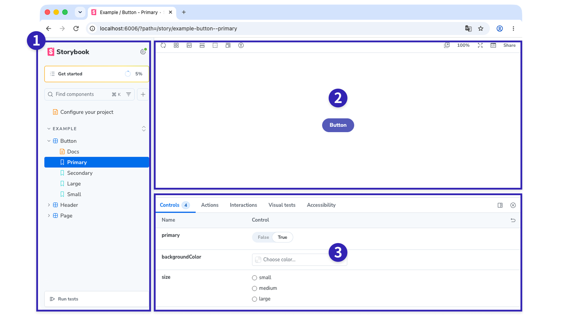
- Sidebar: Lists the example components and stories
- Canvas: Displays a preview of the selected story
- Bottom panel: Displays add-ons such as Controls
Storybook also includes an “Interactions” tab for testing user interactions and a “Visual tests” tab for visual regression testing (VRT).
Create stories for the notice list
Create a NoticeList component that displays the notice list. Add a components directory for React components and arrange the files as follows.
src/components/NoticeList/
  NoticeList.tsx
  NoticeList.css
The component accepts the following props. See the repository for the complete implementation.
export type Notice = {
  /** Internal ID */
  id: string;
  /** Publication date */
  publishedAt: string;
  /** Title */
  title: string;
};

export type NoticeListProps = {
  /** List of notices */
  notices: Notice[];
  /** Whether to show the loading state */
  isLoading?: boolean;
};

export function NoticeList({ notices, isLoading = false }: NoticeListProps) {
  // Render the dates and titles in a list (implementation omitted)
}
Component states are registered as stories. For example, if a button has normal and disabled states, create two stories. In each story, define the prop values passed to the component in args.
Name the file with a .stories.tsx suffix, as in NoticeList.stories.tsx. Storybook recognizes it as a story file when its path matches the pattern specified by stories in .storybook/main.ts. Place the story file in the same directory as NoticeList.tsx.
src/components/NoticeList/
  NoticeList.tsx
  NoticeList.css
  NoticeList.stories.tsx
import type { Meta, StoryObj } from "@storybook/react-vite";
import { NoticeList } from "./NoticeList";
import "./NoticeList.css";

// Specify the component used by these stories
const meta = {
  component: NoticeList,
} satisfies Meta<typeof NoticeList>;

export default meta;
type Story = StoryObj<typeof meta>;

// Sample data containing titles of different lengths
const sampleNotices = [
  {
    id: "1",
    publishedAt: "2026-08-01",
    title: "Summer holiday closure",
  },
  {
    id: "2",
    publishedAt: "2026-07-28",
    title: "Website maintenance notice",
  },
  {
    id: "3",
    publishedAt: "2026-07-15",
    title:
      "Notice of a temporary service interruption for system maintenance, including the expected restoration time, affected services, and actions requested of customers",
  },
];

// Baseline state
export const Default: Story = {
  args: {
    notices: sampleNotices,
  },
};

// Loading state
export const Loading: Story = {
  args: {
    notices: [],
    isLoading: true,
  },
};

// Empty state
export const Empty: Story = {
  args: {
    notices: [],
  },
};

// Enough items to require scrolling
export const Scroll: Story = {
  args: {
    notices: Array.from({ length: 40 }, (_, index) => ({
      id: String(index + 1),
      publishedAt: "2026-07-01",
      title: `Notice ${index + 1}`,
    })),
  },
};
The following four stories have been registered.
- Default: The standard appearance
- Loading: The loading state
- Empty: The empty state
- Scroll: Enough items to require scrolling
Extracting each row into a separate component and registering its stories would make it possible to review each part independently. Because this example uses a small notice list, the rows were not separated. Instead, titles of different lengths were included in Default. For more complex patterns, separating the components makes their stories easier to create.
Column: use presentational components in Storybook
Components included in Storybook are easier to work with when they do not contain business logic such as API requests or navigation. The NoticeList in this example receives the notice array and loading state through props and only renders the supplied values.
Components that receive only the values required for presentation through props and contain no business logic are sometimes called presentational components.
Which patterns should be registered?
Beyond the patterns in this demo, ICS uses the following criteria when creating stories.
- Minimum and maximum values: Text from short to long and item counts from few to many, including counts that trigger scrolling or reach a display limit. For long text, truncating with an ellipsis or wrapping changes the row height and affects neighboring elements
- Empty and zero values: Empty strings, whitespace,
null,undefined, and lists containing no items - States such as loading: Cases where a flag, rather than the amount of data, changes the appearance
- Sort order: Cases where the component sorts items by date, view count, or another value. Fixed data makes it possible to confirm that the first item, last item, and items with equal values appear in the intended order
- Character set differences: ASCII letters, full-width alphanumeric characters used in Japanese typography, and Japanese text can produce different label widths even when they contain the same number of characters
Minimum and maximum values, empty states, and sort order are the same considerations used when testing boundary values and empty inputs in unit tests. See the article “JavaScriptのユニットテストを始めよう.” Storybook adds states that can only be evaluated after rendering, such as loading indicators and differences between character sets.
These criteria help identify display patterns that were not anticipated in the design. There is no need to cover every case at once. Start adding stories for components with many variations, such as shared buttons, and for states that are difficult to reach through normal interaction, such as error messages.
The Storybook below demonstrates these criteria as stories. The sidebar also contains stories for other components.
Article ranking
This component ranks articles by view count. Each row displays the rank, title, and view count, while the ranks of the top three items are highlighted with medal colors.
Titles are limited to one line and truncated with an ellipsis. Switching between Japanese and English changes where the truncation begins. Japanese also lets you compare third place, which uses a medal color, with fourth place, which does not. TiedRanks shows how items are ranked when view counts are equal, EmptyTitle contains a row with an empty title, and Empty shows the list with no items.
Side menu
Space is limited in side menus and table headers. A label that fits on one line in Japanese may wrap onto two lines in English, causing item heights to become uneven. In this demo, all five Japanese labels fit on one line, but two of the English labels wrap onto two lines. Switch between Japanese and English to compare them.
The JapaneseWithBadge and EnglishWithBadge stories add count badges, which reduce the width available to the labels. The badge display is capped at 99+ for counts of 100 or more.
For the CSS wrapping techniques themselves, see “文章の折り返し指定のCSS最新版” and “CSSで文節の折り返しを! br・wbrとauto-phraseの活用術.”
Use Controls for temporary checks
The Controls panel at the bottom or side of the Storybook interface lets you change args values and review the resulting appearance immediately.
For example, open Japanese for the article ranking and use Controls to add items to articles or edit the title strings. This makes it possible to inspect an empty title or changes in the sort order after modifying view counts without editing the file directly.
Controls provides an input for each prop, making it useful for experimentation before changing the code. To change the type of input, such as using a slider for a number, specify it with argTypes in the story meta.
A general distinction is as follows.
- Story: A state worth revisiting. Giving it a name and saving it makes it available for review after a design change
- Controls: A temporary experiment. When a value becomes worth keeping, turn it into a story
▼ Controls interface
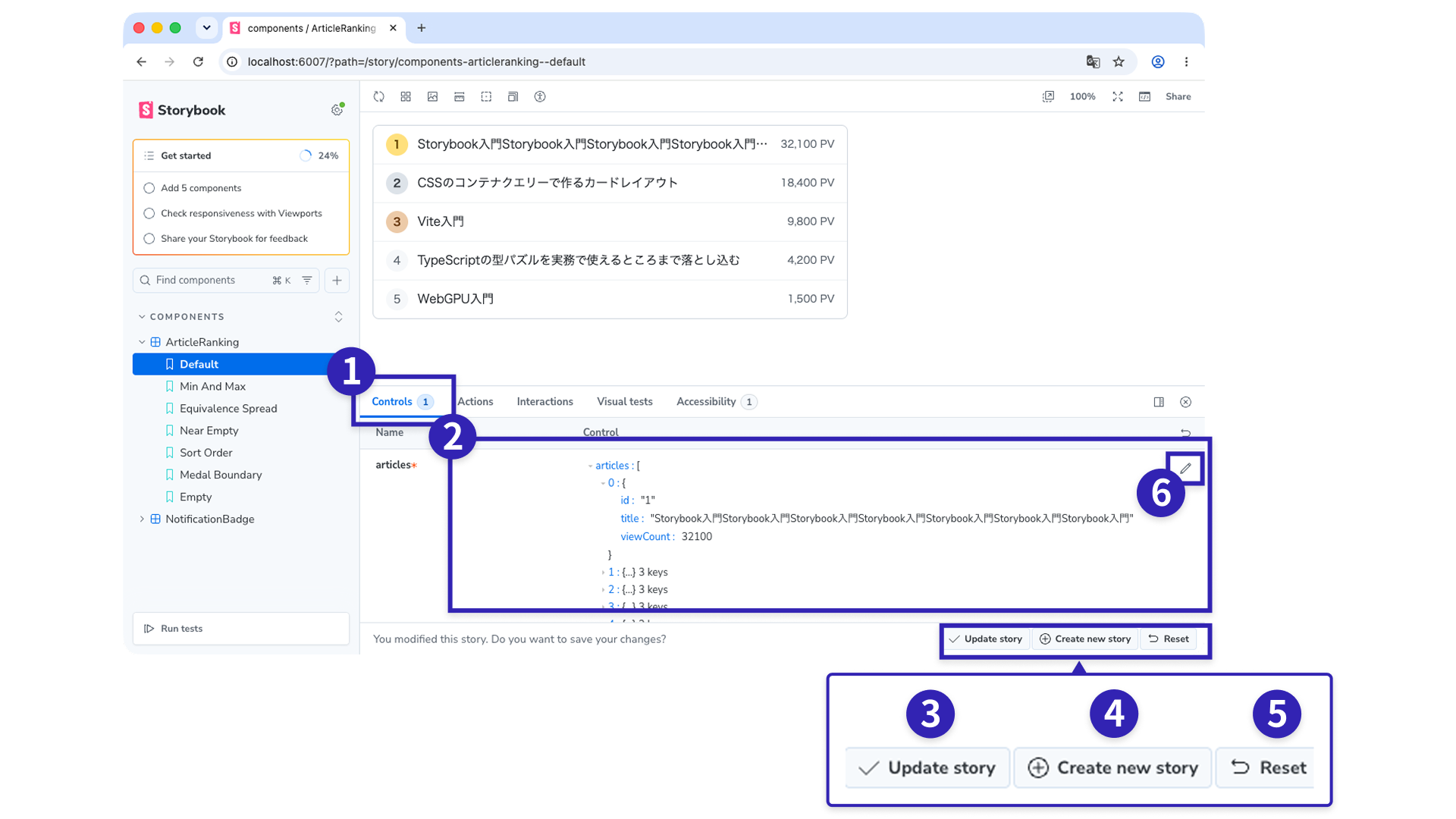
- Controls tab
- Controls editing area: Change the
argsvalues directly - Update story button: Overwrite the open story with the edited values
- Create new story button: Enter a story name and add the edited values to the same story file as a separate story
- Reset button: Restore the original values
- Edit … as JSON: Switch a prop between form controls and JSON editing, with the prop name shown in place of the ellipsis
The Update story, Create new story, and Reset buttons appear only after a value has been changed in Controls while Storybook is running locally with npm run storybook. They do not appear in a static Storybook generated with build-storybook.
When changing Controls in a static Storybook, use Edit … as JSON on the right side of Controls to switch to JSON editing, copy the values, and paste them into the story file.
Column: extend stories with add-ons
Stories are useful for more than reviewing appearance. Add-ons allow registered stories to be used in tests or accessed by coding agents.
Note: The testing add-ons are installed when “Recommended” is selected during setup. The MCP add-on can be installed through the prompt about AI features.
- Component testing (
@storybook/addon-vitest): Runs the stories together as Vitest tests to confirm that each one renders without errors - Visual regression testing (
@chromatic-com/storybook): Compares screenshots of stories before and after a change to detect unintended visual differences. This requires connecting a Chromatic account, which performs the visual comparison in the cloud - Accessibility checks (
@storybook/addon-a11y): Checks the displayed story and lists issues such as insufficient contrast in the panel at the bottom of the screen - Coding agent integration (
@storybook/addon-mcp): Allows coding agents to reference stories and component APIs, create stories, and run tests. At the time of writing, it is available for React. For details, see the official blog post Storybook MCP
If an add-on is not installed, the following commands install its package and automatically register it in .storybook/main.ts. Add the add-ons that suit the project.
npx storybook add @storybook/addon-a11y
npx storybook add @storybook/addon-vitest
npx storybook add @chromatic-com/storybook
npx storybook add @storybook/addon-mcp
Conclusion
Adding Storybook and creating stories makes it possible to adjust styles while switching among component states. Naming states that everyday data can easily miss, such as an empty list, a loading state, or exceptionally long text, reduces the risk of overlooking them after the design changes.
Start by creating stories for components with many display patterns, such as cards and badges. For a refresher on environment setup, see “Vite guide - HTML, TypeScript, React, Vue, and Tailwind CSS.” For more on boundary values, see “JavaScriptのユニットテストを始めよう.”