
This article explores variable fonts, a technology that expands the possibilities of typographic expression. It looks back at the evolution of typography on the web and explains why variable fonts emerged and what makes them compelling.
The evolution of fonts
Digital fonts have evolved in many ways over the past half-century, from the shift to outline fonts and competing format standards to the arrival of web fonts. First, here is a brief history.
The bitmap era
The earliest digital fonts were bitmap fonts. A bitmap font represents each character as a collection of dots. They are still used today on some devices and in designs intended to evoke a retro aesthetic.
Compared with the digital fonts commonly seen today, bitmap fonts look quite rough. Their biggest limitation is practical: they display correctly only at the size for which they were designed. Enlarging a font intended for 12px makes each pixel larger and the text harder to read. Because every character contains a fixed number of dots, a separate font must be created for each font size. Outline fonts, introduced next, solved this problem by making fonts scalable.
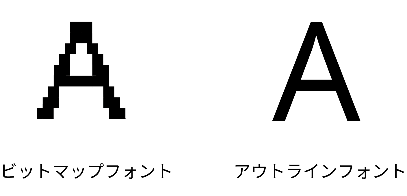
Outline fonts
Unlike bitmap fonts, which are drawn as dots, outline fonts are rendered from vector outlines. Most fonts in use today are outline fonts.
Outline fonts began with Adobe’s development of PostScript fonts. Microsoft and Apple responded by jointly introducing TrueType fonts as a competing format. TrueType development was led by Microsoft. As a result, the format became widespread on Windows, while TrueType and PostScript coexisted on the Mac. This led to compatibility problems between Windows and Mac.
To solve the problem, Microsoft and Adobe joined forces to develop OpenType fonts. OpenType was based on TrueType and also supported PostScript outlines, so it can use more than one file extension. OpenType fonts with PostScript outlines use the .otf extension, while those with TrueType outlines usually use .ttf. This can be slightly confusing: an OpenType font in .ttf format may be described as a “TrueType-flavored OpenType font.” The distinction comes from the different ways TrueType and PostScript calculate outlines.
How OpenType evolved:
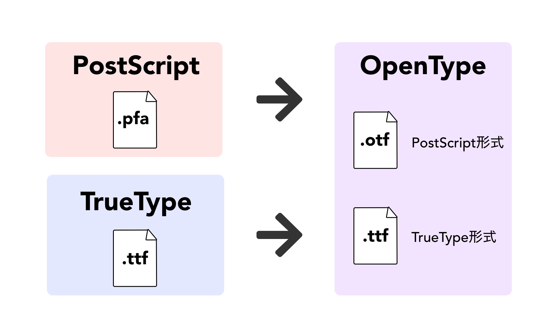
OpenType did more than provide cross-platform compatibility. It also greatly increased a font’s glyph capacity, allowing a single font to contain as many as 64,000 glyphs. A glyph defines the visual shape of a character. To display “a,” for example, the system maps Unicode U+0061 to the corresponding glyph. The same Unicode character can be represented by different glyph designs in bold, light, italic, and other styles. A larger glyph set therefore gives a font greater expressive range.
OpenType also enabled finer typographic controls, including detailed character spacing. The following example applies proportional metrics with the CSS font-feature-settings property. For more information, see Using CSS font-feature-settings for better kerning in Japanese text.
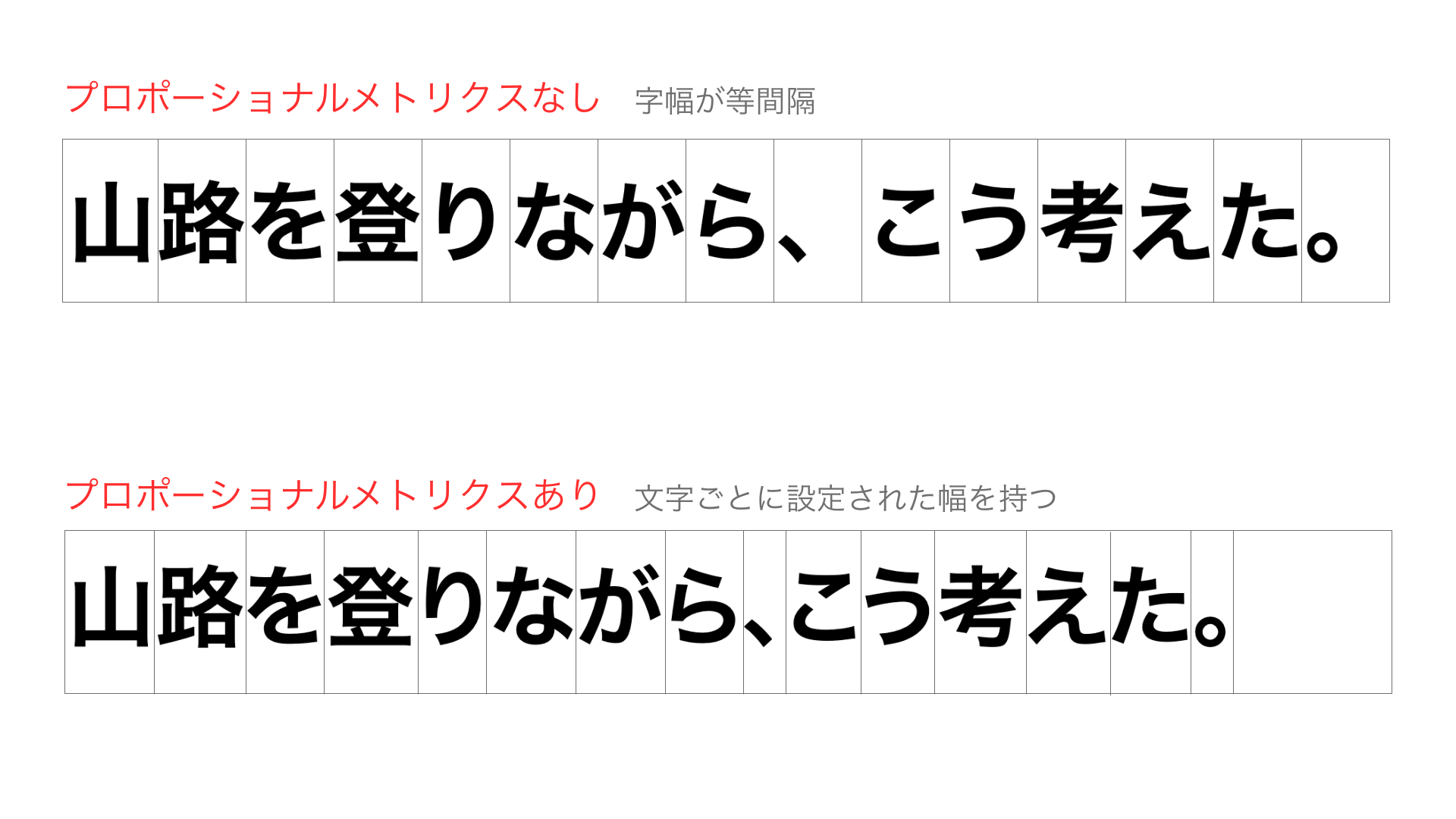
Fonts were becoming steadily more expressive, but that expressiveness could still be used in only a limited range of contexts.
The arrival of web fonts
OpenType enriched typography on computers, but the same was not initially true on the web. The reason was simple: browsers could display only fonts installed on the user’s computer.
Fonts such as Meiryo and Yu Gothic on Windows, and the Hiragino Kaku Gothic family on macOS, are installed by default and therefore display reliably. A specialized font specified with the font-family property, however, will not appear on a computer that does not have it.
Web fonts emerged as the solution. A font file is hosted on a server and downloaded by the browser when the page loads, allowing the specified font to appear regardless of the user’s environment.
The major problem with web fonts was their enormous file size. OpenType fonts can contain information for as many as 64,000 glyphs. The flip side is that the file grows with the amount of glyph data it contains. Every additional font style increases the total transfer size further.
Developers generally handle the interval before a web font finishes loading in one of two ways:
- FOUT (Flash of Unstyled Text): display a fallback font until the web font has loaded
- FOIT (Flash of Invisible Text): keep the text hidden until the web font has loaded
With FOUT, the font changes after the initial render, which can disrupt the user experience. With FOIT, a slow connection may leave the text invisible for too long. JavaScript is sometimes used to combine and control both approaches.
Google and Adobe, for example, have recommended controlling font loading with Web Font Loader. It supports timeout handling and CSS classes for different loading states. Font formats optimized for the web, especially .woff and .woff2, have also become standard.
Even so, large font files remain difficult to manage. Variable fonts emerged in response to the need to reduce the disruption that FOIT and FOUT can cause.
From web fonts to variable fonts
Variable fonts were jointly announced by Apple, Google, Microsoft, and Adobe in September 2016.
Their defining feature is the ability to interpolate continuously across parameters such as optical size, weight, and width. Each parameter is called an axis, and the font changes shape according to the axis value. A variable font contains several master designs and calculates intermediate forms between them based on the axis values.
The following demo changes the font’s weight and width dynamically.
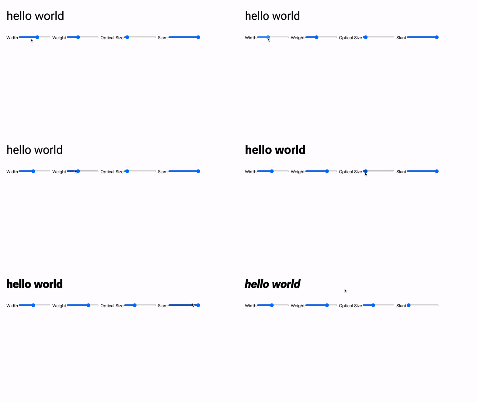
Only one font file is loaded in this demo. Compared with conventional OpenType implementations that require separate files for different styles, a variable font can express many styles with a smaller total file size. When used as a web font, it can also be delivered more quickly.
Exploring variable fonts
The following sections examine variable fonts in more detail.
Understanding variable fonts starts with their axes. The five registered axes are weight, width, italic, slant, and optical size. Each axis is addressed in code with a four-letter tag.
| Axis | Tag |
|---|---|
| Weight | wght |
| Width | wdth |
| Italic | ital |
| Slant | slnt |
| Optical size | opsz |
Only axes included in a font can be interpolated. For example, a font that defines only one ital value will keep the same italic state regardless of the value supplied.
Optical size is a design variation tied to text size. At small sizes, glyphs may use simplified forms; at large sizes, they may include finer details and decoration. Optical sizing generally follows the font size automatically, although some fonts also allow manual control. In the earlier demo, subtle changes in the balance of the letters can be seen as the optical-size value changes.
Using Roboto Flex as an example
To make the concepts concrete, this article uses Roboto Flex, which is distributed under the SIL Open Font License.
Links to other sources of variable fonts are included at the end of the article.
After obtaining the font, it is tempting to load it into HTML immediately. Before doing that, inspect what the font can do. Wakamai Fondue shows a variable font’s axes and their minimum and maximum values, and it lets you interactively preview the results. Load the downloaded Roboto Flex file into the site.
In addition to the registered axes wght (Weight), wdth (Width), opsz (Optical Size), and slnt (Slant), several uppercase axes appear. Variable-font developers can define their own custom axes.
Roboto Flex includes an axis named GRAD. Changing its value adjusts the visual weight in a different way from wght.
In summary, variable fonts have the following characteristics:
- They include registered axes such as weight and width.
- Some also include custom axes.
- Each axis has a minimum and maximum value, with intermediate values generated through interpolation.
Setting variable-font parameters with CSS
Now it is time to display the font. Create an HTML file, add CSS, and follow the steps below.
Variable-font support across operating systems and browsers can be checked at Variable Fonts – Support.
- Load the font with
@font-face
@font-face {
  font-family: "Roboto Flex";
  src: url("./fonts/RobotoFlex-VF.woff2") format(woff2) tech(variations);
  font-weight: 100 1000;
  font-stretch: 25% 151%;
}
First, load the font. Use the .woff2 format for web delivery. The format(woff2) tech(variations) notation tells the browser that the resource is a variable font. It is equivalent to the older format("woff2-variations") syntax; the newer form is now recommended. Give font-weight and font-stretch two values each to define the minimum and maximum weight and width.
- Set axis values with
font-variation-settings
p {
  font-size: 48px;
  font-family: "Roboto Flex", sans-serif;
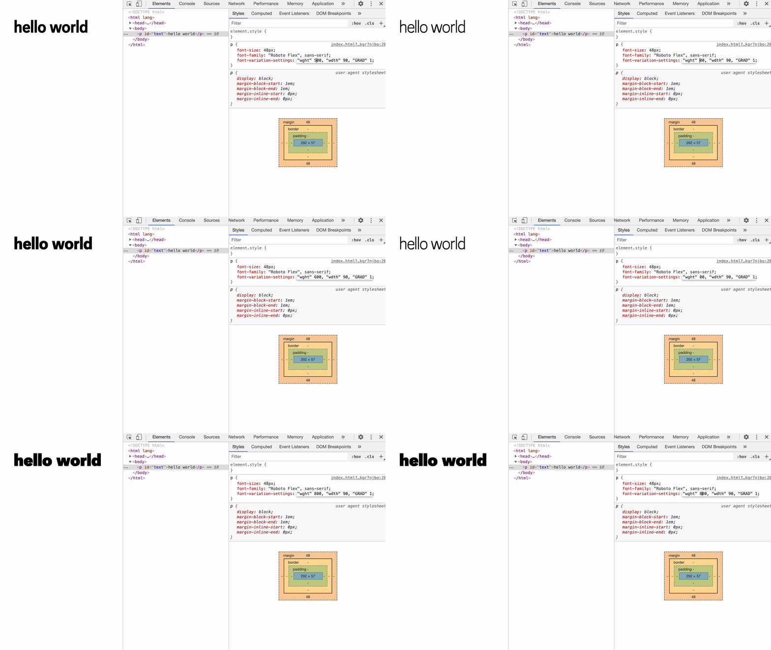
  font-variation-settings: "wght" 400, "wdth" 90, "GRAD" 1;
}
Each axis is written in font-variation-settings as the axis tag followed by its value.
When viewed in the browser, the supplied values are applied to the font. Changing them in the developer tools changes the letterforms.
Animating a variable font
Because the parameters of a variable font vary continuously, they can also be animated.
p {
  font-size: 48px;
  font-family: "Roboto Flex", sans-serif;
  font-variation-settings: "wght" 400, "wdth" 50, "GRAD" 1;
  animation: width-animation 1s ease infinite alternate;
}

@keyframes width-animation {
  from { font-variation-settings: "wght" 400, "wdth" 50, "GRAD" 1; }
  to   { font-variation-settings: "wght" 400, "wdth" 151, "GRAD" 1; }
}

One important point is to include values that do not change between the start and end states. In the example above, wght and GRAD must be specified in both keyframes. If they are omitted, they return to their default values and the font will not look as intended.
Incorrect example:
p {
  font-variation-settings: "wght" 400, "wdth" 50, "GRAD" 1;
  animation: width-animation 1s ease infinite alternate;
}

/* Incorrect: the wght and GRAD values set above are reset. */
@keyframes width-animation {
  from { font-variation-settings: "wdth" 50; }
  to   { font-variation-settings: "wdth" 151; }
}
Managing parameters with CSS custom properties
Storing axis values in CSS custom properties is convenient. When values need to be changed dynamically with JavaScript, only the custom properties have to be updated.
:root {
  --wght: 400;
  --wdth: 100;
  --GRAD: 1;
}

p {
  font-size: 48px;
  font-family: "Roboto Flex", sans-serif;
  font-variation-settings: "wght" var(--wght), "wdth" var(--wdth), "GRAD" var(--GRAD);
}
From JavaScript, the custom-property values can be updated directly. In a CSS animation, however, unregistered custom properties do not interpolate, so the font-variation-settings property itself must be animated. The incorrect and correct versions are shown below.
/* Incorrect: unregistered custom properties do not interpolate. */
@keyframes width-animation {
  from { --wdth: 25; --wght: 100; }
  to   { --wdth: 151; --wght: 100; }
}

/* Correct */
@keyframes width-animation {
  from { font-variation-settings: "wght" 100, "wdth" 25; }
  to   { font-variation-settings: "wght" 1000, "wdth" 151; }
}
Finding variable fonts
Google Fonts and Adobe Fonts, two widely used font services, both provide filters for finding variable fonts.

Unconventional variable fonts
Variable fonts are powerful enough on their own, but the same mechanism has also been used to create fonts that do not represent text.
Anicons is a variable icon font based on Google Material Icons. Characters such as A and B are mapped to individual icons.
Its only axis is TIME, and changing the value animates the icons.
Combining Anicons with CSS animation produces effects like the following.
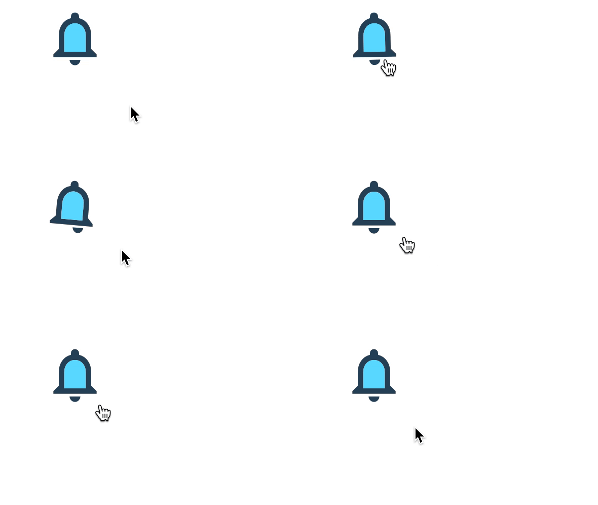
This is one example of how variable-font technology can be applied beyond conventional typography. It will be interesting to see what kinds of fonts emerge next.
Japanese variable fonts finally arrive
Japanese readers who have reached this point may be wondering:
Are there any Japanese variable fonts?
Latin-script fonts require a relatively small character set. Japanese fonts must cover hiragana, katakana, and thousands of kanji, which raises production costs and results in much larger files. For these reasons, Japanese variable fonts were unavailable for a long time.
That changed in April 2021, when Adobe announced a variable version of Source Han Sans. In Japan, the typeface is known as Gen-no-kaku Gothic.
Source Han Sans Variable overcomes the file-size problem described above and reduces the font to a practical size. It includes Chinese, Japanese, and Korean glyphs, but using a regional subset, such as the Japanese-only font, reduces the size further.
The full set of non-variable Pan-CJK Source Han Sans 2.002 fonts is 593.7 MB, while the equivalent variable font, packaged as a single OTC file, is only 32.9 MB. The regional subset fonts are even smaller.
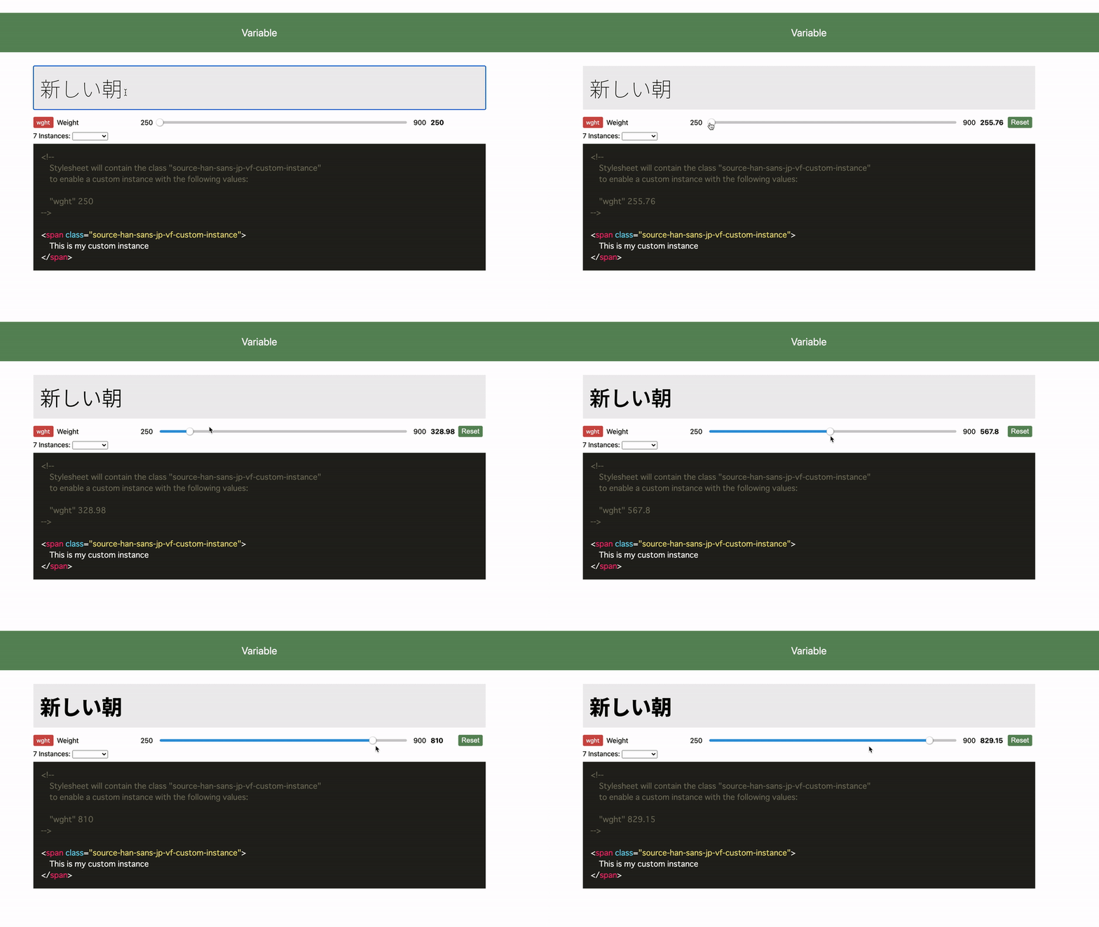
The Japanese subset, SourceHanSansJP-VF.otf, is 7.75 MB. After loading it into Wakamai Fondue and adjusting the Weight axis, the font interpolates cleanly across the range.
Google also provides Noto Sans CJK Variable. A serif version is available in the same repository as Noto Serif CJK Variable.
Noto Sans JP and Noto Serif JP on Google Fonts
Noto Sans JP, which Google Fonts labels “Noto Sans Japanese,” and Noto Serif JP, labeled “Noto Serif Japanese,” are widely used on Japanese websites. Google Fonts has distributed both as variable fonts since 2024.
The wght axis ranges from 100 to 900 for Noto Sans JP and from 200 to 900 for Noto Serif JP. To load Noto Sans JP from Google Fonts, use the variable-font notation wght@100..900.
<link
  href="https://fonts.googleapis.com/css2?family=Noto+Sans+JP:wght@100..900&display=swap"
  rel="stylesheet"
/>
In CSS, any value within the supported range can be specified, such as font-weight: 450. There is no need to use font-variation-settings; the standard font-weight property can control the weight continuously.
The Noto Sans CJK Variable files on GitHub bundle Chinese, Japanese, and Korean glyphs into a single file. The Google Fonts version uses Unicode-range subsetting to reduce transferred data and is organized specifically for web delivery.
Operating systems are also adopting Japanese variable fonts. An April 2025 Windows update added Noto Sans JP to Windows 10 and Windows 11, and Noto Serif JP to Windows 11. The font files are named NotoSansJP-VF.ttf and NotoSerifJP-VF.ttf.
Starting with Android 15, released in October 2024, the bundled Noto Sans CJK JP is also a variable font, so it can render finer weight gradations specified with font-weight.
Differences in naming and implementation across environments are explained in ウェブ制作者のためのNoto Sans JP最新実装ガイド.
Adobe released Momochidori, a retro-inspired Japanese variable font, in February 2025.
Variable fonts are likely to become increasingly familiar in the years ahead.
Conclusion
This article reviewed the history of digital fonts and introduced variable fonts, a technology that expands the possibilities of typographic expression.
Variable fonts are now supported by major browsers and font services, making them far more accessible than before. They are not the right choice for every project, but they enable forms of expression that were difficult to achieve with conventional fonts.
Variable fonts are one technology to watch as new kinds of web experiences emerge.
References
- フォント用語集 | 文字の手帖 | 株式会社モリサワ
- Introduction to variable fonts on the web | Articles | web.dev
- Variable fonts - CSS | MDN
- The Typekit Blog | Variable fonts, a new kind of font for flexible design
- Creating a variable font | Glyphs: A useful guide to creating variable fonts.
Variable-font resources
- Google Fonts: Google’s font library, containing many fonts that are free to use. It also distributes Japanese variable fonts such as Noto Sans JP and Noto Serif JP.
- Adobe Fonts: A large collection of high-quality fonts, many of which can be used commercially through the service. Check the applicable license terms before use.
- Variable Fonts: A catalog of variable fonts from around the world, including both free and paid options.
- GitHub - TypeNetwork: A useful collection for experimentation, with many projects released under open font licenses. Projects such as Decovar also demonstrate the range of ideas being explored with variable fonts.
- Axis-Praxis: An experimental variable-font site. Fonts cannot be downloaded there, but many can be tested interactively. The Zycon icon font is a personal favorite.