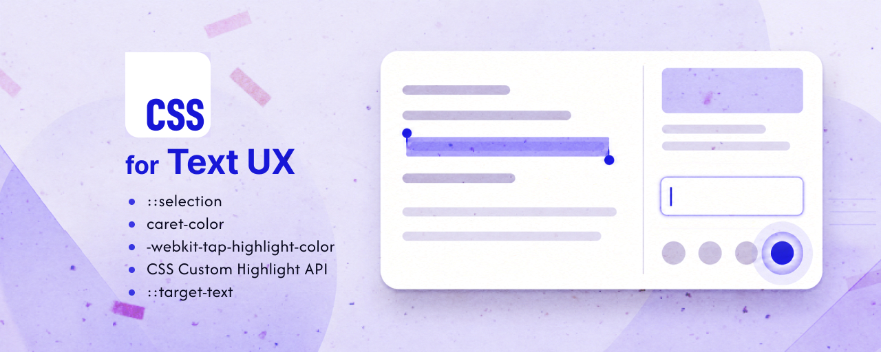
Adjusting how text looks is not only about making a page look nicer.
When selected text is visible, the input position is easy to identify, and tap feedback is clear, these visual cues tell users what is happening on the screen. They also give users confidence that their actions are being recognized correctly. This matters not only for visual design quality, but also for accessibility.
At the same time, text selection and input-related visuals are often left to the browser defaults. Depending on the page colors and UI design, selected text may blend into the background, or the caret, the vertical line that indicates the input position, may be hard to find.
This article introduces CSS approaches for the following issues.
- The selected text range is hard to see
- The caret blends into the background while typing
- The tap highlight on mobile does not match the design
- You want to highlight specific text ranges, such as search results or proofreading results, without adding extra tags to the HTML
- When a shared link jumps to a sentence in the middle of an article, it is hard to tell where to look
The sections below cover five cases: text selection, input position, tap feedback, arbitrary text-range highlights, and jump targets for shared links.
1. The ::selection pseudo-element - make selected text easier to see
In articles and documentation, users may select text to copy it, or temporarily drag over a passage they want to reread.
The ::selection pseudo-element lets you specify the background color and text color for text selected by the user. You can set the same selection color across the whole page, or use different selection colors for specific elements.
Try selecting the body text and code block text in the following demo.
Note: The default selection color depends on the OS and browser settings. In the top example of the demo, the page does not customize the selection color.
.good {
  .article::selection {
    /* For body text, use colors that do not blend into the background. */
    background-color: #ebe9fc;
    color: #3223b3;
  }

  .code-block::selection {
    /* For code blocks, use colors that remain readable on a dark background. */
    background-color: #bab4ff;
    color: #21136f;
  }
}
The important point is to consider the text color as well as the background color. Even if the selected range stands out, users will have trouble checking what they copied or rereading the selected text if the text itself becomes hard to read.
Selection styles are also part of the browser and OS behavior users are familiar with. Rather than changing them heavily only for decoration, customize them with a clear purpose, such as making the selected range easier to read or ensuring enough contrast with the background.
2. The caret-color property - make the input position easier to find
In forms and search boxes, users need to understand immediately where the next character will be inserted. When the background color or text color of an input field is customized to match the design, the caret shown during input can blend into the background and become difficult to see.
If the caret is hard to see, users may have trouble telling whether the input field has focus or where typing will begin. This problem is especially likely in dark themes and forms with dark background colors.
The caret-color property lets you specify the color of the caret shown during text input.
.bad {
  textarea {
    /* Bad example: a transparent caret makes the input position hard to find. */
    caret-color: transparent;
  }
}

.bad2 {
  textarea {
    /* Bad example: when the caret color is close to the background color,
       the input position becomes hard to find. */
    caret-color: #24146f;
  }
}

.good {
  textarea {
    /* Good example: use a bright color so the input position is easy to find. */
    caret-color: #ffe66d;
  }
}
The caret-color property can be applied to elements that accept text input, such as input elements, textarea elements, and elements with the contenteditable attribute.
Choosing a color close to the accent color or text color used in the UI can make the input position easier to find while keeping it visually consistent with buttons and links. On the other hand, if the caret color is close to the background color, the caret becomes difficult to see. Check that it has enough visibility while the user is typing.
The value can be auto, transparent, or any color. With auto, many browsers display the caret in a color close to the text color, but iOS Safari may display the OS default blue caret. Depending on the background color, that default caret color may blend into the background and become hard to see.
When form colors are heavily customized, do not rely only on auto. Check the contrast against the background, then specify caret-color when needed.
3. The -webkit-tap-highlight-color property - adjust tap feedback
When a link or button is tapped on a mobile device, a highlight may appear briefly. This highlight is feedback that tells the user the tap was recognized.
However, the browser’s default highlight color may feel disconnected from the design, or it may look too intense against the background. Removing it completely can make the feedback too weak.
The -webkit-tap-highlight-color property lets you adjust the highlight color shown when tapping in mobile browsers.
Try the demo on a mobile device, or watch the following video to compare the example that removes the highlight with the example that keeps it.
.bad {
  & a,
  & button {
    /* Bad example: making it transparent weakens the feedback
       that the tap was recognized. */
    -webkit-tap-highlight-color: transparent;
  }
}

.good {
  & a,
  & button {
    /* Good example: use a subtle color while keeping tap feedback visible. */
    -webkit-tap-highlight-color: rgb(50 35 179 / 0.32);
  }
}
Do not immediately remove the highlight with transparent just because the default color does not match the design. When the network is unstable, if no reaction is visible, users may think the tap did not work and repeat the same action several times. By adjusting the highlight to a subtle brand color or a color that blends with the background, you can keep the tap feedback while reducing visual disruption.
4. CSS Custom Highlight API - mark arbitrary text ranges
The ::selection pseudo-element introduced earlier styles a range selected by the user. But what should you do when the page itself needs to mark a specific text range?
Traditionally, arbitrary text ranges were often highlighted by wrapping them in span elements or rewriting the DOM with JavaScript. However, this can add tags that are unrelated to the document structure and make DOM manipulation more complex when content is updated dynamically.
The CSS Custom Highlight API lets you create Range objects in JavaScript and style them with the CSS ::highlight() pseudo-element, without rewriting the DOM.
::highlight(search-result-good) {
  /* Developer-defined highlights should be easy to distinguish
     from the selected range. */
  background-color: rgb(124 113 246 / 0.18);
}
For the basic usage of the CSS Custom Highlight API, including examples such as search term highlighting and proofreading input, see the article “CSS Custom Highlight API”.
One important point is what happens when the user’s selection overlaps with a developer-defined highlight. For example, if search results are shown with a dense yellow highlight and the user selects the same text, it may become difficult to tell which state is being shown.
A clearer approach is to keep search highlights subtle and make the user’s selection more distinct, so each state has a different visual priority.
5. The ::target-text pseudo-element - make shared-link targets easier to see
When you want to share a specific sentence in a long article or document, linking only to a heading may not be enough to point to the exact place. The user who opens the link has to search through the text below the heading to find the sentence the sender wanted to share.
Text fragments let you jump directly to specific text in a page by adding #:~:text= to the end of the URL.
https://example.com/article#:~:text=Text%20to%20share
In supported browsers, opening the link automatically scrolls to the matching text and highlights the target range.
The appearance of this highlight can be adjusted with CSS using the ::target-text pseudo-element.
The following demo compares jumping to the beginning of a section with a heading link and jumping directly to a sentence in the body text with a text fragment.
The heading link in the top example only moves to the section, but the shared link in the bottom example highlights the relevant part of the body text. Try it and see how the shared sentence becomes easier to find, even in a long article.
::target-text {
  /* Emphasize the target reached through a shared link
     while matching the body text colors. */
  background-color: #ebe9fc;
  color: #1f1b3f;
}
The ::target-text pseudo-element has a different role from the :target pseudo-class used when jumping to a heading with an id. The :target pseudo-class targets an element that matches the URL fragment, while ::target-text targets the matching text itself from a text fragment.
However, text fragments depend on the text in the destination page. If the text changes and no longer matches, the link may not jump to the intended location. For links that need to remain stable over time, prefer links to heading id values. Use text fragments when you want to point to “this specific sentence right now,” such as in quotations or search results.
Browser support
The ::selection pseudo-element
The ::selection pseudo-element is available in major desktop browsers such as Chrome, Edge, Firefox, and Safari. However, it is not available in iOS Safari, so if you want to adjust selection colors for mobile devices, check the appearance on real devices.
Reference: Can I use…
The caret-color property
The caret-color property is available in major modern browsers.
Reference: Can I use…
The -webkit-tap-highlight-color property
The -webkit-tap-highlight-color property is a non-standard property. It is mainly used to adjust the appearance of tap feedback in WebKit- and Blink-based mobile browsers, but because it is not guaranteed by a standard specification, treat it as a supplementary declaration.
Reference: Can I use…
CSS Custom Highlight API
The CSS Custom Highlight API is available in Chrome and Edge 105 (September 2022), Safari 17.2 (December 2023), Firefox 149 (March 2026), and later.
Reference: Can I use…
The ::target-text pseudo-element
The ::target-text pseudo-element is available in Chrome and Edge 89 (March 2021), Firefox 131 (October 2024), Safari 18.2 (December 2024), and later.
Reference: Web Platform Status
Conclusion
The WCAG 2.2 principle of “Perceivable” states that information and user interface components must be presented in ways users can perceive.
Small issues such as an unclear selection range while reading a long article, or losing sight of the caret and inserting text in the wrong place, can still interrupt the user. Reducing these small moments of uncertainty and stress is an important part of creating a more usable UI.
Text-related visuals are often treated separately from usability and design, but both matter. Ideally, UI design should care about both readability and visual quality. CSS continues to expand what can be adjusted directly in the browser, and these small details are worth checking as part of UI design.