CSS linear() gives animation much more flexibility. One example is spring animation, which creates motion like a spring. It can add lively energy to UI and give users a lighter, more satisfying sense of feedback.
Spring animation created with linear() can be used in both CSS transitions and CSS animations. It works well across many parts of a web page and is especially useful when you want small UI elements such as buttons, tabs, and toggle switches to feel more pleasant and responsive.
This article covers the following:
- UI effects that use spring animation
- How to adjust
linear()values - Why spring animation is gaining attention
The following sections introduce original demos built with spring animation.
Common UI patterns
These examples work especially well for small UI elements.
Segmented button
This demo switches the selected state of a segmented button. The background slightly overshoots and settles into place, which creates the spring effect.
The moving background uses CSS Anchor Positioning (see CSSアンカーポジショニング入門〜anchor()・anchor-size()の使い方〜).
Toggle switch
This demo uses spring animation for the round thumb as it moves horizontally. When the switch changes state, the thumb moves as if it lightly hits a boundary and settles, which gives the interaction a softer feel.
UI patterns with entrance and exit motion
Spring animation is also effective for UI patterns such as notifications, dialogs, and side menus.
Toast notification
This demo shows a notification appearing from the top edge of the screen. It helps direct the user’s attention. The toast moves like a spring as it appears.
Modal dialog
This demo shows a dialog element appearing near the button that was pressed. Because a dialog interrupts the current view, adding motion softens the abruptness. It also makes it easier to understand which action opened it.
This demo is easier to understand alongside the article HTML dialog element for modal UIs.
Popover menu
This demo shows a menu appearing near a button.
Popover is a feature available directly in HTML (see 階層メニューやトーストUIが簡単に作れる新技術! JavaScriptで利用するポップオーバーAPI).
Floating action button menu
This demo shows a submenu expanding from a circular action button. Having the items appear one after another changes the feeling of the open and close interaction.
The layout uses CSS trigonometric functions (see CSSの三角関数を理解しよう! sin()とcos()でできる表現).
Accordion
This demo applies spring animation to opening and closing.
Using CSS interpolate-size makes accordion code simpler (see CSSでheight: autoでもアニメーションが可能に! interpolate-sizeとは).
Side menu
This demo shows a side menu appearing from off-screen. Spring animation gives it a softer feel.
Action sheet
This demo shows a sheet appearing from the bottom of the screen.
Exit motion
This demo shows an item being removed by moving the surrounding items.
This demo relies on quite a bit of JavaScript, but the effect is based on FLIP animation (see JavaScriptで実現するFLIPアニメーションの原理と基礎).
UI patterns with changing shapes or text
Spring animation can also work well for UIs whose shapes change, and even for text.
Morphing search form
This demo changes shape as the search form expands. Morphing refers to motion in which one shape transforms into another.
Morphing submit button
This demo switches the shape of a submit button. In UI that shows a state change after the button is pressed, spring animation can create a more continuous flow.
Text animation (bonus)
This is slightly outside the category of interactive UI, but it shows characters appearing one after another. The animation starts when the element enters the viewport as the page scrolls.
Because this demo uses Scroll-driven Animations (see CSSだけでスクロールアニメーションが作れる!? 新技術Scroll-driven Animationsとは), try scrolling and watching it again (supported in Chrome and Edge 146 or later).
The scattered letter reveal effect uses CSS sibling-index() (see CSS staggered animations with sibling-index() and sibling-count()).
What is spring animation?
At this point, it helps to clarify what spring animation actually is.
Spring animation converges toward its endpoint while including small overshoots and oscillations along the way. As the name suggests, it resembles a spring stretching and compressing before settling down. Because it imitates physical motion, it is well suited to expressing natural response and feedback.
CSS linear() makes this possible on the web. The linear() function is not dedicated to spring animation, but by specifying multiple points, it can approximate many kinds of motion. That makes it possible to create curves such as spring and bounce motion that are difficult to reproduce with the traditional cubic-bezier() function. In other words, it approximates the curve by linearly interpolating many points.
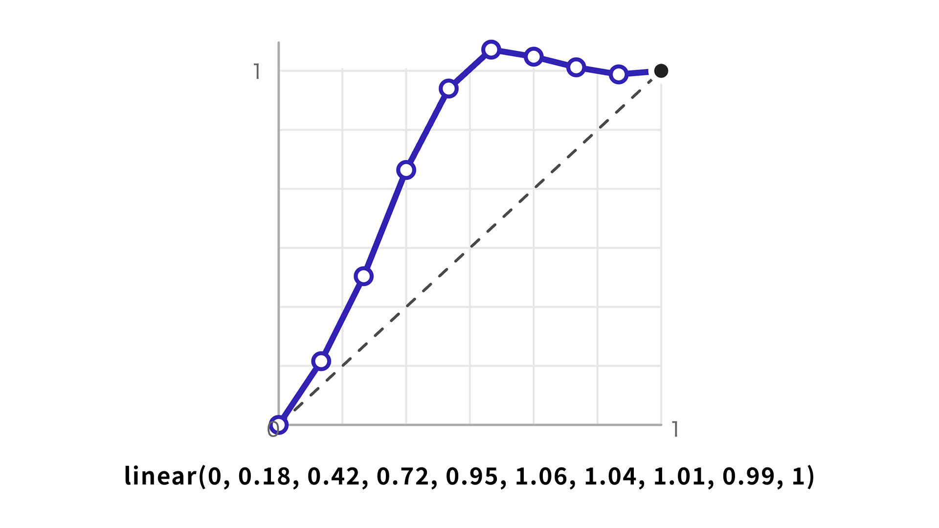
:root {
  --ease-spring: linear(0, 0.18, 0.42, 0.72, 0.95, 1.06, 1.04, 1.01, 0.99, 1);
}

.button {
  transition: all 1s var(--ease-spring);
}
For more details, see CSSイージングのお手本 - ease-out, ease-in, linearの使い分け.
Generate linear() values with a web tool
The web tool Easing Functions Editor from Anime.js is useful for creating linear() values. It lets you visualize a spring curve, adjust it, and export it as CSS.
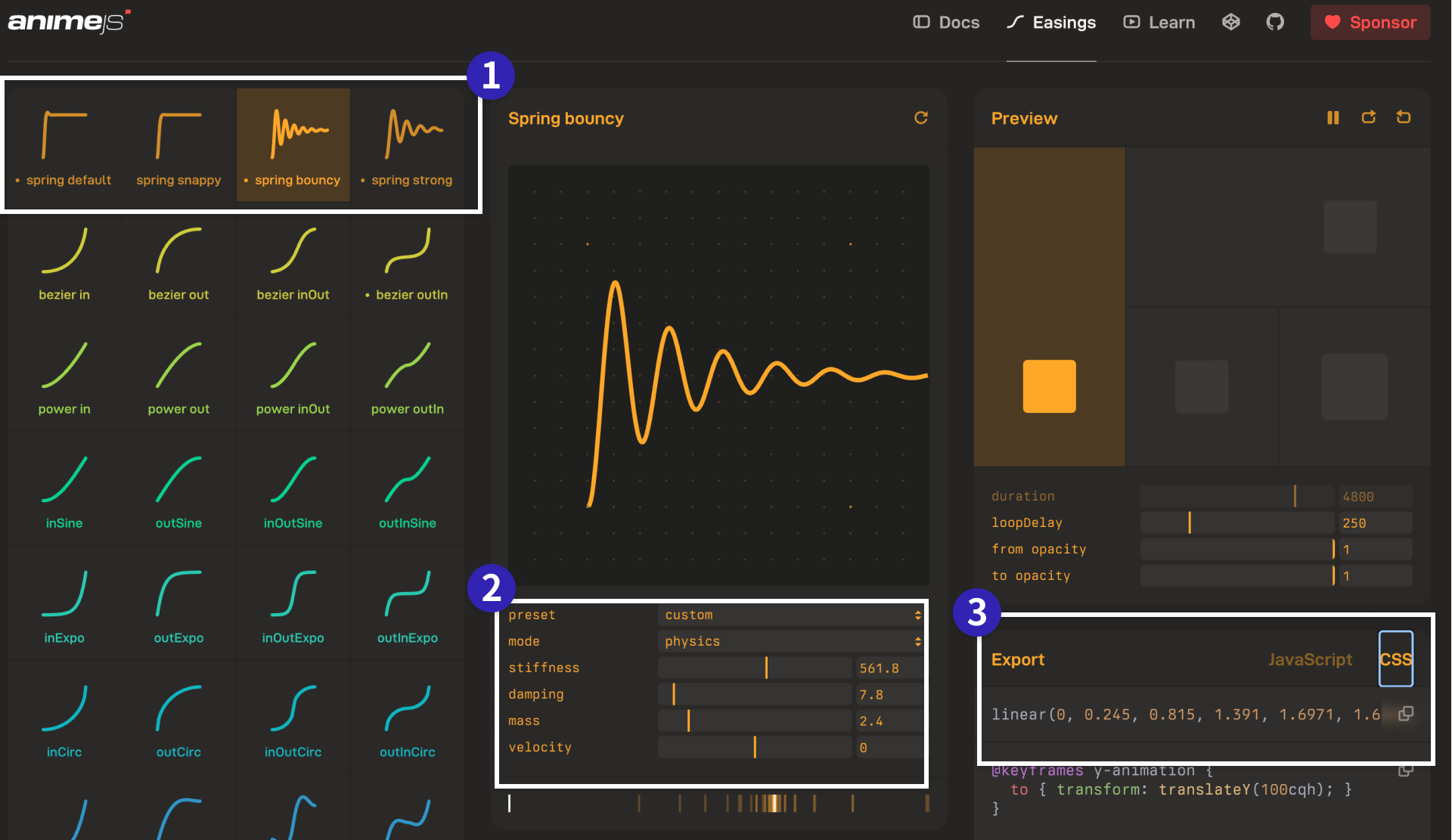
Choose [Export] → [CSS] in the lower-right corner, then copy the code that starts with linear(0, ....
Spring animation has four parameters:
mass: The mass of the spring. Higher values make the motion feel heavier.stiffness: The stiffness of the spring. Higher values make it settle faster.damping: The damping of the spring. Higher values reduce overshoot.velocity: The initial velocity. Higher values make the first movement larger.
Paste the exported value into CSS and use it as a custom property, as in the example below.
:root {
  /*
  Default spring curve
  https://animejs.com/easing-editor/spring/default
  */
  --ease-spring: linear(0, 0.0107, 0.0398, 0.0834, 0.138, 0.2003, 0.2677, 0.3379, 0.4089, 0.4791, 0.5471, 0.612, 0.6731, 0.7297, 0.7815, 0.8283, 0.87, 0.9068, 0.9388, 0.9662, 0.9892, 1.0083, 1.0237, 1.0357, 1.0449, 1.0514, 1.0556, 1.058, 1.0587, 1.0581, 1.0563, 1.0538, 1.0506, 1.0469, 1.043, 1.0388, 1.0347, 1.0306, 1.0266, 1.0228, 1.0192, 1.0159, 1.0128, 1.0101, 1.0076, 1.0055, 1.0036, 1.002, 1.0006, 0.9995, 0.9986, 0.9979, 0.9974, 0.997, 0.9967, 0.9966, 0.9966, 0.9966, 0.9967, 0.9968, 0.997, 0.9972, 0.9975, 0.9977, 0.998, 0.9982, 0.9984, 0.9987, 0.9989, 0.9991, 0.9992, 0.9994, 0.9996, 0.9997, 0.9998, 0.9999, 1, 1, 1.0001, 1.0001, 1.0002, 1.0002, 1.0002, 1.0002, 1.0002, 1.0002, 1.0002, 1.0002, 1.0002, 1.0002, 1.0001, 1.0001, 1.0001, 1.0001, 1.0001, 1.0001, 1.0001, 1.0001, 1, 1, 1);
}

.toggle__thumb {
  transition: all 1s var(--ease-spring);
}
Why spring animation is gaining attention
To understand why spring animation is gaining more attention, it helps to look at the background. Spring animation itself has existed since the Flash era around 2000, but adoption in mobile operating systems and similar interfaces increased around 2015 to 2018.
In Apple’s Designing Fluid Interfaces, elements on the screen are explained as objects connected by springs and pulled toward their target positions. In WWDC23: Animate with springs, spring animation is described as the only type of animation that maintains continuity both from rest and when an element already has initial velocity. Because it can be used from any initial velocity, it is well suited to starting an animation midway through a gesture.
Material Design 3’s Motion – Material Design 3 page also organizes the idea of springs. It explains that one spring can cover many situations, including screen transitions, button effects, and gestures. Another advantage is consistency: springs make it easier to keep motion and expression coherent across an entire product.
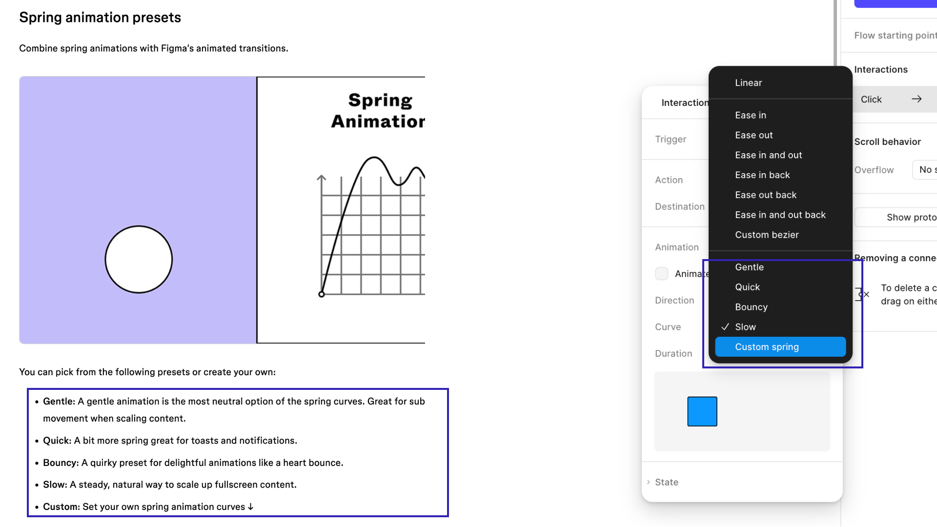
For these reasons, spring animation is spreading, and tool support is expanding as well. Figma’s prototyping features also support spring animation.
Spring animations in JavaScript libraries
Spring animation is also available in JavaScript libraries. In fact, JavaScript is where spring animation more naturally belongs. Some libraries, such as Motion’s spring and Anime.js’s Spring, let you work with springs directly. GSAP does not provide a direct spring API. For a broader comparison of JavaScript animation libraries, see 現場で使えるアニメーション系JSライブラリまとめ - GSAP, Anime.js, Motion, Tween.js, WebAnimationなど.
Column: how it differs from Elastic
Motion libraries have long included a category called Elastic. For people who have been creating motion for years, Elastic may feel more familiar than spring. Both can create a “boing” impression, but Elastic tends to overshoot the goal and wobble back several times, which makes it feel more like rubber and more dramatic.
Spring, by contrast, offers a wider range of adjustment. It can be tuned to feel lighter or heavier, stiffer or softer, and more or less damped. Spring also does not necessarily end in an obvious bouncing motion.
The following demo compares Elastic and spring so the difference in their character is easier to see. This demo is implemented with Anime.js.
This demo uses Elastic for a scroll effect. Compared with spring, the stronger oscillation makes the difference easier to see.
Finally, let’s touch on a slightly more advanced point. In tweening libraries, Elastic is an easing curve: given an input such as time, it deterministically returns a single value. A true spring, by contrast, is a convergence model based on physical behavior, so the time it takes to settle depends on its parameters. Put differently, a real spring animation is not a formula that uniquely determines the exact duration until convergence. Because physics-based spring animations internally preserve velocity, they can produce motion that continuously carries that velocity forward even when the target changes—for example, when an element is released during a drag. This is the benefit that design systems from Apple, Google, and others are referring to.
What this article introduces is only a spring animation in the sense of a curve that looks like a spring.
Conclusion
Spring animation is not just a way to make a UI feel new. It is a way to make results and spatial relationships easier to understand, improve the feeling of direct manipulation, and give the interface a more reassuring feel.
Use spring animation where it genuinely improves usability.
For a broader overview of easing, see CSSイージングのお手本 - ease-out, ease-in, linearの使い分け. To expand your set of UI ideas, see CSSアニメーションで実現! コピペで使えるマイクロインタラクション. The article イマドキのUIデザインには欠かせない! マイクロインタラクションを作るためのズルいAdobe CC活用テクニック(Adobe MAX JAPAN 2018発表資料) also explains why microinteractions matter.