Rendering speed matters. Google’s Core Web Vitals include metrics related to page speed. The time it takes for a page to appear affects not only user experience but also SEO. This article introduces techniques for improving image loading.
- Open the before-improvement demo in a new window
- Open the after-improvement demo in a new window
- View the code
Image Loading: Before / After
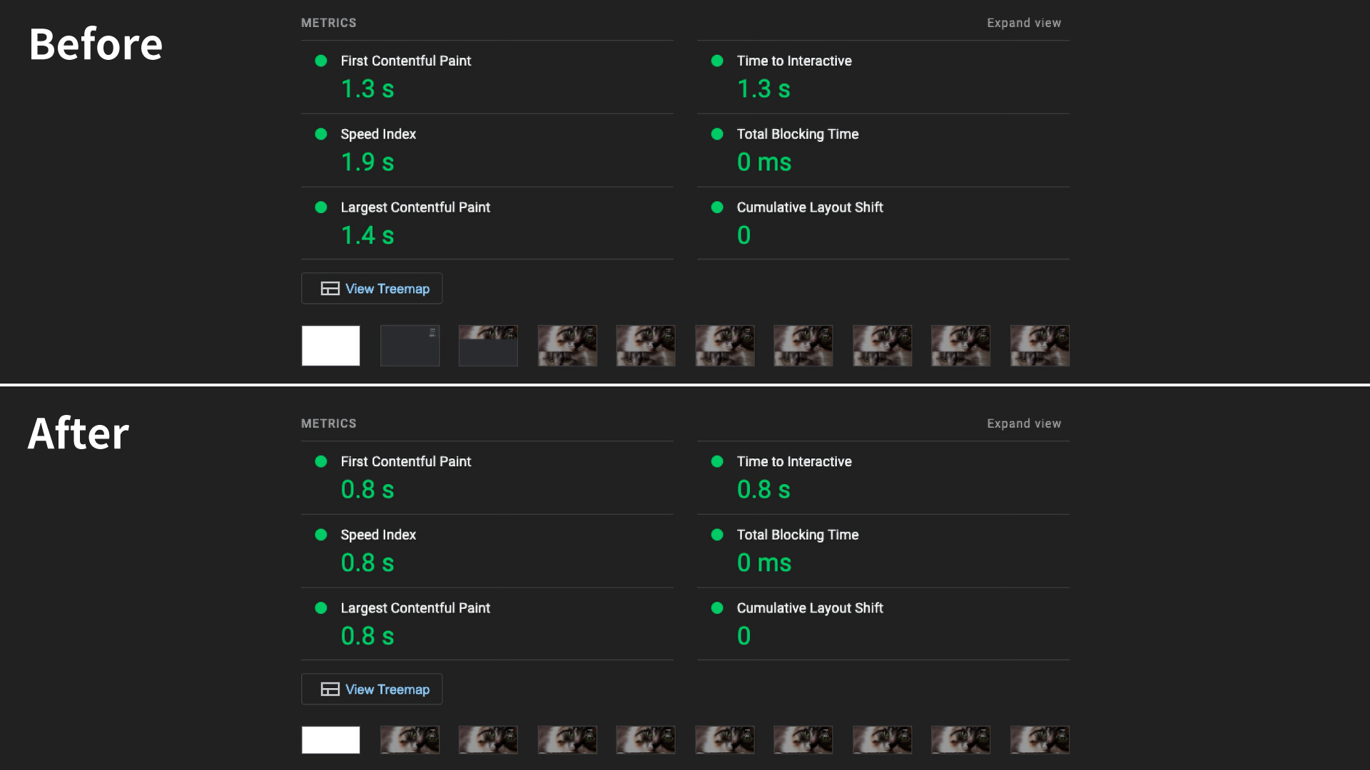
This is the result of a Lighthouse audit. Lighthouse is a measurement tool available in Chrome DevTools. To understand real-world behavior, also check PageSpeed Insights and Chrome UX Report (CrUX).
After the improvements, First Contentful Paint (FCP) improved by 0.5 seconds. Largest Contentful Paint (LCP) improved by 0.6 seconds, and Speed Index by 1.1 seconds.
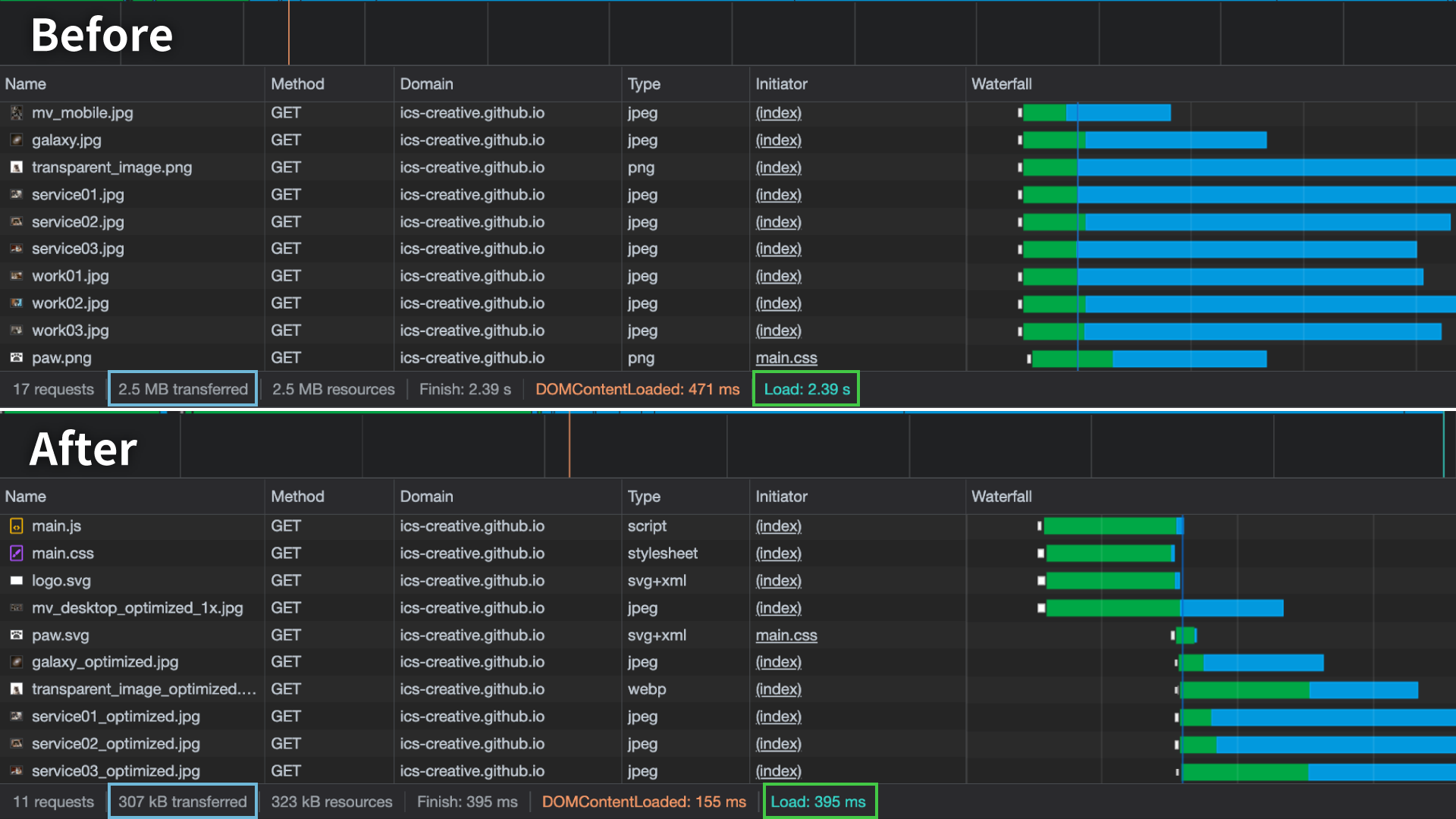
On 4G (10 Mbps), the initial load time dropped from about 2.4 seconds to about 0.4 seconds. Transfer size also fell from 2.5 MB to 307 kB.
Lazy loading with loading="lazy"
You can implement lazy loading by adding loading="lazy" to an <img> element. However, images near the first view, roughly within 2000px to 3000px from the top of the page, are still included in the initial load. Using it for images farther down the page reduces the initial transfer size.
It is safer not to use loading="lazy" on images in the first view. This is especially true for images that are likely to affect LCP. Delaying initially visible images can hurt LCP.
width and height are not required, but you should still set them. Without them, the browser cannot reserve space in advance. That can cause layout shifts. Even if you set the size in CSS, do not omit the width and height attributes.
Loading priority
The fetchpriority attribute lets you tell the browser the loading priority of an image. The values are high and low. You can check the priority in the Network tab.
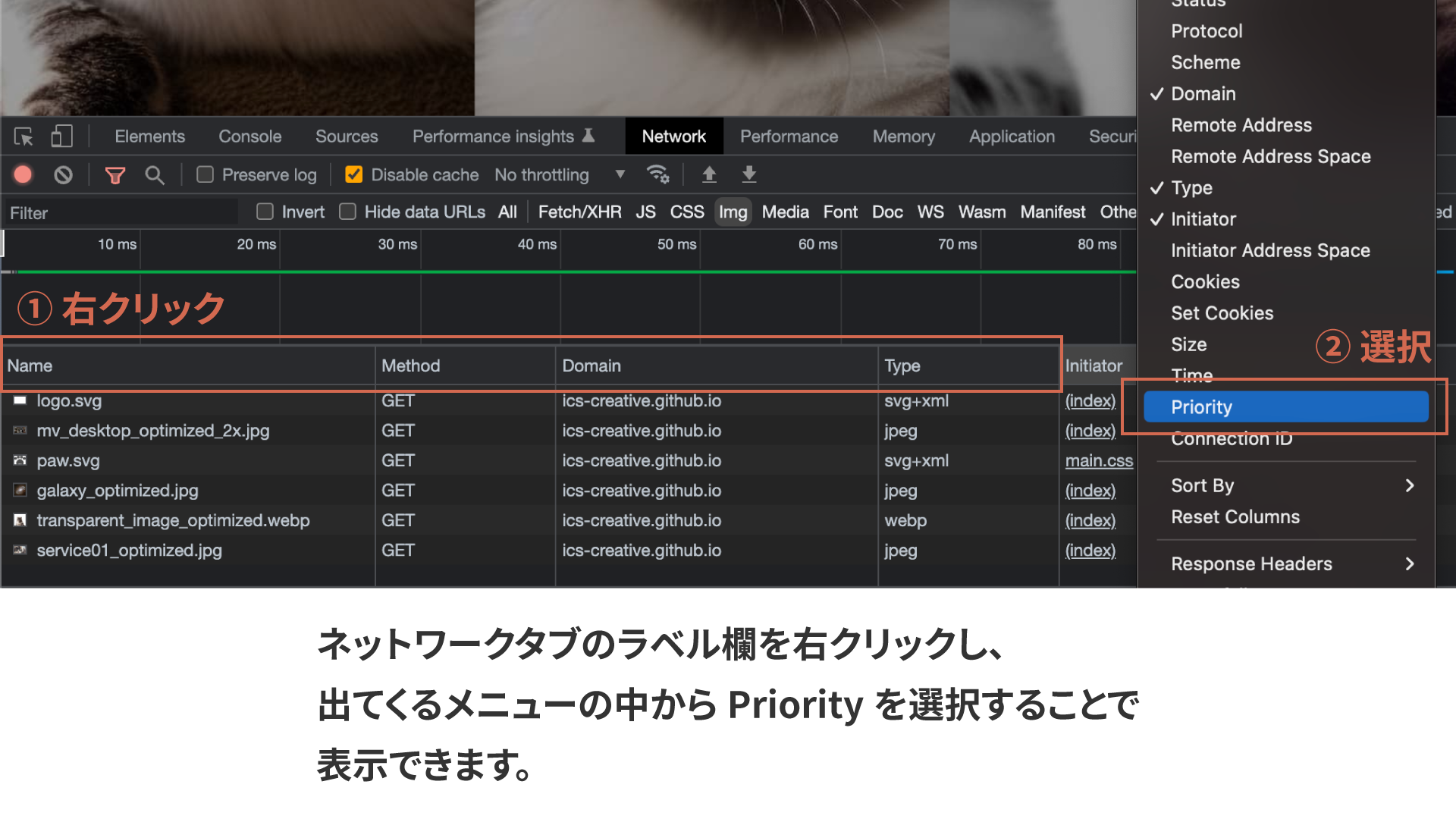
In the improved sample, fetchpriority="high" is applied to the main visual and logo. fetchpriority="low" is applied to the mobile hamburger button.
If you do not specify it, the browser decides automatically. fetchpriority="high" makes it easier to prioritize a specific image. However, using high too often is counterproductive. Limit it to one or two important images in the initial view.
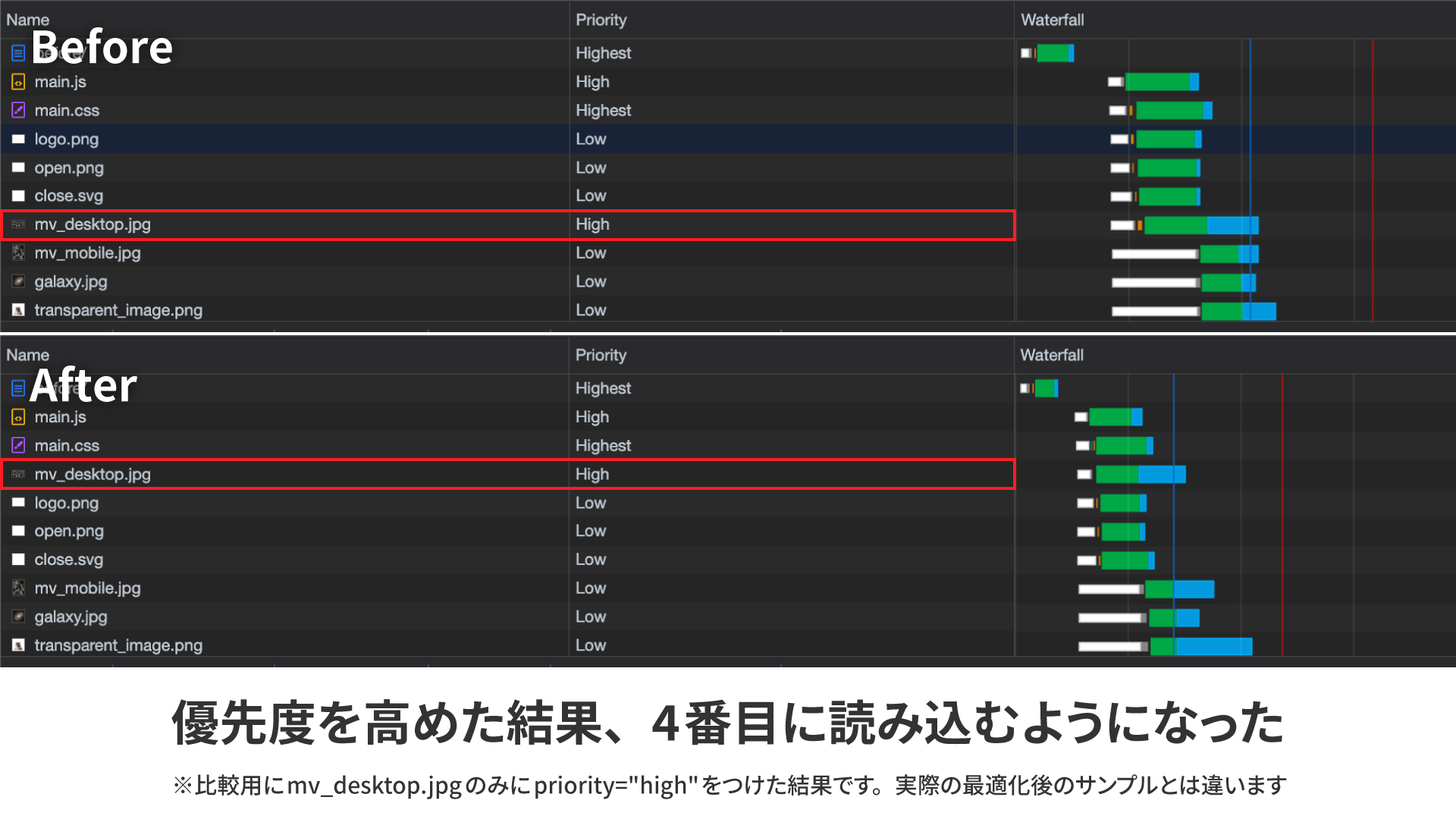
In this example, only mv_desktop.jpg has fetchpriority="high". Its internal priority becomes higher, so it moves forward in the loading order.
In the improved sample, the main image and logo are loaded first. The fetchpriority attribute is now available in all browsers.
Using the <picture> element to serve separate images for desktop and mobile
The first view uses different images for desktop and mobile. If you switch them with CSS using display: none, the hidden-side image is still loaded.
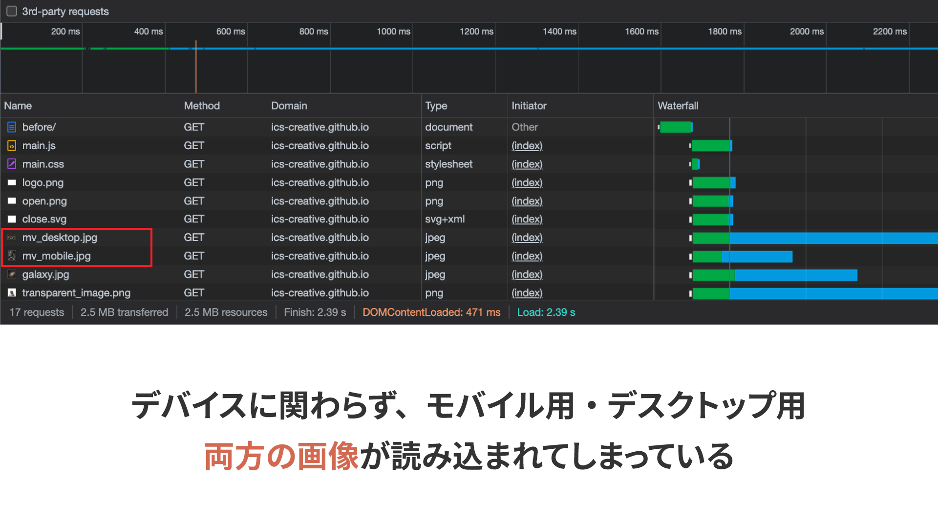
The <picture> element prevents unnecessary downloads. It is also suitable for format switching and art direction.
<picture>
  <source
    media="(width >= 768px)"
    srcset="
      assets/mv_desktop_optimized_1x.jpg 1x,
      assets/mv_desktop_optimized_2x.jpg 2x
    "
  />
  <source
    media="(width < 768px)"
    srcset="assets/mv_mobile_optimized.jpg"
  />
  <img
    src="assets/mv_desktop_optimized_1x.jpg"
    alt="Cats"
    width="1024"
    height="512"
  />
</picture>
Using <source> elements and the media attribute, you can specify separate images for desktop and mobile. The browser chooses the matching image, which helps avoid unnecessary downloads.
Serving images based on display resolution
High-resolution displays are common now. In the unoptimized version, a large 2048px × 1024px image was used, so even standard-resolution displays downloaded a heavy image. To avoid that, serve different images depending on display resolution.
The srcset attribute lets you specify multiple image candidates separated by commas. Adding 1x or 2x lets the browser switch images based on display resolution.
<source
    media="(width >= 768px)"
    srcset="
      assets/mv_desktop_optimized_1x.jpg 1x,
      assets/mv_desktop_optimized_2x.jpg 2x
    "
  />
In the example above, _1x.jpg is loaded on standard-resolution displays and _2x.jpg on displays with 2x pixel density.
Optimize the images
Before optimization, the JPEG images were exported from Adobe Photoshop with image quality set to 80. However, tools such as Squoosh and imagemin can reduce file size significantly with only minor quality loss.
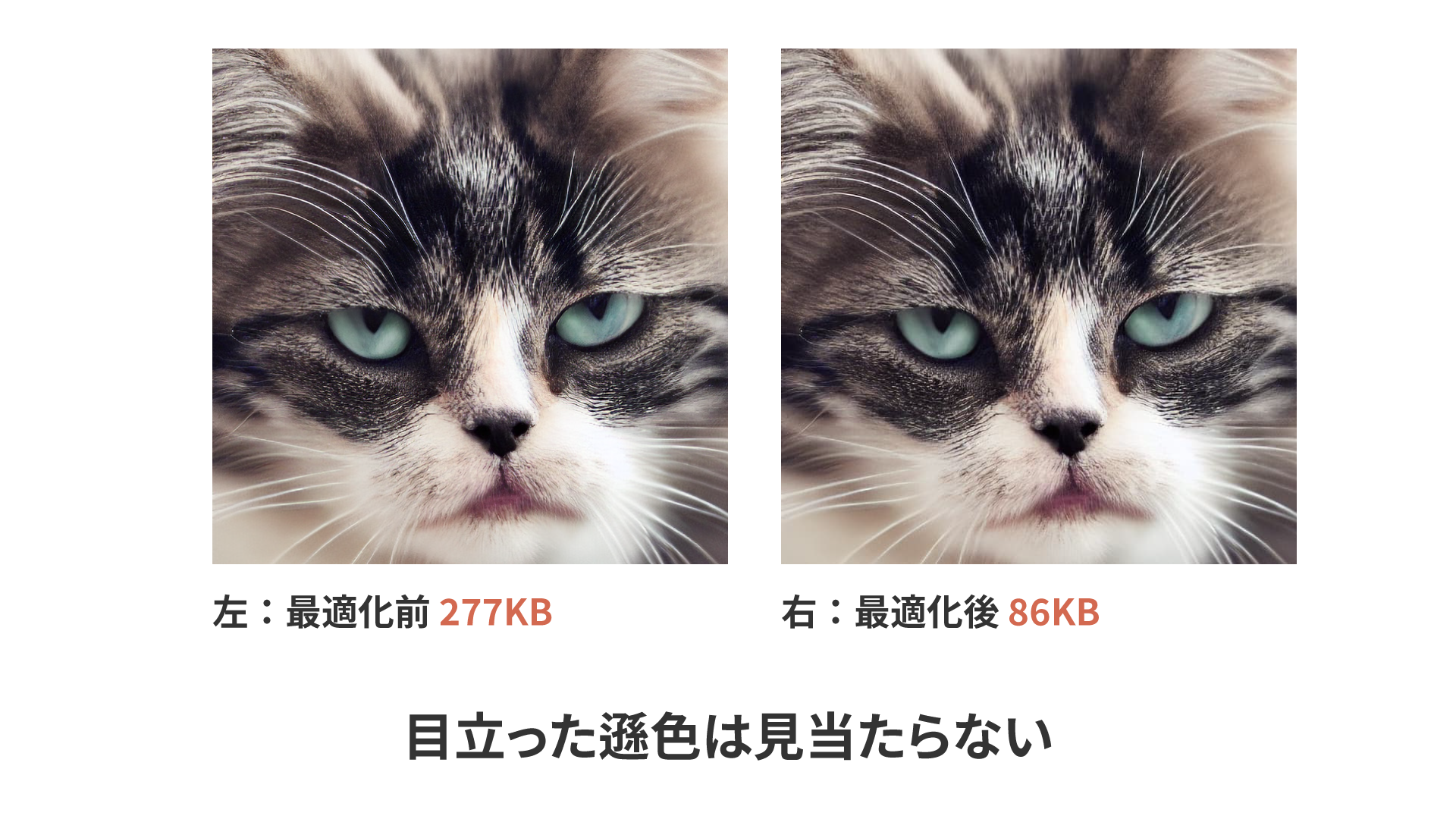
This figure shows an example optimized in Squoosh with MozJPEG. The image went from 277 KB to 86 KB, a reduction of about 69%.
When you optimize images, it is better to compress the original source data. Avoid recompressing an already exported JPEG. That adds another round of lossy compression.
Squoosh is convenient because it lets you compare results visually, but converting many images by hand is tedious. If you want to compress many images at once, CLI tools and Node.js libraries are a better fit. For the Node.js version, see グーグルが開発した画像圧縮ツールSquoosh。フロント開発向けにNode.jsで扱う方法まとめ.
The best image file formats
Choosing the right format can also reduce file size. PNG works well for logos and charts with fewer colors, while JPEG works well for photos. Here we also cover AVIF and SVG.
AVIF format
AVIF is a next-generation image format that offers higher compression efficiency than JPEG and PNG. It also supports transparency. For photos and hero images, AVIF is the first format to try.
This sample uses AVIF. AVIF is available in all browsers.
The AVIF image used in the sample is also much smaller than PNG, with almost no visible difference.
For more details, see 次世代画像形式のWebP、そしてAVIFへ –変わり続ける技術に対応するweb制作の黄金解–.
Column: Should Everything Be AVIF?
AVIF is a strong option for photos and hero images. However, that does not mean every image should be AVIF. SVG is still better for logos and icons, and depending on the graphic, PNG or JPEG may still be easier to use.
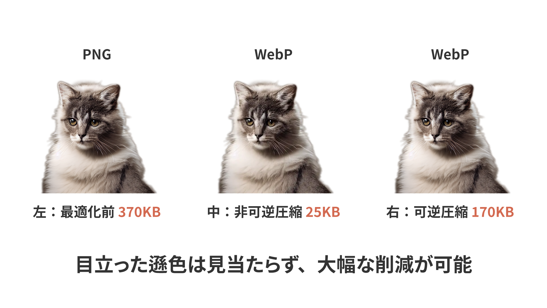
We do not recommend the WebP image format. Its balance of image quality and file size is not especially good. At best, it is only slightly better than JPEG. AVIF is clearly more effective. This article is also helpful: 画像圧縮するベストな方法(2025) #OpenCV - Qiita.
SVG format
SVG does not become blurry when enlarged. It works especially well for logos and icons.
In the sample, the centered logo in the first view uses SVG. It went from 10 KB down to 4 KB. The paw mark used in the middle “Service” section is 6 KB as PNG and 521 bytes as SVG. The simpler the shape and the larger the display size, the more effective SVG becomes.
If an image contains a lot of text, PNG may still be smaller. As a rule of thumb, use SVG for logos and icons, and PNG for explanatory diagrams.
background-image and the <img> element
You can also display images with CSS background-image. However, it behaves differently from an <img> element.
- It is discovered only after the CSS is fetched and parsed, so it is a disadvantage for hero images and other images that tend to affect LCP
- You cannot use image-specific mechanisms such as
loading="lazy"oraltin the same way
With background-image, the browser discovers a hero image only after CSS has loaded and been parsed. That delay can slow LCP.
If you need to use background-image for a first-view background, one option is <link rel="preload" as="image" fetchpriority="high">. If you have different resolutions, CSS image-set() is also useful.
<link
  rel="preload"
  as="image"
  href="assets/hero@1x.avif"
  fetchpriority="high"
/>
.hero {
  background-image: image-set(
    url("assets/hero@1x.avif") 1x,
    url("assets/hero@2x.avif") 2x
  );
}
background-image has no equivalent to the alt attribute. If you use it for meaningful images, screen reader users cannot access that information. Choose between background-image and <img> with the image meaning, accessibility, and LCP in mind.
Conclusion
Image loading is one of the highest-impact performance improvements. If your site feels slow, start by reviewing how images are loaded.