Website rendering speed is one of the key indicators of a healthy site. Google’s Core Web Vitals include metrics related to page speed, which means the time it takes for a page to appear matters not only for user experience but also for SEO. Many factors can degrade rendering speed, ranging from the network and server side to the front end. In this article, we focus specifically on image loading and introduce techniques for improving it by comparing before and after examples.
Image Loading: Before / After
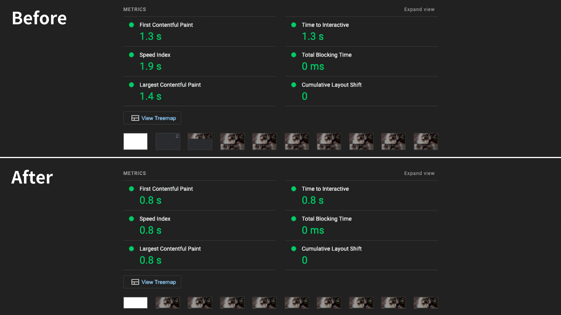
The figure above shows the results of a Lighthouse audit. Lighthouse is a website inspection tool that measures the performance, accessibility, SEO, and other aspects of a web page. Because it is built into Google Chrome DevTools, it is also very easy to run.
The sample page is quite simple to begin with, so even before the improvements it already scores well in Lighthouse. However, after optimization, First Contentful Paint (FCP) improves by 0.5 seconds, Largest Contentful Paint (LCP) by 0.6 seconds, and Speed Index by 1.1 seconds. If a simple page with only about 14 images can improve this much, the gap will only grow as pages become larger.
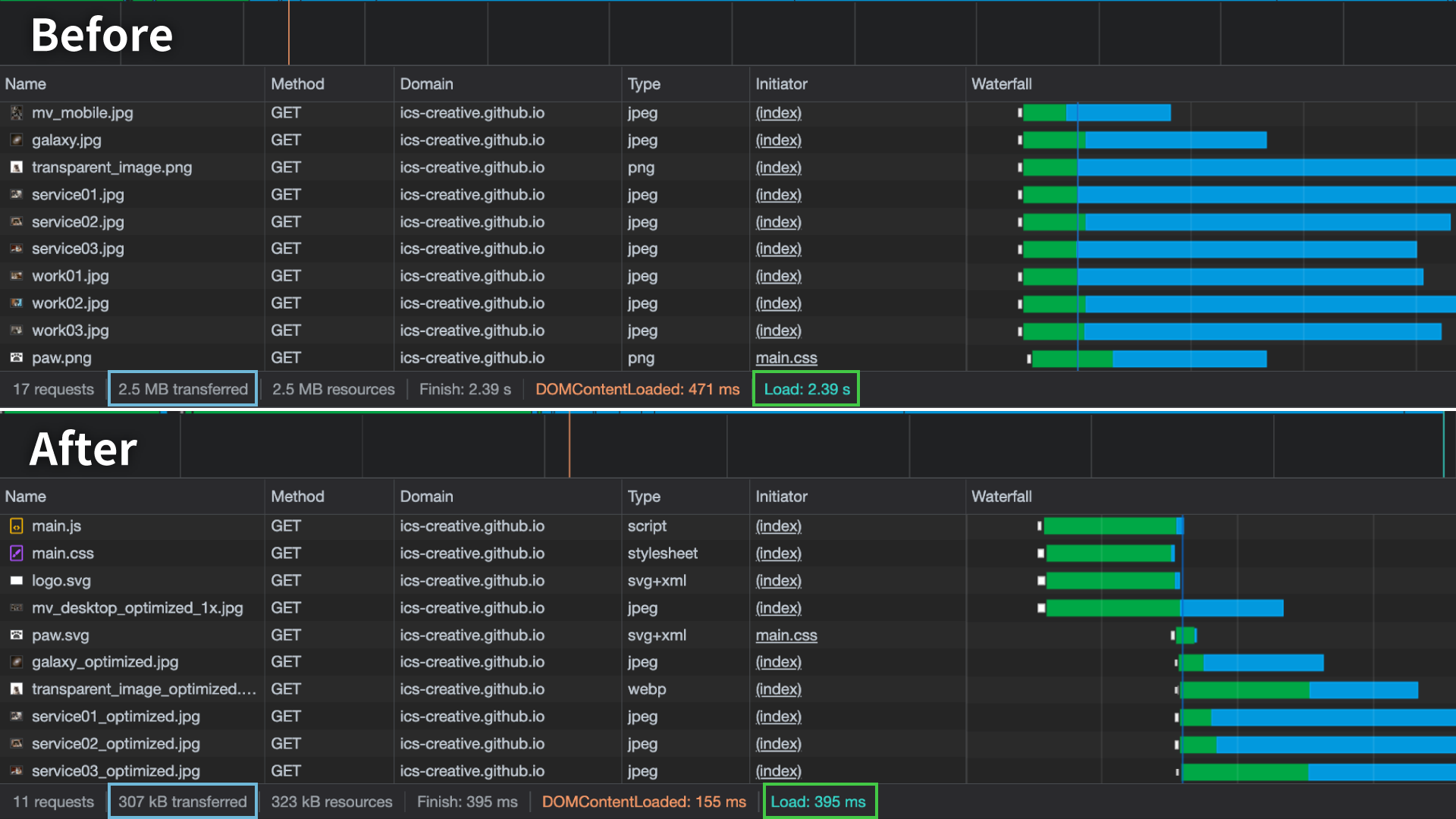
Looking at the actual loading behavior, on a 4G connection (10 Mbps), the page took about 2.4 seconds to complete its initial load before optimization, whereas after optimization it was reduced to about 0.4 seconds. The transfer size also dropped dramatically, from 2.5 MB to 307 kB.
From here, let’s look at the specific optimization techniques.
Lazy loading with loading="lazy"
You can easily implement lazy loading by using the loading="lazy" attribute on an <img> element. Images with this attribute are loaded only when the user scrolls close enough to them. However, images near the top of the page (roughly within 2000px to 3000px from the top) are still included in the initial load. Even so, delaying images farther down the page that are not shown immediately is effective for reducing the amount of data loaded at the start.
One thing to watch out for is that when using loading="lazy", the <img> element needs proper width and height attributes. Without them, the browser cannot determine the image’s layout box until the image has fully loaded. As a result, the layout is recalculated after the image loads, which can cause layout shifts. Layout shifts are one of the factors that can hurt Lighthouse scores. Even if you specify the size in CSS, it is better not to omit the width and height attributes.
Loading priority
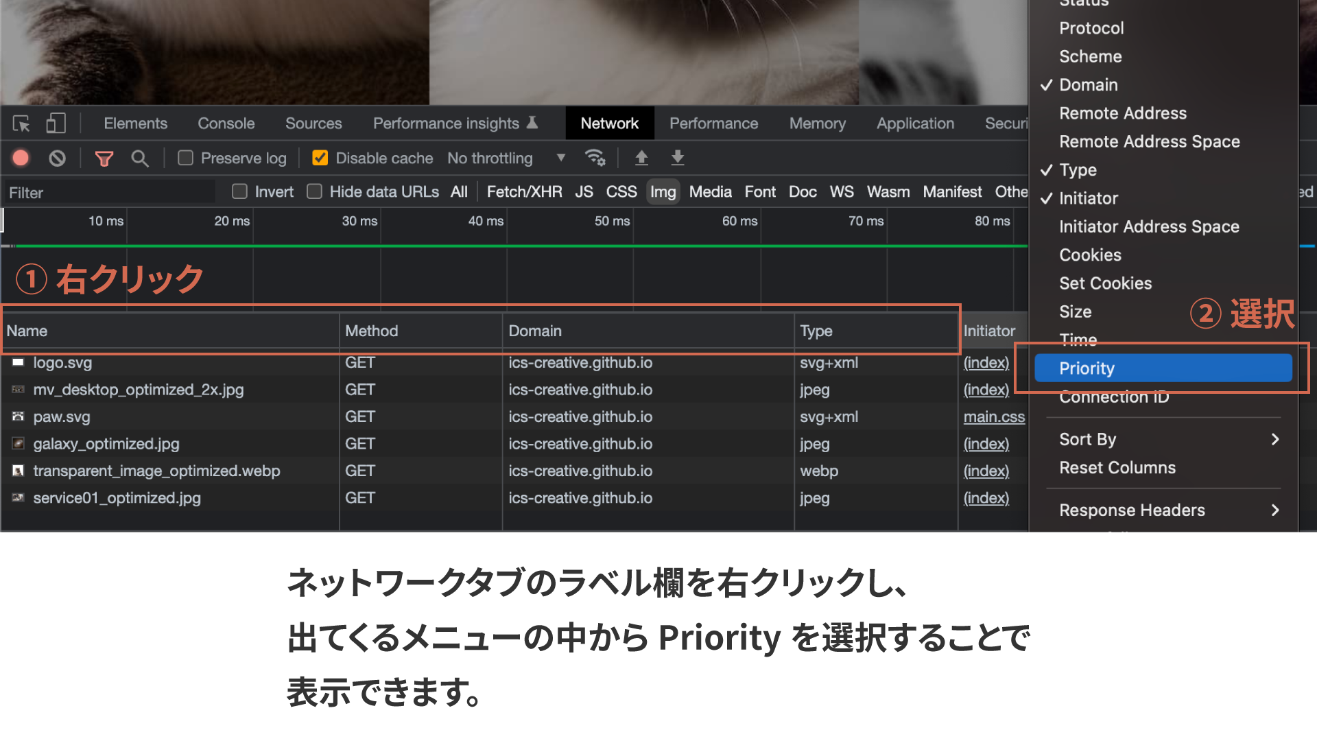
This is a slightly more advanced topic, but you can also tell the browser the loading priority of images. By setting the fetchpriority attribute to values such as high or low, the browser will prioritize higher-priority resources first. You can check the priority in the Network tab of DevTools. If you do not see a “Priority” column, right-click the label row and enable it from the list.
In the improved sample, fetchpriority="high" is applied to the main visual and logo images, which are important in the initial viewport, while fetchpriority="low" is applied to the mobile hamburger button image, which does not need to appear immediately.
If nothing is specified, the browser assigns loading priority automatically. By explicitly setting fetchpriority="high", you can instruct the browser to load specific resources earlier.
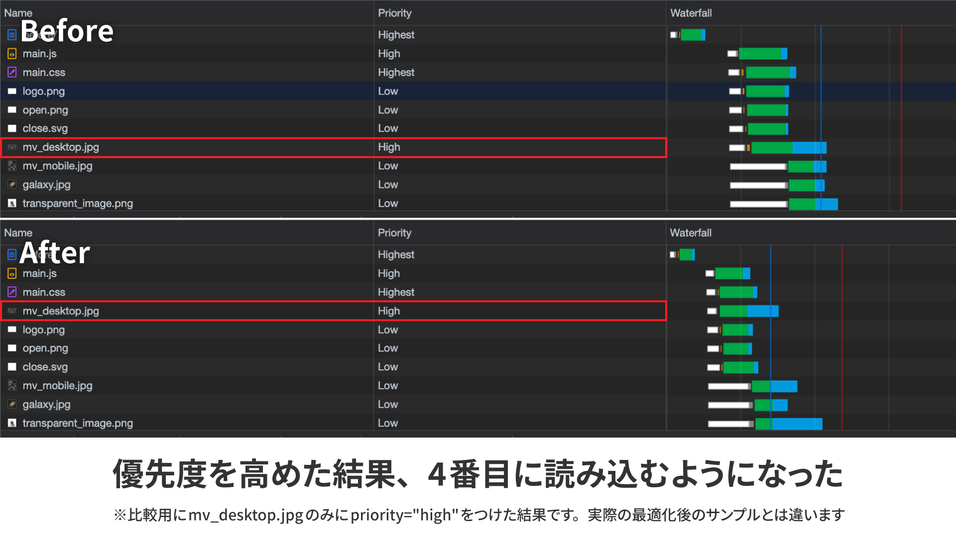
The figure above shows the result when only mv_desktop.jpg is given fetchpriority="high". The displayed priority label still appears as high, but internally the priority is raised further, and the image is loaded earlier.
In this sample, the perceived display speed is improved by loading the main visual and logo images first. However, as of December 2022, the fetchpriority attribute is supported only in Google Chrome and Microsoft Edge.
Using the <picture> element to serve separate images for desktop and mobile
The hero image uses different assets for desktop and mobile. If you control visibility with CSS using display: none, both images are still loaded. In other words, the desktop image is loaded on mobile, and the mobile image is loaded on desktop.
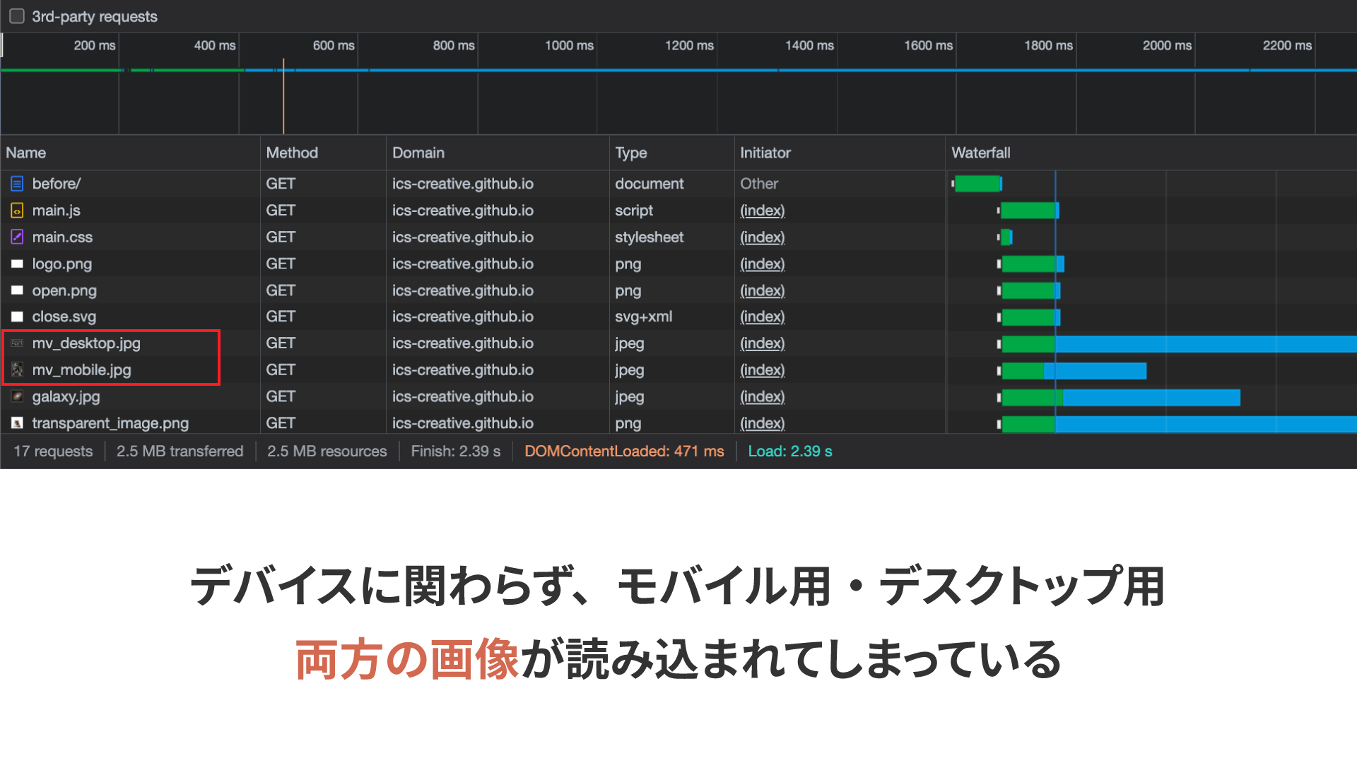
To avoid this, you can use the <picture> element to serve the appropriate image depending on the device.
<picture>
  <source
    media=" (min-width: 768px)"
    srcset="
      assets/mv_desktop_optimized_1x.jpg 1x,
      assets/mv_desktop_optimized_2x.jpg 2x
    "
  />
  <source
    media=" (max-width: 768px)"
    srcset="assets/mv_mobile_optimized.jpg"
  />
  <img
    src="assets/mv_desktop_optimized_1x.jpg"
    alt="Cats"
    width="1024"
    height="512"
  />
</picture>
Using <source> elements and the media attribute, you can specify separate images for desktop and mobile. Even if the browser window is resized down to a mobile width, the browser automatically fetches the mobile image, so you do not have to worry about broken image links. For a more detailed explanation, see imgタグのsrcset・sizes属性とpictureタグの使い方 - レスポンシブイメージで画像表示を最適化.
Serving images based on display resolution
High-resolution desktop displays have become common in recent years. In the unoptimized version, the hero image uses a large image (2048px × 1024px) intended for high-resolution displays. In that case, users without high-resolution displays end up downloading an unnecessarily large image. To avoid that, you can serve different images depending on the user’s display resolution.
There is an attribute called srcset, similar to src. It lets you specify multiple candidate images separated by commas. It is also used in the desktop image example shown earlier.
<source
    media=" (min-width: 768px)"
    srcset="
      assets/mv_desktop_optimized_1x.jpg 1x,
      assets/mv_desktop_optimized_2x.jpg 2x
    "
  />
By adding pixel density descriptors such as 1x after each image path, you can specify images according to the display resolution. In the example above, mv_desktop_optimized_1x.jpg is used for standard-resolution displays, while mv_desktop_optimized_2x.jpg, which is twice as large, is used for displays with 2x pixel density.
Optimize the images
Before optimization, the JPEG images were exported from the original data in Adobe Photoshop with image quality set to 80. That is not a bad setting by any means, but by using image compression tools such as Squoosh or imagemin, you can achieve dramatic file-size reductions with only minimal quality loss.
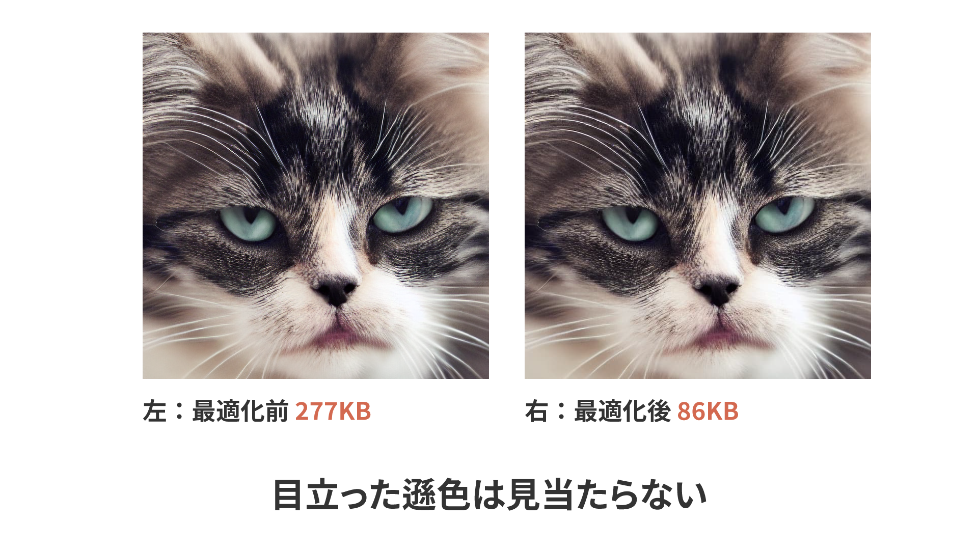
The figure above shows an image optimized in Squoosh using the MozJPEG encoder. Before optimization, the image was 277 KB; afterward, it dropped to 86 KB, a reduction of about 69%. There is no noticeable quality loss between the before and after versions.
When optimizing images, it is best to compress from the original lossless source data rather than optimizing an image that has already been exported as JPEG. JPEG itself uses lossy compression, so an exported JPEG has already lost some quality compared with the original. Recompressing it adds another round of lossy processing, which makes further degradation more likely. If you cannot optimize directly from the original source data, a good alternative is to export a lossless PNG first and optimize that instead.
Squoosh is convenient because it lets you compare results while fine-tuning the optimization settings, but manually converting a large number of images can be tedious. Although per-image control is more limited, there are CLI tools and Node.js libraries that can compress many images at once. For the Node.js version, see グーグルが開発した画像圧縮ツールSquoosh。フロント開発向けにNode.jsで扱う方法まとめ for a detailed explanation. imagemin also has webpack plugins, which are useful if you are using a bundler.
The best image file formats
Choosing the right image format can reduce file size significantly. As a general rule, PNG is suitable for simple images with fewer colors, such as logos and charts, while JPEG is better for complex images with many colors, such as photographs. In addition to those, this article also covers WebP and SVG.
WebP format
WebP is an image format that supports transparency, lossless compression, and lossy compression, and it is known for its high compression efficiency compared with formats such as JPEG. JPEG is well suited to photographic images, but because it does not support transparency, PNG is often used when transparent images are needed. For example, in the sample, the image in the “OUR MISSIONS” section below the initial viewport is split into a background image and a transparent cat image to allow animation.
The unoptimized version uses PNG images, but PNG files can become quite large when used for photographic content. For that reason, the optimized version uses WebP instead. WebP supports transparency and can be compressed much more effectively than PNG.
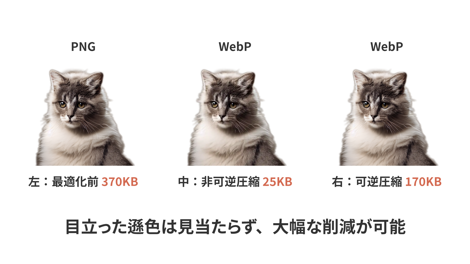
The optimized image uses WebP’s lossy compression settings, so unlike the PNG original, some degradation does occur. However, it is still acceptable in practice. WebP also supports lossless compression, allowing the same kind of non-destructive compression as PNG. In that case, the file size is larger than with lossy compression, but still smaller than PNG.
For a more detailed explanation of WebP, see 次世代画像形式のWebP、そしてAVIFへ。変わり続ける技術に対応するweb制作の黄金解. AVIF offers even better performance than WebP, but as of December 2022, Microsoft Edge did not support it, so it still felt a bit early for production use.
Column: Should Everything Be WebP?
All modern browsers released since 2020 support WebP, so we are now in an environment where replacing all images with the more size-efficient WebP format is entirely feasible. In practice, however, MozJPEG optimization alone can already reduce image sizes sufficiently, and when you consider the extra effort of converting assets to WebP, there are still many cases where JPEG is perfectly adequate.
Transparent photos benefit greatly from being converted to WebP, but for other cases it comes down to balancing the benefits against the implementation effort. This may change as design tools improve and more convenient WebP conversion workflows become established.
These solutions generally assume the use of a framework, but image optimization tools such as next/image in Next.js and Nuxt Image in Nuxt are very useful because they reduce implementation cost.
SVG format
SVG images are vector data, so they remain sharp even when displayed at large sizes. Like PNG, SVG works well for simple images, but it is especially suitable for logos and icons.
For example, in the sample, a large logo appears in the center of the initial viewport. Before optimization, it was exported at a relatively large size to account for high-resolution displays, and the file size was 10 KB. Converting it to SVG reduces that to 4 KB. Elsewhere, in the “Service” section around the middle of the sample page, a paw-print graphic is used as a background. The PNG version is 6 KB, while the SVG version is only 521 bytes. The simpler the shape, and the larger the display size, the more effective SVG becomes.
However, even for simple images, if the image contains a lot of text, PNG can sometimes end up smaller than SVG. So even among simple images, SVG is a good fit for logos and icons, while explanatory diagrams are often better as PNG.
background-image and the <img> element
Another way to display images is with the CSS background-image property. Visually, there may not be much difference between the two approaches, but background-image differs from the <img> element in the following ways:
- The
background-imageproperty is not lazy-loaded. - It cannot be read aloud by screen readers in the way textual image alternatives can.
Although the loading priority of background-image is relatively low, it is still included in the initial page load. That means if you assign a large image to background-image, it will increase the time required to complete loading.
Unlike the alt attribute on an <img> element, there is no equivalent textual alternative for background-image. As a result, if you use meaningful images on the page (for example, images containing explanatory text), screen reader users may not receive that information, which can interfere with understanding the content.
When deciding whether to use background-image or an <img> element, it is worth considering not only implementation convenience, but also the semantic meaning of the image on the page and its file size.
Conclusion
This article covered image loading, one of the more impactful areas in performance tuning. As the number of images used on a page increases, the effect of these optimizations becomes even greater. If your site feels slow to load, reviewing how images are loaded may be a good first step toward improvement.