
Easing is the term used for how motion accelerates and decelerates over time. In animation, it defines the “character” of motion. Choosing the right easing can significantly change the impression of an effect. Easing is an essential part of designing a good UI experience.
There are many kinds of easing, though, and it can be difficult to understand each one well enough to choose the right one. This article introduces practical patterns that can serve as a reference when selecting easing.
Summary
ease-ingradually accelerates, whileease-outgradually decelerates.ease-outis recommended in many situations because it tends to leave a lingering sense of motion.- CSS
ease-out,ease-in, andease-in-outare fairly subtle. In many cases,easeis the better default, and if you want more control,cubic-bezier()is the better option.
The character of easing
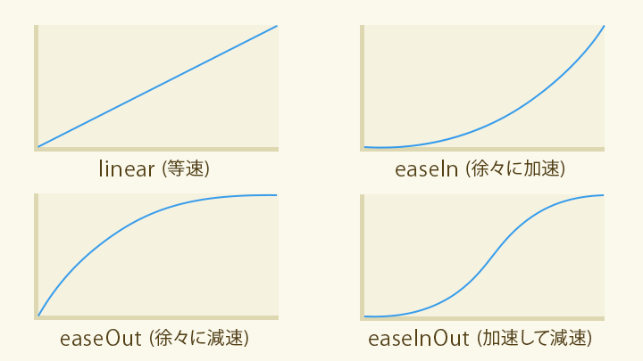
Easing defines the character of motion, such as starting slowly and then gradually speeding up. There are many kinds of easing, but they can be broadly divided into the following four groups.
linear: changes at a constant speed. Feels flat and steady.ease-in: gradually accelerates. Feels energetic, as if it is gathering speed.ease-out: gradually decelerates. Tends to leave a lingering sense of motion.ease-in-out: accelerates and then decelerates.
To specify an easing function in CSS, use syntax like the following.
For CSS transitions
/* For CSS transitions */
.example {
  transition-property: all;
  transition-duration: 1s;
  /* Specify the easing */
  transition-timing-function: ease;
}

.example-2 {
  /* You can write it in shorthand */
  transition: all 1s ease;
}
For CSS animations
/* For CSS animations */
.example {
  animation-name: motion-x;
  animation-duration: 1.5s;
  animation-iteration-count: infinite;
  animation-fill-mode: forwards;
  /* Specify the easing */
  animation-timing-function: ease;
}

.example-2 {
  /* You can write it in shorthand */
  animation: motion-x 2s infinite forwards ease;
}
Choosing easing in CSS
The main values you can use for easing are:
ease: moderate acceleration and decelerationlinear: constant speedease-in: gentle accelerationease-out: gentle decelerationease-in-out: gentle acceleration and deceleration
If transition-timing-function is omitted, the default ease is applied.
ease is a general-purpose choice with both acceleration and a sense of follow-through, so it works naturally in many situations. If you are unsure which easing to use, ease is the safest default.
By contrast, ease-in, ease-out, and ease-in-out are fairly subtle. They are not ideal when you want motion to feel more distinct.
For comparison, look at the following demo. It lets you compare different easing choices for the appearance of a checkmark in a checkbox.
linear feels stiff. ease-in, ease-out, and ease-in-out do differ, but the difference in impression is relatively small. ease feels more responsive. cubic-bezier() can be tuned for the best responsiveness, as explained later.
The same pattern can be seen in hover effects. ease gives interaction feedback a good balance of speed and responsiveness.
The main point here is that CSS ease-in, ease-out, and ease-in-out are subtle enough that they often increase code without producing a corresponding improvement in the experience. In practice, when code is explicitly set to values such as ease-out, it is often unclear whether that value was truly chosen for the content itself. If there is no strong reason to choose otherwise, leaving the default ease can be the better option.
Advanced easing with cubic-bezier()
If the built-in easing keywords are not enough, use cubic-bezier() to create custom easing. The cubic-bezier() function specifies the coordinates of the control points of a cubic Bézier curve.
Example
/* For CSS transitions */
.example {
  transition-property: all;
  transition-duration: 1s;
  /* Specify the easing */
  transition-timing-function: cubic-bezier(0.19, 1, 0.22, 1); /* easeOutExpo */
}
However, it is hard to imagine the actual motion from control-point numbers alone. A practical solution is to use visual tools such as Easing Functions Cheat Sheet or Ceaser, which let you draw and inspect easing curves. You can copy and paste the parameters you need.
Here are some commonly used parameter sets. Because cubic-bezier() values are hard to read at a glance, it helps to name them by strength and define them as CSS custom properties.
:root {
  /* Quint (stronger than Quart, weaker than Expo) */
  --ease-quint-in: cubic-bezier(0.755, 0.05, 0.855, 0.06);
  --ease-quint-out: cubic-bezier(0.23, 1, 0.32, 1);
  --ease-quint-inout: cubic-bezier(0.86, 0, 0.07, 1);

  /* Expo (the strongest) */
  --ease-expo-in: cubic-bezier(0.95, 0.05, 0.795, 0.035);
  --ease-expo-out: cubic-bezier(0.19, 1, 0.22, 1);
  --ease-expo-inout: cubic-bezier(1, 0, 0, 1);
}

/* For CSS transitions */
.example {
  transition-property: all;
  transition-duration: 1s;
  /* Specify the easing with a CSS custom property */
  transition-timing-function: var(--ease-expo-out);
}
If you want a broader reference for easing strengths, see the appendix at the end of this article.
Different easing strengths
cubic-bezier() can describe countless kinds of easing depending on the combination of arguments. Within that broad range, there is a commonly used set of six easing strengths: Sine, Quad, Cubic, Quart, Quint, and Expo.
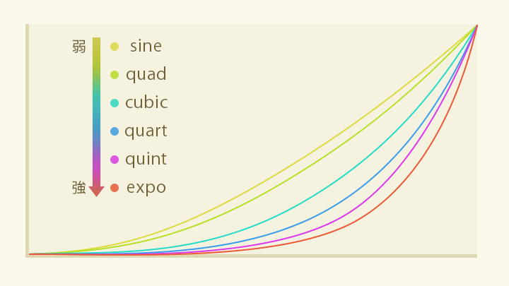
From weakest to strongest: Sine < Quad < Cubic < Quart < Quint < Expo
* The definitions of Sine, Expo, and the other easing types are based on Robert Penner’s published work, Robert Penner’s Easing Functions.
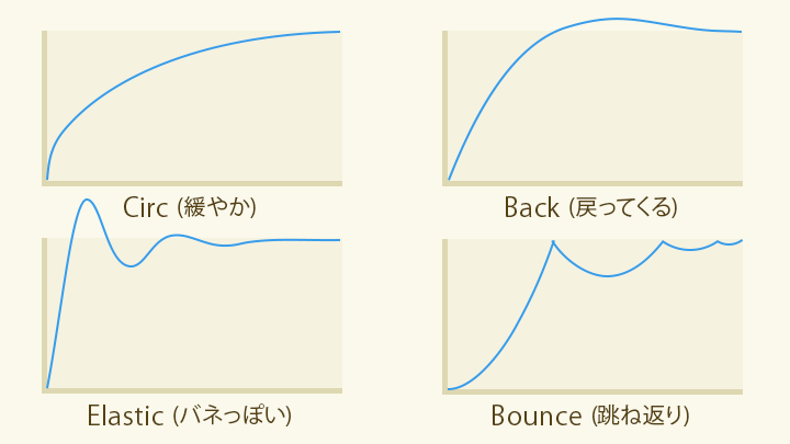
There are also easing types with more specialized motion, such as the following:
- Circ: as strong as Expo, but with gentler acceleration and deceleration
- Back: overshoots slightly and then returns
- Elastic: oscillates like a released spring
- Bounce: bounces like a ball
When using cubic-bezier(), do not choose values at random. It is easier to communicate with teammates if you think in terms of established strength categories like the ones above.
When to use ease-out and ease-in
The following sections look at where each easing works best.
Entrance motion
For animations that bring something in or move it into place, ease-out is generally the best starting point. By leaving a bit of lingering motion at the end, it helps guide the user’s attention smoothly into the next state.
The next demo compares the same animation with a strong ease-out, a standard ease-out, and linear. Start with the strong ease-out. It feels responsive and still leaves enough lingering motion to feel pleasant.
Next, here is the standard ease-out. This is the CSS keyword ease-out. Because it is rather mild, it leaves very little lingering motion and feels a bit clunky.
Now compare that with linear, which means constant speed. It leaves no lingering motion at all, so the movement feels scripted.
Improving responsiveness to user input
When an animation is triggered by user input, it is important to prioritize fast feedback. That can mean choosing an easing that moves early in the timeline or shortening the overall duration.
The next demo compares ease-out and ease-in for the same interaction. Start with ease-out. The animation responds immediately when clicked.
By contrast, ease-in creates a delay before the animation really gets going. It feels one beat late.
ease-out is the most broadly useful easing. Even when there is no time to fine-tune or no better option comes to mind, choosing ease-out is often enough to improve the quality of motion. That said, the built-in CSS ease-out is quite mild, so it is usually not the best choice. For ease-out, the stronger Quint and Expo curves tend to work especially well.
When to deliberately use acceleration
This article has emphasized the usefulness of ease-out, but ease-in has its place when you want to express force or momentum. Combining it with scale changes during movement can make the effect stronger. It also works for slow fade-outs, where it can feel like a spotlight is gradually narrowing and disappearing.
Where linear works well
linear often feels clunky, but it is useful for short fade effects, especially when the animation is part of a continuous sequence.
With opacity animation, changes near 0% and 100% are hard to perceive. If you apply an easing such as ease-out, the lingering portion near the end can look like an unintended pause where nothing is changing.
In the next example, the heading seems to stop for a moment as it appears.
*The text fades in with `ease-out`*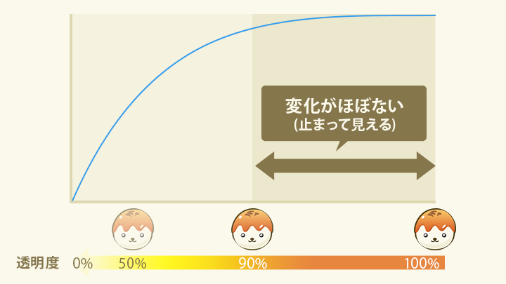
To avoid this, use linear. If you switch to linear and shorten the duration, the motion looks similar, but the pause disappears and the pacing improves.
Creating custom motion with CSS linear()
In addition to the linear keyword, transition-timing-function also accepts the linear() function. linear() lets you linearly interpolate between multiple points. The arguments are multiple values between 0 (the start) and 1 (the end).
Curves such as bounce could not be expressed with cubic-bezier(), but linear() makes it possible to create these kinds of easing freely.
.motion-x {
  animation: motion-x 1s infinite forwards;
  /* Slow down in the middle */
  animation-timing-function: linear(0, 0.45, 0.48, 0.52, 0.55, 1);
}
@keyframes motion-x {
  from {
    translate: 0%;
  }
  to {
    translate: 100px;
  }
}
The linear() function is available in Chrome 113 (April 2023), Safari 17.2 (December 2023), and Firefox 112 (April 2023) or later (see Can I Use…).
Conclusion
Changing only the easing can dramatically change the expression of an animation. The ideal approach is to choose easing that fits the tone and purpose of what you are making. When that is difficult, simply using the default ease, or a stronger cubic-bezier() curve such as easeOutQuint or easeOutExpo, can already improve the look and feel considerably.
Also worth reading is feb19.jp’s article アニメーションの調味料「イージング」の使い分けレシピ (透明度、UI、音量).
For more articles on animation, see ICS MEDIA’s あえてズレを! ウェブのアニメーションを「いい感じ」に魅せる手法 and CSSアニメーションで実現! コピペで使えるマイクロインタラクション.
For practical examples of spring animation using linear(), see Using CSS linear() for spring animations in UI. That article is a good companion if you want to see where this technique works especially well in UI design.
Side note: ease-in and ease-out are defined the other way around in video tools
This article describes ease-out as deceleration and ease-in as acceleration. That matches both the CSS specification CSS Easing Functions Level 1 and the historical definitions in Robert Penner’s Easing Functions. In the web world, that interpretation is standard.
However, in Adobe After Effects, Easy Ease Out refers to easing out of a keyframe, which corresponds to acceleration, while Easy Ease In refers to easing into a keyframe, which corresponds to deceleration. In other words, the terminology is reversed between web animation and video tools, so it is worth being careful.
Appendix: reference list of easing strengths
The following values can be defined as CSS custom properties and used with animation-timing-function and transition-timing-function. Elastic and Bounce use linear().
:root {
  /* Sine (the weakest) */
  --ease-sine-in: cubic-bezier(0.47, 0, 0.745, 0.715);
  --ease-sine-out: cubic-bezier(0.39, 0.575, 0.565, 1);
  --ease-sine-inout: cubic-bezier(0.445, 0.05, 0.55, 0.95);

  /* Quad (mild: stronger than Sine, weaker than Cubic) */
  --ease-quad-in: cubic-bezier(0.55, 0.085, 0.68, 0.53);
  --ease-quad-out: cubic-bezier(0.25, 0.46, 0.45, 0.94);
  --ease-quad-inout: cubic-bezier(0.455, 0.03, 0.515, 0.955);

  /* Cubic (stronger than Quad, weaker than Quart) */
  --ease-cubic-in: cubic-bezier(0.55, 0.055, 0.675, 0.19);
  --ease-cubic-out: cubic-bezier(0.215, 0.61, 0.355, 1);
  --ease-cubic-inout: cubic-bezier(0.645, 0.045, 0.355, 1);

  /* Quart (stronger than Cubic, weaker than Quint) */
  --ease-quart-in: cubic-bezier(0.895, 0.03, 0.685, 0.22);
  --ease-quart-out: cubic-bezier(0.165, 0.84, 0.44, 1);
  --ease-quart-inout: cubic-bezier(0.77, 0, 0.175, 1);

  /* Quint (stronger than Quart, weaker than Expo) */
  --ease-quint-in: cubic-bezier(0.755, 0.05, 0.855, 0.06);
  --ease-quint-out: cubic-bezier(0.23, 1, 0.32, 1);
  --ease-quint-inout: cubic-bezier(0.86, 0, 0.07, 1);

  /* Expo (the strongest) */
  --ease-expo-in: cubic-bezier(0.95, 0.05, 0.795, 0.035);
  --ease-expo-out: cubic-bezier(0.19, 1, 0.22, 1);
  --ease-expo-inout: cubic-bezier(1, 0, 0, 1);

  /* Circ (as strong as Expo, but with gentler acceleration and deceleration) */
  --ease-circ-in: cubic-bezier(0.6, 0.04, 0.98, 0.335);
  --ease-circ-out: cubic-bezier(0.075, 0.82, 0.165, 1);
  --ease-circ-inout: cubic-bezier(0.785, 0.135, 0.15, 0.86);

  /* Back (overshoots slightly and then returns) */
  --ease-back-in: cubic-bezier(0.6, -0.28, 0.735, 0.045);
  --ease-back-out: cubic-bezier(0.175, 0.885, 0.32, 1.275);
  --ease-back-inout: cubic-bezier(0.68, -0.55, 0.265, 1.55);

  /* Elastic motion */
  --ease-elastic-out: linear(0, 0.2178 2.1%, 1.1144 8.49%, 1.2959 10.7%, 1.3463 11.81%, 1.3705 12.94%, 1.3726, 1.3643 14.48%, 1.3151 16.2%, 1.0317 21.81%, 0.941 24.01%, 0.8912 25.91%, 0.8694 27.84%, 0.8698 29.21%, 0.8824 30.71%, 1.0122 38.33%, 1.0357, 1.046 42.71%, 1.0416 45.7%, 0.9961 53.26%, 0.9839 57.54%, 0.9853 60.71%, 1.0012 68.14%, 1.0056 72.24%, 0.9981 86.66%, 1);

  /* Bounce */
  --ease-bounce-out: linear(0, 0.004, 0.016, 0.035, 0.063 9.1%, 0.141, 0.25, 0.391, 0.563, 0.765, 1, 0.891, 0.813 45.5%, 0.785, 0.766, 0.754, 0.75, 0.754, 0.766, 0.785, 0.813 63.6%, 0.891, 1 72.7%, 0.973, 0.953, 0.941, 0.938, 0.941, 0.953, 0.973, 1, 0.988, 0.984, 0.988, 1);
}
* The values above are taken from Ceaser.
How to use these values
/* After pasting the code above */

.example {
  /* Apply it as a timing function */
  transition: all 1s var(--ease-elastic-out);
}