CSS Grid Layout is a specification for building website layouts. Before it became common, many developers relied on float or Flexbox for page layout.
With Grid Layout, it becomes easier to build website layouts without cluttering the HTML structure. It is especially well suited to grid-like layouts with both rows and columns, which are harder to build cleanly with Flexbox.
This article introduces the basics of Grid Layout by building actual layouts. If you have time, try creating the layouts yourself as you read.
What you’ll learn in this article
- Basic Grid Layout usage
- Benefits of Grid Layout
- How to use Grid Lanes
- How to use subgrid
- How to animate the
grid-templateproperty
Learn the basics of Grid Layout by building a common page layout
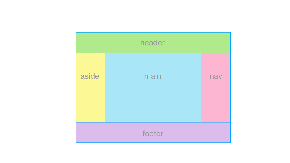
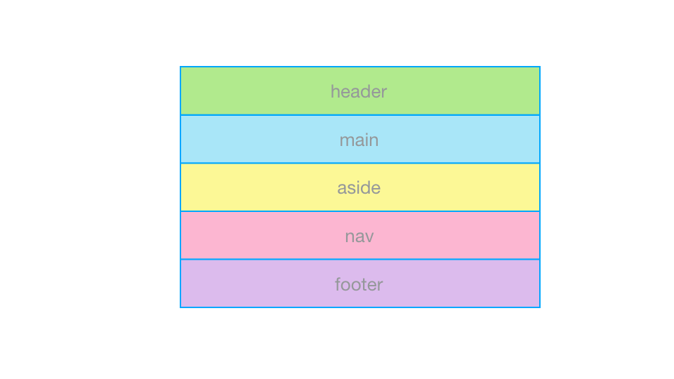
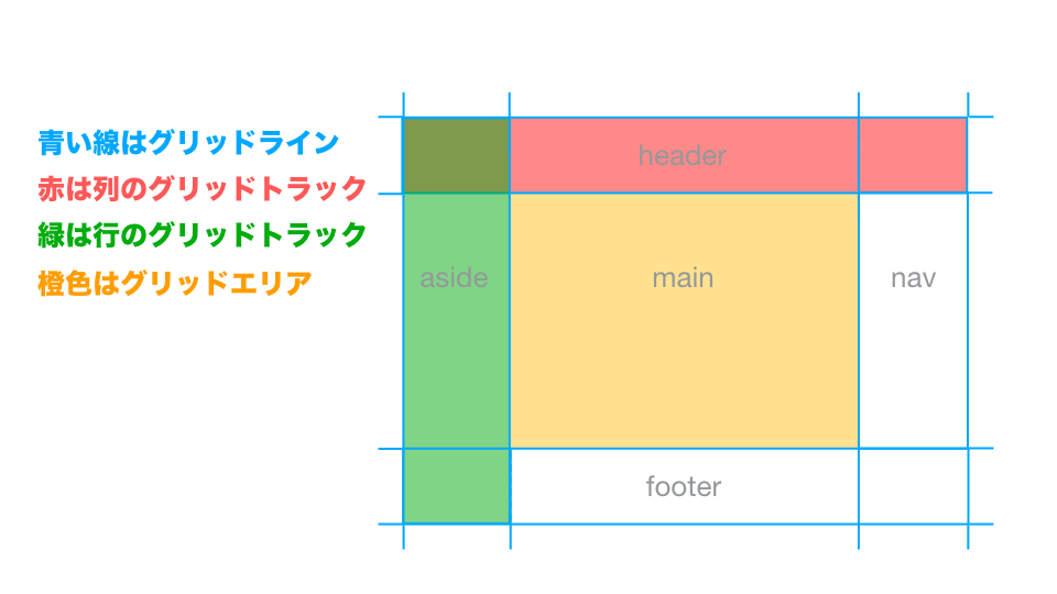
The following example uses a layout with a header, main content area, left and right sidebars, and a footer.
<div class="container">
  <header class="header">header</header>
  <main   class="main"  >main</main>
  <aside  class="aside" >aside</aside>
  <nav    class="nav"   >nav</nav>
  <footer class="footer">footer</footer>
</div>
First, write the HTML. There are the individual elements to place and a parent element that wraps them all. In this example, the parent element is given the class name container.
If you build it with Flexbox
To build this layout with Flexbox, you would typically wrap the horizontally aligned elements (aside, main, and nav) in a div or similar element to create a flex container, then place those elements as flex items inside it.
That means adding an extra wrapper element just for layout.
If you build it with Grid Layout
With Grid Layout, you define how the child elements should be placed on the element that wraps the layout (in this example, .container). Unlike Flexbox, you do not need to create another element to act as a row or column container.
Now, build the layout in CSS while going through grid containers and grid items.
Grid container
To place elements with Grid Layout, first create a grid container. Set display: grid on an element to make it a grid container. (Use display: inline-grid if you want it to behave as an inline element.)
.container {
  display: grid;
}
At this point, the elements are still just flowing normally. Next, define how the grid container should be divided.
Split the grid container into columns and rows. Use grid-template-columns to set the size of each column and grid-template-rows to set the size of each row.
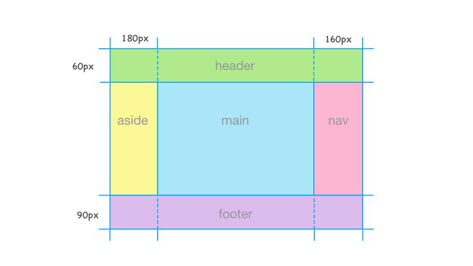
Now define the column widths. In this layout, the left sidebar is 180px wide and the right sidebar is 160px wide. The center main area should have a flexible width equal to the parent width minus the widths of the sidebars.
For the main area, use the fr unit. The fr unit is used to divide the available space inside a grid container. After subtracting any tracks sized with non-fr units such as px or % from the total width, the remaining space is distributed among the tracks sized with fr. It works much like Flexbox’s flex-grow. In this case, the remaining width after subtracting the left and right sidebars (180px and 160px) should be assigned to the main area, so write the following:
.container {
  display: grid;
  /* Columns from left to right: 180px, 1fr, 160px */
  grid-template-columns: 180px 1fr 160px;
}
In the same way, define the height of each row.
.container {
  display: grid;
  /* Columns from left to right: 180px, 1fr, 160px */
  grid-template-columns: 180px 1fr 160px;
  /* Rows from top to bottom: 60px, 1fr, 90px */
  grid-template-rows: 60px 1fr 90px;
}
These columns and rows are called grid tracks. The lines that divide them are called grid lines. Grid lines are not visible lines like borders.
Grid items
Next, place the grid items. The direct children of a grid container are called grid items. In this example, the header, main content, left and right sidebars, and footer are all grid items.
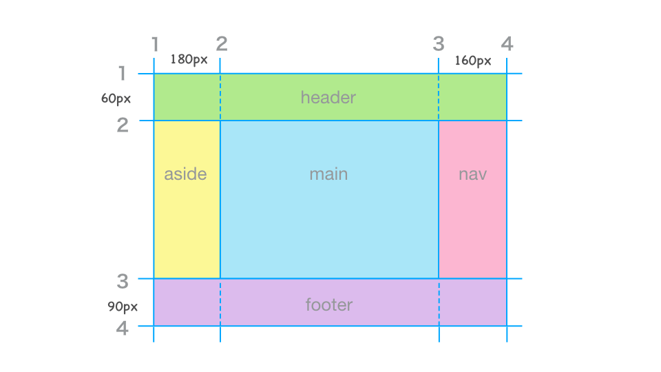
Grid lines are numbered automatically from 1, 2, 3, and so on. Use grid-column-start and grid-column-end to specify which column grid lines a grid item should start and end at.
Likewise, use grid-row-start and grid-row-end to specify which row grid lines it should start and end at.
.header {
  /* From column grid line 1 to 4 */
  grid-column-start: 1;
  grid-column-end: 4;
  /* From row grid line 1 to 2 */
  grid-row-start: 1;
  grid-row-end: 2;
}
If grid-column-end or grid-row-end is set to auto, the item is placed up to the next grid line after the one specified by grid-column-start or grid-row-start. For the header, grid-row-end can be written as auto.
.header {
  /* From column grid line 1 to 4 */
  grid-column-start: 1;
  grid-column-end: 4;
  /* From row grid line 1 to 2 */
  grid-row-start: 1;
  grid-row-end: auto;
}
Place the other grid items in the same way.
.header {
  /* From column grid line 1 to 4 */
  grid-column-start: 1;
  grid-column-end: 4;
  /* From row grid line 1 to 2 */
  grid-row-start: 1;
  grid-row-end: auto;
}

.main {
  /* From column grid line 2 to 3 */
  grid-column-start: 2;
  grid-column-end: auto;
  /* From row grid line 2 to 3 */
  grid-row-start: 2;
  grid-row-end: auto;
}

.aside {
  /* From column grid line 1 to 2 */
  grid-column-start: 1;
  grid-column-end: auto;
  /* From row grid line 2 to 3 */
  grid-row-start: 2;
  grid-row-end: auto;
}

.nav {
  /* From column grid line 3 to 4 */
  grid-column-start: 3;
  grid-column-end: auto;
  /* From row grid line 2 to 3 */
  grid-row-start: 2;
  grid-row-end: auto;
}

.footer {
  /* From column grid line 1 to 4 */
  grid-column-start: 1;
  grid-column-end: 4;
  /* From row grid line 3 to 4 */
  grid-row-start: 3;
  grid-row-end: auto;
}
grid-column-start and grid-column-end can be written using the shorthand grid-column. Likewise, grid-row-start and grid-row-end can be written using grid-row. In that case, auto can be omitted. The .header rules above can be rewritten like this.
.header {
  /* From column grid line 1 to 4 */
  grid-column: 1 / 4;
  /* From row grid line 1 to 2 */
  grid-row: 1;
}
That completes the layout. Check the sample below to compare the code and the rendered result.
Column: when 1fr doesn’t behave as expected
Sometimes a layout does not behave as expected even when 1fr is set. If that happens, the following article is worth reading.
Create a tile layout with Grid Layout
Next, build a layout where equal-width items repeat in a tile pattern.
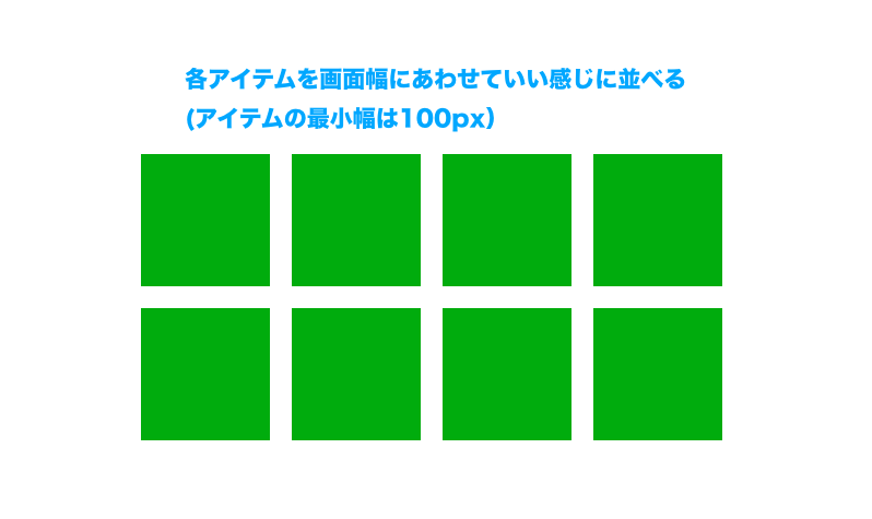
This kind of layout can also be built with float or Flexbox, but Grid Layout offers a few clear advantages here (including some properties not covered earlier). In this sample, all Grid Layout-related CSS is applied only to the grid container, and the layout can be built with just a few properties.
.container {
  /* Grid container */
  display: grid;
  /* Repeat columns with a minimum of 100px and a maximum of 1fr */
  grid-template-columns: repeat(
    auto-fill,
    minmax(100px, 1fr)
  );
  column-gap: 10px;
  row-gap: 10px;
}
You can keep layout rules on the grid container
First, it is very convenient that this layout can be built by styling only the grid container. With float or Flexbox, you typically style the parent as a container and then separately set widths or margins on the items that line up horizontally. With Grid Layout, you can define how grid items are placed directly on the grid container.
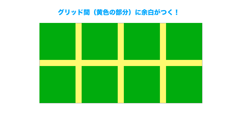
Spacing between items is easy to control
Second, the layout uses row-gap and column-gap to set spacing between grid items. These properties create space only between grid items.
To build this with float or Flexbox, spacing usually requires extra work, such as applying margin and then removing unnecessary outer margins with negative margins or E:nth-child(n). When you use gap, that adjustment is unnecessary.
Item sizing stays simple even when the parent width changes
Third, look at the grid-template-columns value: repeat(auto-fill, minmax(100px, 1fr)). Here, repeat() and auto-fill are used to repeat columns so that as many items as possible fit across the available width, while minmax() sets each item’s minimum and maximum width.
With float or Flexbox, responsive horizontal layouts often require multiple properties to control how many items fit in a row at different widths and how wide each one should be. With Grid Layout, repeat(), auto-fill(), and minmax() make flexible layouts much easier to tune.
Grid Lanes for tightly packing cards with different heights
All of the examples so far assumed a standard Grid Layout where both rows and columns line up. When card heights differ, row alignment tends to create empty space. For layouts such as photo galleries or card lists, where items with varying heights should be packed tightly, Grid Lanes are useful.
Grid Lanes is a layout mode where you define only columns or only rows, and items are packed along the other direction. In the next sample, only the columns are defined with grid-template-columns, so the browser places each card into the earliest column where it can fit based on the card’s height. Unlike normal display: grid;, rows are not aligned, so extra white space is less noticeable even when cards have different heights.
.grid-lanes-demo {
  display: grid-lanes; /* Enable Grid Lanes */
  grid-template-columns: repeat(auto-fit, minmax(112px, 1fr));
  flow-tolerance: 16px; /* Tolerance when packing items */
  gap: 8px; /* Space between items */
}
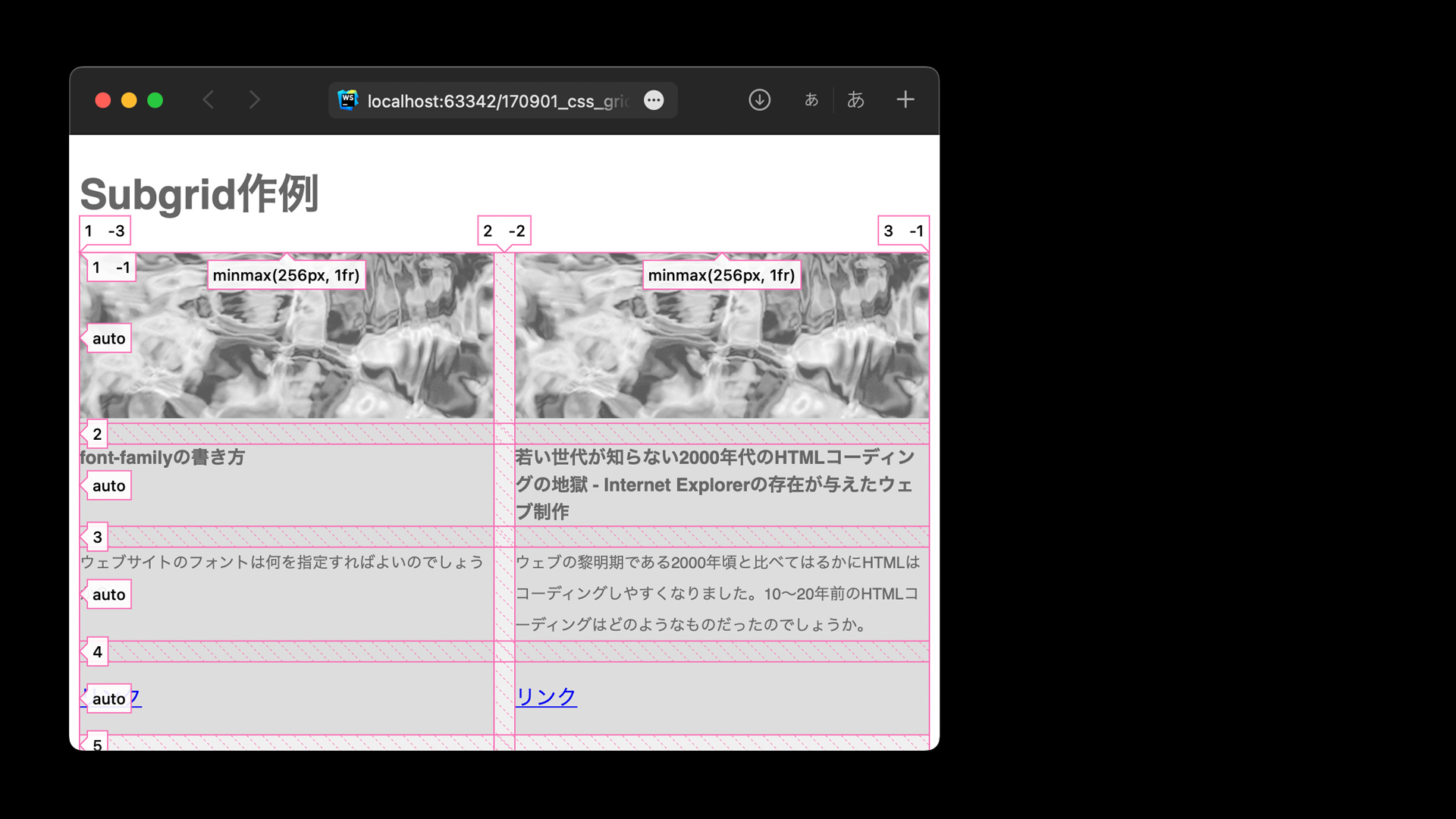
Subgrid
CSS Grid includes a feature called subgrid. In regular CSS Grid, only direct children are treated as grid items. You can nest grids by defining a grid on both parent and child, but those grids do not stay aligned with each other.
With subgrid, nested grids can share the parent grid, so the parent and child tracks stay aligned.
The following example makes the behavior easier to understand.
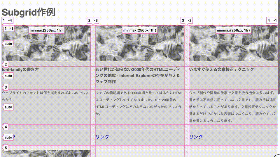
Each card contains a thumbnail, title, summary, and link. The amount of text differs from card to card, but thanks to subgrid, the heights of corresponding rows still line up.
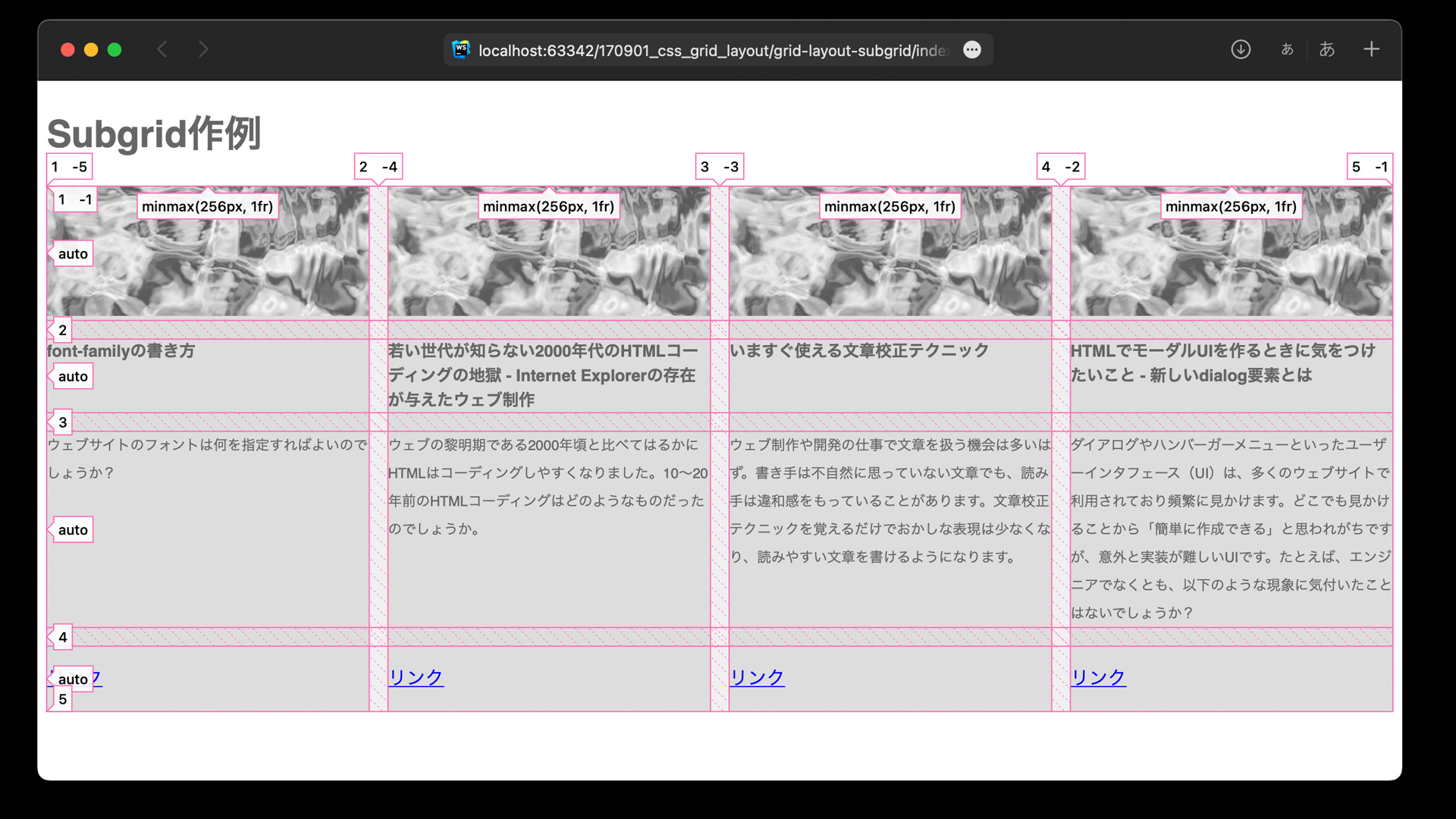
Below is an excerpt showing subgrid. The key point is that the child element has display: grid;, and grid-template-rows: subgrid; is then applied.
.container {
  /* Grid container */
  display: grid;
  /* Repeat columns with a minimum of 256px and a maximum of 1fr */
  grid-template-columns: repeat(auto-fill, minmax(256px, 1fr));
  /* Gap */
  gap: 16px;
}

.item {
  display: grid;
  grid-row: span 4;
  grid-template-rows: subgrid; /* subgrid */
}
Animation
grid-template-columns, grid-template-rows, and the shorthand grid-template property are animatable.
In the following example, hovering a grid item expands the row height for the entire grid, while expanding the column width only for the hovered item.
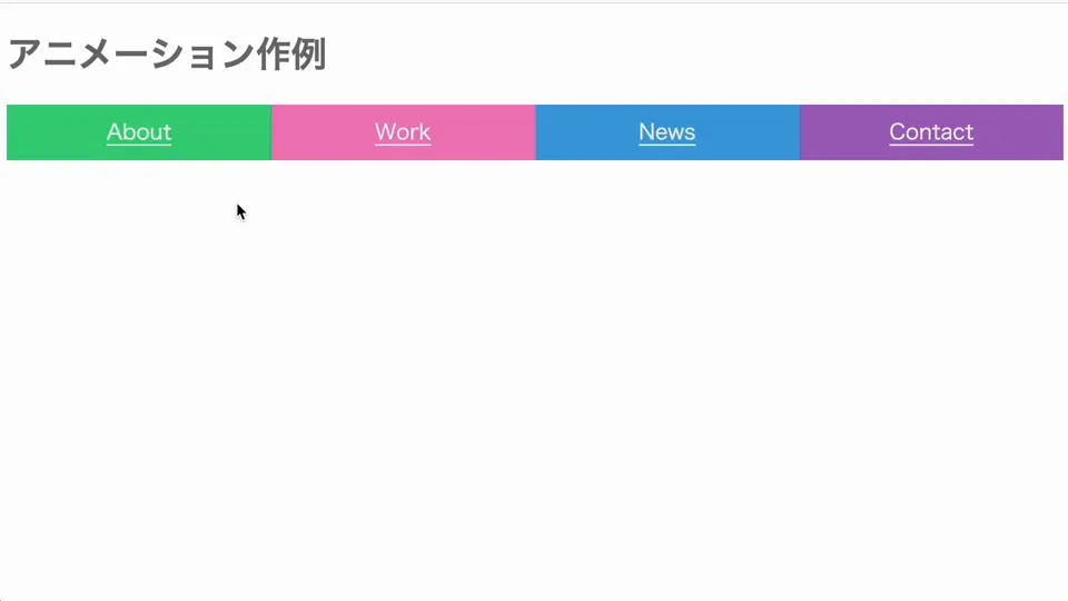
Using the :has() pseudo-class, the container changes the grid size when a grid item is hovered.
See also: “has()疑似クラスでコーディングが変わる! CSS最新スタイリング”
/* Grid container */
.container {
  display: grid;
  grid-template-columns: 1fr 1fr 1fr 1fr;
  grid-template-rows: 50px;
  transition: grid-template 0.8s ease;

  /* Change column widths */
  /* 5fr: make the hovered item wider (5/8 of the total area) */
  /* 1fr: non-hovered items keep their size */
  &:has(> .item:nth-of-type(1):hover){
    grid-template-columns: 5fr 1fr 1fr 1fr;
  }
  &:has(> .item:nth-of-type(2):hover){
    grid-template-columns: 1fr 5fr 1fr 1fr;
  }
  /* (3 and 4 omitted) */

  /* Change row height */
  &:has(> .item:hover){
    grid-template-rows: 280px;
  }

  /* Dim non-hovered items */
  &:has(.item:hover) .item:not(:hover) {
    opacity: 0.5;
  }
}

/* Grid items */
.item{
  min-width: 60px;
  transition: opacity 0.8s;
}
Note: Uses CSS nesting syntax (excerpted to show only the Grid Layout-related parts).
To animate these properties smoothly, the units need to match.
Examples that do not animate correctly
repeat(3, 1fr)->2fr 1fr 1fr(the number of columns or rows is the same, but the different value syntax prevents interpolation)1fr 1fr 1fr->2fr 1fr 1fr 1fr(different numbers of columns or rows)80px->1fr(different units)
Examples that animate correctly
1fr 1fr 1fr->2fr 1fr 1fr(list out the grid sizes and change only the part you want to animate)80px->200px(same unit)
Browser support
Grid Layout has been available in major browsers, including Chrome, Firefox, Safari, and Edge, in versions released since October 2017.
- Reference: CSS Grid Layout (level 1) | Can I use…
Subgrid is available in Chrome and Edge 117 (September 2023), Safari 16.0 (September 2022), and Firefox 71 (December 2019) and later.
- Reference: CSS Subgrid | Can I use…
Grid Lanes is available in Safari 26.4 (March 2026) and later.
Conclusion
This article introduced the basic ways to build layouts with Grid Layout and the key properties involved. There is much more that can be done with Grid Layout.
The follow-up article “特徴で使い分けたいCSSレイアウト手法” explains the differences between Grid Layout, float, and Flexbox. Take a look as well.