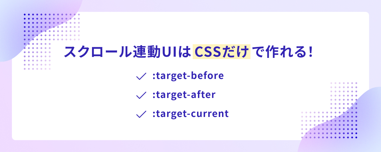
CSS can tell whether the current scroll position is before or after a target piece of content. With the pseudo-classes :target-before, :target-after, and :target-current, plus the scroll-target-group property, you can build scroll-linked interactions in pure CSS that previously required JavaScript.
This article explains how to use each of these CSS features and introduces demos of interactions built entirely with CSS.
Note: The demos in this article require Chrome or Edge 142 or later.
Basic usage for scroll-linked styling
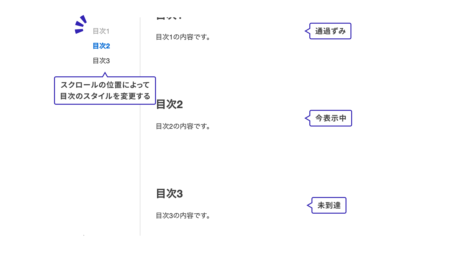
This example uses a website table of contents. The styles change in sync with the scroll position, and the entire interaction is implemented in CSS alone.
Items you have already scrolled past use one style, the section currently in view is emphasized, and items you have not reached yet use another.
1. Set scroll-target-group on the parent element
First, add scroll-target-group: auto to the parent element of the items you want to style based on scroll position. The scroll-target-group property accepts either auto or none. Use auto when you want the styles to respond to scrolling.
In this example, the table of contents is marked up with <ol> and <li> elements. Set scroll-target-group: auto on the outer <ol> element.
<ol class="list">
  <li>Section 1</li>
  <li>Section 2</li>
  <li>Section 3</li>
</ol>
.list {
  scroll-target-group: auto;
}
2. Place <a> elements inside the list
Place <a> elements somewhere inside the container that has scroll-target-group: auto.
Set href="#section1" on the <a> element. Pseudo-classes such as :target-before are activated in sync with the position of the linked element (<section id="section1">) in view, which makes it possible to style the link based on the current scroll position.
<ol class="list">
  <li><a href="#section1">Section 1</a></li>
  <li><a href="#section2">Section 2</a></li>
  <li><a href="#section3">Section 3</a></li>
</ol>

<section id="section1">
  This is the content for Section 1.
</section>
3. Write styles for the pseudo-classes
The following three pseudo-classes are available for styling that responds to scroll position. Here is what each one represents.
:target-current: currently in view:target-before: already scrolled past:target-after: not yet reached
The :target-current pseudo-class is also introduced in “JavaScript不要! HTMLとCSSでつくるカルーセルUI”, so that article is worth checking as well.
.list {
  /* Omitted */

  /* Already scrolled past: light gray */
  a:target-before {
    color: #999;
  }

  /* Currently in view: emphasized */
  a:target-current {
    color: #0066cc;
    font-weight: bold;
  }

  /* Not reached yet: dark gray */
  a:target-after {
    color: #333;
  }
}
Even with this minimal setup, you can create an interaction that stays in sync with scrolling.
Demos
Now that the basic pattern is clear, let’s look at a few demos. In every case, the styling is written entirely in CSS.
Demo 1: Table of contents
This works almost the same way as the earlier table-of-contents example, but here the same idea is applied to a header menu.
.nav__list {
  /* Omitted */
  scroll-target-group: auto;
}

.nav__link {
  /* Omitted */

  /* Already scrolled past */
  &:target-before {
    color: var(--color-text-muted);
  }

  /* Currently in view */
  &:target-current {
    color: var(--color-primary);
    text-decoration: underline;
  }

  /* Not reached yet */
  &:target-after {
    color: var(--color-secondary);
  }
}
Demo 2: Showing progress
This demo makes progress easier to read by styling each step according to the scroll state. The same approach could also work well for a multi-step signup form.
.progress__item {
  /* Omitted */

  /* Already scrolled past */
  /* Show the vertical line between steps */
  &:has(.progress__link:target-before)::after {
    height: 100%;
  }
}

.progress__link {
  /* Omitted */

  /* Already scrolled past */
  &:target-before {
    color: var(--color-text-muted);

    /* Show the check mark */
    .progress__text::after {
      content: "✔️";
      position: absolute;
      top: 0;
      right: -18px;
    }

    .progress__badge {
      color: var(--color-text-muted);
    }
  }

  /* Currently in view */
  &:target-current {
    color: var(--color-primary);

    .progress__badge {
      background-color: var(--color-primary);
      color: var(--color-white);
      border-color: transparent;
    }
  }

  /* Not reached yet */
  &:target-after {
    color: var(--color-text);
  }
}
The :has() pseudo-class also makes more elaborate styling concise. For a detailed explanation of :has(), see “has()疑似クラスでコーディングが変わる! CSS最新スタイリング”.
Demo 3: Combined with horizontal scrolling
This works with horizontal scrolling as well as vertical scrolling. In the itinerary demo below, the header styles change based on the horizontal scroll position.
.nav__list {
  &::after {
    /* Position the bus icon with anchor positioning */
    top: anchor(top);
    right: anchor(right);
    height: anchor-size(height);
    width: calc(anchor-size(width) + 24px);
    position-anchor: --current-city;
    /* Omitted */
  }
}

.nav__item {
  /* Omitted */

  /* Currently in view */
  &:has(.nav__link:target-current) {
    border-bottom: 1px solid var(--color-border);
  }

  /* Not reached yet */
  &:has(.nav__link:target-after) {
    border-bottom: 1px solid var(--color-border);
  }
}

.nav__link {
  /* Omitted */

  /* Already scrolled past */
  &:target-before {
    color: var(--color-text-muted);
  }

  /* Currently in view */
  &:target-current {
    color: var(--color-primary);
    /* Use the currently visible item as the anchor so the bus icon can move */
    anchor-name: --current-city;
  }
}
The styles that move the bus icon use CSS Anchor Positioning. For more information, see “CSSアンカーポジショニング入門 anchor()・anchor-size()の使い方”.
Browser support
The :target-before and :target-after pseudo-classes are supported in Chrome and Edge 142 (October 2025) and later.
Reference: Can I use…
Conclusion
Using the :target-before and :target-after pseudo-classes makes it easy to build interactive UI without JavaScript. For now, the feature is limited to Chrome and Edge, but hopefully it will spread to other browsers in the future.