
With Chrome 135 and Edge 135, released in April 2025, it became possible to build a carousel UI using only HTML and CSS. The newly added ::scroll-button() and ::scroll-marker pseudo-elements make it possible to implement both buttons and indicators.
A carousel implemented with only HTML and CSS
When implementing a carousel UI, many front-end developers have probably reached for a JavaScript library such as Swiper.js instead of building everything from scratch. ICS MEDIA also has an article that summarizes JavaScript libraries for carousel UIs.
This article looks at the kinds of carousels that these new CSS features make possible.
Note: View the demos in Chrome 135 or later, or Edge 135 or later.
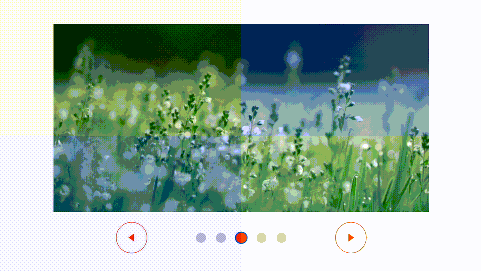
1. A simple carousel
First, here is a simple carousel with the following features.
- Shows one image at a time and moves one slide at a time
- Displays previous and next buttons
- Displays indicators
Try the demo above yourself. In Chrome on Android, swipe gestures are also supported.
Excerpt from the HTML
<div class="container">
  <ul class="carousel">
    <li class="item"><img src="./images/flower_01.jpg" alt="" /></li>
    <li class="item"><img src="./images/flower_02.jpg" alt="" /></li>

    <!-- Omitted -->
  </ul>
</div>
Excerpt from the CSS
/* ----------------------*
 * Container
 * ----------------------*/
.container {
  /* Omitted */

  /* Use a grid layout to place each part */
  display: grid;
  grid-template-areas: "item item item" "left markers right";

  /* Omitted */
}

/* ----------------------*
 * Carousel
 * ----------------------*/
.carousel {
  display: grid;
  /* Arrange items horizontally */
  grid-auto-flow: column;
  grid-area: item;
  /* Space to the next slide */
  gap: 120px;
  overflow-x: auto;
  /* Snap on the x-axis */
  scroll-snap-type: x mandatory;
  /* Move one slide at a time */
  scroll-snap-stop: always;
  /* Scroll smoothly */
  scroll-behavior: smooth;
  /* Display indicators */
  scroll-marker-group: after;
  /* Hide the scrollbar */
  scrollbar-width: none;

  /* Omitted */
}
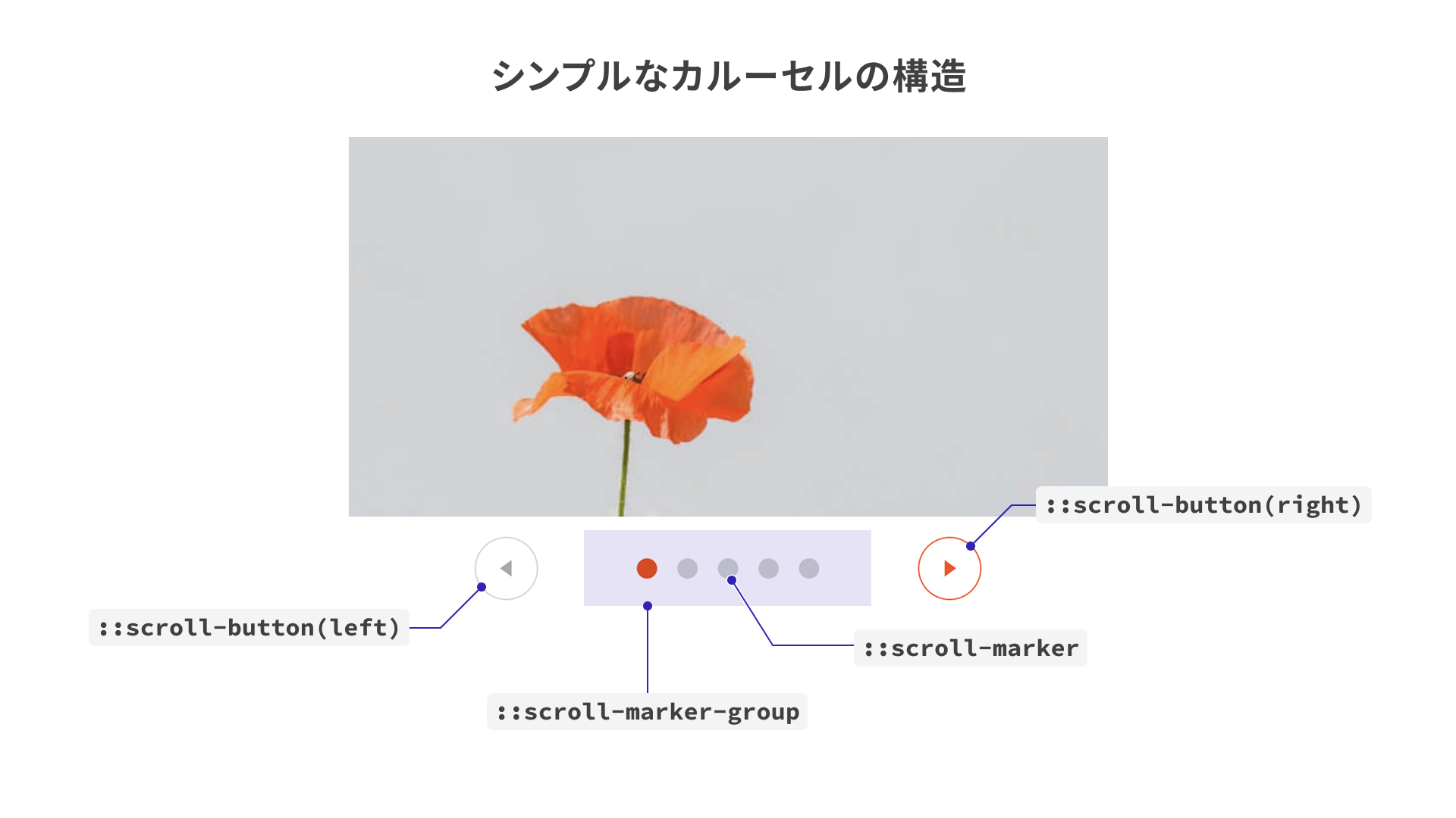
The HTML is very simple, consisting of only the wrapper element for the carousel (div.container) and the image list that makes up the carousel itself (ul.carousel).
The key features in this simple carousel are the ::scroll-button() and ::scroll-marker pseudo-elements introduced earlier. They are used to render the previous/next buttons and the indicators, respectively.
Displaying previous and next buttons with ::scroll-button()
The ::scroll-button() pseudo-element is applied to the carousel itself, ul.carousel, to display the previous and next buttons (*). Using * inside the parentheses targets both buttons, while left and right let you style each side individually.
* The ::scroll-button() pseudo-element only works on scrollable elements.
Excerpt from the CSS
/* ----------------------*
 * Carousel
 * ----------------------*/
.carousel {
  /* Omitted */

  /* Previous and next buttons */
  &::scroll-button(*) {
    width: 50px;
    height: 50px;
    border-radius: 50%;

    /* Omitted */
  }

  /* Previous button (left) */
  &::scroll-button(left) {
    /* Visible content / alternative text */
    content: "◀" / "Previous";
    grid-area: left;
    justify-self: end;
  }

  /* Next button (right) */
  &::scroll-button(right) {
    /* Visible content / alternative text */
    content: "▶" / "Next";
    grid-area: right;
  }

  /* Omitted */
}
- Reference: ::scroll-button() - CSS | MDN
Displaying indicators with ::scroll-marker
The indicators are displayed with the ::scroll-marker pseudo-element applied to li.item. The appearance of each dot can also be customized. To control the placement of the indicator group itself, use ::scroll-marker-group on the parent element, ul.carousel.
Excerpt from the CSS
/* ----------------------*
 * Carousel image item
 * ----------------------*/
.item {
  /* Indicator */
  &::scroll-marker {
    content: "";
    display: block;
    width: 16px;
    height: 16px;

    /* Omitted */
  }

  /* Current indicator style */
  &::scroll-marker:target-current {
    background-color: blue;
  }
}
References:
In summary, the simple carousel has the following structure.
From here, let’s look at layout patterns that commonly appear in real-world websites.
2. A carousel with image indicators
This is a common layout for product detail pages on e-commerce sites.
A distinctive feature of this layout is that the indicators are image buttons that correspond to each slide. This is implemented with CSS custom properties, also known as CSS variables.
Excerpt from the HTML and CSS
<ul class="carousel">
  <!-- Set the image URL in --img via the style attribute -->
  <li
    class="item"
    style="--img: url(/250516_css_carousel/02/images/product_01.jpg)"
  >
    <img src="/250516_css_carousel/02/images/product_01.jpg" alt="" />
  </li>

  <!-- Omitted -->
</ul>
/* Indicator */
&::scroll-marker {
  /* Omitted */

  /* Set the background image. --img contains the same URL as the img element's src attribute */
  background-image: var(--img);

  /* Omitted */
}
Custom properties are a feature that lets you define arbitrary variable names prefixed with -- and retrieve them with the var() function. In the example above, the URL used for the CSS background-image is set to the same value as the src attribute of the HTML img element.
In this demo, the image paths are written as root-relative URLs so they do not change depending on where the CSS file is located.
3. A full-width carousel
This is the kind of layout often seen on website homepages. Think of linked banner images that take the user to another page when clicked.
In this layout, the previous and next buttons are placed inside the carousel. Here, the button positions are adjusted with the position-anchor property.
Excerpt from the CSS
/* ----------------------*
 * Carousel
 * ----------------------*/
.carousel {
  /* Name the anchor used as the positioning reference */
  anchor-name: --carousel;

  /* Omitted */

  /* Previous and next buttons */
  &::scroll-button(*) {
    position: absolute;
    /* Position relative to the carousel */
    position-anchor: --carousel;
    top: anchor(center);
    transform: translateY(-50%);

    /* Omitted */
  }
}
Set a name with anchor-name on the element you want to use as the reference point, which is ul.carousel in this example, and then specify position-anchor: --carousel; on the ::scroll-button() pseudo-element. This lets you place the buttons over the carousel and center them vertically.
As another point to keep in mind, anchor-name and position-anchor were also supported only in Chrome and Edge among major browsers as of May 2025. See the following pages for details.
References:
Accessibility benefits
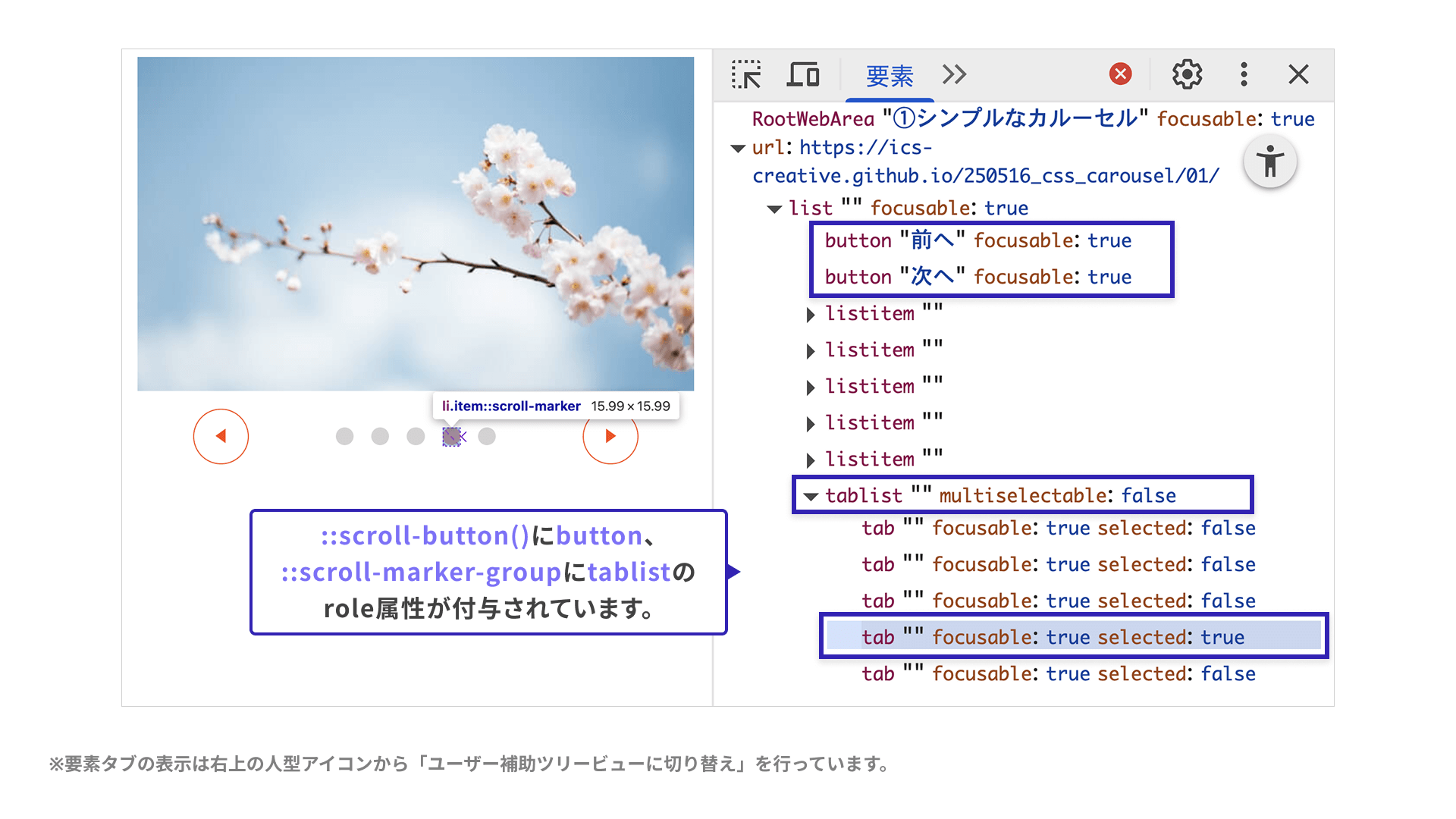
This way of implementing a carousel also offers accessibility benefits. Using the demo in “1. A simple carousel” as an example, here are a few of them.
Supports keyboard navigation
The carousel’s previous and next buttons and indicators can be operated with the Tab key and the arrow keys. This is because appropriate role attributes such as button and tablist are assigned automatically. If you inspect the accessibility tree in DevTools, you can see settings like the following.
Screen readers announce the UI appropriately
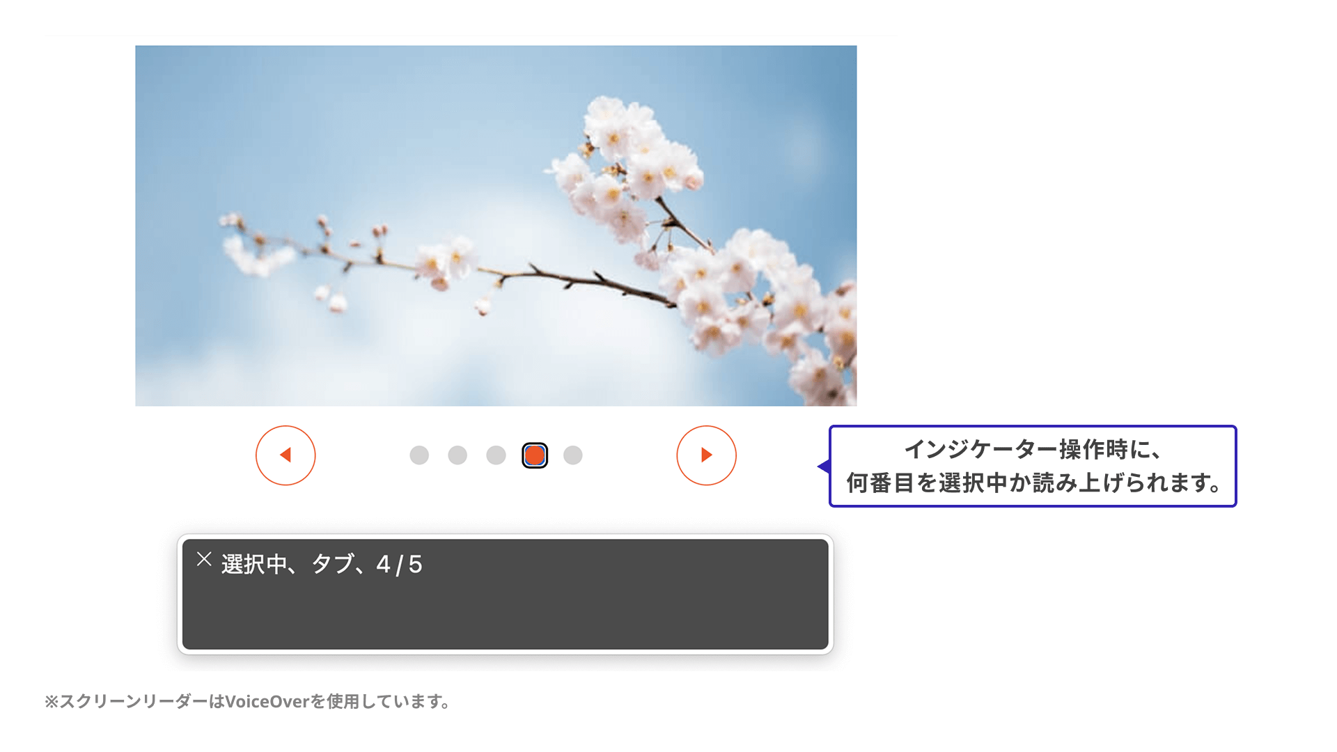
Screen readers also announce these controls appropriately. For example, an indicator button can convey information such as which item is currently selected.
Besides eliminating the need for JavaScript, it is also helpful that the browser handles behavior automatically that could become complicated in a custom implementation.
Things to watch out for: browser support and features that are still missing
So far, this article has introduced carousel UIs built with CSS. There are still some limitations that make them difficult to adopt in production today, so it is worth highlighting a few caveats.
- Browser support is still limited (as of May 2025, Chrome and Edge only)
- Some desired features have been discussed, but are not yet available
The browser support for ::scroll-button() and ::scroll-marker is shown below.
Reference: CSS selector: ::scroll-button() | Can I use… Support tables for HTML5, CSS3, etc
Reference: CSS selector: ::scroll-marker | Can I use… Support tables for HTML5, CSS3, etc
An example of the second point, features that are still unavailable, is looped navigation. In other words, when the last slide is visible and the user clicks the “Next” button, the carousel cannot yet wrap back to the first slide. Many JavaScript libraries let you enable this as an option, so it is definitely a feature worth having.
Conclusion
Carousel UIs that used to be difficult to build without JavaScript are becoming easier and more accessible to implement. Although not included in the demos here, the pseudo-elements introduced in this article can also be used for tabbed interfaces, not just carousel UIs. It is still too early to adopt them casually in production projects, but it will be worth watching how support expands and what features are added next.