text-box-trim and text-box-edge properties make it possible to control the space above and below text elements.
For example, text-box: trim-both cap alphabetic; lets you adjust the space above and below text.
Results vary by font.
This article explains how these properties work and focuses primarily on how they help implement specific designs, especially with Japanese fonts.
What is the space above and below text?
What exactly is the space above and below text that can now be adjusted? It is the space created when the line-height property makes the overall line height larger than the font size. This is also called “half-leading.” Here is a simple explanation.
For example, suppose text with a font size of 60px is given line-height: 2. If a background color is added to make the effect easier to see, it looks like this.
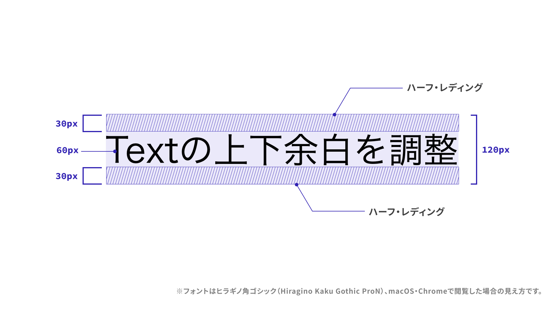
The line height is 120px, calculated as 60px × 2. The difference between that 120px line height and the 60px font size is 60px, and that difference is called leading. The English word “leading” comes from the strips of lead placed between lines in letterpress printing. Half-leading is half of that value, which means 30px is added above the text and another 30px below it.
To match a design precisely, many developers have probably adjusted padding or margin values to account for half-leading, or used other techniques to cancel it out.
With the text-box property, you can control whether to trim the half-leading on the top, the bottom, or both, and where the trimming should start.
Can line-height: 1 also solve this?
For single-line text, another common approach has been to set line-height: 1 so no extra space is created by the difference between font size and line height. But when the text changes or wraps into multiple lines, for example after machine translation, it can start to look cramped.
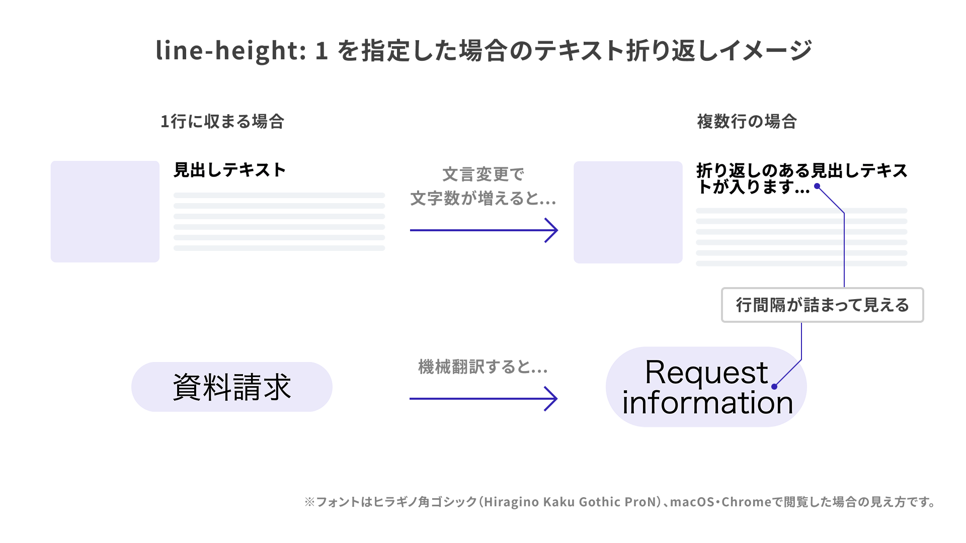
With the text-box property, you can remove unnecessary half-leading while still preserving the line spacing specified by line-height.
How to use the text-box property
Before looking at the shorthand text-box property, let’s go through text-box-trim and text-box-edge one by one.
text-box-trim
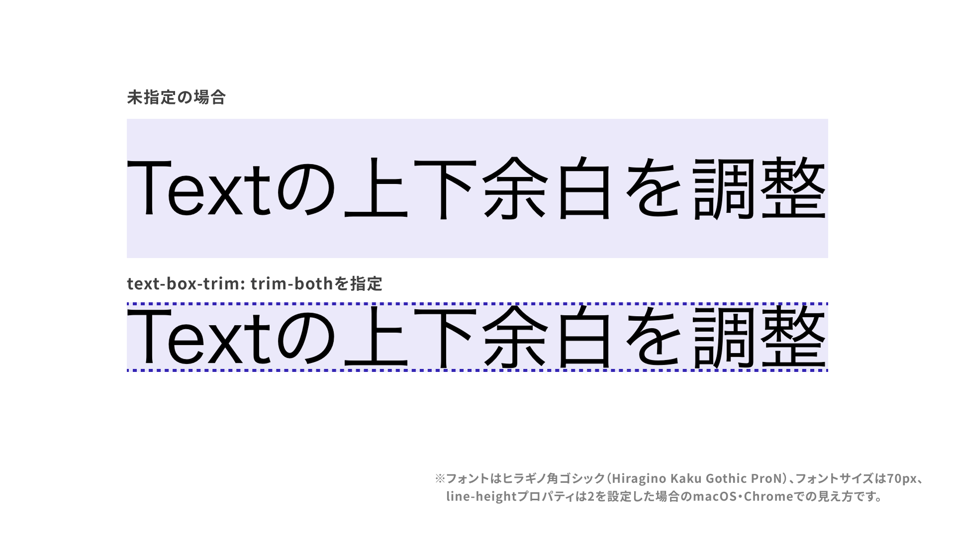
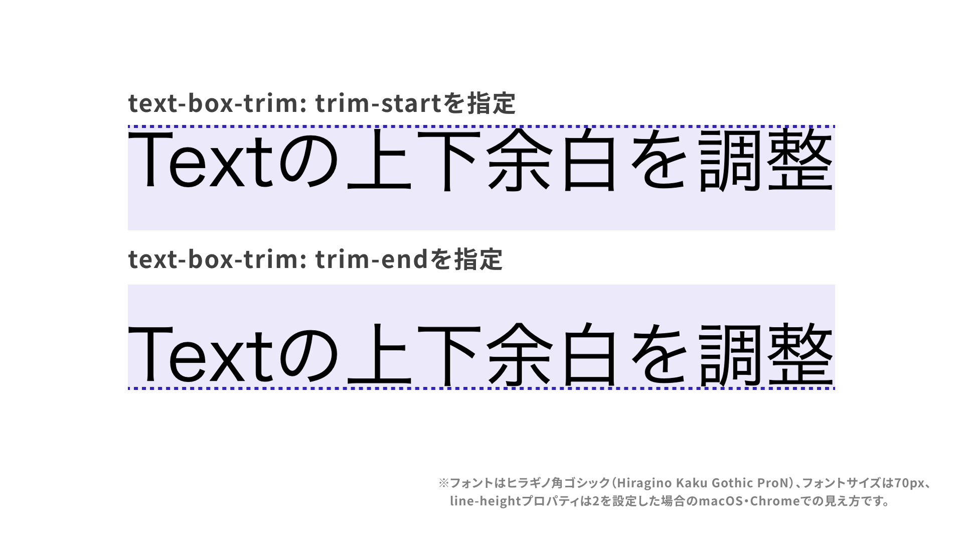
This property specifies which side of the extra vertical space should be trimmed. Use trim-both to trim both the top and bottom. Other possible values are as follows.
none: The initial value. No space is trimmed.trim-both: Trims the space on both the top and bottom.trim-start: Trims the space at the top.trim-end: Trims the space at the bottom.
Example CSS
/* Trim both the top and bottom space */
.text {
  text-box-trim: trim-both;
}
References
text-box-edge
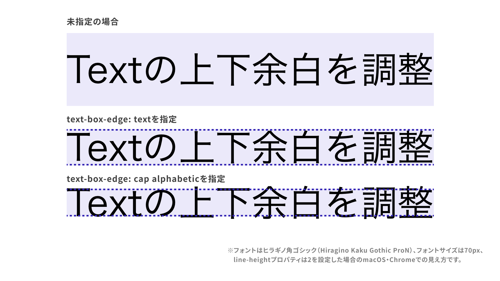
The text-box-edge property specifies where trimming begins.
There are several possible values. Here are a few representative ones.
text: The initial value. Trims the top attext-over baseline(including the font’s ascenders) and the bottom attext-under baseline(including descenders).cap: Trims the top atcap-height baseline, which corresponds to the cap height of Latin uppercase letters such asX.alphabetic: Trims the bottom at thealphabetic baselineused by Latin text.
Example CSS
/* When specifying one value */
.text {
  text-box-trim: trim-both;
  text-box-edge: text;
}

/* When specifying two values, the first applies to the top space and the second to the bottom space */
.text2 {
  text-box-trim: trim-both;
  text-box-edge: cap alphabetic;
}
The following image shows roughly how trimming changes with each value.
The position of each reference line varies by font. In Japanese fonts the difference is often subtle, but in Latin typefaces the positions can vary significantly depending on the font.
In addition to the values used in the opening example, ideographic and ideographic-ink are also defined for Chinese, Japanese, and Korean text, but they are not yet supported.
References
- text-box-edge - CSS | MDN
- Microsoft Edge 133 web platform release notes (Feb. 2025)
<text-edge>- CSS | MDN
text-box shorthand
Using the text-box property lets you set text-box-trim and text-box-edge together.
.text {
  text-box-trim: trim-both;
  text-box-edge: cap alphabetic;
}
The same declaration can be written more concisely as follows. The values are specified in the order text-box-trim, then text-box-edge.
.text {
  text-box: trim-both cap alphabetic;
}
See the MDN page for full syntax details.
Design examples that are easier to build with text-box
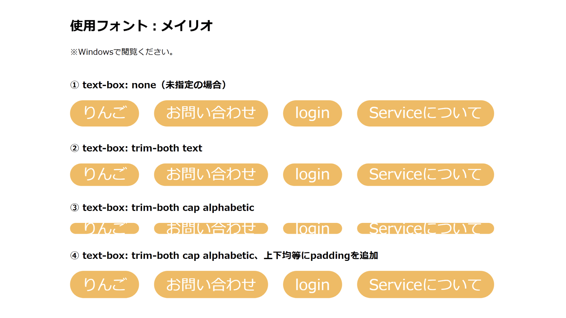
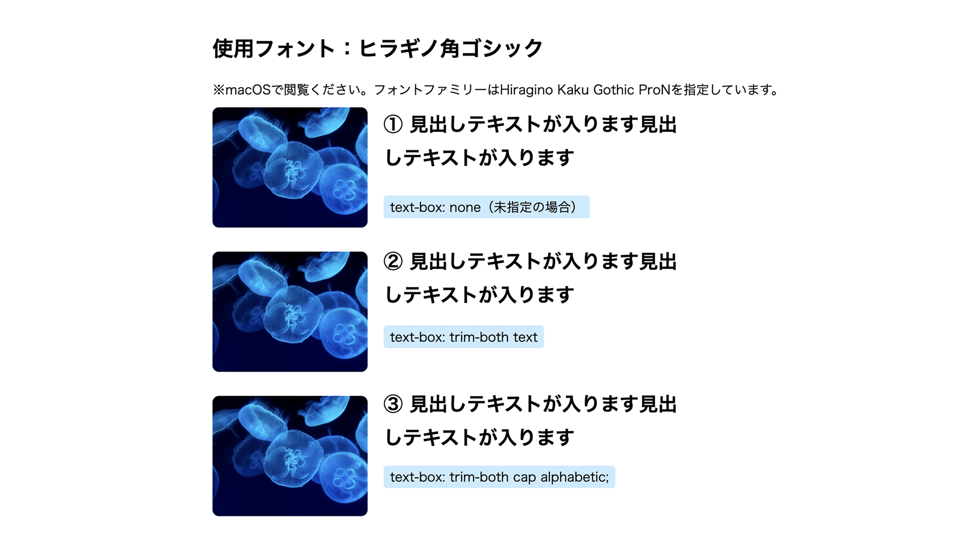
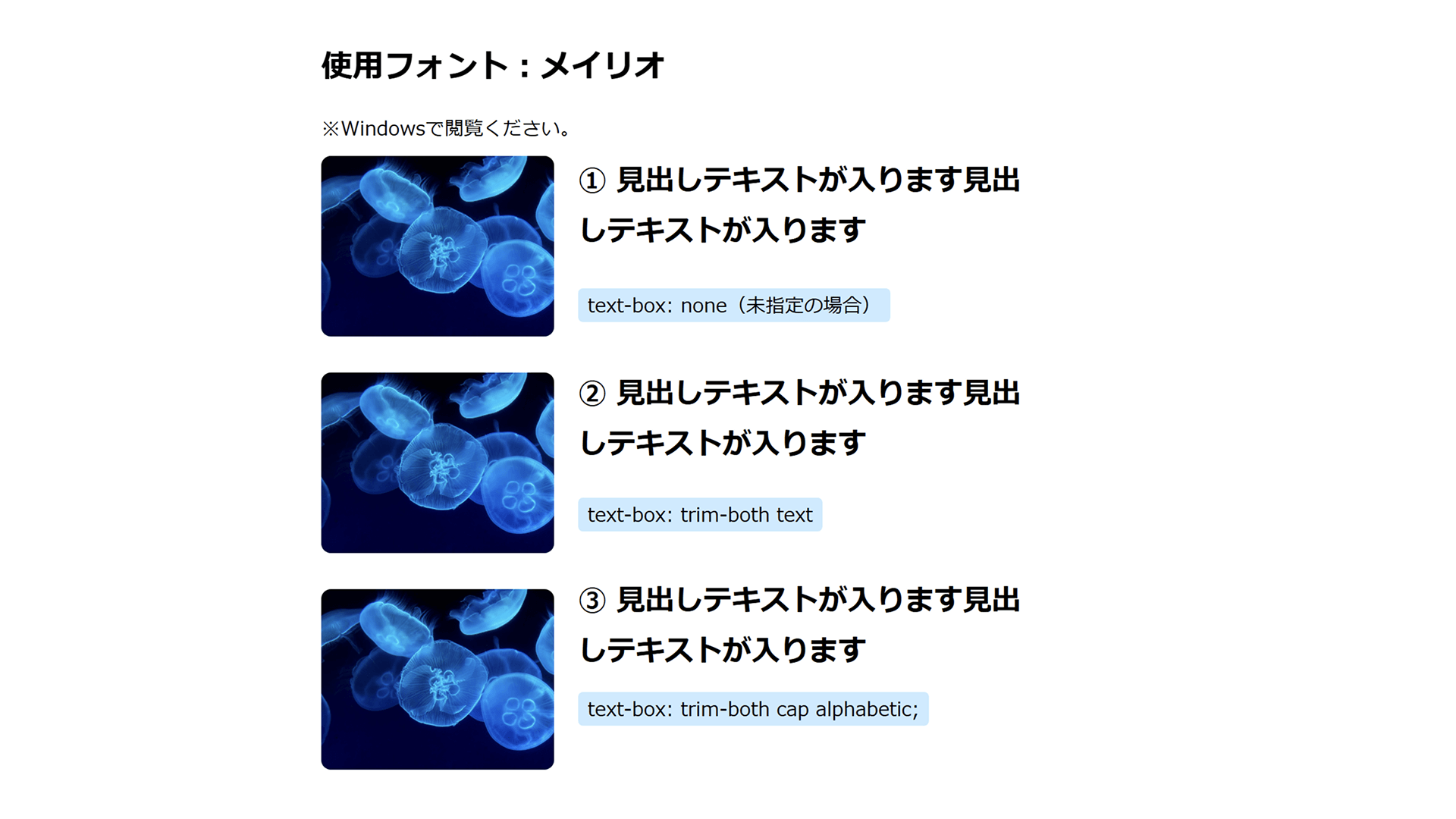
From here, let’s look at design patterns whose appearance becomes easier to refine with the text-box property. Most examples use Google Fonts’ Noto Sans Japanese, a font commonly seen on recent websites that has noticeably different amounts of space above and below the glyphs. The samples also include BIZ UDPGothic, Zen Old Mincho, and the default system fonts Yu Gothic, Hiragino Kaku Gothic, and Meiryo.
Text on rounded rectangle backgrounds
Let’s start with a pattern commonly used across many websites: text placed on a rounded rectangle background.
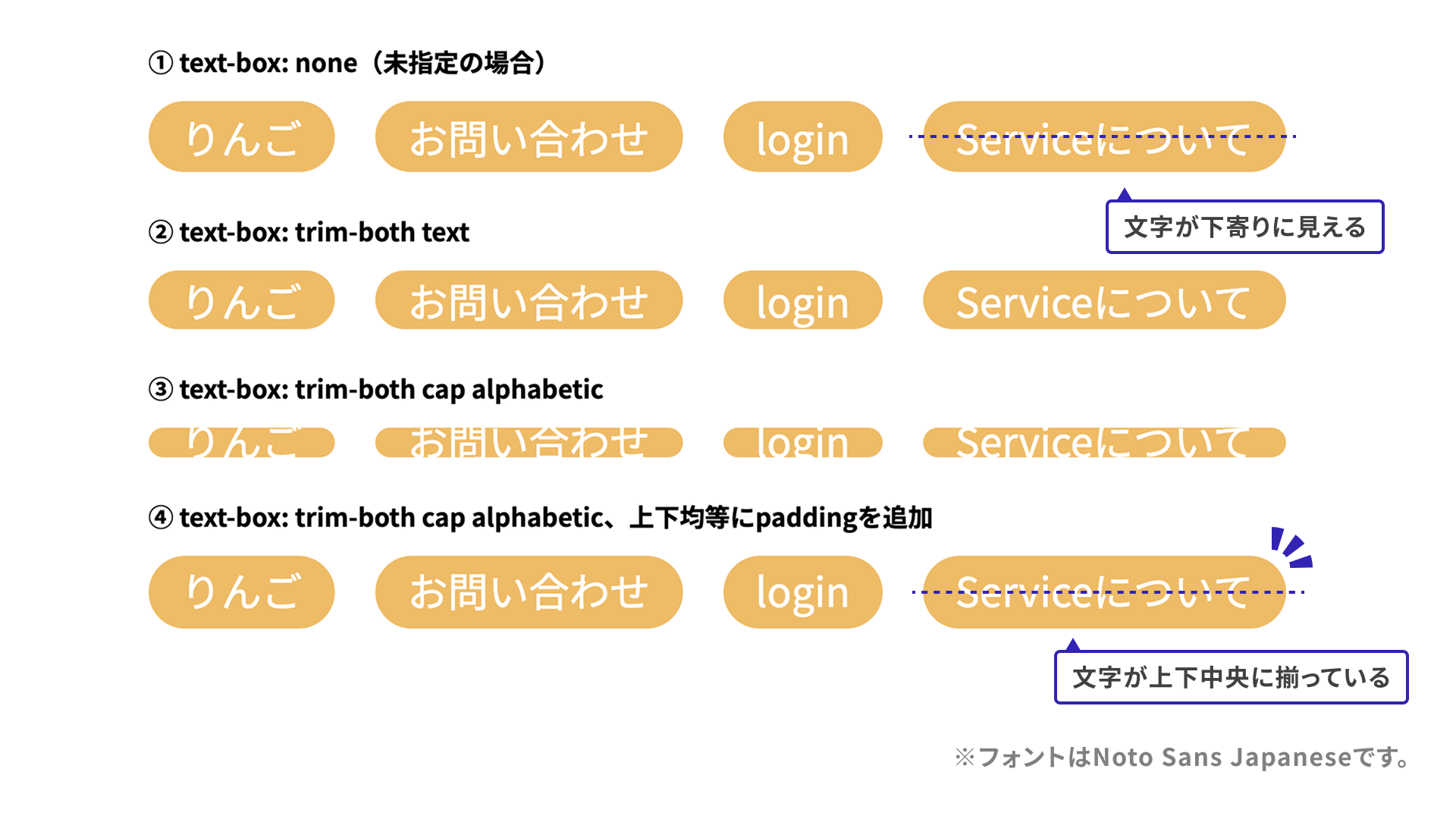
The difference is subtle, but in example 1, with no text-box specified, the text looks a few pixels too low. In example 2, the half-leading has been removed, but the text still looks slightly low. In example 3, changing the value to trim-both cap alphabetic makes the Japanese text look somewhat over-trimmed, but Japanese and English are trimmed more evenly together. In example 4, equal padding is added above and below to fine-tune the result.
To compare how other fonts render, see the demo below.
Scroll to view the demo.
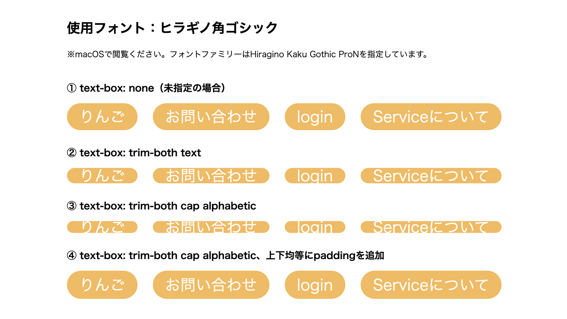
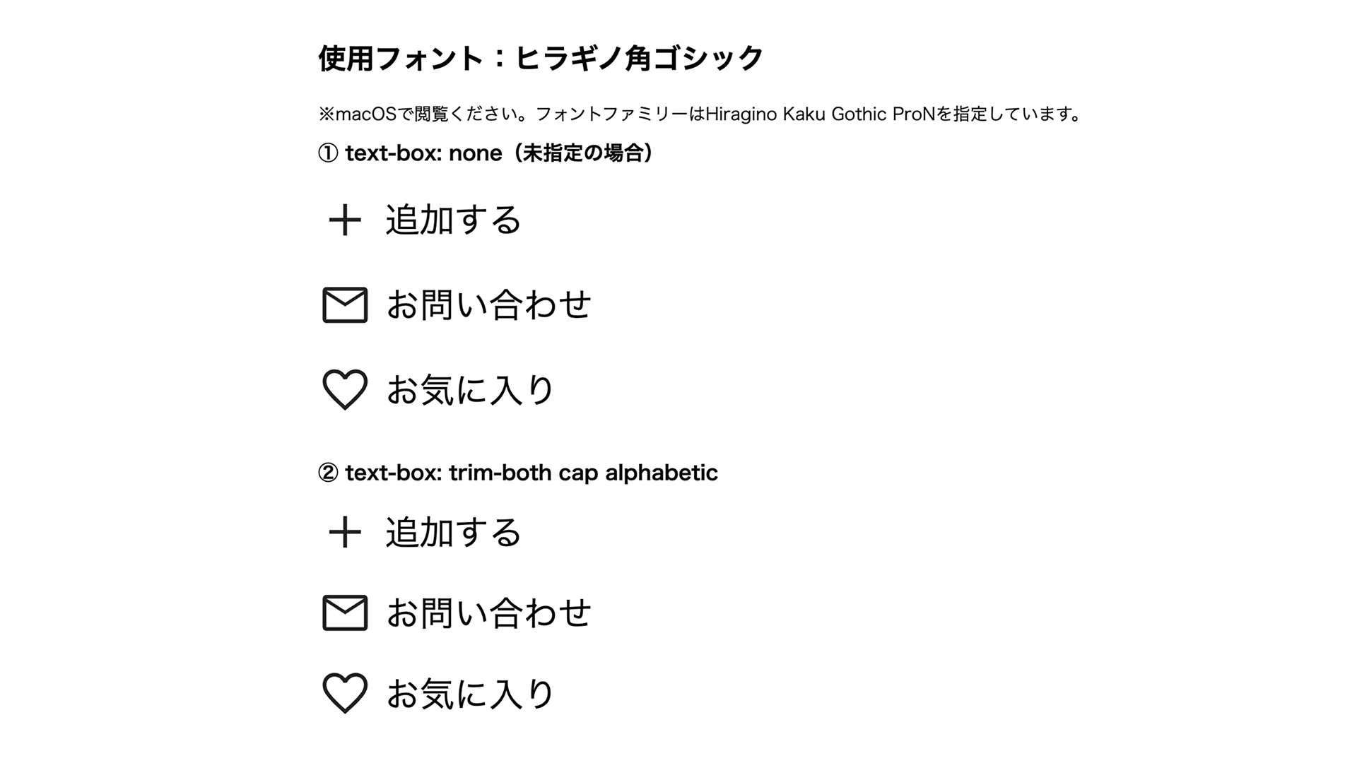
Because Hiragino Kaku Gothic and Meiryo are only available in limited environments, screenshots are included below.
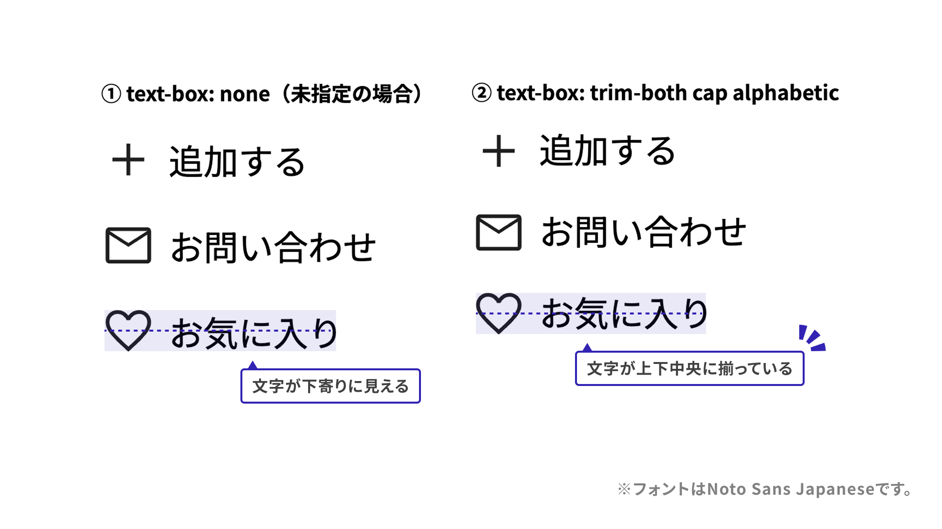
Combining icons and text
Next, consider a layout that combines an icon and text. Even when CSS is used to vertically center the icon and text, some fonts can still make them look a few pixels off. In the following sample, text-box: trim-both cap alphabetic makes the icon and text look vertically centered.
To compare how other fonts render, see the demo below.
Scroll to view the demo.
Because Hiragino Kaku Gothic and Meiryo are only available in limited environments, screenshots are included below.
Combining images and text
Side-by-side layouts with an image and text are also common, but half-leading can make the text look slightly lower than the image.
Here too, the text-box property can help align the top edges of the image and text.
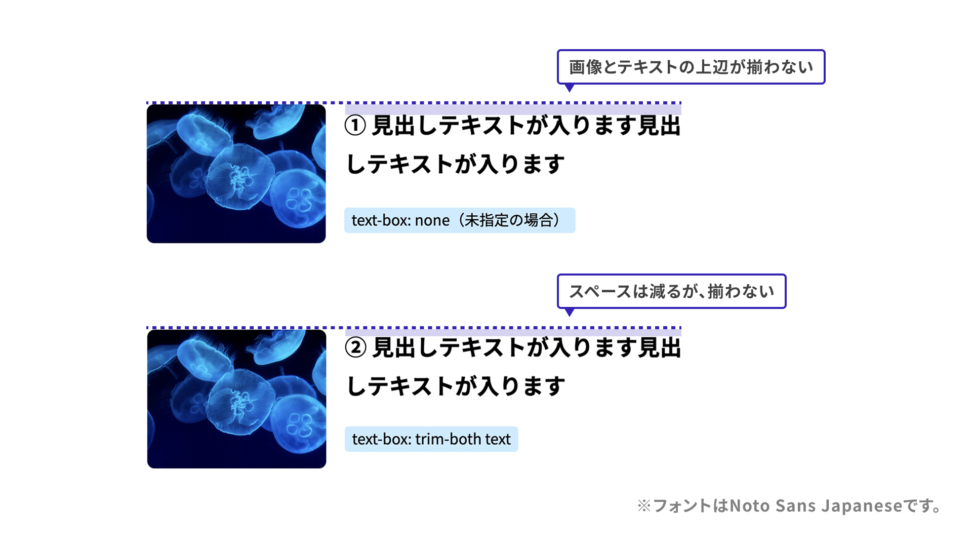
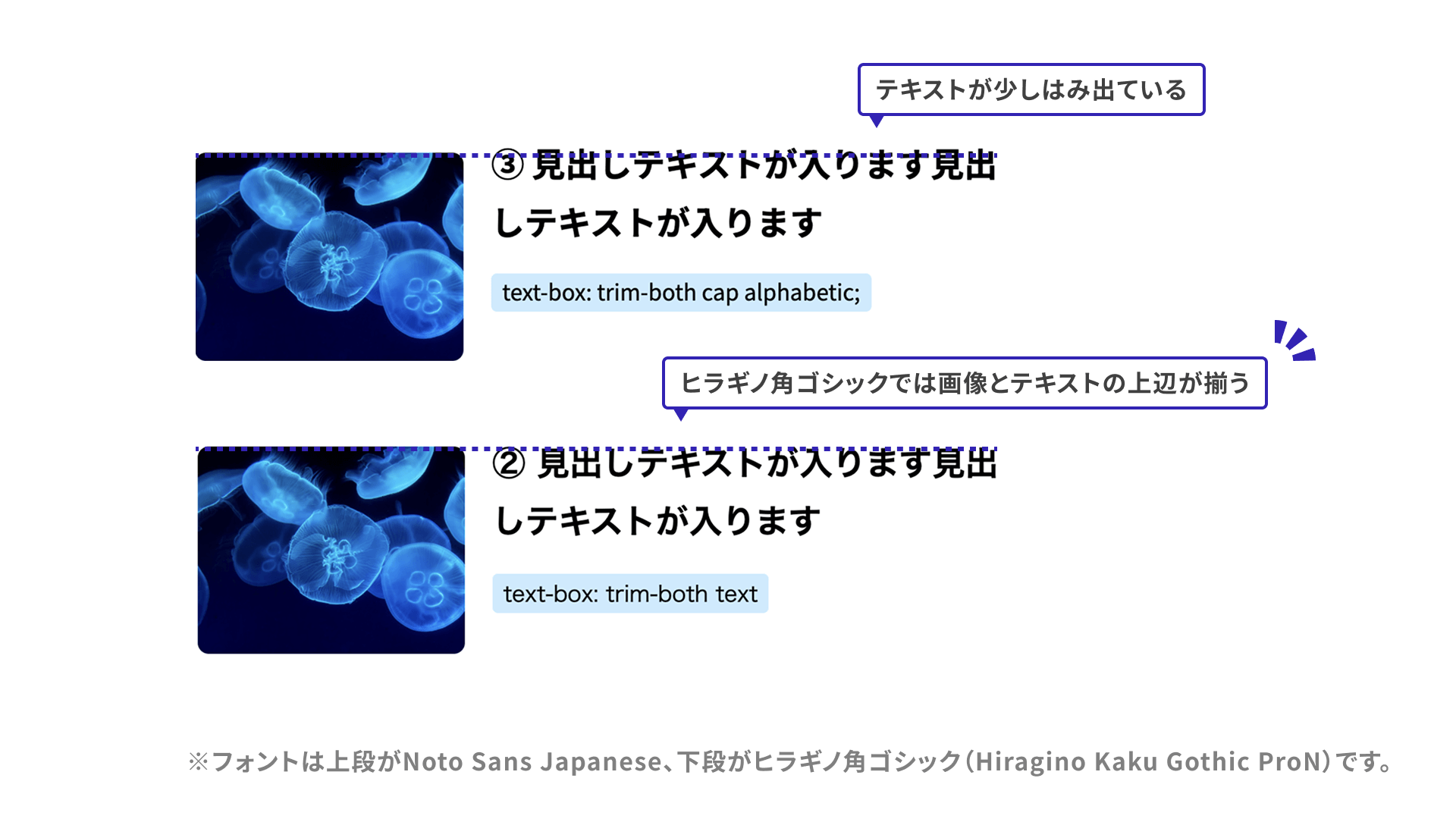
However, fonts require some caution. With a font like Noto Sans Japanese, which sits visually low, the top edges of the image and text may still not align perfectly no matter how text-box-edge is set. Hiragino Kaku Gothic, by contrast, looks better aligned than Noto Sans Japanese.
To compare how other fonts render, see the demo below. In the fonts tested for this article, text-box: trim-both text produced the most visually aligned result in most cases.
Scroll to view the demo.
Because Hiragino Kaku Gothic and Meiryo are only available in limited environments, screenshots are included below.
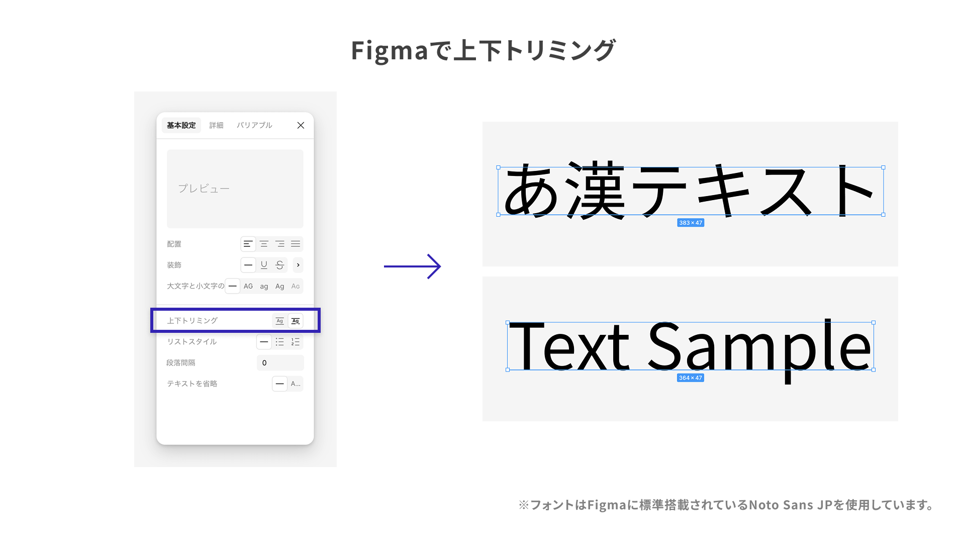
Useful Figma settings
Some of the text-box behavior shown above can also be approximated in Figma. To configure it for a text layer, follow these steps.
- Select a text layer.
- In the Design panel, go to the Typography section and click the Type settings icon at the lower right to open the settings panel.
- Set Vertical trim to “Cap height to baseline.”
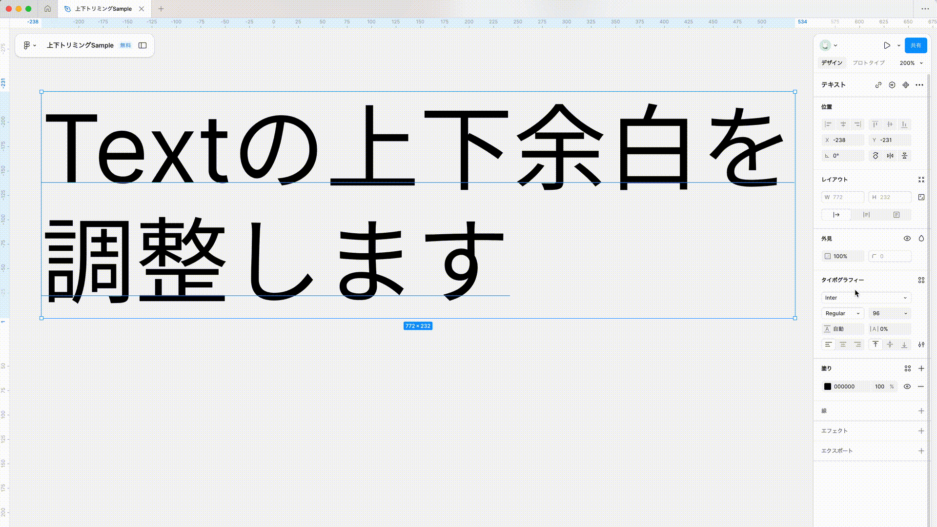
This looks close to trimming with text-box-edge: cap. Because cap height is based on Latin uppercase letters, it can protrude slightly when applied to Japanese fonts.
For more on this feature, see the post from Figma’s official X account below.
Also note that, as of March 2025, Figma cannot do the following:
- Trim only the top or only the bottom
- Reproduce
text-box-edgevalues other thancap
Browser support
As of January 2026, the text-box property is supported in Chrome and Edge 133 (February 2025) and Safari 18.2 (December 2024) and later. Among the major modern browsers, Firefox does not support it.
Reference: Can I use…
Conclusion
This article introduced the text-box property. Being able to control the extra space created by line-height is certainly useful. At the same time, as the samples show, the results change even across Japanese fonts, so it is worth adopting carefully. Better support for Japanese fonts and wider browser support would make this even more useful.