Released in March 2025, Chrome 134 and Microsoft Edge 134 made it possible to customize the <select> element. Until now, the visual styles available for <select> were quite limited, so many developers may have resorted to building custom replacements by combining other elements. With a custom implementation, however, accessibility and keyboard interaction also need to be handled manually, and those parts can easily end up incomplete. Being able to customize <select> directly makes it easier to create flexible designs and layouts while preserving the built-in behavior of the element.
This article looks at what is now possible with customizable <select> elements. (The demos in this article are intended to be viewed in Chrome 134 or Microsoft Edge 134 and later.)
Required CSS for customization
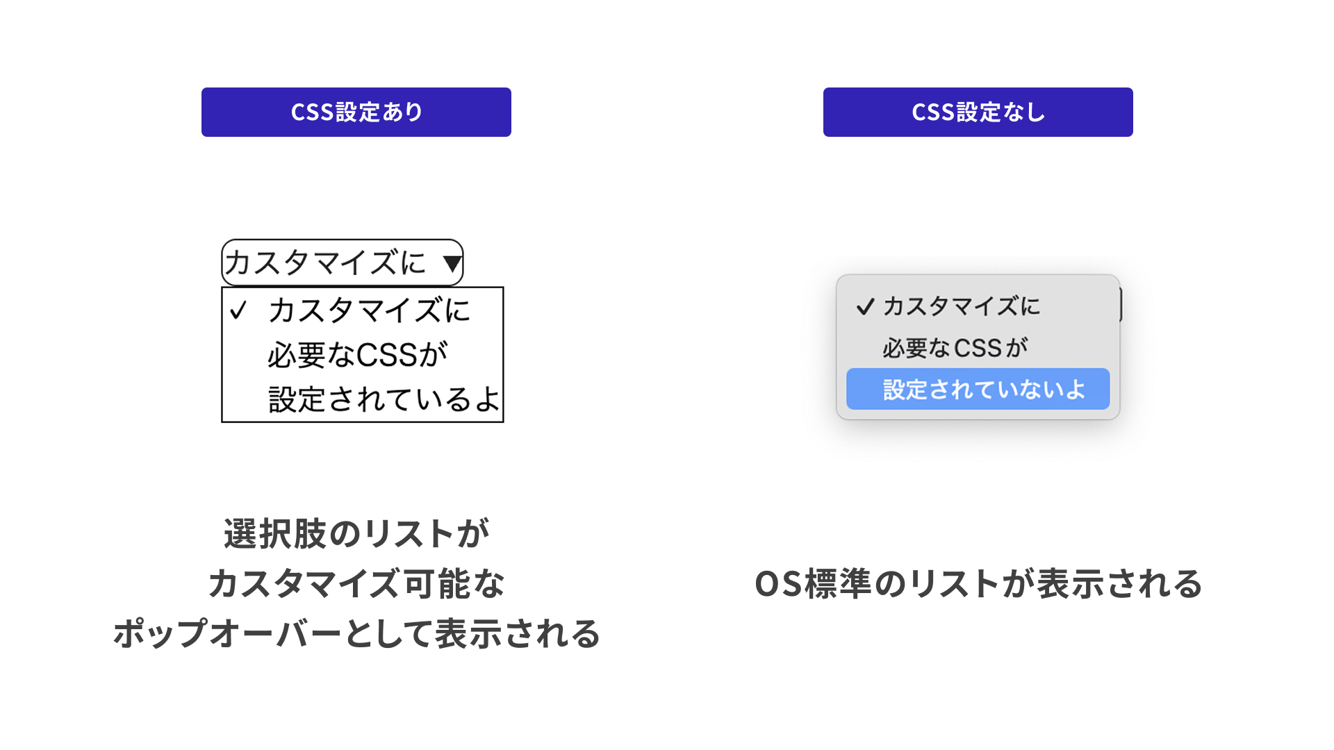
Start with the CSS that is required for customization. Apply appearance: base-select; to the <select> element and its ::picker(select) pseudo-element, as shown below. The ::picker(select) pseudo-element controls the popover that displays the list of options when the <select> element is clicked. Once this declaration is in place, the element is ready to be customized.
select,
::picker(select) {
  appearance: base-select;
}
A quick comparison with and without this declaration shows that the appearance changes immediately.
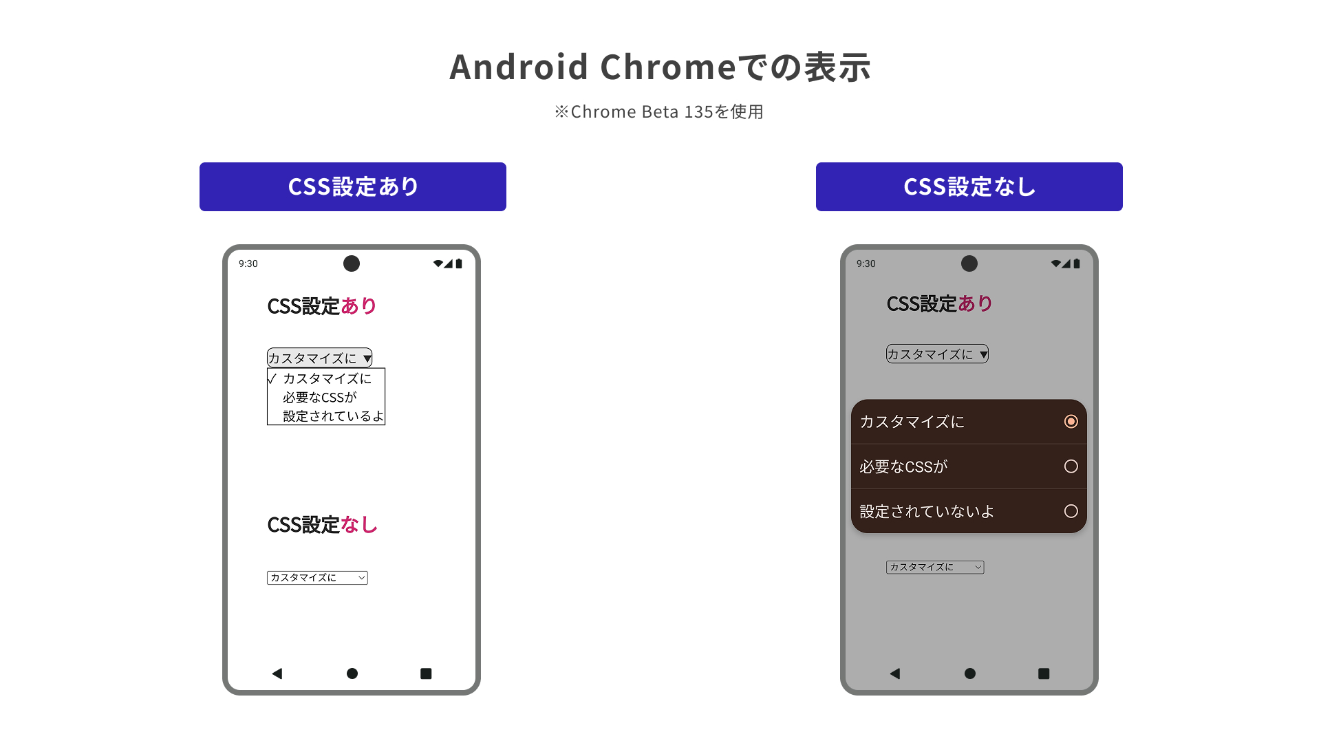
Chrome on Android
This setting also works in Chrome on Android. In Chrome Beta 135 for Android, the control appears as shown below. Without the CSS declaration, it uses the default OS styling.
However, as the figure below also shows, the version without the CSS customization is easier to use in this demo on Chrome for Android. When customizing a control with CSS, it is important to pay attention not only to how it looks, but also to how easy it is to use.
Adding styles to the pseudo-element
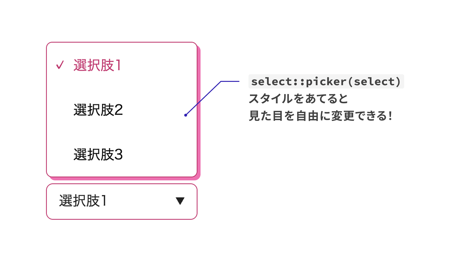
You can also style the ::picker(select) pseudo-element to change the appearance of the options list more freely. Animations using CSS transitions are supported as well.
/* Change the style of the options popover */
.styled::picker(select) {
  border-color: #cf256d;
  border-radius: 8px;
  margin: 8px 0;
  box-shadow: 4px 4px #ff67b3;
  /* You can animate it too */
  transition: scale 0.2s;
}
.styled::picker(select):hover {
  scale: 1.05;
}
<select> can now contain elements other than <option> and <optgroup>
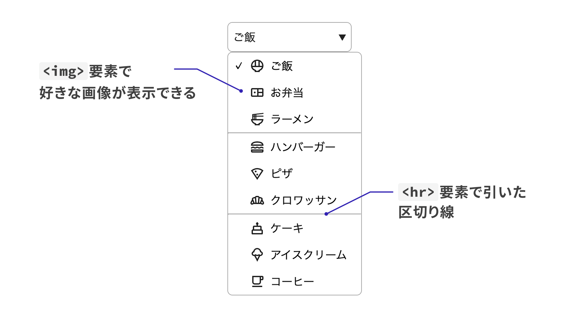
Originally, <select> could not contain anything other than <option> and <optgroup>, and traditional browsers ignored any other elements placed inside it.
In browsers around 2024 (Chrome and Edge 119 and later, Safari 17.4 and later), it became possible to insert an <hr> element into the list of options.
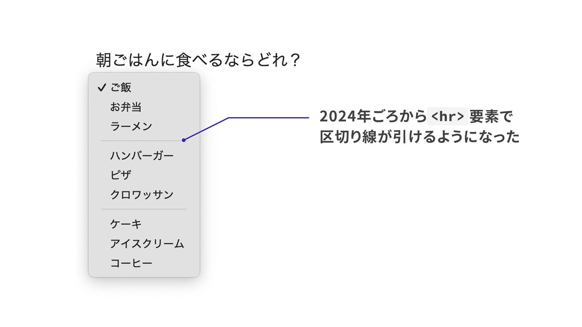
Now, additional elements can be placed there as well.
<!-- In addition to option, img and hr can also be used -->
<select class="food-select">
  <option value="onigiri">
    <img src="./images/foods/i_onigiri.svg" width="24" height="24" alt="" />
    Rice ball
  </option>
  <hr />
</select>
Customizing the <button> that opens the options list
If you place a single <button> element inside a <select> element, the browser treats it as the button used to open the list of options. If you then place a <selectedcontent> element inside that <button>, the currently selected <option> element is cloned and displayed there. You can use CSS on <selectedcontent> to adjust the appearance.
In the demo below, each option includes a description in a <small> element. The CSS applied to <selectedcontent> hides that description inside the <button> element.
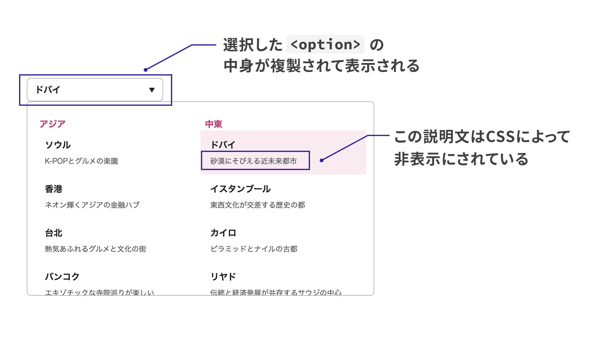
<style>
  /* Hide the description inside the button element */
  selectedcontent .city-small {
    display: none;
  }
</style>

<!-- Omitted -->

<select class="city-select">
  <button class="city-select-button">
    <!-- A clone of the selected option is displayed here -->
    <selectedcontent></selectedcontent>
  </button>

  <!-- Omitted -->

  <option class="city-option" value="seoul">
    <span class="city-text">Seoul</span>
    <small class="city-small"> A paradise for K-pop and food lovers </small>
  </option>
</select>
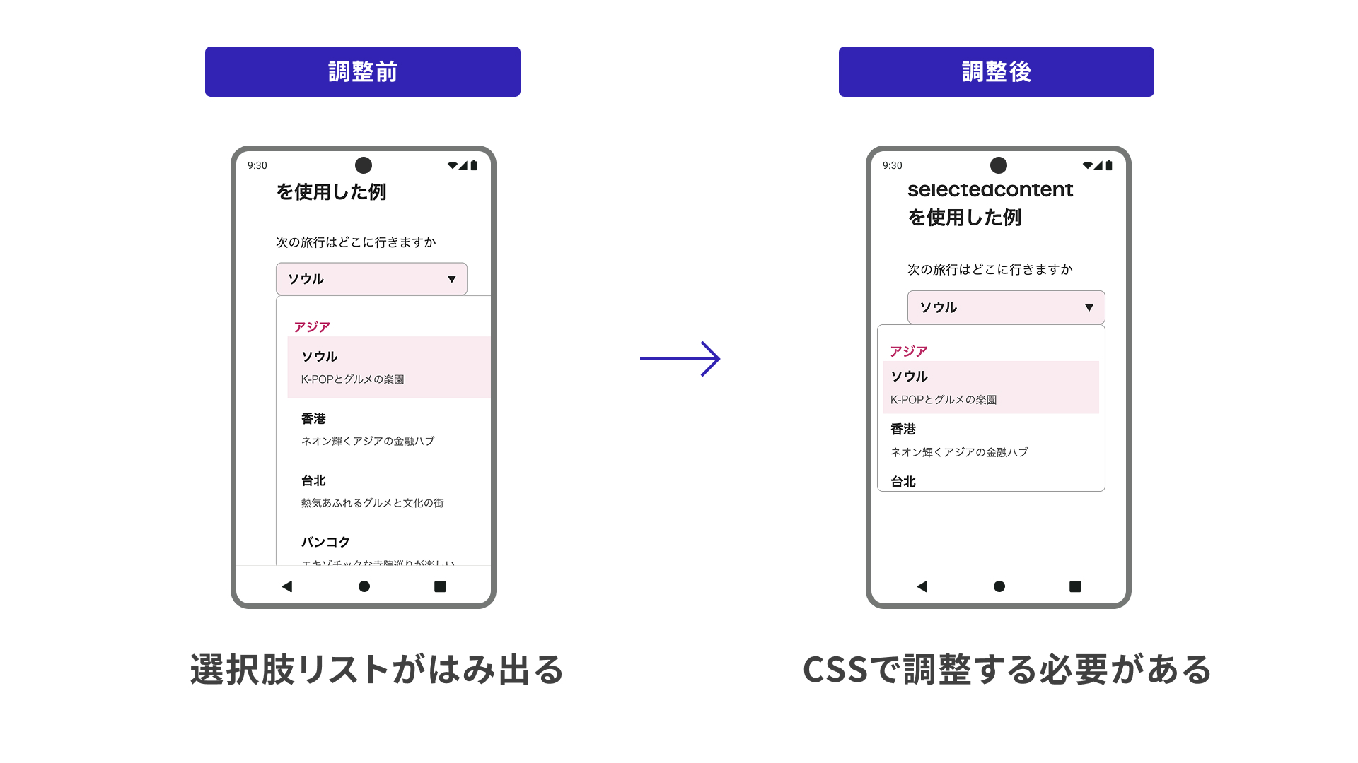
Make sure the options list does not go off-screen
As noted in Chrome on Android, usability matters when customizing a control with CSS.
In this demo, the layout of the options list changes depending on the viewport width and height. Unlike a standard dropdown, a customized control can let the options list extend beyond the viewport depending on the layout. This is something to watch for on both mobile and desktop.
Column: Using the selected option outside the <select> element
There are cases where you may want to reflect the option selected in a <select> element elsewhere in the UI. For example, as shown below, you might want the content chosen with the [▼] button on the right to also appear in the button on the left.
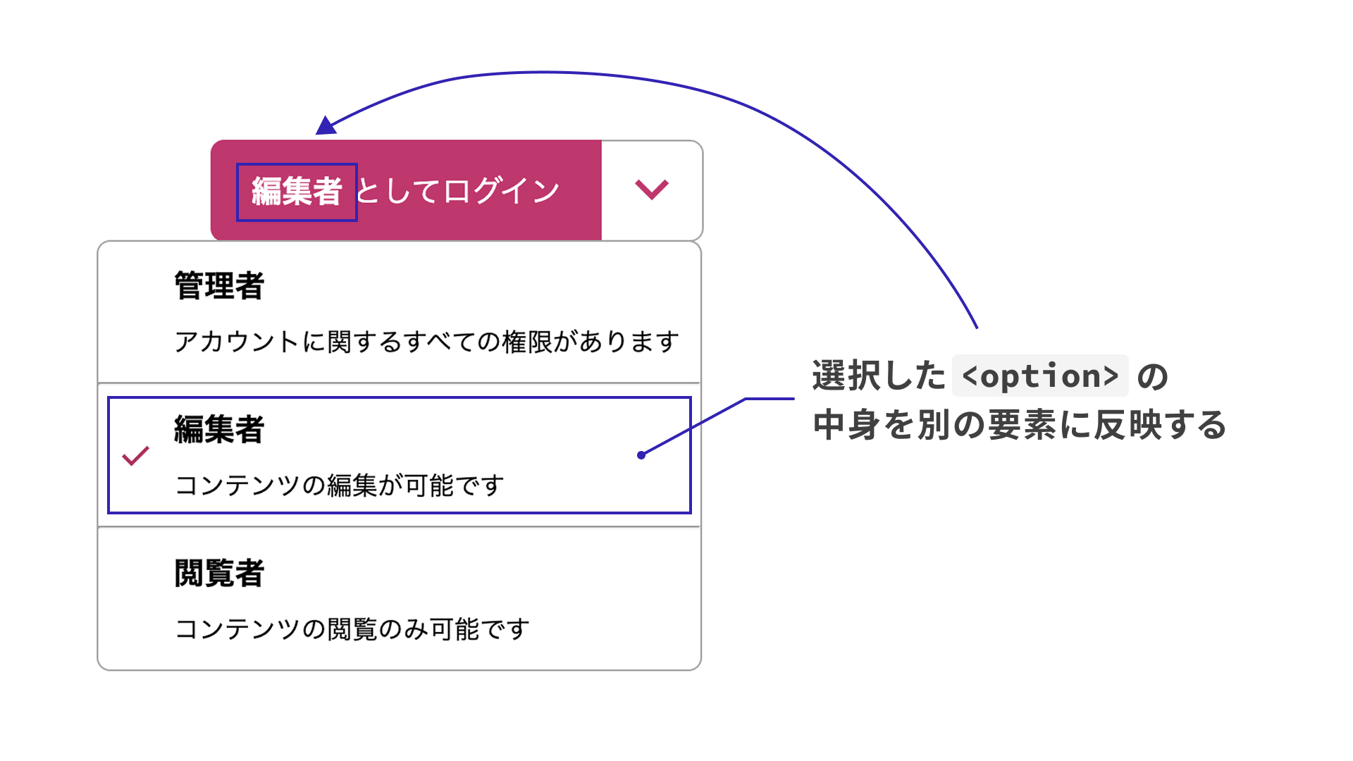
Previously, this kind of UI would likely have required JavaScript to retrieve the selected item dynamically, but the selectedcontentelement attribute makes it possible in HTML alone.
Usage is simple: add a selectedcontentelement attribute to the <select> element, then use the same value as the id of a <selectedcontent> element. Once you do that, the content inside the <button> is replaced with the currently selected content from the <select> element.
Notes for checking the demo
As of March 7, 2025, the selectedcontentelement attribute did not work in Chrome 134. To check the demo, use one of the following methods.
- Open
chrome://flagsin Chrome 134 and enable “Experimental Web Platform features”- For details about
chrome://flags, see What are Chrome flags?
- For details about
- Open the demo page in Chrome Canary
On Android, the selectedcontentelement attribute also did not work in either Chrome Beta 135 or Chrome Canary 136.
<button class="login-button">
  <!-- Set the id to match the value of the select element's selectedcontentelement attribute -->
  Sign in as <selectedcontent id="selected"></selectedcontent>
</button>
<!-- Set selectedcontentelement to the id of selectedcontent -->
<select class="role-select" selectedcontentelement="selected">
  <option value="admin">
  </option>
</select>
Cases that cannot be customized
Unfortunately, the kind of customization introduced here is not available when a <select> element has the multiple or size attribute. Hopefully support will expand in the future.
Conclusion
This article introduced the customization options now available for <select> elements. As support expands beyond Chrome and Edge, a single <select> element will be able to cover a much wider range of designs. It will be worth watching how support develops.