
As of 2024, browsers support the CSS :has() pseudo-class. It is remarkably powerful because it effectively lets you write selectors for almost any relationship between elements. That opens the door to far more expressive CSS. This article introduces styling patterns and techniques that make practical use of :has().
Basic usage of the :has() pseudo-class
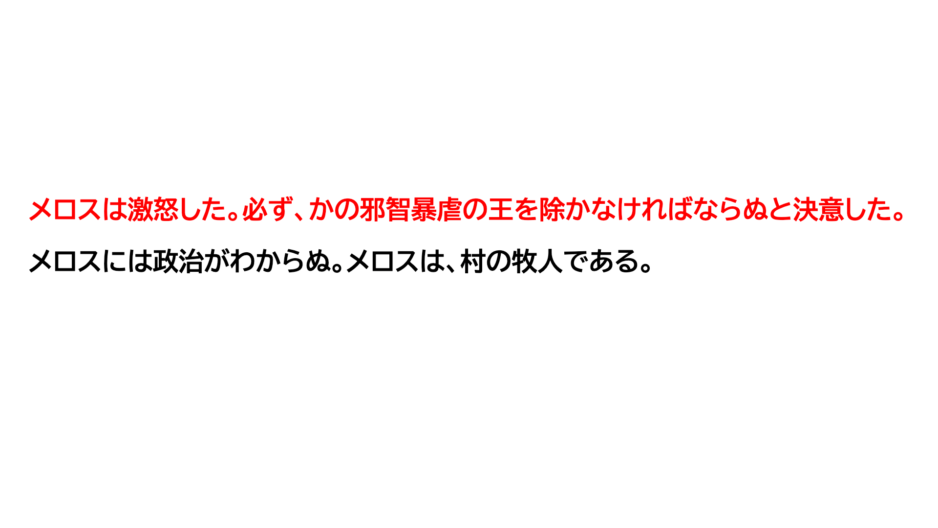
To start, here is the basic idea behind :has(). It matches an element when the selector passed to :has() is found inside it. For example, consider the following HTML and CSS:
<p class="text">
  <strong>Melos</strong> was furious. He resolved that he must, without fail, rid the world of the cruel and tyrannical king.
</p>
<p class="text">Melos knew nothing of politics. He was a shepherd from a village.</p>
.text {
  color: #000;
}

.text:has(strong) {
  color: red;
}
In this case, the first .text element contains a <strong> tag, so the :has(strong) pseudo-class matches and the text becomes red. The second .text element does not contain a <strong> tag, so the text remains black.
On its own, this may look like nothing more than a parent selector. The real power of :has() is that it lets you move back up to an ancestor and then continue selecting from there, which means you can write selectors that go beyond simple parent-child relationships. Combined with other pseudo-classes, it becomes much easier to style elements based on state.
Styling based on form state
In form validation, you often want to change the appearance of the UI when a value is invalid so the error stands out.
Here is the desired result when validation fails:
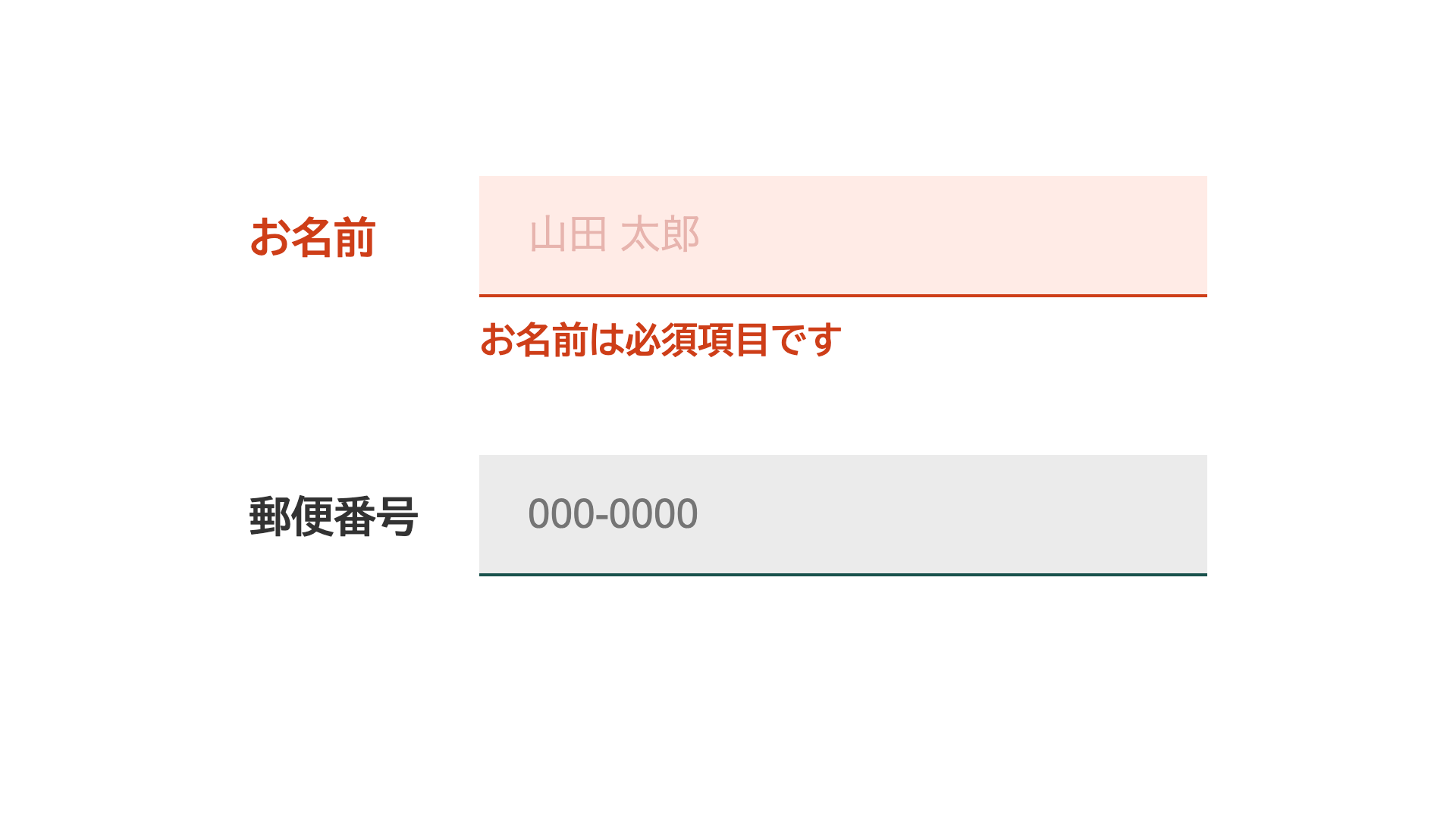
If you use built-in HTML validation supported by elements such as <input>, invalid states can be detected with the :user-invalid pseudo-class. However, that selector can target only the <input> element itself. Even the subsequent-sibling combinator ~ can reach only elements that come after the input. With :has(), you can first go back to the parent element and then use descendant selectors, which means you can also style elements that appear before the input.
Unlike the :invalid pseudo-class, :user-invalid checks validity only after the user has interacted with the field. That makes it useful because required fields do not start out in an error state.
For example, suppose the form is structured like this, with a label and an input grouped together.
<p>
  <label class="formWrapper">
    <span class="formLabel">Full name</span>
    <input type="text" class="textForm" placeholder="John Doe" required />
    <span class="errorMessage">Full name is required</span>
  </label>
</p>
<p>
  <label class="formWrapper">
    <span class="formLabel">Postal code (Japan)</span>
    <input
      type="text"
      class="textForm"
      placeholder="123-4567"
      pattern="\d{3}-\d{4}"
    />
    <span class="errorMessage">Enter the correct format</span>
  </label>
</p>
Before :has(), even with :user-invalid, you could not style the .formLabel element that appears before the <input> element - in other words, the label text itself. The usual choices were to change the HTML order so the <input> came first, or to use JavaScript. With :has(), you can write the following instead.
(Another way to affect previous elements is :focus-within(), but that applies only while the field is focused. :has() is more flexible because it is not limited to focus state.)
The following example uses CSS nesting.
/* When there is an error */
.formWrapper:has(.textForm:user-invalid) {
  /* Turn the label red */
  .formLabel {
    color: var(--color-alert);
  }
  /* Show the error message */
  .errorMessage {
    display: block;
  }
}

/* Turn the input red */
.textForm:user-invalid {
  background-color: var(--color-alert-bg);
  border-color: var(--color-alert);
  color: var(--color-alert);
}

/* Turn the placeholder red as well */
.textForm:user-invalid::placeholder {
  color: var(--color-alert-placeholder);
}

By combining the :has() pseudo-class with the state-detection pseudo-class :user-invalid, you can change the styles of labels, placeholders, and other related elements when validation fails, without changing the HTML structure.
This example uses built-in HTML validation, but the same idea also works when validation is handled in JavaScript. Instead of adding classes to every related element, you can add a class only to the <input> element and use :has() to style the surrounding UI.
Form validation is covered in more detail in the following articles.
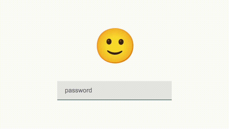
Another fun variation is a character that puts on sunglasses while the password is being entered.
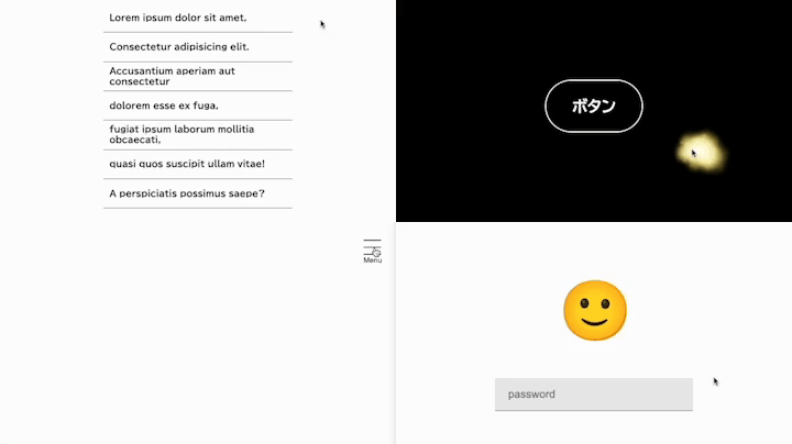
Toggling a side panel
As mentioned earlier, :has() lets you write selectors beyond direct parent-child relationships. That also makes it useful for interactions such as a hamburger button and a side panel. Consider a common pattern like this.
- Clicking the button changes the three-line icon into a close icon
- Clicking the button opens and closes the side panel

The HTML looks like this. Some details are omitted.
<div class="hamburgerAndPanel">
  <button class="hamburgerButton">
    <span class="hamburgerButtonIcon">
      <!-- Open icon -->
      <img
        src="/assets/images/open.svg"
        alt="Open"
        class="hamburgerButtonIcon openIcon"
      />
      <!-- Close icon -->
      <img
        src="/assets/images/close.svg"
        alt="Close"
        class="hamburgerButtonIcon closeIcon"
      />
    </span>
    <span class="hamburgerButtonText">Menu</span>
  </button>

  <aside class="sidePanel">
    <ul class="linkList">
      <!-- Side panel content omitted -->
    </ul>
  </aside>
</div>
JavaScript still handles the actual state change on click. Normally, you might expect to add an isOpen class to both the hamburger button and the side panel so their states stay in sync. With :has(), you only need to add the class to the hamburger button, and the side panel can follow automatically.
/* Control styles when the menu is open */
.hamburgerAndPanel:has(.hamburgerButton.isOpen) {
  /* Hide the open icon and show the close icon */
  .openIcon {
    visibility: hidden;
    opacity: 0;
  }

  .closeIcon {
    visibility: visible;
    opacity: 1;
  }

  /* Show the side panel and backdrop */
  .sidePanelBackdrop {
    visibility: visible;
    opacity: 1;
  }

  .sidePanel {
    transform: translateX(0);
  }
}
Here, .hamburgerAndPanel:has(.hamburgerButton.isOpen) means “the wrapper element that contains an open hamburger button.” Once that wrapper is selected, descendant selectors can reach the side panel. JavaScript no longer has to manage a separate class for the side panel’s open state, which keeps the script cleaner. In practice, it is still better for accessibility to control things like aria-hidden on the side panel, so :has() may not remove every bit of JavaScript. Even so, it can reduce the amount of code and make the overall logic easier to read.
Taken further, body:has() can theoretically reach every element on the page. In other words, :has() can effectively describe relationships between almost any two elements. That is why it makes “selectors for almost any relationship” possible in practice.
Controlling scrollbars for modals
When a modal opens, developers often apply overflow: hidden to the <body> so the page behind it does not scroll. If the content is long enough to show a scrollbar, that scrollbar disappears when the modal opens. On platforms such as Windows, the layout can then shift by the width of the scrollbar and cause visible jank. The scrollbar-gutter property can be used to prevent that shift. The article 『HTML制作で気をつけたいスクロールバーの挙動 - ガタつきをCSSのscrollbar-gutterで防ぐ方法など -』 explains the technique in detail.
With :has(), you can control scrollbar-gutter without JavaScript.
<body>
  <div class="scrollControl">
    <dialog class="modal">
      <!-- Omitted -->
    </dialog>
  </div>
</body>
/* When the modal is open */
body:has(dialog[open]) {
  overflow: hidden;
}

body:has(dialog[open]) .scrollControl {
  overflow: auto;
  scrollbar-gutter: stable;
}
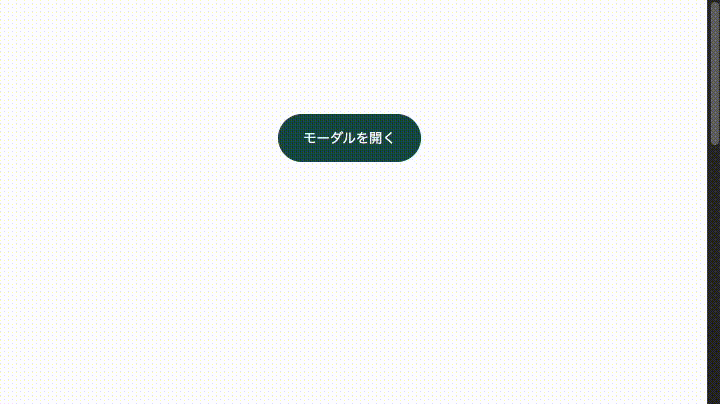
A <dialog> element is displayed when it has the open attribute, so :has(dialog[open]) lets you target the state where the modal is open. With :has(), you can apply overflow: hidden to the <body> only while the modal is open, and apply overflow: auto plus scrollbar-gutter: stable to the wrapper element that manages scrolling.
This example uses a <dialog> element, but the same pattern works for modals built with a <div> as long as some class indicates that the modal is open.
/* When the modal is open */
body:has(.modal.isOpen) {
  overflow: hidden;
}

body:has(.modal.isOpen) .scrollControl {
  overflow: auto;
  scrollbar-gutter: stable;
}
For more on building modals, see 『HTMLでモーダルUIを作るときに気をつけたいこと』.
Hover behavior for a cursor follower
:has() also pairs well with interaction. In this demo, a cursor follower grows larger when the pointer enters an <a> element.

The motion that follows the cursor can be implemented with the following HTML and JavaScript.
<div id="mouseStalker"></div>
const mouseStalkerElement = document.querySelector("#mouseStalker");
document.addEventListener("mousemove", (event) => {
  mouseStalkerElement.style.translate = `${event.clientX}px ${event.clientY}px`;
});
This code reads the cursor position and applies it to the cursor follower element. If you also want the follower to grow when the pointer is over an <a> element, a first attempt in JavaScript might look like this.
const handleLinkHoverNg = (event) => {
  // Add a class when the hovered target is an <a> element
  event.target.tagName === "A"
    ? mouseStalkerElement.classList.add("isLinkHover")
    : mouseStalkerElement.classList.remove("isLinkHover");
};

document.addEventListener("mousemove", (event) => {
  mouseStalkerElement.style.translate = `${event.clientX}px ${event.clientY}px`;
  handleLinkHoverNg(event);
});
However, this does not always work. If an <a> element contains a <span> and the pointer is over that <span>, then event.target becomes the <span>, not the <a>.
One workaround is to attach mouseenter and mouseleave handlers to every link, adding a class on enter and removing it on leave. But :has() lets you handle the hover state entirely in CSS, without JavaScript.
.mouseStalker {
  /* Omitted */
  border: 2px solid var(--color-text);
  transition:
    translate 0.3s var(--ease-out-quart),
    scale 0.2s var(--ease-out-quart);
  scale: 0.25;
}

body:has(a:hover) .mouseStalker {
  border-width: 1px;
  scale: 1;
}
With this approach, JavaScript only has to control the position of the cursor follower, which keeps the code much cleaner. :has() can move behavior into CSS that would previously have been handled in JavaScript.
Using :has() in JavaScript
In the previous cursor follower example, CSS handled the visual change on hover. If the visual change is drawn on a <canvas>, though, you may want to control it in JavaScript instead. In that case, :has() can be used not only in CSS but also inside a querySelector() query.

The following JavaScript comes from the Canvas-based demo, where the cursor follower changes when an <a> element is hovered.
// Mouse position
const mousePosition = { x: 0, y: 0 };

// Default particle settings
const defaultSettings = {
  /* Omitted */
};

// Current particle settings
let particleSettings = {
  /* Omitted */
};

document.addEventListener("mousemove", (event) => {
  // Update the mouse position and change where particles are emitted
  mousePosition.x = event.pageX;
  mousePosition.y = event.pageY;

  const isATagHovered = document.querySelector("body:has(a:hover)");

  if (isATagHovered) {
    // Change particle settings while hovering
    particleSettings = {
      ...defaultSettings,
      particleNum: 4,
      xVariance: 70,
      yVariance: 70,
    };
  } else {
    // Otherwise, restore the default settings
    particleSettings = { ...defaultSettings };
  }
});
One benefit of using :has() here is that you no longer need to attach event handlers to individual <a> elements. Hover-related control can stay inside the mousemove handler. In this demo, that may not be dramatically better than using link events directly, but once the state becomes more complex, it gets harder to coordinate logic spread across multiple handlers. That is where this approach becomes more valuable, especially in more elaborate Canvas-based effects.
This demo was built with PixiJS. The following articles are also useful references for particle effects.
Column: Performance of :has()
In both cursor follower examples - the CSS version and the Canvas version - the selector body:has(a:hover) is evaluated across the whole page. That might raise performance concerns because the browser has to inspect elements across the document.
The short answer is that body:has(a:hover) is not a problem for typical page sizes. In a quick test, the CSS and JavaScript versions were run on HTML containing 50 nested div levels repeated about 500 times. On an iPhone 12 mini, there was no obvious stutter. Pages that large are unusual in normal production use, so this selector is generally fine in practice. The demos below let you experiment with different nesting depths and counts.
Animations with Anchor Positioning
Finally, here is an animation that combines :has() with the CSS Anchor Positioning API. Anchor Positioning is supported in Chrome 125, Edge 125 (May 2024), and Safari 26.0 (September 2025) and later. When used together with :has(), effects like the following can be built with CSS alone.
<div class="anchorHoverListWrapper">
  <ul class="anchorHoverList">
    <li class="anchorHoverListItem"><!-- Omitted --></li>
    <li class="anchorHoverListItem"><!-- Omitted --></li>
    <li class="anchorHoverListItem"><!-- Omitted --></li>
    <li class="anchorHoverListItem"><!-- Omitted --></li>
    <li class="anchorHoverListItem"><!-- Omitted --></li>
    <li class="anchorHoverListItem"><!-- Omitted --></li>
    <li class="anchorHoverListItem"><!-- Omitted --></li>
  </ul>
  <div class="anchorHoverListBackground"></div>
</div>
Excerpt:
.anchorHoverListWrapper {
  position: relative;
}

.anchorHoverListItem {
  transition: color 0.3s 0.05s var(--ease-out-quart);
}

/* Background styles when nothing is hovered */
.anchorHoverListBackground {
  position: absolute;
  z-index: -1;
  top: 0;
  left: anchor(left);
  position-anchor: --anchor-hover;
  scale: 1 0;
  transform-origin: center center;
  transition:
    top 0s 1s,
    scale 0.5s var(--ease-out-quart);
}

/* Initial position */
.anchorHoverListItem:not(:hover):first-child {
  anchor-name: --anchor-hover;
}

/* Hover state */
.anchorHoverListItem:hover {
  anchor-name: --anchor-hover; /* Set the hovered item as the anchor */
  color: #fff;
  transition: color 0.6s 0.1s var(--ease-out-quart);
}

/* If the list is being hovered, move the background to that position */
.anchorHoverListWrapper:has(.anchorHoverListItem:hover) {
  .anchorHoverListBackground {
    top: anchor(top);
    scale: 1 1;
    transition:
      top 0.3s var(--ease-out-quart),
      scale 0.3s 0.15s var(--ease-out-quart);
  }
}
The CSS Anchor Positioning API is explained in detail in 『階層メニューやトーストUIが簡単に作れる新技術! JavaScriptで利用するポップオーバーAPI』, so the details are omitted here. Instead, here is the overall flow.
When a list item is hovered, that item becomes the anchor. As the anchor changes, the background moves to the new element. Because the top property is animated with transition, the background slides into place. When nothing is hovered, the background should be hidden, so in the default state it waits at the top with scale: 1 0. When :has(.anchorHoverListItem:hover) detects a hover, the scale returns to 1 1 and the background moves to the anchored element. By adjusting the transition values, the animation looks as if the background emerges from that position.
:has() is used here mainly to control the hover-out state. If the background had a fixed place to return to when the pointer leaves, the effect could also be implemented without :has().
Browser support
The :has() pseudo-class is available in Chrome and Edge 105 (August 2022), Safari 15.4 (March 2022), and Firefox 121 (December 2023) and later.
:has() CSS relational pseudo-class | Can I use…
Conclusion
The :has() pseudo-class is not limited to selecting a parent that contains a particular element. It lets you write selectors that go beyond simple parent-child relationships. That makes it possible to control complex state with CSS alone, in situations that previously required JavaScript. The range of possible uses is broad. Try :has() and see how much richer your CSS can become.