
When you need an underline in CSS, which property do you reach for? text-decoration, border-bottom, or perhaps background-image? Because there are several ways to create an underline, it is easy to hesitate over which one to choose.
This article introduces CSS underline techniques by use case.
This article is for anyone who is unsure which approach to choose among the many options. Whether you need a simple underline, an underline that also covers an ellipsis, or something that animates cleanly, this article should help. It is also useful if you want a quick overview of the standard ways to decorate text with CSS.
Recommended underline techniques by use case
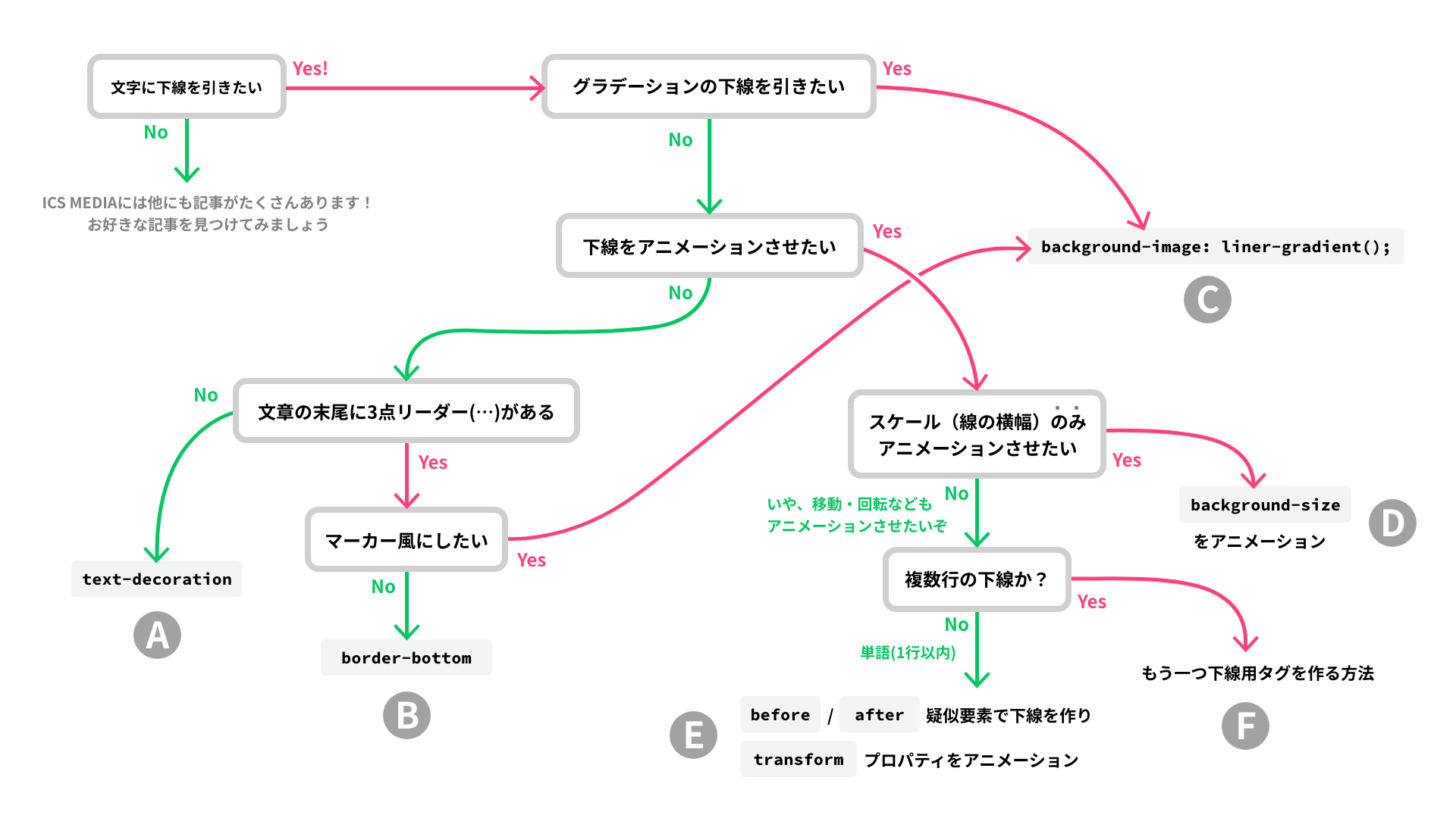
The chart below summarizes recommended underline techniques by use case. Click to enlarge.
To get straight to the point, the methods that work best in each situation are summarized above. The article then walks through sections A to F in order, so if you are in a hurry, jump directly to the section that matches what you need.
Setup: the basic HTML
Start with the basic HTML.
Wrap the text you want to underline in a <span> element, then apply the underline styles in CSS to the class on that <span>.
<p>
  This is a <span class="underline">sample</span> text.
</p>
- Open the demo in a new window
- View the source code (HTML, CSS)
A <span> element is ideal here because it is an inline-level element with the default value display: inline;, and it is a versatile container that can also be used inside elements such as <button> and <a>.
With the HTML ready, the rest of the article starts with the most basic underline style and then moves on to more advanced variations.
A: A basic underline
If you just need a simple underline, text-decoration is recommended for the following reasons.
- It is a property designed specifically for decorating text, so it is easy to apply.
- In Latin typefaces, letters such as
g,j,p,q, andyhave descenders that extend below the baseline. Withtext-decoration: underline;, it is possible to keep the underline from hurting readability where it crosses those descenders. See text-decoration-skip-ink - MDN.
text-decoration is a shorthand property for line decoration. It can set the following four properties.
text-decoration-color: The line color. The initial value iscurrentcolor.text-decoration-line: Which line to draw. The initial value isnone. For other values, see text-decoration-line - MDN.text-decoration-style: The line style. The initial value issolid. For other values, see text-decoration-style - MDN.text-decoration-thickness: The line thickness. The initial value isauto.
.textDecoration {
  text-decoration: #05c662 underline 1px;

  /*
    This is shorthand for:
    text-decoration-color: #05c662;
    text-decoration-line: underline;
    text-decoration-style: solid; omitted here because solid is the initial value
    text-decoration-thickness: 1px;
  */
}
However, Safari cannot use the full text-decoration shorthand here. Use one of the following two approaches.
- Use the shorthand with the
-webkit-vendor prefix. However,text-decoration-thicknesscannot be included in that shorthand, so it still needs to be set separately. - Do not use the shorthand at all, and specify each property individually.
Example using the -webkit- vendor prefix for Safari support:
.textDecoration {
  text-decoration: #05c662 underline 1px;

  /* Added for Safari */
  -webkit-text-decoration: #05c662 underline;
  text-decoration-thickness: 1px; /* Not included in the -webkit-text-decoration shorthand */
}
Underline offset
The underline offset can be controlled with the text-underline-offset property. As the name suggests, text-underline-offset is applied only when text-decoration-line is set to underline.
Example with individually specified properties for Safari support, plus a highlighter-style underline:
.textDecorationMarker {
  text-decoration-color: #05c662a0;
  text-decoration-line: underline;
  text-decoration-thickness: 8px;
  text-underline-offset: -5px;
}
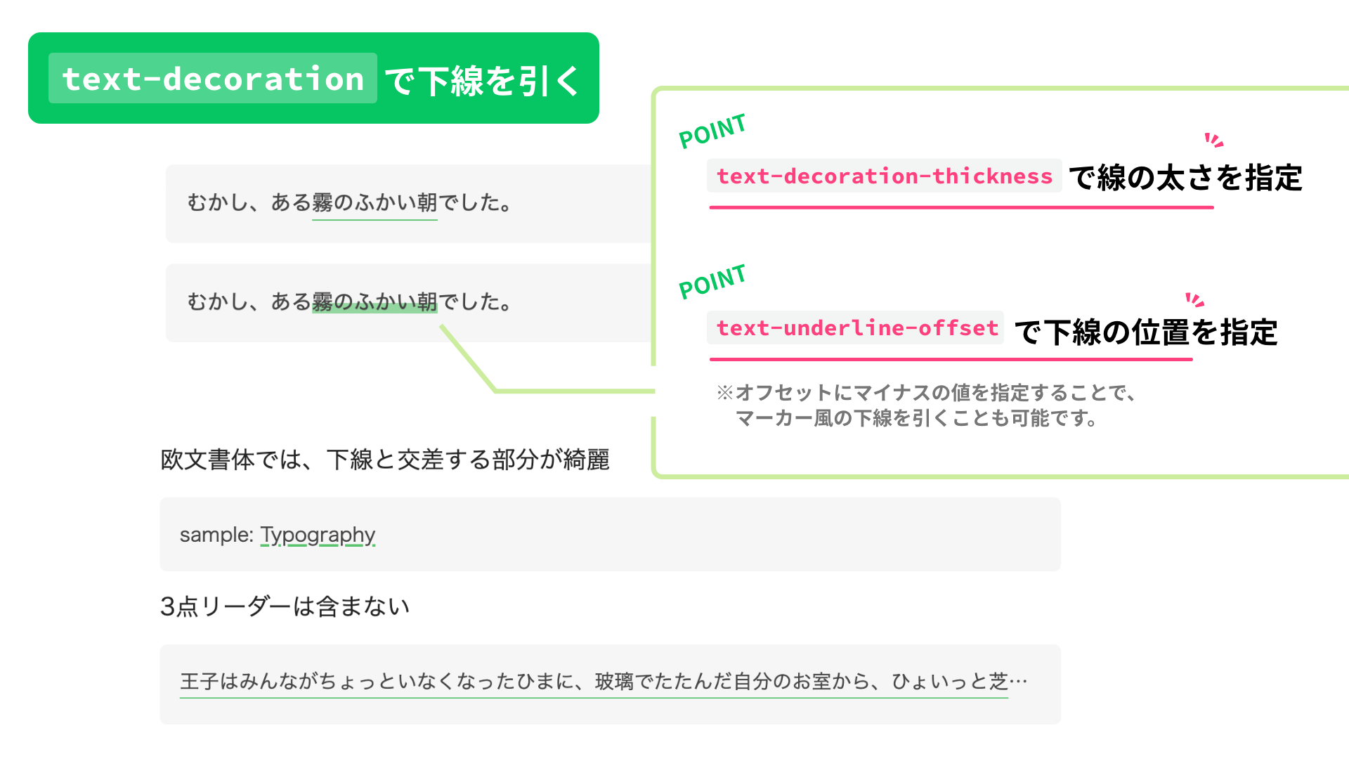
B: Underlines that include an ellipsis
If the underline needs to extend through an ellipsis (…) at the end of the text, border-bottom is a simple and effective option.
border-bottom is a shorthand property for the bottom border. It can set the following three properties.
border-bottom-color: The line color. The initial value iscurrentcolor.border-bottom-style: The line style. The initial value isnone. For other values, see border-bottom-style - MDN.border-bottom-width: The line thickness. The initial value ismedium.
Unlike text-decoration, border-bottom has no dedicated offset property. Use padding-bottom instead to adjust the underline position.
.borderBottom {
  border-bottom: #05c662 solid 1px;
  padding-bottom: 5px; /* Offset */
}
Note: the HTML also includes a wrapper element to create the ellipsis (span.textOverflow, etc.). The details of how the ellipsis itself is built are omitted here to keep the article focused. See the relevant part of the sample code.
<p class="textWrapper">
  <span class="textOverflow">
    <span class="borderBottom">This is sample text. This is sample text. This is sample text.</span>
  </span>
</p>
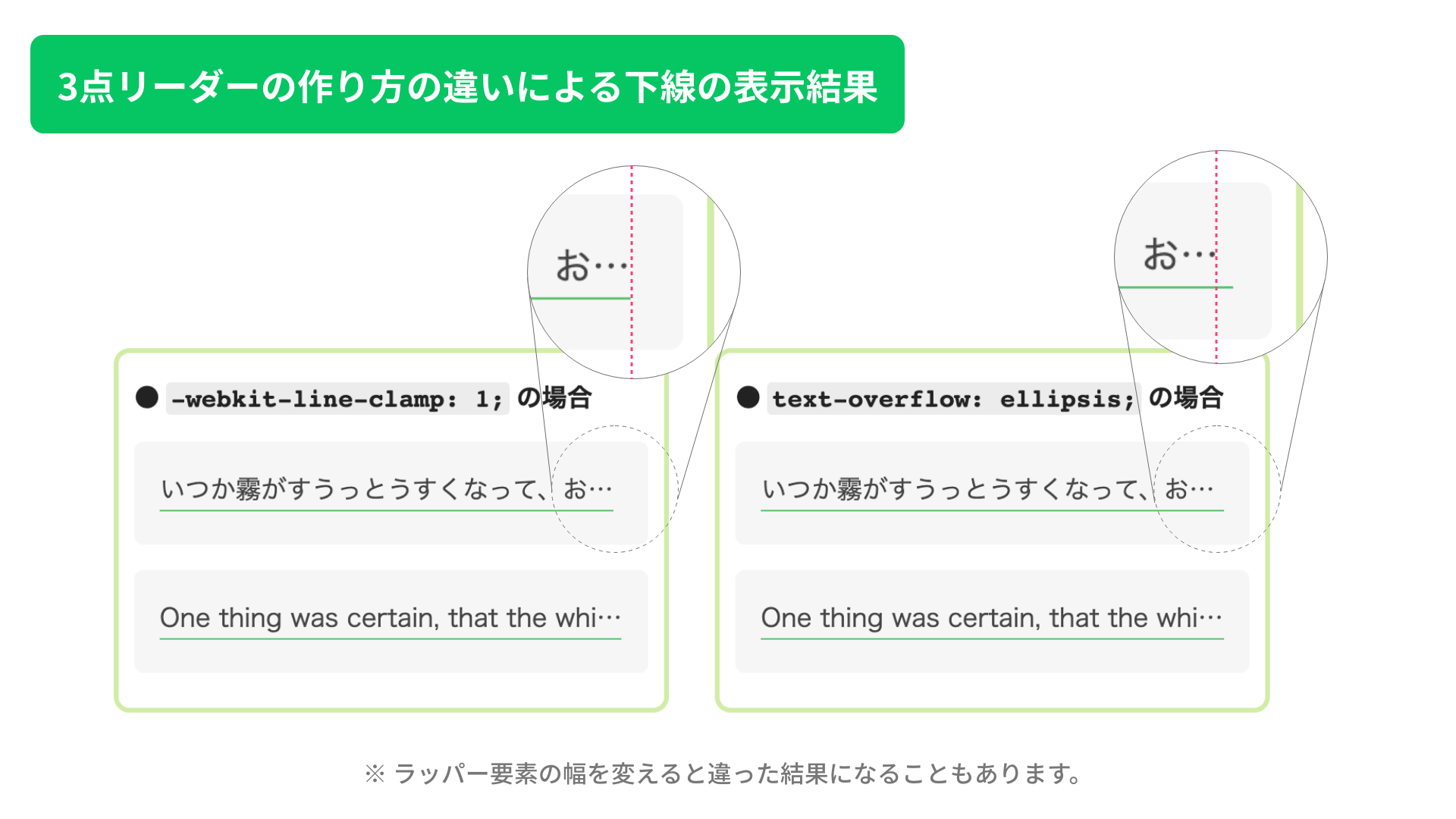
Differences in underline rendering depending on how the ellipsis is created
There are two common ways to create an ellipsis: text-overflow: ellipsis; and -webkit-line-clamp. The rendering is slightly different. For multi-line text, -webkit-line-clamp is the better option. For single-line text, either approach can work depending on your preference.
If you merge the outermost wrapper and the wrapper that creates the ellipsis, the difference becomes even more obvious. Try it if you are curious.
Note: the relationship between the text font-size, line-height, and the wrapper height
When you create an underline that supports an ellipsis, the wrapper used to generate the ellipsis for multi-line text (the .textOverflow, .lineClamp1, and .lineClamp3 classes in the sample code) may need an explicit height. Without it, the underline on the last line can be clipped, depending on values such as the underline thickness.
The following diagram shows how to calculate the minimum height needed to keep the underline visible.
Excerpt showing only the height property:
.lineClamp3 {
  height: calc(16px * 1.75 * 3 + 5px);
}
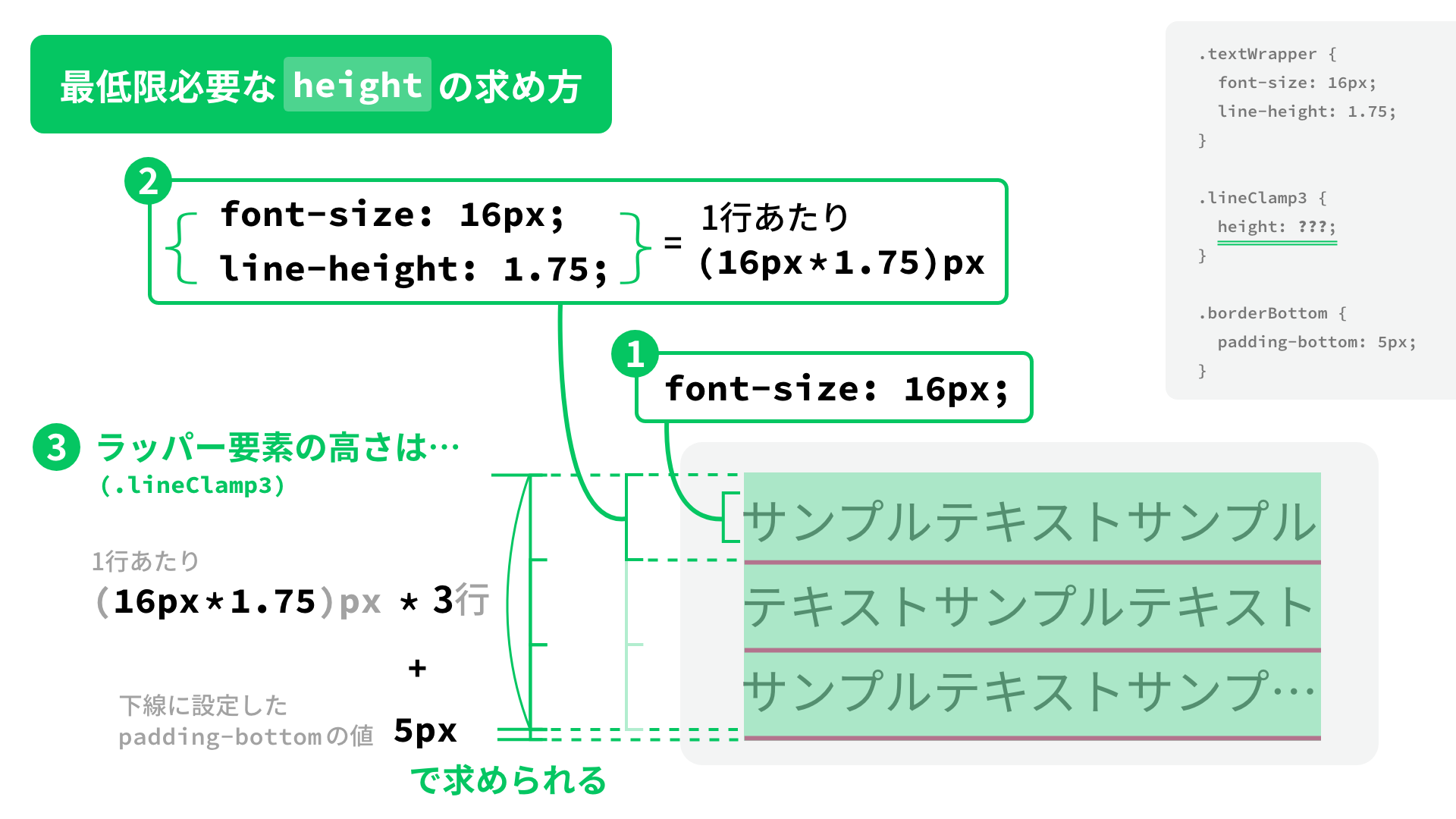
When you set the height, check the values you used for font-size, line-height, and padding-bottom (the offset applied to the underline).
C: Highlighter-style underlines that include an ellipsis, or gradient underlines
If you need an underline that supports an ellipsis and also overlaps the text like a highlighter (that is, you need a negative offset), or if you want a gradient underline, background-image is a good choice.
As explained in the article 1歩踏み込んでみる! CSSグラデーションのマニアックな世界, gradient functions can do much more than simple color transitions. Here, linear-gradient() is used in two ways to create underlines.
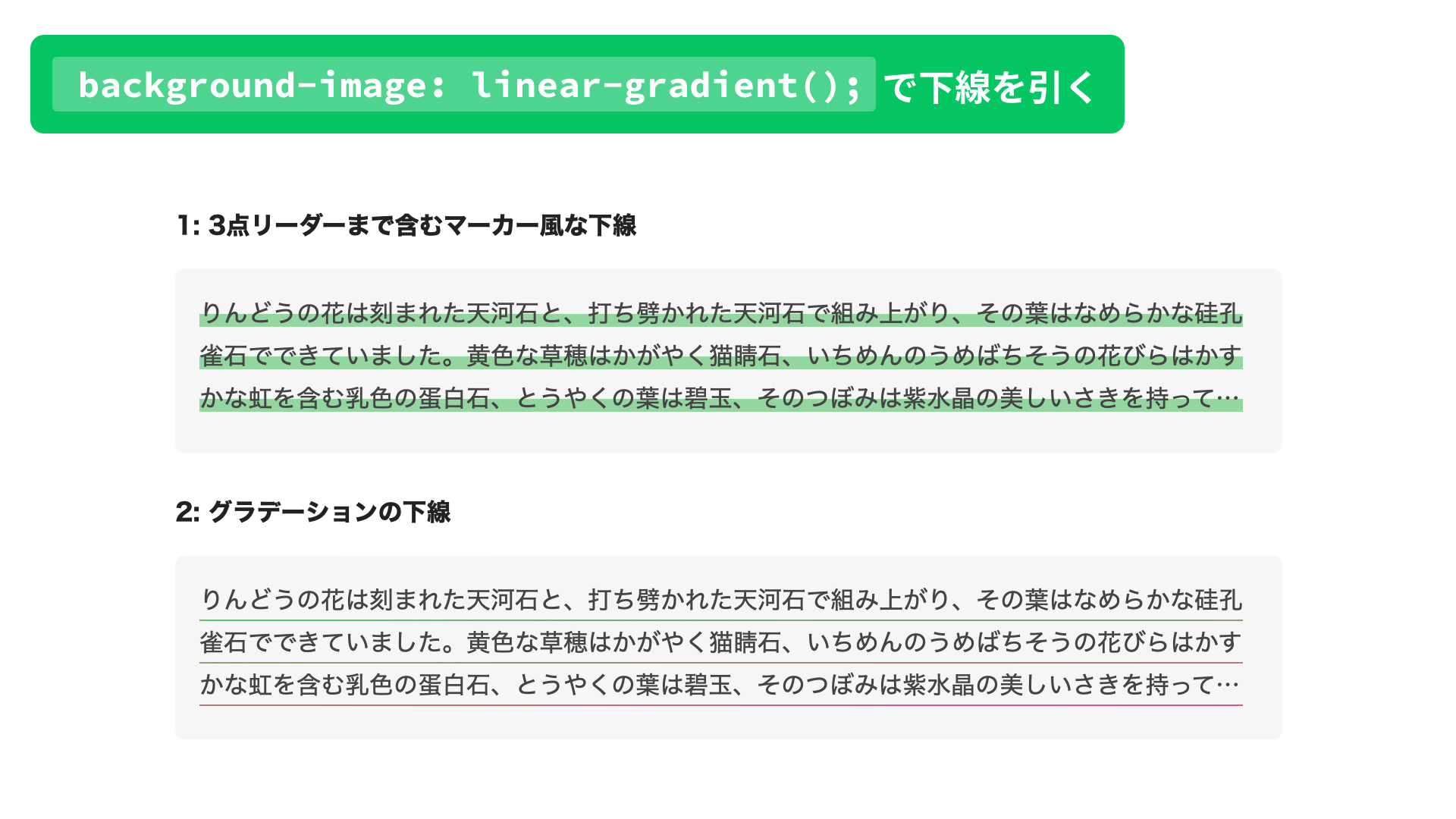
1: A highlighter-style underline that includes the ellipsis
.simpleBackgroundImage {
  background-image: linear-gradient(transparent 50%, #fc40a199 0%);
}
By making the top half of the background transparent and coloring the bottom half, you can create a highlighter-style underline.
2: A gradient underline
The first method is concise, but it does not let you set the line thickness in pixels. If you need a fixed thickness, specify it with background-size.
Set the width value in background-size to 100% so it matches the text width, and set the height value to the thickness you want. Also, add background-repeat: no-repeat; so the background does not repeat vertically, and set background-position: bottom; so the line is aligned to the bottom edge of the element.
If you need an offset, use padding-bottom, just like in section B.
Example of a gradient underline:
.gradationBackgroundImage {
  background-image: linear-gradient(to right, #05c662, #fe407e); /* Line color */
  background-size: 100% 1px; /* Width (100% = text width) | Height (line thickness) */
  background-position: bottom; /* Align to the bottom */
  background-repeat: no-repeat; /* Do not repeat the background */
  padding-bottom: 5px; /* Offset */
}
D: Animate the underline width
If you want the underline width to animate, background-image continues to be useful.
In this example, hovering over the wrapper element (p.textWrapper) changes background-size, so the underline is drawn on hover and disappears when the pointer leaves.
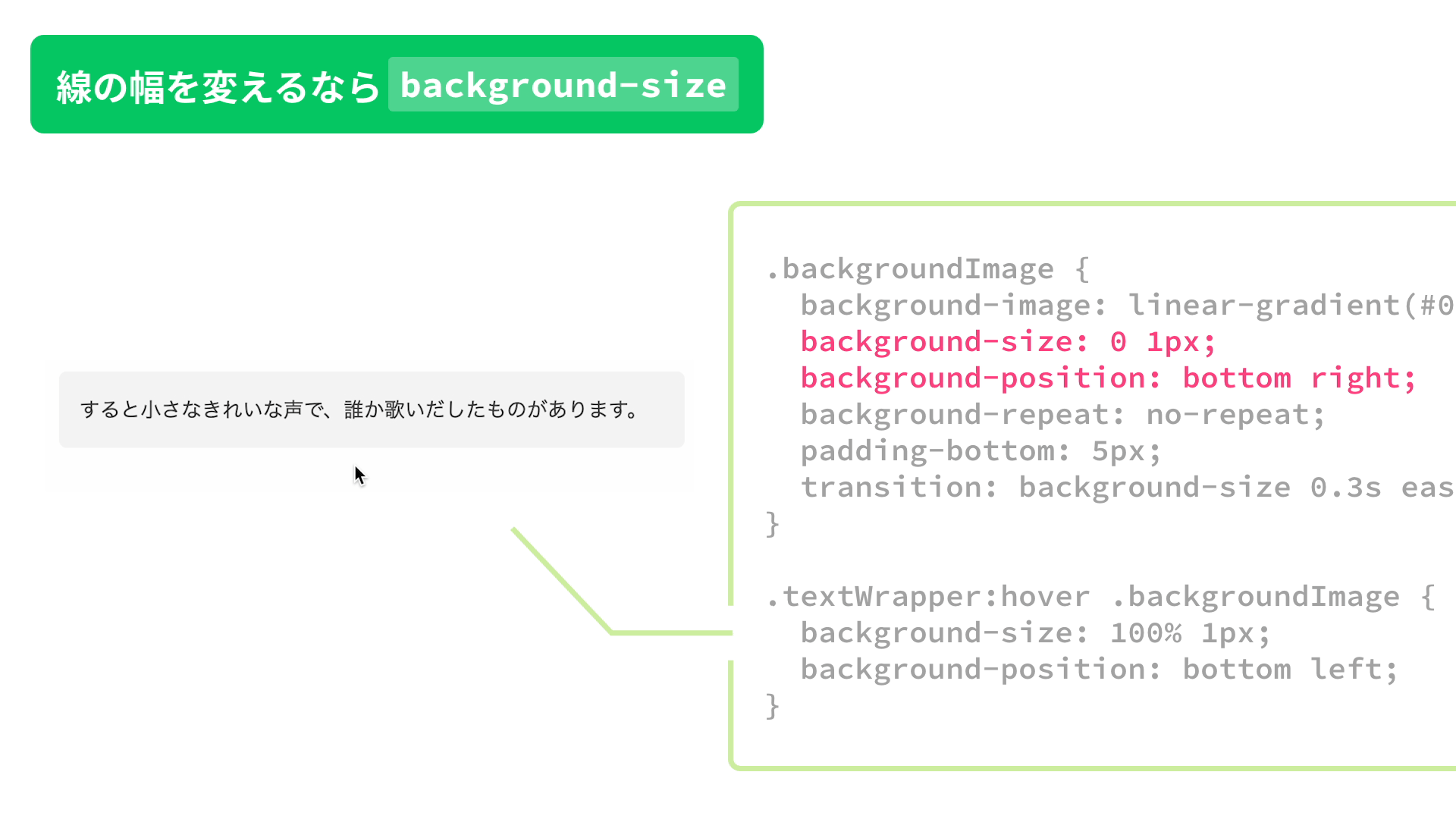
First, set background-size and the animation parameters in the transition property.
Then use background-size: 0 1px; as the initial state so the line is invisible, and change it to background-size: 100% 1px; on hover so the underline expands to the full width of the text.
Also, by moving the origin of background-position from bottom right to bottom left on hover, the line appears to sweep across the text.
.backgroundImage {
  background-image: linear-gradient(#05c662, #05c662); /* Solid color */
  background-size: 0 1px; /* Width (0 = hidden) | Height (line thickness) */
  background-position: bottom right; /* Place at the bottom right */
  background-repeat: no-repeat;
  padding-bottom: 5px;
  transition: background-size 0.3s ease-out;
}

.textWrapper:hover .backgroundImage {
  background-size: 100% 1px; /* Width (100% = text width) | Height (line thickness) */
  background-position: bottom left; /* Place at the bottom left */
}
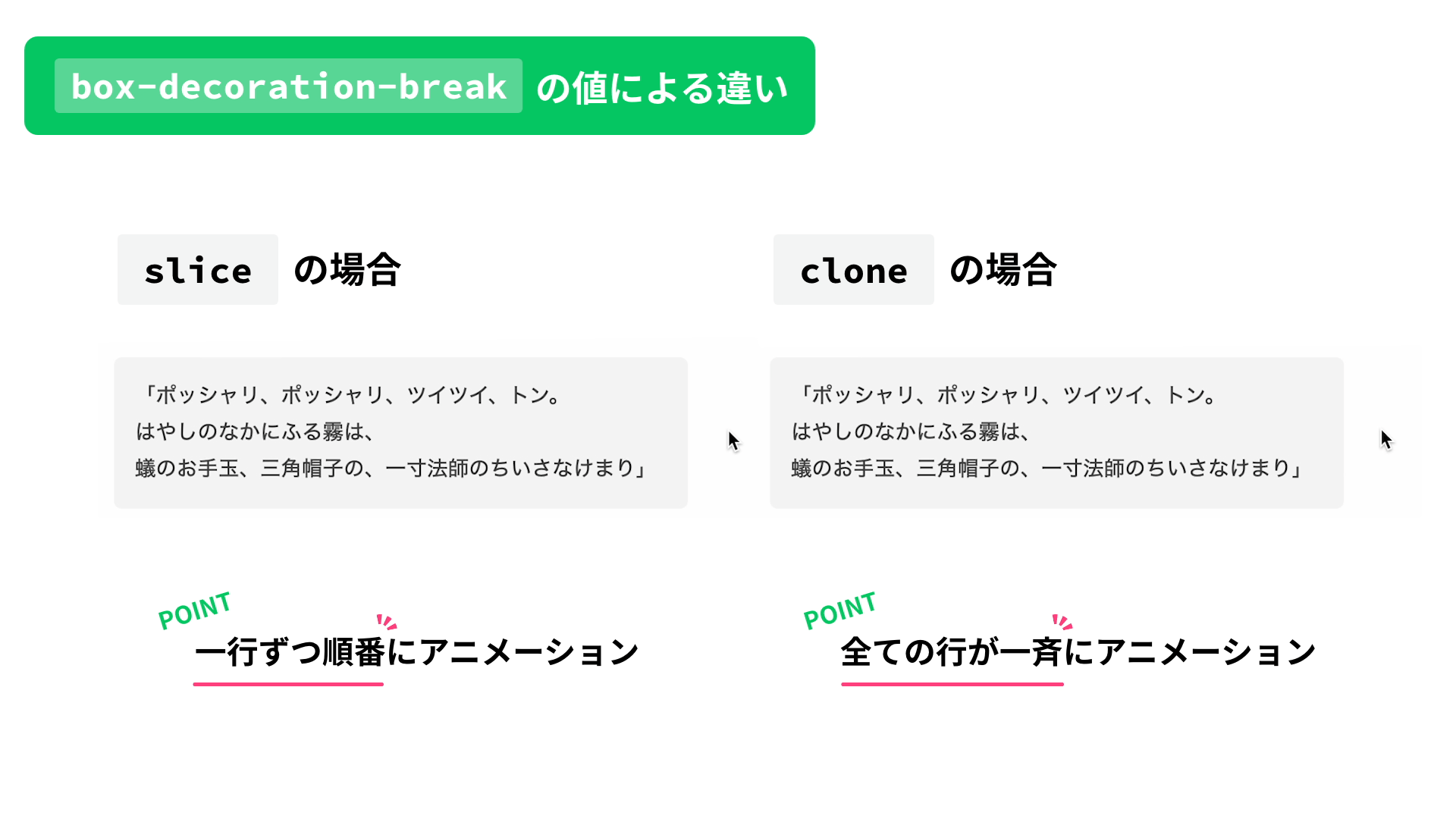
An easy way to create a different animation feel
When animating multi-line text, setting the value of (-webkit-)box-decoration-break to either slice or clone is an easy way to change the feel of the animation.
slice: The underline animates as one connected shape from the beginning of the text to the end, even across multiple lines.clone: Each line is split into its own fragment, and all lines animate at the same time.
.backgroundImage__slice {
  box-decoration-break: slice; /* For Firefox */
  -webkit-box-decoration-break: slice; /* For browsers other than Firefox */
  transition: background-size 1.2s ease-out;
}
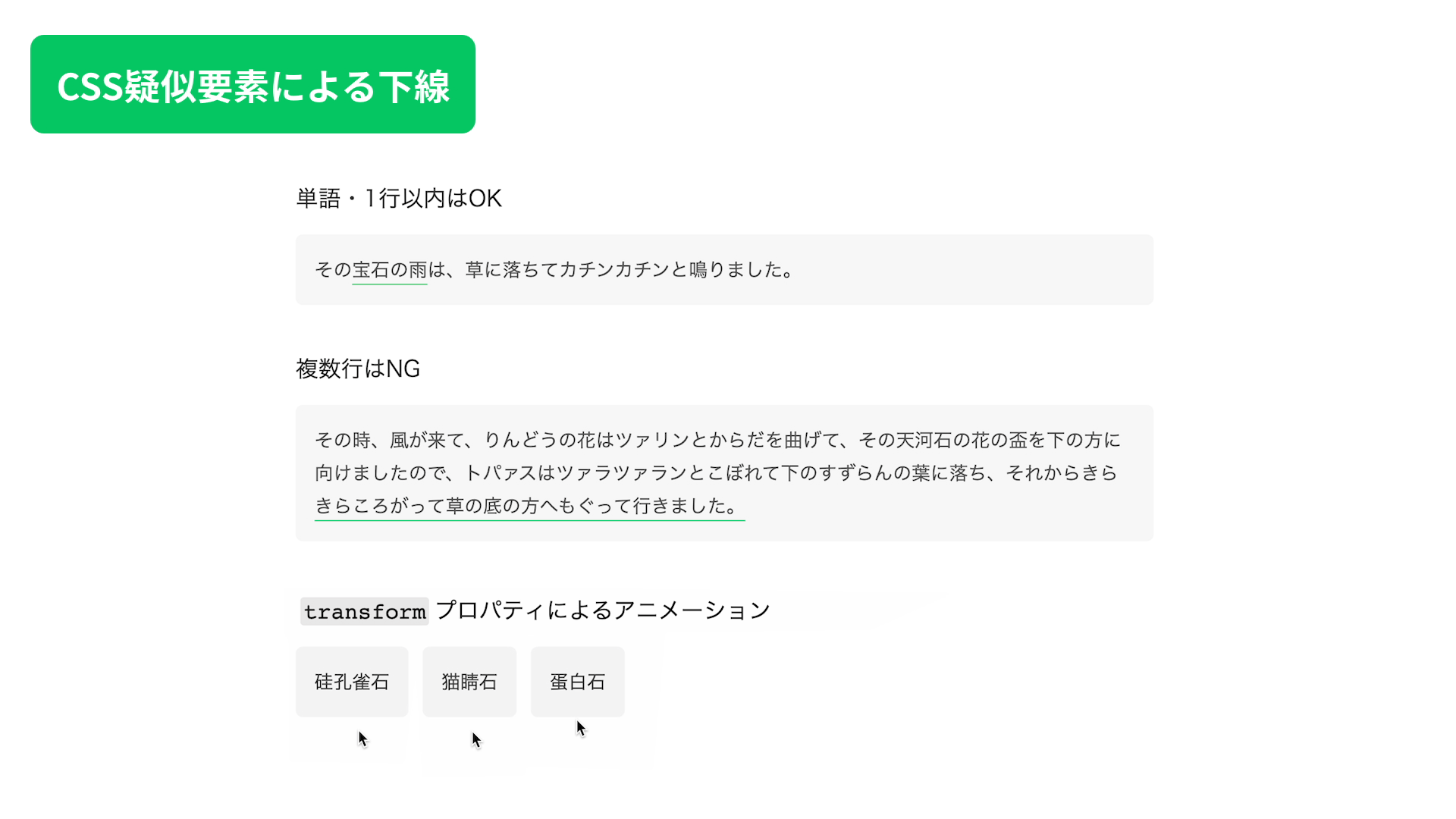
E: Highly flexible underline animations for a single word or a single line
If you want a more flexible underline animation for a single word or any text that stays on one line, use a CSS pseudo-element such as ::before or ::after. The background-size animation from section D only changes the line width, but with a pseudo-element, you can also animate movement and rotation.
Start by creating the underline with a pseudo-element.
.pseudoElement {
  position: relative;
}

.pseudoElement::after {
  content: "";
  position: absolute;
  width: 100%; /* Match the text width */
  height: 1px; /* Line thickness */
  bottom: -5px; /* Offset */
  left: 0;
  background-color: #05c662;
}
Then add an animation to the underline pseudo-element. In the sample below, transform is used to animate movement and scaling.
.pseudoElement__translate::after {
  transform: translateY(10px) scaleX(0);
  transform-origin: center;
  transition: transform 0.2s ease-out;
}
.textWrapper:hover .pseudoElement__translate::after {
  transform: translateY(0) scaleX(1);
}
F: Use a separate underline element for highly flexible multi-line animations
This is not the first method to recommend because it makes the HTML structure more complex, but if you render the text and the underline as separate elements, you can create highly flexible animations even for multi-line text. In this sample, the technique is used for effects based on movement and for animations that clip the whole element, giving a different feel from a simple background-size animation.
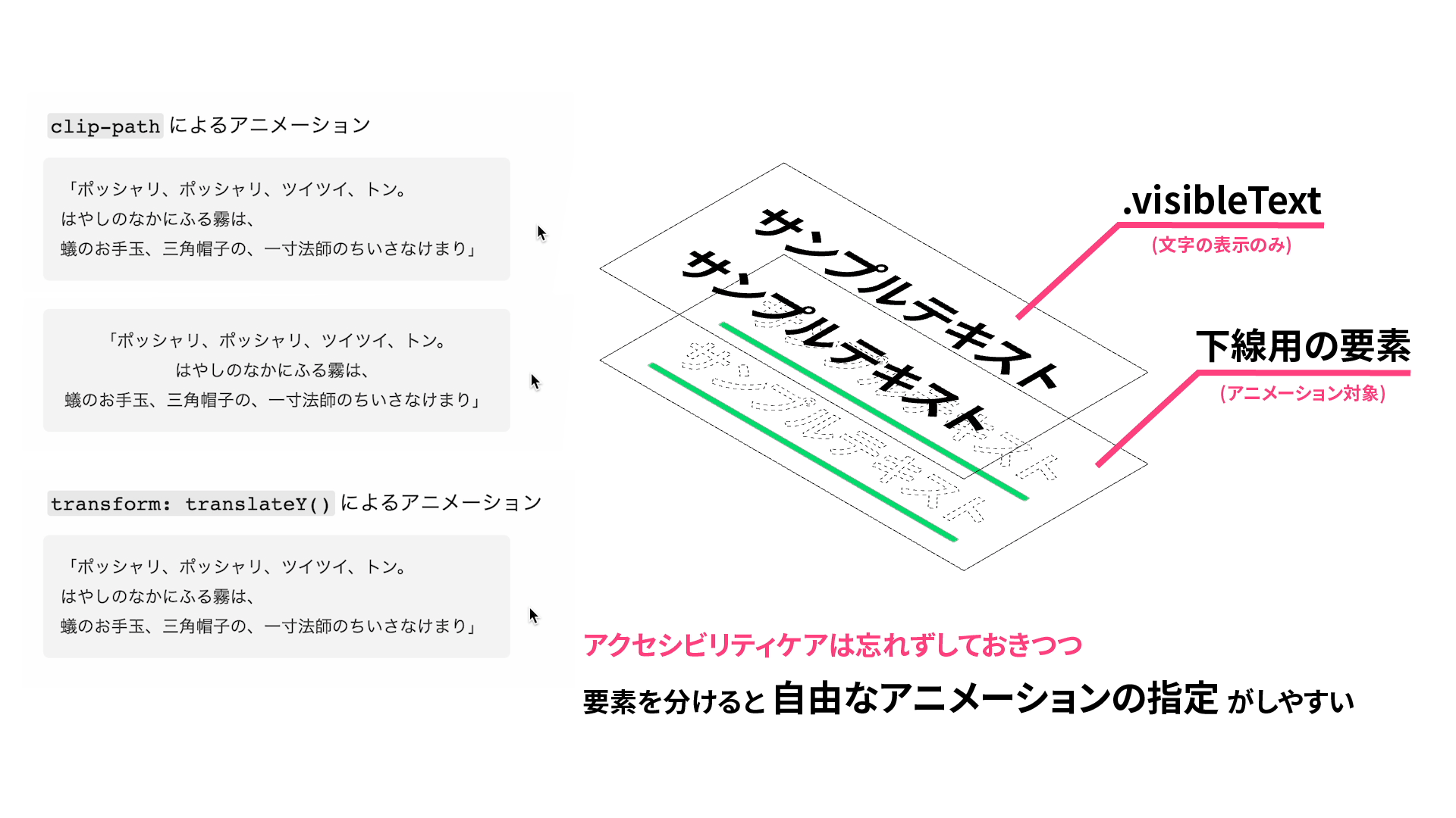
Build it with the following steps.
- Create two elements with the same text: one for the visible text and one for the underline.
- Draw the underline with one of the methods introduced in sections A to C. The sample below uses
text-decoration, the same approach as section A. - Add
aria-hidden="true"to the underline-only element.
<p class="textWrapper">
  <!-- Underline-only element -->
  <span class="textDecoration invisibleText" aria-hidden="true">This is the first line of sample text.<br>This is the second line of sample text.<br>This is the third line of sample text.</span>
  <!-- Visible-text element -->
  <span class="visibleText">This is the first line of sample text.<br>This is the second line of sample text.<br>This is the third line of sample text.</span>
</p>
- Adjust the position of the visible-text element.
.visibleText {
  position: absolute;
  top: 0;
  left: 0;
  padding: 16px; /* Match the parent padding to keep both layers aligned */
}
- Add
display: inline-block;to the underline-only element. - Make the underline-only element’s text transparent and prevent it from being selected.
- Add the animation to the underline-only element.
.invisibleText {
  display: inline-block; /* Keep the underline inline while still allowing the element to animate like a block */

  /* Make the text transparent and prevent it from being selected */
  color: transparent;
  user-select: none;

  /* Add the animation here... See the source code for details */
}
Note: do not forget accessibility when adding aria-hidden="true" and user-select: none;
If you duplicate the same text so the underline can animate independently, a screen reader will read the content twice. Add aria-hidden="true" to the underline-only element so the same text is not announced twice. Also, even if the text is transparent, users can still end up selecting both layers of text. Add user-select: none; to the underline-only element so it cannot be selected.
Extra: use a background image
Most examples above focus on a solid underline, but there will be cases where none of them fits. In that situation, background-image: url() is another option.
Note: do not use elements that already render with an underline purely for decoration
Some elements, such as <u>, render with a solid underline by default, but they are not recommended for decorative use alone. Use appropriate markup, and implement the underline with one of the CSS techniques introduced above.
Conclusion
By choosing CSS properties based on the situation, it becomes possible to draw a line under text in almost any case.
The examples in this article are organized from the simpler approaches to the more specialized ones, so they should serve as a practical reference whenever you need to decide which underline technique to use.