In website production, it is important to implement the visual design correctly, but small differences in code can also create inconvenience for users. This article explains coding techniques that consider not only appearance but also usability. This time, we focus on the parts of a site that users interact with most directly and introduce 17 ways to improve them using only simple HTML and CSS.
The sample below includes both bad and good examples. It is easier to understand this article if you read it while trying the differences for yourself.
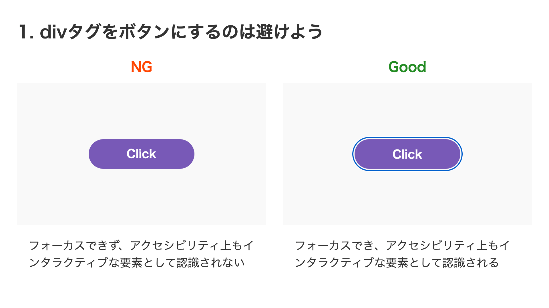
1. Avoid using a div tag as a button
Even if it looks like a button, implementing it with a <div> element is not good from an accessibility standpoint. If it has button behavior, using a <button> element is effective in many cases. If you must use a <div> element for some reason, you need to handle keyboard focus and provide screen reader support with WAI-ARIA and similar techniques.
<!-- Bad -->
<div>Click</div>

<!-- Good -->
<button>Click</button>
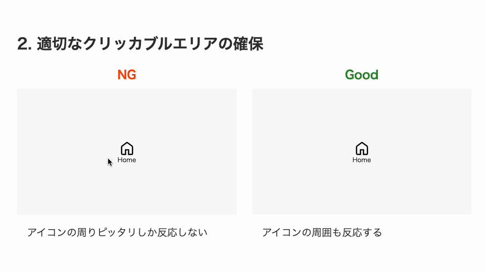
2. Ensure an appropriate clickable area
There is one thing to watch out for when using a small icon as a button. Rather than making only the visible bounds of the icon clickable, it is better to add some space around it so that the surrounding area also responds. You can expand the clickable area by adding padding, or, if padding is difficult because of background color or layout constraints, you can enlarge it with a pseudo-element.
/* Bad: the icon is only 32px square */
.icon {
  position: relative;
  width: 32px;
  height: 32px;
}

/* Good: use a pseudo-element to expand the clickable area to 50px square */
.icon::before {
  position: absolute;
  top: -9px;
  left: -9px;
  display: block;
  width: 50px;
  height: 50px;
  content: "";
}
It is also better to avoid using very small icons at the design stage. According to the Web Content Accessibility Guidelines (WCAG) 2.1, interactive targets are recommended to be at least 44×44 pixels.
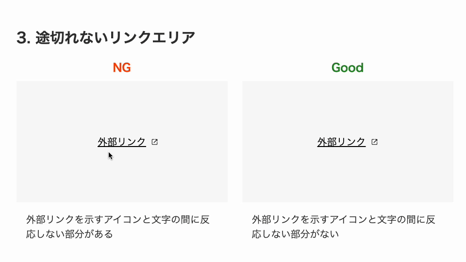
3. Keep the link area continuous
When indicating an external link, you may place an icon after the text to show that it opens in a new tab. In that case, just like the clickable area discussed above, the link area can become disconnected if you do not leave enough space.
/* Bad */
.externalLink {
  position: relative;
  color: #000;
}

.externalLink::after {
  position: absolute;
  top: 6px;
  right: -20px; /* The icon sticks out beyond the area */
  display: block;
  width: 12px;
  height: 12px;
  content: "";
  background-image: url("/assets/images/icon_tab.svg");
  background-repeat: no-repeat;
  background-size: 12px;
}

/* Good */
.externalLink {
  position: relative;
  color: #000;
}

.externalLink::after {
  position: absolute;
  top: 6px;
  right: 0; /* Place it at the right edge within the padded area */
  display: block;
  width: 12px;
  height: 12px;
  padding-right: 20px; /* Reserve space for the icon */
  content: "";
  background-image: url("/assets/images/icon_tab.svg");
  background-repeat: no-repeat;
  background-size: 12px;
}
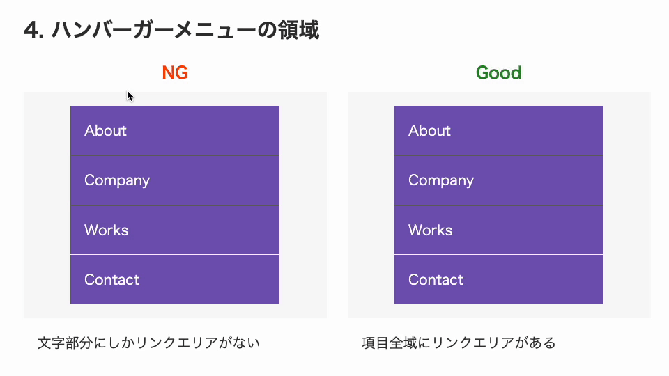
4. Make the whole hamburger menu item clickable
Hamburger menus are often used for mobile navigation. With this kind of design, it is better for the entire area inside the border to be clickable. If only the text itself is part of the link area, tapping or clicking the blank space on the right will not do anything. Just like button design, it is easier to use when the whole item area responds.
<ul class="menu">
  <li>
    <a href="#">About</a>
  </li>
</ul>
/* Bad */
li {
  padding: 16px; /* The list item creates the spacing */
}

/* Good */
a {
  display: block;
  padding: 16px; /* The anchor creates the spacing */
}
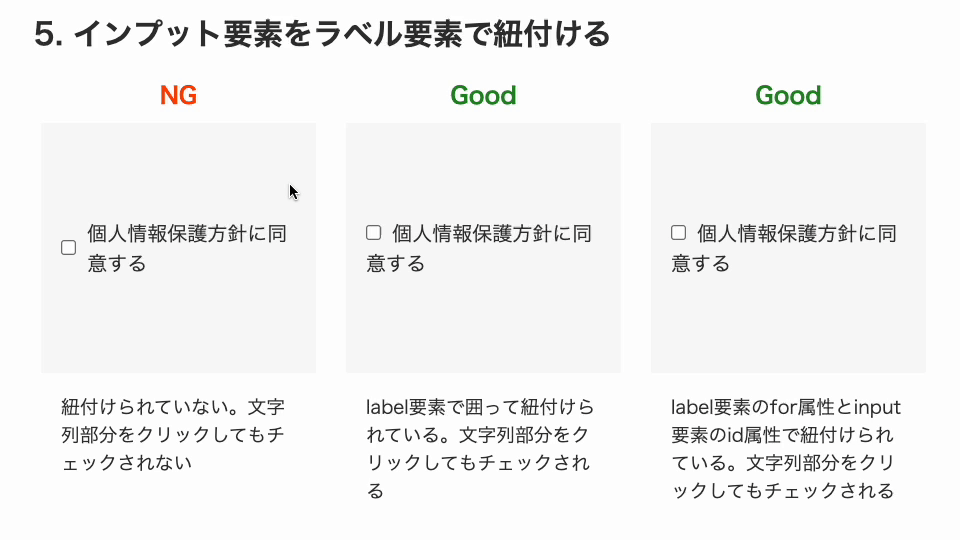
5. Associate <input> elements with <label> elements
Properly associating a label with an <input> element has benefits for both accessibility and usability. From an accessibility perspective, assistive technologies can read the label when the <input> element receives focus, which helps users understand the field. From a usability perspective, clicking the label can also check the element or move focus to it, making it easier to use.
There are two ways to associate an <input> element with a <label> element. The easiest is to wrap the input with the <label> element. If that is not possible, you can also associate them by matching the for attribute on the <label> element with the id attribute on the <input> element.
<!-- Bad -->
<input type="checkbox" />I agree to the privacy policy

<!-- Good: wrap it in a label element -->
<label><input type="checkbox" />I agree to the privacy policy</label>

<!-- Good: associate them with id and for -->
<input type="checkbox" id="agreePrivacy" />
<label for="agreePrivacy">I agree to the privacy policy</label>
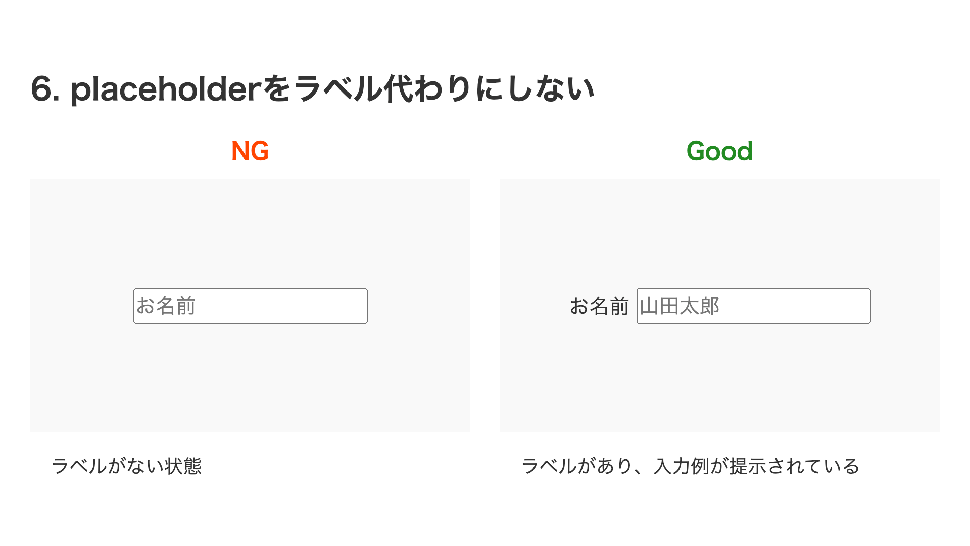
6. Don’t use placeholder as a label
Related to the previous point, it is better not to use the placeholder attribute on a text <input> element as a substitute for a label. Without a <label> element, the relationship between the field and its label is insufficient. According to the HTML Living Standard, the placeholder attribute is a short hint intended to aid the user with data entry, so using it as a label is inappropriate.
<!-- Bad -->
<input type="text" placeholder="Name" />

<!-- Good -->
<label>Name <input type="text" placeholder="Taro Yamada" /></label>
7. Don’t overlap interactions or place them too close together
If you overlap one interactive element with another, you force users to perform very precise actions. In the example below, this is a pattern often seen in privacy policy consent UIs, but the clickable area for the checkbox overlaps with the clickable area for the link, which can cause accidental operations, such as clicking the link when trying to check the box.
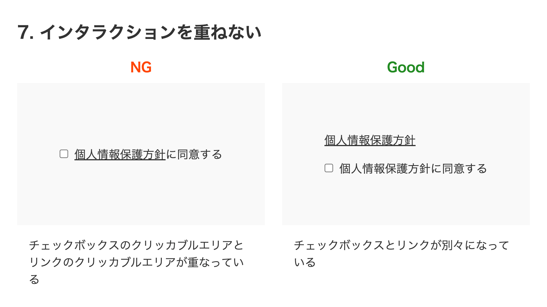
<!-- Bad -->
<label>
  <input type="checkbox" />
  I agree to the <a href="#" target="_blank">Privacy Policy</a>
</label>

<!-- Good -->
<a href="#" target="_blank">About the Privacy Policy</a><br />
<label> <input type="checkbox" />I agree to the privacy policy </label>
Also, if interactive elements are placed too close to each other, users are more likely to click the wrong one, so it is better to leave enough distance between them.
8. Give icon-only buttons proper labels
If an icon-only button does not have an appropriate label, screen readers and similar tools will not be able to read it properly. A design that includes text alongside the icon is more user-friendly, but if the button must be icon-only, it is better to supplement the label with the aria-label attribute or visually hidden text.
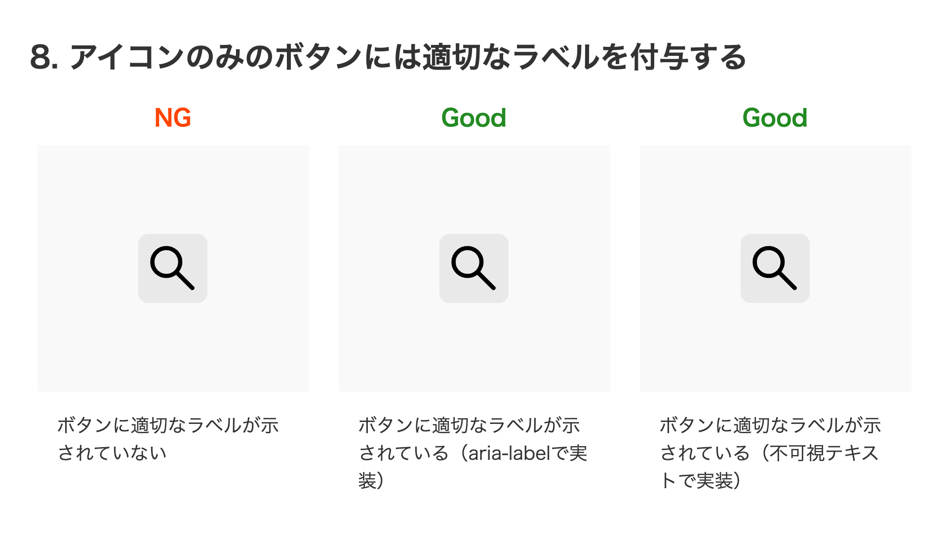
<!-- Bad -->
<button></button>

<!-- Good: implemented with aria-label -->
<button aria-label="Search"></button>

<!-- Good: implemented with visually hidden text -->
<button>
  <span class="sr-only">Search</span>
</button>
/* Styles to visually hide an element */
.sr-only {
  position: absolute;
  width: 1px;
  height: 1px;
  padding: 0;
  margin: -1px;
  clip-path: polygon(0 0, 0 0, 0 0, 0 0);
  border: 0;
}
The second approach, using visually hidden text, is also a versatile technique for conveying text to assistive technologies such as screen readers in many situations beyond button labels.
9. Add cursor: pointer to buttons
This may be surprising, but by default, hovering over a <button> element does not change the cursor and it remains an arrow. To make it clear that the element is interactive, it is more user-friendly to set the CSS cursor property to pointer so the cursor becomes a pointing hand icon.
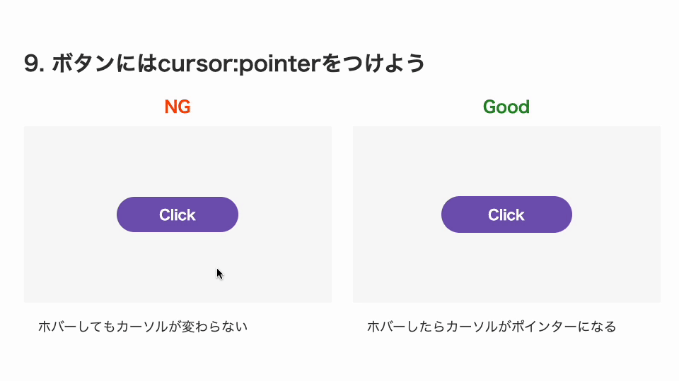
button {
  cursor: pointer;
}
10. Avoid hover animations on touch devices
Hover animations are useful on desktop devices with a mouse, but touch devices do not have hover. However, animations implemented with the :hover pseudo-class can still fire on touch, which can create awkward behavior. To avoid hover animations on touch devices, use the any-hover media feature in a media query.
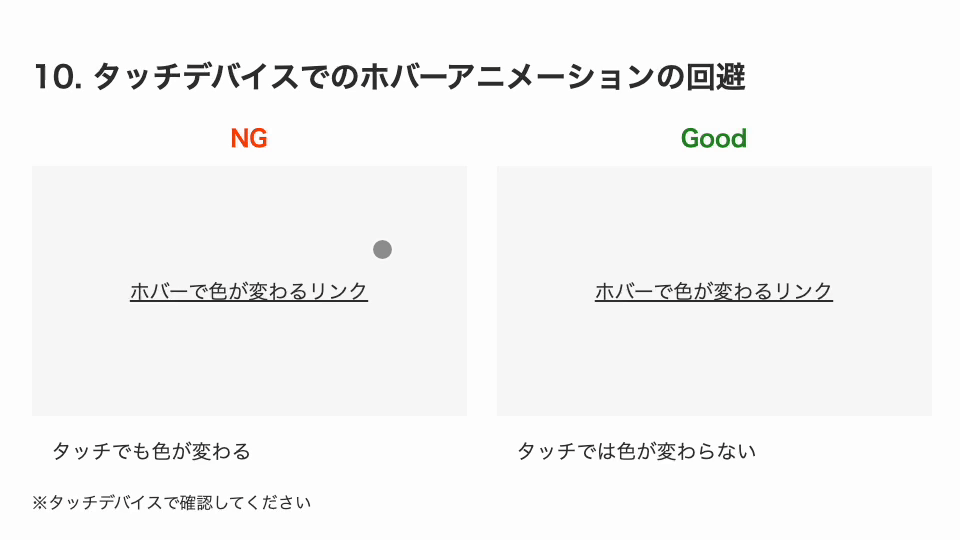
/* Applied only on devices that support hover */
@media (any-hover: hover) {
  .hoverLinkGood:hover {
    color: orangered;
  }
}
11. Avoid using outline:none on interactive elements when they receive focus
When an interactive element receives focus through keyboard operation and similar actions, a focus outline is displayed. This focus outline is provided by the browser’s default styles through the outline property. You can remove it by overriding the outline property, but this should be avoided from an accessibility standpoint.
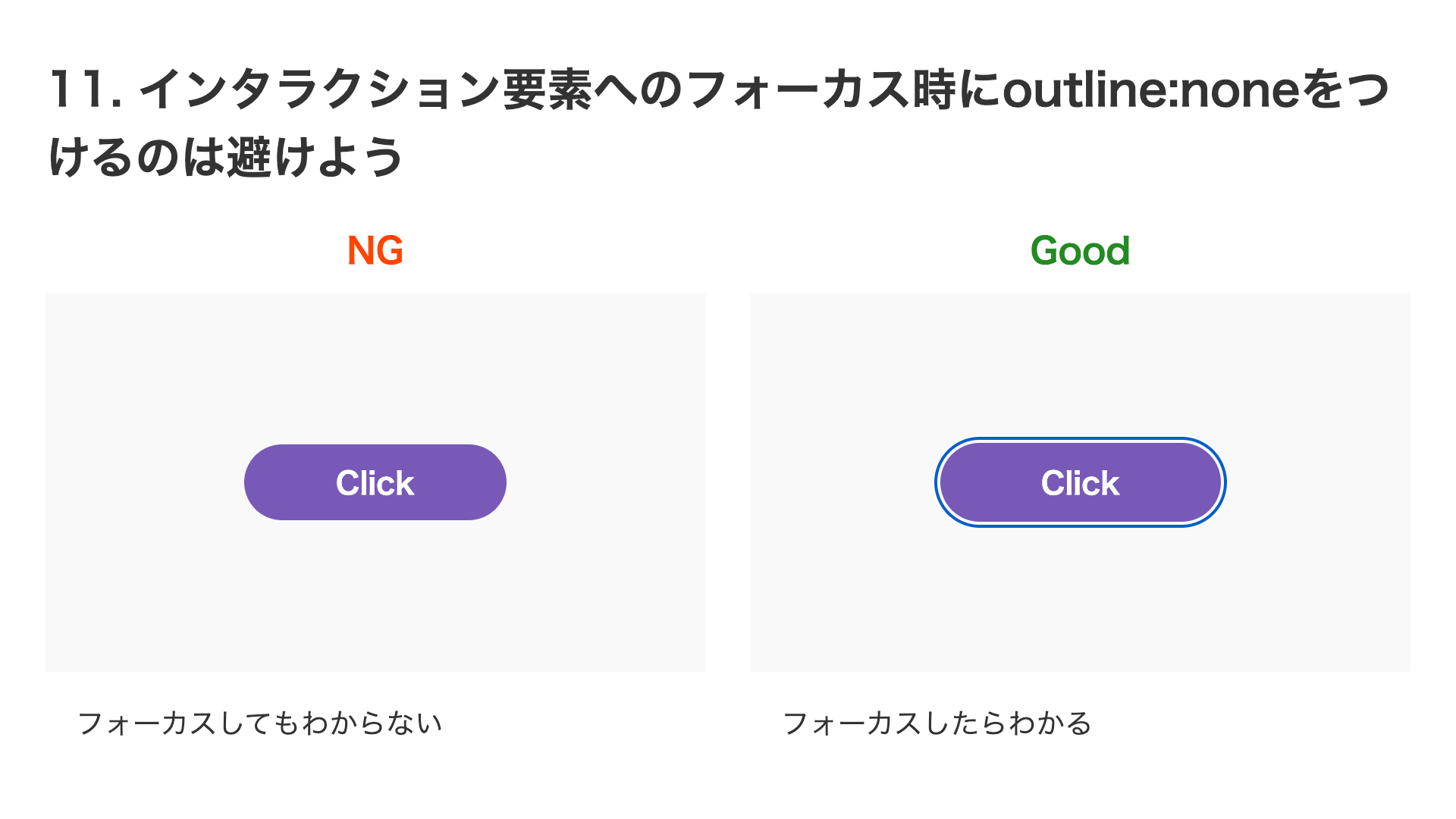
/* Bad */
button {
  outline: none;
}
Unless there is a special reason, it is better not to override it. If, as in this demo, the button has a dark color, it may be helpful to move the outline slightly away using outline-offset.
12. summary and details are handy when building accordions
Accordions are often used in website UIs to organize large amounts of information. It is convenient to implement this UI with the <summary> and <details> elements. When you use them, the open/closed state can also be conveyed to assistive technologies without special additional implementation. For details, see the article Building an animated accordion with HTML details and summary.
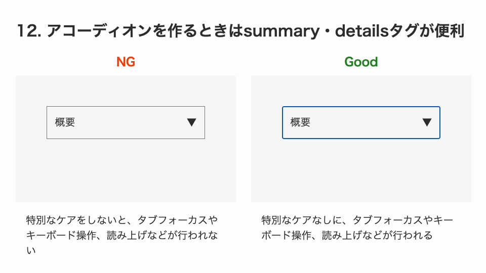
<!-- Bad -->
<div>
  <div>Overview</div>
  <div>This is the collapsed section.</div>
</div>

<!-- Good -->
<details>
  <summary>Overview</summary>
  <div>This is the collapsed section.</div>
</details>
13. Use transform when scaling or moving elements
When creating animations that scale up or move elements, the transform property is more useful than animating the width property or the left property. Changing the width property changes the actual size of the element, which affects the layout. If you use the scale() value of the transform property, the element can look larger without affecting the layout.
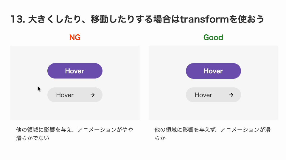
/* Bad */
button {
  width: 148px;
  height: 42px;
  transition: width 0.4s, height 0.4s;
}

button:hover {
  width: 178px;
  height: 50px;
}

/* Good */
button {
  width: 148px;
  height: 42px;
  transition: transform 0.4s;
}

button:hover {
  transform: scale(1.2);
}
Also, animating the left property or the width property can produce slightly choppy motion, especially at slow speeds. This is because left and width can only animate in 1px increments. By contrast, the transform property can animate in fractional increments, which makes it smoother. From an animation standpoint as well, transform is the better choice when changing size or moving elements.
14. Watch out for hover behavior near boundaries
Be careful with animations that change an element’s size or move it on hover. Near the boundary, the start and end of the animation can repeat rapidly and create a jittery effect.
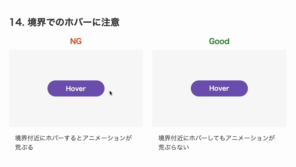
The reason is that the interactive area changes before and after hover, causing a loop such as hover → shrink → hover is lost → return → hover → … . Changing the interactive area is not very good for usability either, not just for animation behavior. It is better to make sure the interactive area does not change between the normal and hover states.
<!-- Bad -->
<button>Hover</button>

<!-- Good -->
<button>
  <span class="inner">Hover</span>
</button>
/* Bad */
button {
  transition: transform 0.2s;
}

button:hover {
  transform: scale(0.5);
}

/* Good */
button .inner {
  transition: transform 0.2s;
}

button:hover .inner {
  transform: scale(0.5);
}
In this implementation example, the button’s visual styling is handled by the inner <span> element. By animating the inner <span> element instead of the interactive <button> element, the interactive area does not change.
15. Don’t use display:none when customizing input elements
Sometimes you may want to create a custom design for an <input> element instead of using the browser’s default UI. In that case, if you apply display: none to the <input> element, it can no longer receive focus. By combining a <label> tag with a visually hidden technique, you can create a custom-designed form control while preserving focus behavior.
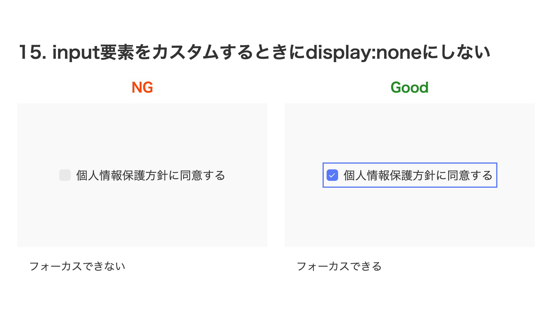
<!-- Bad -->
<label class="customCheckbox">
  <input type="checkbox" />I agree to the privacy policy
</label>

<!-- Good -->
<label class="customCheckbox">
  <input type="checkbox" class="sr-only" />I agree to the privacy policy
</label>
.customCheckbox {
  /* Customized styles */
}

/* Bad */
.customCheckbox input {
  display: none;
}

/* Good */
.sr-only {
  position: absolute;
  width: 1px;
  height: 1px;
  padding: 0;
  margin: -1px;
  clip-path: polygon(0 0, 0 0, 0 0, 0 0);
  border: 0;
}
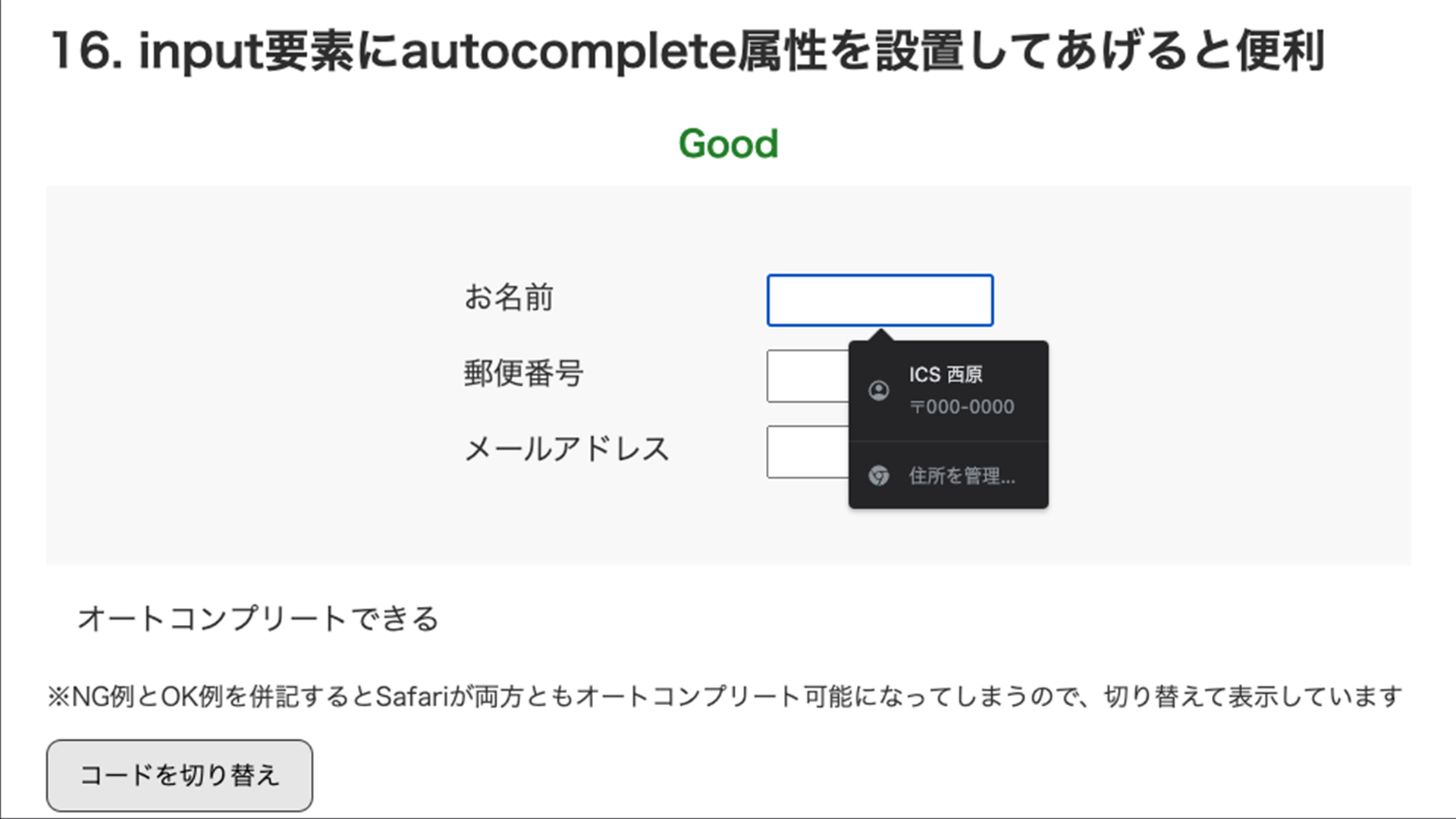
16. Adding the autocomplete attribute to input elements is useful
The <input> element has an autocomplete attribute that helps users enter data. Browser behavior differs slightly (*1), but it becomes effective when you set the autocomplete attribute with an appropriate value. In Safari, it does not work unless the fields are wrapped in a <form> element, so it is better to include the <form> element as well. For details, see the article How to write modern HTML forms: A guide to the input element.
<!-- Bad -->
<div>
  <label>Name<input type="text" name="name" /> </label>
  <label>Postal code<input type="text" name="postal-code" /></label>
  <label>Email address<input type="email" name="email" /></label>
</div>

<!-- Good -->
<form>
  <label>Name<input type="text" name="name" autocomplete="name" /> </label>
  <label
    >Postal code<input type="text" name="postal-code" autocomplete="postal-code"
  /></label>
  <label
    >Email address<input type="email" name="email" autocomplete="email"
  /></label>
</form>
17. Don’t set the font size of input elements below 16px
This behavior is specific to iOS Safari, but if you set the font-size of an <input> element below 16px, the page zooms in on the form field. It stays zoomed in even after input, so the user has to manually zoom back out. It is better not to design forms with text that is too small.
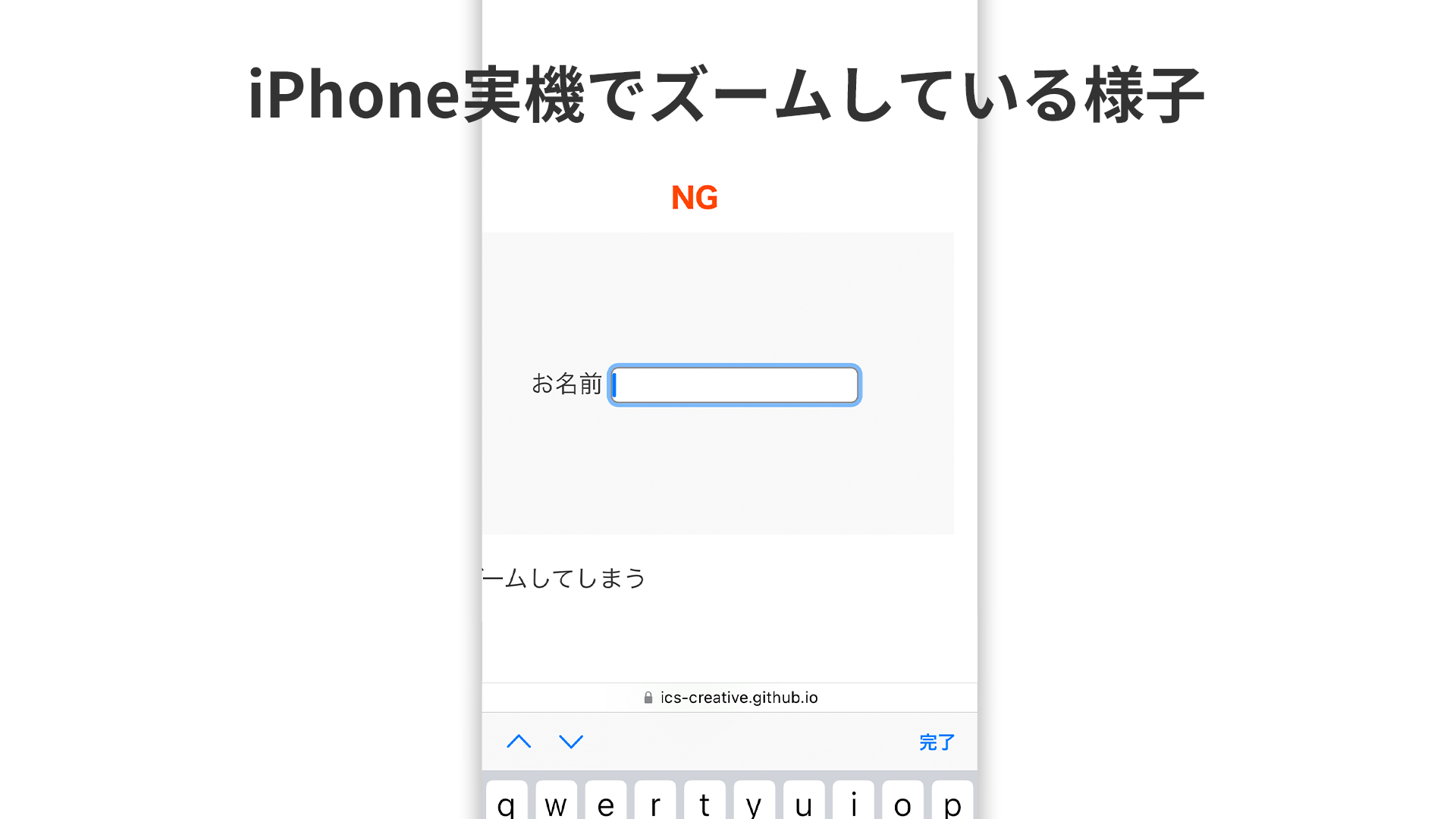
/* Bad */
input {
  font-size: 14px;
}

/* Good */
input {
  font-size: 16px;
}
18. Hide controls on decorative video tags
Modern browsers now make it possible to use transparent video on the web as well (for details, see the article ウェブサイトに透過動画を埋め込む方法). In the future, we will probably see more decorative uses of video, not just videos meant to be watched. Decorative videos are also implemented with the <video> tag, but because they are purely decorative, the video control UI is unnecessary. It is a good idea to add settings that hide the various controls.
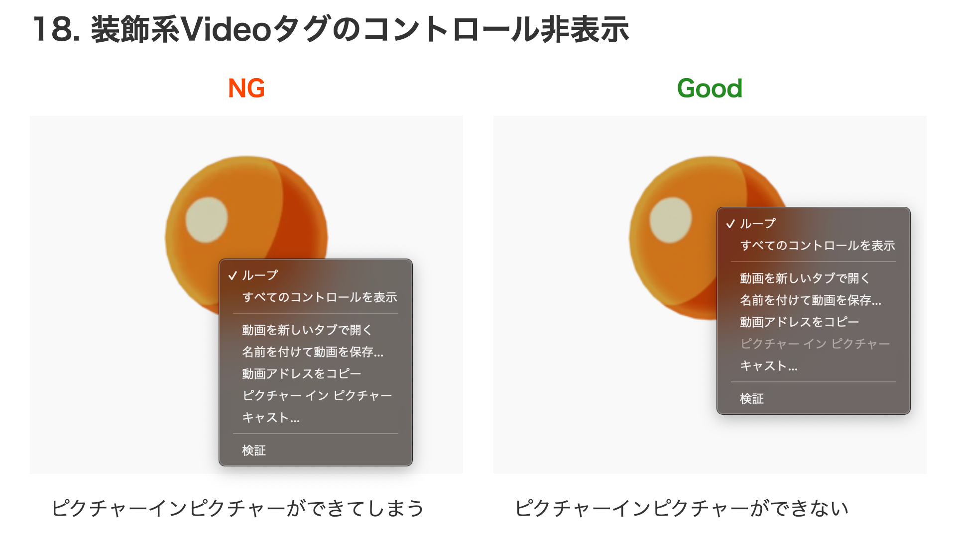
<!-- Bad -->
<video
  muted
  playsinline
  autoplay
  loop
  src="ikura.mp4"
  width="256"
  height="256"
></video>

<!-- Good -->
<video
  muted
  playsinline
  autoplay
  loop
  controlslist="nodownload nofullscreen noremoteplayback"
  x-webkit-airplay="deny"
  disablepictureinpicture
  src="ikura.mp4"
  width="256"
  height="256"
></video>
However, these settings are only meant to prevent control UI from appearing unnecessarily, so they cannot make downloading completely impossible.
Conclusion
Small tweaks in code can improve a site’s ease of use, and those small improvements add up to the site’s overall UX. I hope the techniques introduced here will help you build better websites.
Notes
- *1 As of December 2022, in Google Chrome 108 and Microsoft Edge 108, autofill may still work automatically even without the
autocompleteattribute, as in the bad example, if there is appropriate nearby text. In Safari 16 as well, if even one element has anautocompleteattribute, other elements may also become enabled, so there are cases where it works even without theautocompleteattribute.