
Accordion user interfaces (UIs) are common on web pages. There are many tutorials showing different ways to build an accordion UI, but how do you implement yours? Are you taking care not only of the appearance, but accessibility as well?
The <details> and <summary> elements are ideal for implementing accordion UIs. If you used to build accordion UIs with <button>, <div>, or <input> elements as an old workaround for IE, we recommend adopting <details> and <summary> because accessibility is much easier to handle with them.
In this article, we’ll explain why <details> and <summary> are such a good fit for accordion UIs, and walk through how to build one step by step—from HTML markup and CSS styling to JavaScript-based animation control.
Common challenges when building accordion UIs
The <details> and <summary> elements are relatively new tags that were introduced in HTML 5.1 (the link points to the specification as of 2016). Perhaps as a legacy of old IE-support workarounds, many accordion UI examples still add open/close behavior to <button>, <div>, or <input> elements with type="checkbox". These approaches can reproduce accordion-like behavior, but they come with a variety of issues like the following.
Code structure
The HTML structure becomes complex. If you build it with tags that do not match their original purpose, it is hard to tell at a glance what the markup represents.
▼Example built with an <input> element
<input id="accordion" type="checkbox" class="open" />
<label class="summary" for="accordion">Overview</label>
<div class="content">Detailed content</div>
Implementation effort
Even if you only want the minimum opening and closing behavior, a CSS-based implementation is still required.
Accessibility and usability
- Without keyboard support, the element often cannot receive focus with the Tab key. Opening and closing it with the Enter or Space key also cannot be done without JavaScript.
- Without screen reader support, the open/closed state will not be announced.
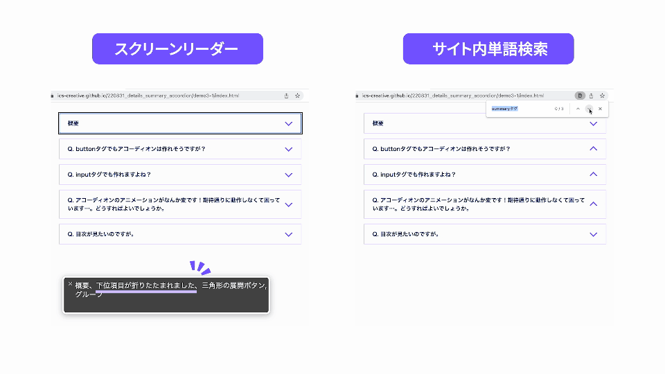
- It is common for find-in-page searches to miss words inside the accordion. Even when a word is found, the accordion may not open, making the match hard to locate.
Benefits of using <details> and <summary> for accordion UIs
Now that we have looked at the issues, let’s look at the benefits of using <details> and <summary> in an accordion UI. They cover all of the problems listed above, and are especially strong from an accessibility standpoint.
Code structure
The HTML structure is simple. You can see how easy it is to understand the structure from the tag names alone.
<details>
  <summary>Overview</summary>
  Detailed content
</details>
Implementation effort
If you only need the minimum accordion open/close behavior, CSS is unnecessary because HTML alone is enough.
Accessibility and usability
They are optimized for accessibility without any special care.
-
Without registering keyboard events in JavaScript, users can tab to the control and toggle it with the Enter or Space key.
-
Screen readers appropriately announce the open/closed state. For example, if you use VoiceOver on macOS in Google Chrome, when the accordion is closed it reads something like “(summary text), collapsed, disclosure triangle, group,” and when it is open it reads something like “(summary text), expanded, disclosure triangle, group.”
-
When users search within the page, the accordion containing the matched word opens, and the browser jumps directly to that word.
That explains why <details> and <summary> are such a strong choice. Next, let’s build an accordion UI in three steps.
STEP 1: Mark up the HTML
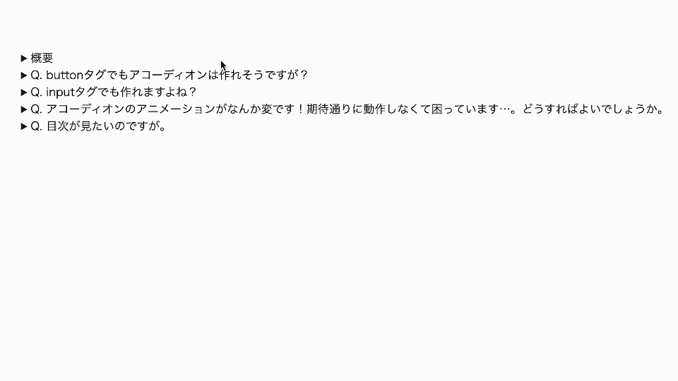
Wrap a <summary> element containing the summary text in a <details> element to create the basic structure. Next, mark up the collapsible part, such as the detailed content, below the <summary> element and the accordion is complete. In the example below, no tag is added to the collapsed section itself, but you can use a variety of tags there.
▼Basic HTML structure
<details>
  <summary>Overview</summary>
  This is the collapsed section.
</details>
Try it in a browser. With just these two tags, you can already open and close an accordion!
▼Accordion behavior built with basic HTML
Grouping with the name attribute
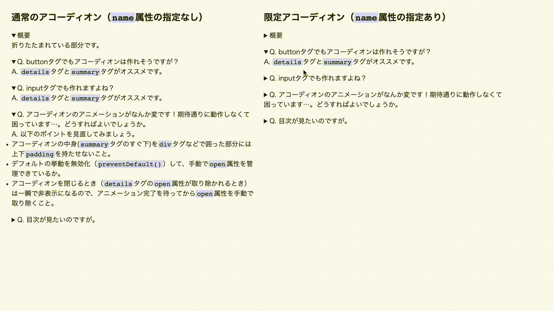
If you assign the same name attribute value to multiple <details> elements, only one accordion in the group can stay open, and the others close automatically.
<details name="accordion">
  <summary>Accordion 1</summary>
  Content
</details>
<details name="accordion">
  <summary>Accordion 2</summary>
  Content
</details>
▼Left: all accordions open independently, Right: only one accordion can be open in the group
Supported browsers: HTML element: details: name | Can I use…
STEP 2: Style it with CSS
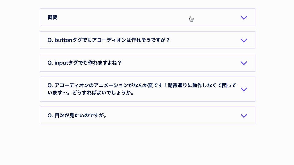
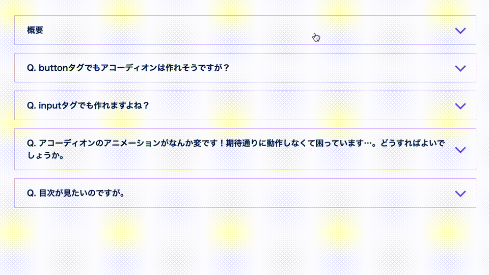
Next, let’s change the appearance with CSS. We will create an accordion UI with an icon like the one below.
- Open the demo in a new window
- View the source code (HTML, CSS)
First, let’s remove the default triangle icon so we can replace it. Because the triangle appears when the initial display: list-item value is used, you can hide it either by changing the display value or by setting list-style-type: none;.
summary {
  /* Set a value other than display: list-item to hide the default triangle icon */
  display: block;
  /* Or, using the following also works */
  list-style-type: none;
}
Another option is to set the content property of the ::marker pseudo-element to an empty string, but Safari renders the triangle icon differently, so that approach does not work there. We recommend using one of the methods above instead.
summary::marker {
  content: "";
}
One caveat: before Safari 18.4 (released in April 2025), the default triangle icon in Safari was displayed using a CSS pseudo-element called -webkit-details-marker. Depending on which versions you need to support, it may be worth specifying that separately.
/* Hide the default triangle icon displayed in Safari */
summary::-webkit-details-marker {
  display: none;
}
Next, let’s create a new icon. If you want to add an element for the icon, add a <span> element or similar to the HTML as shown below. The CSS for the icon itself is lengthy, so please refer to the source code.
<details>
  <summary>Overview<span class="icon"></span></summary>
  This is the collapsed section.
</details>
Now let’s adjust the layout of the icon and text inside the <summary> element. This time we used display: grid.
▼Sample CSS for adjusting the icon/text layout (excerpt)
summary {
  display: grid; /* Because this is no longer the initial display: list-item value, the default triangle icon is hidden */
  grid-template-columns: 1fr 24px;
  gap: 6px;
  align-items: center;
  padding: 16px 24px;
}
Animating the icon with CSS
As shown below, you can register the styles for the opened state with the details[open] selector and animate the icon.
.icon {
  /* Omitted */

  transition: transform 0.4s;
}

/* Styles when the accordion is open */
details[open] .icon {
  transform: rotate(180deg);
}
Safari caveat
The sample code includes a version that creates the icon with the after pseudo-element of the <summary> tag. This is a technique often used when you want a more concise DOM structure.
However, Safari 17.4 (released in March 2024) and earlier have a bug where CSS pseudo-elements such as before and after do not transition with transform: rotate(). If you want the icon to animate, we recommend the method described earlier, where you add a dedicated icon element.
STEP 3-A: Open/close animation (CSS only)
Let’s make the accordion open and close with animation when it is clicked or operated from the keyboard. Here we introduce two implementation approaches: one that uses only CSS and works in some browsers, and one that uses JavaScript and works across all browsers.
How to add open/close animation with CSS alone (supported only in some browsers)
- Open the demo in a new window
- View the source code (HTML, CSS)
The open attribute that is added when the contents of a <details> element are shown is toggled as soon as the accordion is clicked. Even if you define an open/close animation for the detailed content, the open attribute has already been removed by the moment closing starts, so the animation cannot be seen.
The ::details-content pseudo-element solves this problem.
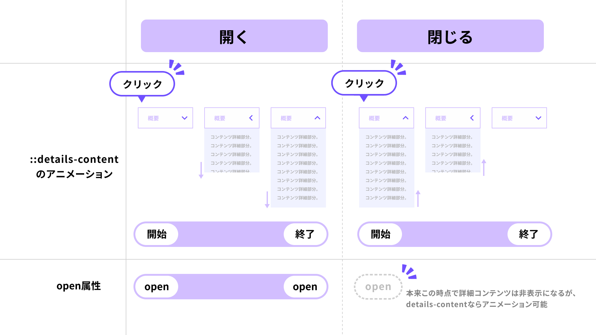
On the transition property of the ::details-content pseudo-element, specify the properties and values you want to animate, along with content-visibility 0.4s allow-discrete. This keeps the content in a rendered state while the open/close animation plays.
details {
  /* --------Styles for the accordion content-------- */
  &::details-content {
    transition:
      height 0.4s,
      opacity 0.4s,
      content-visibility 0.4s allow-discrete;
    height: 0;
    opacity: 0;
    overflow: clip;
    background-color: #f0f2ff;
  }

  /* --------Styles for the accordion content (open state)-------- */
  &[open]::details-content {
    opacity: 1;
  }

  /* Styles when the accordion is open */
  &[open] .icon {
    transform: rotate(180deg);
  }
}

@supports (interpolate-size: allow-keywords) {
  :root {
    interpolate-size: allow-keywords; /* Required to allow animation from height: 0 (numeric type) to auto (keyword type) */
  }
  details[open]::details-content {
    height: auto;
  }
}

/* If animation from height: 0 to auto is not supported, animate to a fixed value instead */
@supports not (interpolate-size: allow-keywords) {
  details[open]::details-content {
    height: 150px;
    overflow-y: scroll;
  }
}
Browser support is as follows: as of May 2025, Chrome and Edge fully support this. Safari does not yet support interpolate-size: allow-keywords; (the setting that allows the height property to animate from 0 to auto), so a fixed-value animation is specified as a fallback. Firefox does not support it yet, so the animation will not play there.
※ When animating to a fixed height, the height can no longer adapt to the amount of content, so the visible area may become too small or, conversely, appear unnecessarily tall.
STEP 3-B: Open/close animation (with JS)
How to add open/close animation with JavaScript (works in all browsers)
Use the browser’s built-in Web Animations API to animate the accordion content. You can use whatever animation library you prefer, of course. If you’re unsure, see “現場で使えるアニメーション系JSライブラリまとめ - GSAP, Anime.js, Motion, Tween.js, WebAnimationなど”.
▼Example we will build this time
- Open the demo in a new window
- View the source code (HTML, CSS, JavaScript)
For the JavaScript implementation, we will make a few small changes to the HTML and CSS. First, add classes for JavaScript control to the HTML, and wrap the collapsed section (the part below the <summary> element) in two nested <div> elements.
▼HTML changed so the content can be animated
<details class="js-details">
  <summary class="js-summary">Overview<span class="icon"></span></summary>
  <div class="content js-content">
    <div class="content_inner">This is the collapsed section.</div>
  </div>
</details>
Next, set overflow: hidden in CSS on the outer div element with the content class. Then add padding to the inner div element with the content_inner class. The key point is not to assign vertical padding to the content class directly under the <details> tag. If you do, the animation becomes jerky.
▼CSS changed so the content can be animated (excerpt)
/* --------Styles for the accordion content-------- */
.content {
  overflow: hidden;

  /* If padding is set on the element directly under details, the behavior becomes unstable, so do not set it here */
}

.content_inner {
  padding: 24px 48px;
}
Registering the animation
Now that the HTML and CSS are ready, let’s move on to the JavaScript implementation. First, register the animation that shows and hides js-content. This time we prepared a simple animation that changes the height and opacity.
/**
 * Duration and easing for the animation
 */
const animTiming = {
  duration: 400,
  easing: "ease-out",
};

/**
 * Creates keyframes for when the accordion closes.
 * @param content {HTMLElement}
 */
const closingAnimKeyframes = (content) => [
  {
    height: content.offsetHeight + "px", // Specify the element height because height: "auto" will not be calculated correctly
    opacity: 1,
  },
  {
    height: 0,
    opacity: 0,
  },
];

/**
 * Creates keyframes for when the accordion opens.
 * @param content {HTMLElement}
 */
const openingAnimKeyframes = (content) => [
  {
    height: 0,
    opacity: 0,
  },
  {
    height: content.offsetHeight + "px",
    opacity: 1,
  },
];
Registering the click event
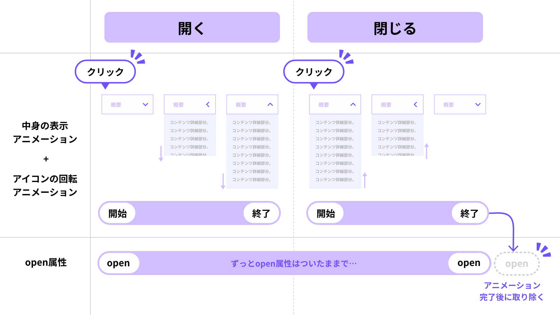
Next, register a click event on the <summary> element. The <details> element switches its contents between visible and hidden based on the presence or absence of the open attribute (a boolean attribute). You can determine the open/closed state with the open property of the <details> element (a boolean value), so check details.open and run the animation registered earlier.
However, as soon as the open attribute is removed from the <details> element, the contents instantly become hidden. In that case, no matter how much you animate, the animation cannot be seen (similar to display: none). To make the animation visible, add preventDefault() to the click event on the <summary> element and disable the default behavior.
Of course, once the default behavior is disabled, the accordion will no longer open and close automatically, so you must toggle the open attribute manually. When the accordion opens, add the open attribute at click time; when it closes, remove the open attribute after the animation is complete.
const details = document.querySelector(".js-details");
const summary = document.querySelector(".js-summary");

summary.addEventListener("click", (event) => {
  // Disable the default behavior
  event.preventDefault();

  // Check the open attribute of details
  if (details.open) {
    // Process when closing the accordion
    // ...omitted

    // Run the animation
    const closingAnim = content.animate(
      closingAnimKeyframes(content),
      animTiming,
    );

    closingAnim.onfinish = () => {
      // Remove the open attribute after the animation is complete
      details.removeAttribute("open");
    };
  } else {
    // Process when opening the accordion
    // Add the open attribute
    details.setAttribute("open", "true");

    // Run the animation
    const openingAnim = content.animate(
      openingAnimKeyframes(content),
      animTiming,
    );

    // ...omitted
  }
});
You may already have noticed this, but when opening the accordion, the content animates only after it has become visible, so ordinarily there would be no need to add the open attribute manually. However, because Safari has a bug where the animation does not play, this implementation toggles the open attribute manually for both opening and closing.
▼The timing of running the animation and toggling the open attribute is different
We will omit the detailed explanation here, but the sample code also adds an is-opened class to control when the icon animation runs. Check the sample to see exactly when the icon moves.
Handling repeated clicks
Now the content opens and closes with animation. However, it is still not complete. If the user clicks repeatedly, the next animation starts while the current animation is still running, and the behavior becomes unstable.
To prevent the open/close state from being toggled during an animation, we add a safeguard. This time we use a custom data attribute called data-anim-status and manage the animation state with the value running. We set that value only while the animation is running, and return early if the user clicks while the value is set. In JavaScript, you can reference the custom data attribute you created via dataset.animStatus.
▼JavaScript with logic added to prevent repeated clicks (excerpt)
summary.addEventListener("click", (event) => {
  // Prevent repeated clicks. If an animation is running, ignore the click event and return
  if (details.dataset.animStatus === "running") {
    return;
  }

  // Check the open attribute of details
  if (details.open) {
    // ...omitted
    // Set a value indicating that an animation is running
    details.dataset.animStatus = "running";

    closingAnim.onfinish = () => {
      // Remove the value after the animation is complete
      details.dataset.animStatus = "";
    };
  } else {
    // ...omitted
    // Set a value indicating that an animation is running
    details.dataset.animStatus = "running";

    openingAnim.onfinish = () => {
      // Remove the value after the animation is complete
      details.dataset.animStatus = "";
    };
  }
});
Note
If you add the click event to the <details> element, the opened content area will also become clickable. Be sure to add the click event to the <summary> element instead.
Bonus: version that supports repeated clicks
We also prepared a version that can still be clicked while the accordion is in the middle of its open/close animation. If you try clicking repeatedly, you will see the difference in behavior. For details, please check the demo and the sample code. It uses the JavaScript animation library GSAP.
Conclusion
We introduced both the benefits of building an accordion UI with <details> and <summary>, and the detailed steps for implementing it.
Depending on the design you need, it is best to enhance it step by step as follows.
- I want to build an accordion UI quickly for now → HTML only
- I want to focus on the appearance of the accordion UI → HTML + CSS
- I want to focus on both the appearance and motion of the accordion UI → HTML + CSS + JavaScript
<details> and <summary> are the best choice for addressing the various concerns involved in building accordion UIs. Give them a try.