When it comes to spacing, many people probably think first of the margin and padding properties. However, you can also specify spacing with CSS’s gap property. Using gap with CSS Grid or Flexbox makes it possible to build flexible layouts.
In this article, I will introduce layout techniques that make use of the gap property available in Flexbox and CSS Grid, along with their benefits. In some cases, spacing that was previously adjusted with the margin property can be handled more flexibly with gap. Note that the sample below does not use the margin property at all.

Also, in this article, to avoid confusion with the term margin, I will refer to the empty space between elements simply as “spacing.” This convention is used only within this article.
How to use the gap property
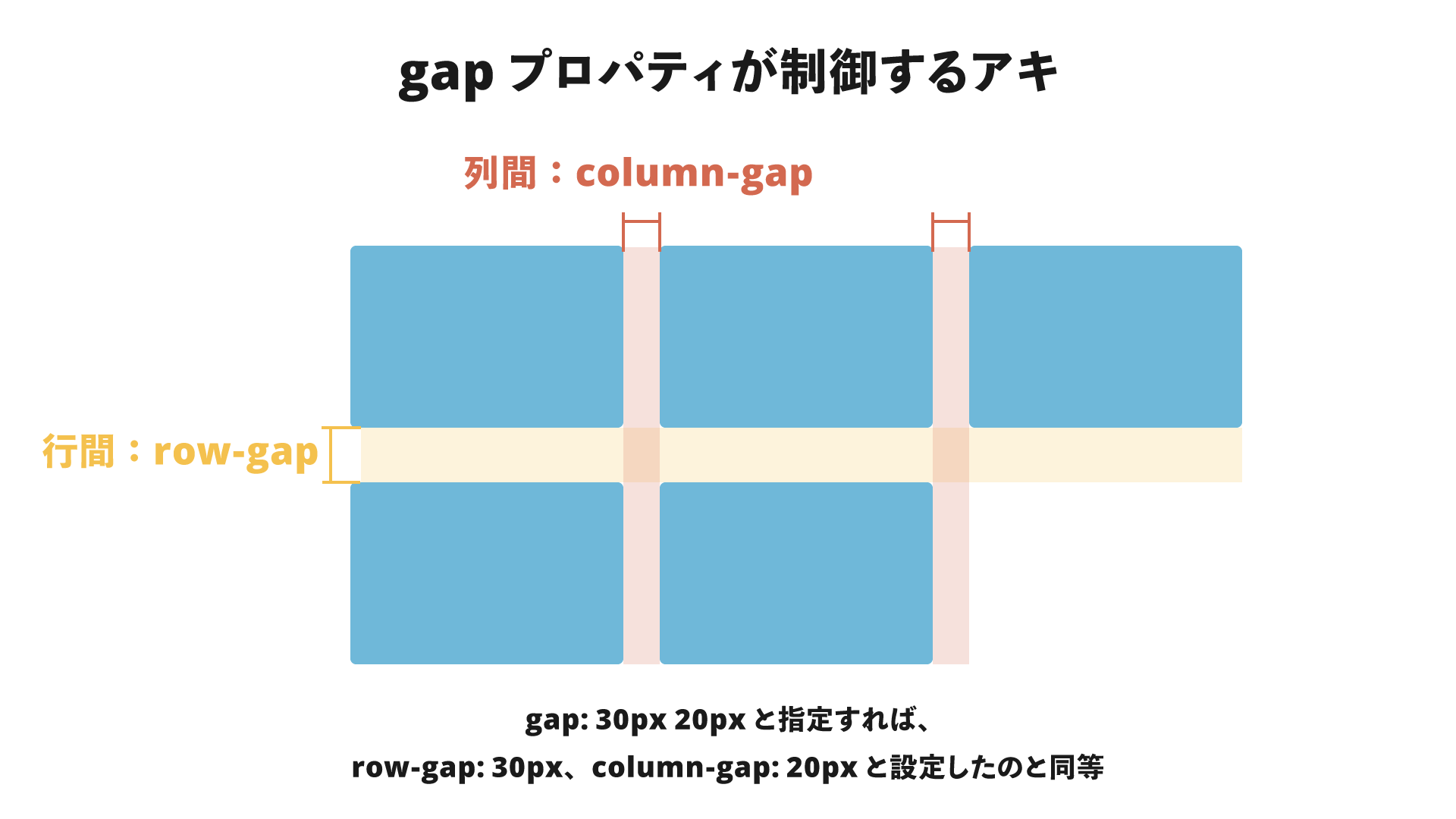
The gap property lets you set spacing between items in Flexbox and CSS Grid.
.hoge {
  display: flex;
  gap: 30px 20px;
}

.fuga {
  display: grid;
  gap: 30px 20px;
}
The gap property accepts one or two values, which specify the spacing between rows and columns respectively. If only one value is given, the same value is applied to both row and column gaps. If two values are given, the first is the row gap and the second is the column gap. Since gap is a shorthand property, use row-gap and column-gap when you want to set them individually.
For a more detailed explanation of how to use the gap property in CSS Grid, see CSSグリッド入門 - 図解でわかりやすく解説.
Page design without using margin
The sample page uses no margin property in either the desktop or mobile layout. Elements are laid out using only the gap and padding properties. Let’s look at a few techniques that avoid using margin.
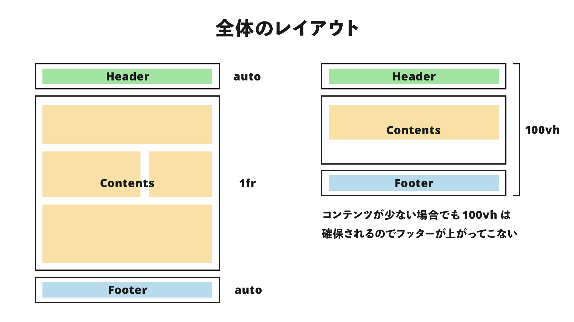
Overall layout
First, let’s look at the overall layout. Broadly speaking, it consists of a header, main content, footer, and a hamburger button for the mobile version (hidden in the desktop version). The main content is further divided into seven sections. The header, content, and footer use CSS Grid. (Detailed inner HTML is omitted.)
<body class="global-layout">
  <header class="global-layout__header header">...</header>
  <button class="global-layout__hamburger-button hamburger-button">
    ...
  </button>
  <main class="global-layout__contents contents-layout">...</main>
  <footer class="global-layout__footer footer">...</footer>
</body>
.global-layout {
  display: grid;
  grid-template: "header" auto "contents" 1fr "footer" auto/100%;
  min-height: 100vh;
}

.global-layout__header {
  position: fixed;
  top: 0;
  left: 0;
  grid-area: header;
  width: 100%;
}

.global-layout__contents {
  grid-area: contents;
}

.global-layout__footer {
  grid-area: footer;
}
One advantage of using CSS Grid even for a vertically stacked layout is that it prevents the footer from rising up when the content height is small. By setting min-height: 100vh to make the minimum height equal to the viewport height, and setting the content area to 1fr, the remaining space after subtracting the header and footer heights from 100vh is allocated to the content area. As a result, the footer is always positioned at least at the very bottom of the screen. For details about CSS Grid and how fr works, see CSSグリッド入門 - 図解でわかりやすく解説.
The main content consists of seven sections stacked vertically, with 120px between each section. This can be implemented as follows by combining Flexbox and gap.
<main class="global-layout__contents contents-layout">
  <section class="main-visual">...</section>
  <section class="missions">...</section>
  <section class="service">...</section>
  <section class="news">...</section>
  <section class="works">...</section>
  <section class="company">...</section>
  <section class="credits">...</section>
</main>
.contents-layout {
  display: flex;
  flex-direction: column;
  row-gap: 120px;
  padding-bottom: 120px;
}
Using display:flex and flex-direction:column, the sections are stacked vertically. Flexbox is often associated with horizontal layouts, but the flex-direction property also makes vertical layouts possible. This enables the use of the gap property in Flexbox, and setting row-gap:120px creates 120px of spacing between each section. With the gap property, you can set spacing in one place instead of individually applying margin-bottom or margin-top.
Header
The desktop header is broadly divided into a logo area and a navigation area. Since they are aligned to opposite ends, they can be laid out with the following HTML and CSS.
<header class="global-layout__header header">
  <h1>HOGE</h1>
  <nav>
    <ul class="header__navigation">
      <li>
        <a href="#">ABOUT</a>
      </li>
      <li>
        <a href="#">WORKS</a>
      </li>
      <li>
        <a href="#">COMPANY</a>
      </li>
      <li>
        <a href="#">CONTACT</a>
      </li>
    </ul>
  </nav>
</header>
.header {
  display: flex;
  align-items: center;
  justify-content: space-between;
  padding: 16px 32px;
}
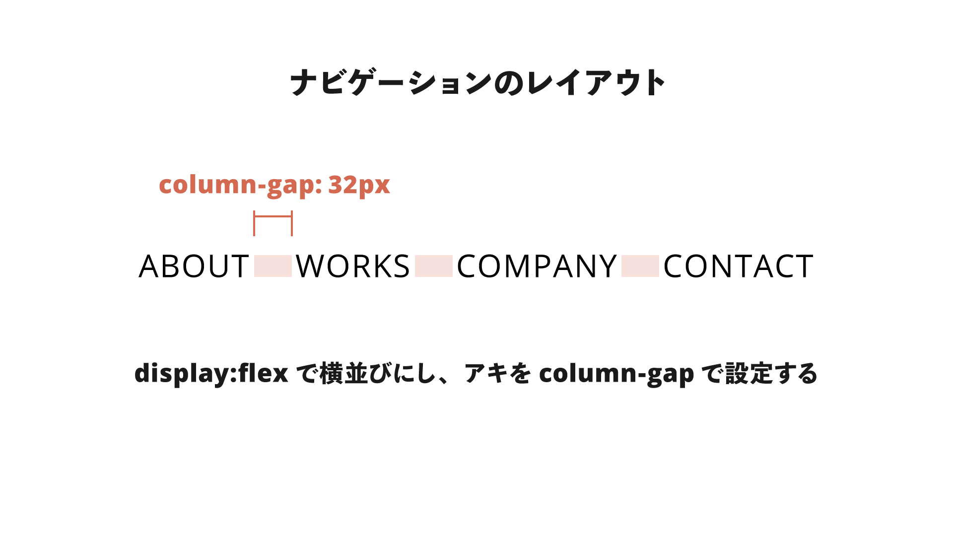
Next, let’s focus on the navigation area. In the desktop layout, the navigation items are arranged horizontally. This too is laid out using Flexbox.
.header__navigation {
  display: flex;
  column-gap: 32px;
  align-items: center;
  justify-content: flex-start;
  list-style: none;
}
This is where the gap property comes in. The spacing between horizontally arranged elements is created by the column-gap property.
Traditionally, you might have used the margin-left property on <li> elements, along with the :first-child pseudo-class so that the first element would not get an unnecessary margin-left.
▼Traditional approach
.header__navigation li {
  margin-left: 32px;
}

.header__navigation li:first-child {
  margin-left: 0;
}
By combining Flexbox with the gap property, the same thing can be done with a single line: column-gap: 32px.
Service section
In the Service section, an image and text are displayed side by side. This section simply places two elements, each 50% wide, side by side with display: flex, so there is nothing especially new here. Only the even-numbered rows are reversed using the flex-direction property.
.alternating-layout__item {
  display: flex;
}

.alternating-layout__item:nth-child(2n) {
  flex-direction: row-reverse;
}
The text area is centered both vertically and horizontally, which can be done in just the following two lines.
.alternating-layout__description {
  display: grid;
  place-items: center;
}
The same thing can also be done with display:flex, justify-content:center, and align-items:center, but this saves one line.
Works section
In the Works section, display:flex is used both for the layout of the three cards and for the internal layout of each card. First, let’s look at the code that arranges the three cards.
.card-list {
  display: flex;
  gap: 32px 24px;
  justify-content: center;
}
As in the navigation example, the spacing between cards is implemented with the gap property. This time, the gap property is given two values, which means a row-gap is also specified. At the moment, when three cards are arranged in a single row, the row-gap has no effect. However, if the layout becomes two rows in the future, spacing between the rows is already in place.
The layout of the card itself looks like this.
.card {
  display: flex;
  flex-direction: column;
  row-gap: 8px;
}
The Flexbox direction is set vertically, and the row-gap property adds space between the image and title, and between the title and description. Using display:flex vertically also makes it easier to build layouts that adapt to changes such as varying numbers of lines.
About the mobile version
In the mobile layout, elements that were generally arranged horizontally are changed to vertical layouts. Since Flexbox is used, changing the value of flex-direction to column is enough to handle that. Spacing is adjusted by changing the values of row-gap and column-gap (or the shorthand gap property). By using the shorthand gap property, the mobile version can avoid the kind of code where you cancel out the desktop version’s margin-left and then add a new margin-top, which keeps things simpler.
Benefits of gap
So far, I’ve introduced practical layout techniques using the gap property. Here are some advantages of creating spacing between elements with gap.
No need for pseudo-class handling such as :last-child
As mentioned in the navigation layout example, using the margin property can create unnecessary spacing in some cases. To avoid that, you may end up writing rules with pseudo-classes such as :last-child or :nth-child. However, because the gap property controls the space between elements, you can avoid writing that kind of selector logic.
Even in responsive layouts where the number of columns changes and handling with pseudo-classes becomes difficult, gap makes spacing easy to control.
The parent can control spacing between child elements
Another advantage is that the parent element itself, which is responsible for layout via Flexbox and so on, can control the spacing between child elements. The child elements do not need properties such as margin that affect the layout of other elements, and can instead focus on their own internal layout.
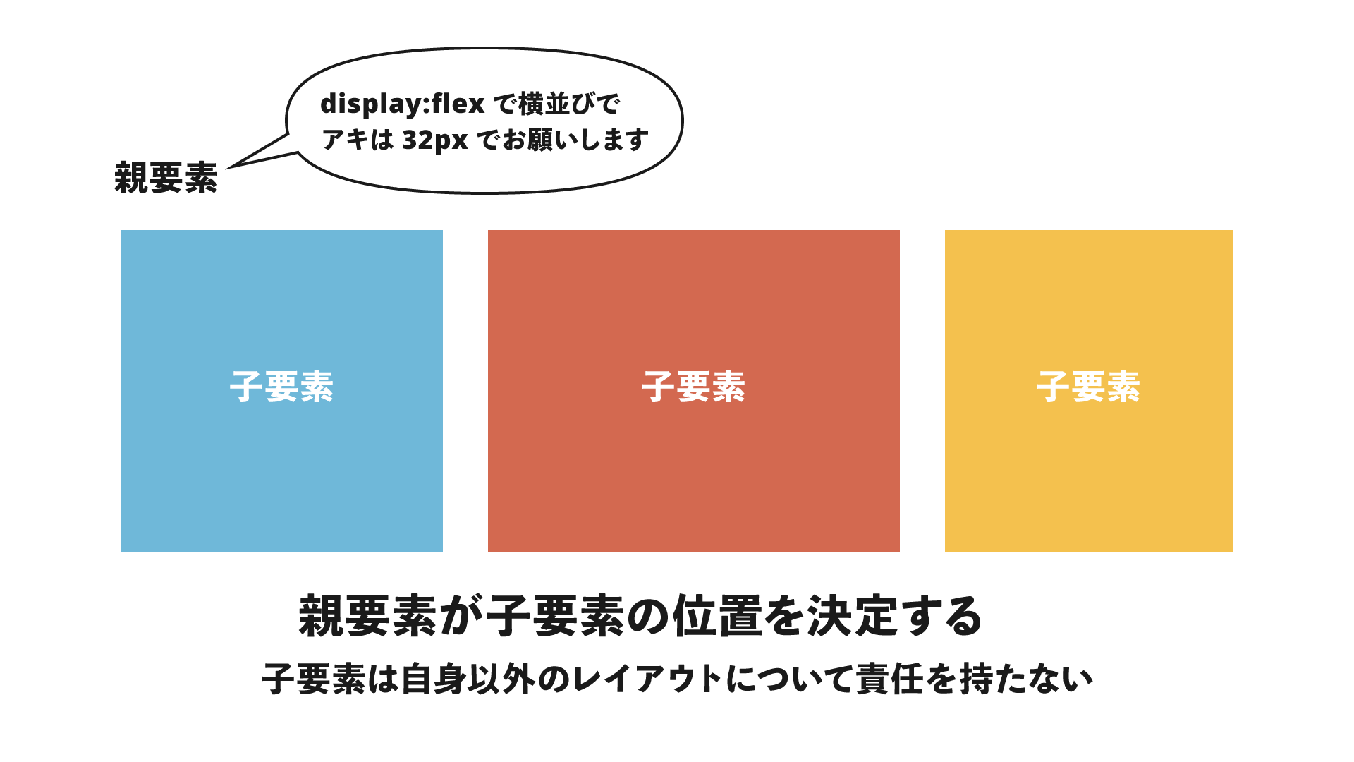
This is especially beneficial in CSS architecture and in frameworks such as React and Vue.js, which are built around components. Have you ever heard the phrase, “Don’t put margins on components”? Because the margin property affects other elements, it can lead to unintended layout breakage and more complex CSS. Controlling spacing with the gap property helps solve that problem.
In the demo for this article as well, CSS related to layout is controlled hierarchically.
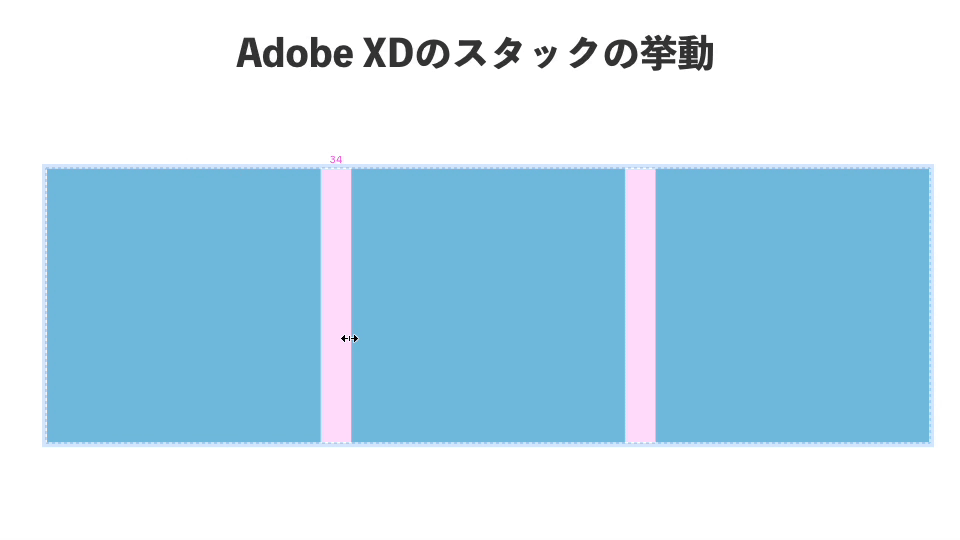
Highly compatible with design tools such as Figma
Figma has a feature called “Auto layout,” and Adobe XD has “Stack.” Their behavior is close to a combination of Flexbox and the gap property. This makes it easier to build layouts with the same feel as the design data, and it also makes the designer’s intent easier to understand.
No need to think about margin collapsing
When margin properties are adjacent to each other, CSS has a behavior called “margin collapsing.” This relates to the earlier discussion about components, but with gap, you do not need to worry about unintended margin collapsing or, conversely, margins being applied twice.
Drawbacks of gap
However, the gap property also has some disadvantages.
Fine-grained control of individual spacing is difficult
Because the gap property sets all spacing with a single property, it is difficult to adjust the spacing between specific elements in detail. In such cases, you may want to use the gap property to control the minimum baseline spacing, and then adjust any extra spacing separately with the margin or padding properties.
You may end up with more wrapper elements
Because a parent element is needed to determine the layout between elements, you may end up with more <div> elements and other wrappers compared with a simple flat layout. The HTML hierarchy can become deeper, which may affect the development experience.
Conclusion
I introduced layout techniques using Flexbox, CSS Grid, and the gap property. In the demo, I took the ambitious approach of not using the margin property at all, but in practice there will still be cases where margin is unavoidable.
Even so, by making use of the gap property and reducing dependence on the margin property, you can create more flexible layouts. Going forward, the gap property may well become a major CSS layout property alongside margin.