
Anyone who has worked on web design or coding has probably added a shadow at least once. On the other hand, relatively few people may have stopped to think about how many different expressions and technical variations shadows actually offer.
box-shadow is the standard way to add shadows in CSS, but there are many other techniques and approaches as well. Shadow treatment is an important theme not only on the web, but also in design trends that continue to evolve year by year.
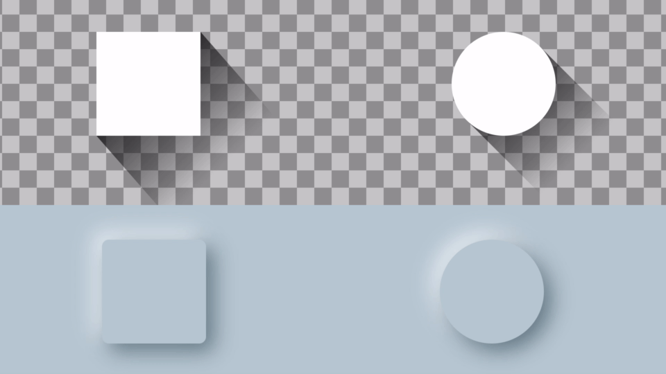
For example, long shadows, which were popular a little while ago, and Neumorphism, which has been called one of this year’s trends, are both unique visual styles that make effective use of shadow techniques.
▼ Examples of a long shadow created with CSS (top image) and Neumorphism (bottom image):
In this article, we will explain a variety of techniques and approaches for creating shadows, along with the different kinds of expressions each technique can achieve.
First, understand the basics of box-shadow
The most fundamental CSS property for adding shadows is box-shadow. As the name suggests, box-shadow draws a shadow for an element’s box area (the border and everything inside it).
Review: How to use box-shadow
Let’s start by reviewing the basics of box-shadow.
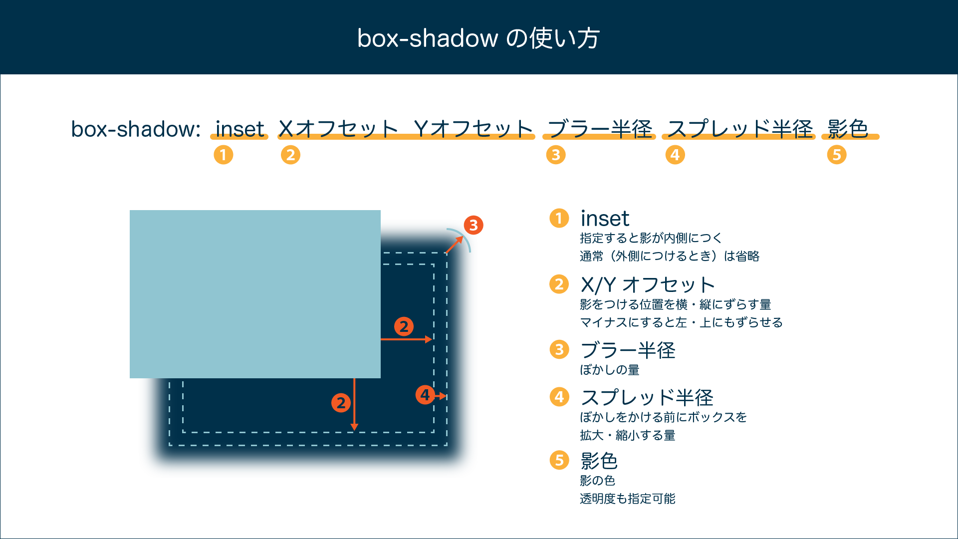
Even this basic form can produce a wide range of effects.
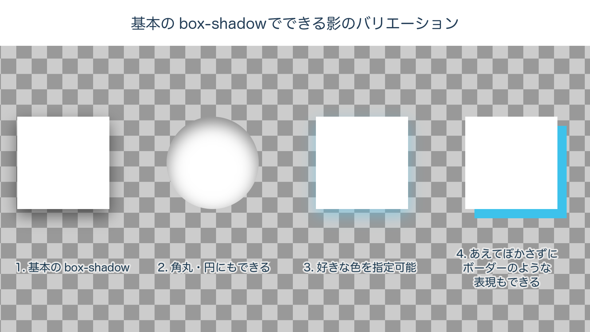
/* 1. Basic box-shadow */
.basic1 {
  box-shadow: 0 10px 25px 0 rgba(0, 0, 0, .5);
}
/* 2. Add an inner shadow with inset. Rounded corners and circles also work */
.basic2 {
  box-shadow: inset 0 10px 25px 0 rgba(0, 0, 0, .5);
}
/* 3. You can freely set the shadow color and opacity */
.basic3 {
  box-shadow: 0 10px 25px 0 rgba(60, 194, 235, 0.5);
}
/* 4. Set blur to 0 to create a border-like effect */
.basic4 {
  box-shadow: 15px 15px 0px 0 rgb(60, 194, 235);
}
Useful even for Material Design: layering multiple shadows
You can also freely stack as many shadows as you like. Let’s look at some examples.
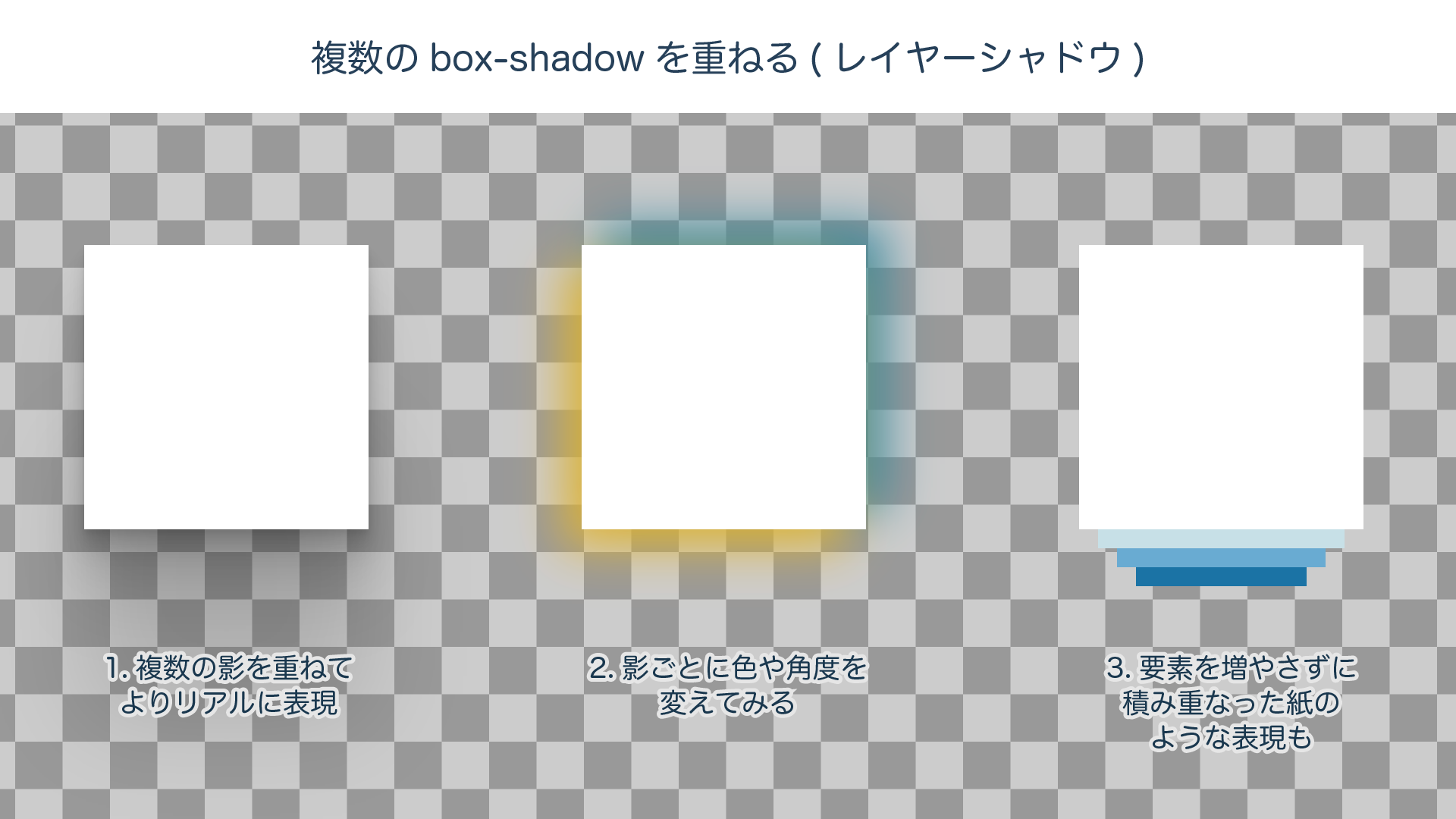
/* 1. A smooth shadow made from 6 box-shadow layers */
.layer1 {
  box-shadow:
    0 1.9px 2.5px rgba(0, 0, 0, 0.057),
    0 5px 6.1px rgba(0, 0, 0, 0.076),
    0 10.1px 11.4px rgba(0, 0, 0, 0.086),
    0 19.2px 19.8px rgba(0, 0, 0, 0.092),
    0 38.4px 34.8px rgba(0, 0, 0, 0.1),
    0 101px 74px rgba(0, 0, 0, 0.13);
}
/* 2. Example applying different directions and colors to each shadow */
.layer2 {
  box-shadow:
    -10px 10px 25px rgba(230, 180, 15, 0.9),
    10px -10px 25px rgba(8, 131, 161, 0.9)
}
/* 3. Layering sharp shadows can also create a stacked-paper effect */
.layer3 {
  box-shadow:
    0 20px 0 -10px rgb(198, 224, 231),
    0 40px 0 -20px rgb(105, 171, 209),
    0 60px 0 -30px rgb(27, 115, 165)
}
At first glance, stacking multiple shadows might seem like a special technique. But if you look closely, you will notice it is used frequently even in everyday designs, such as Google’s Material Design.
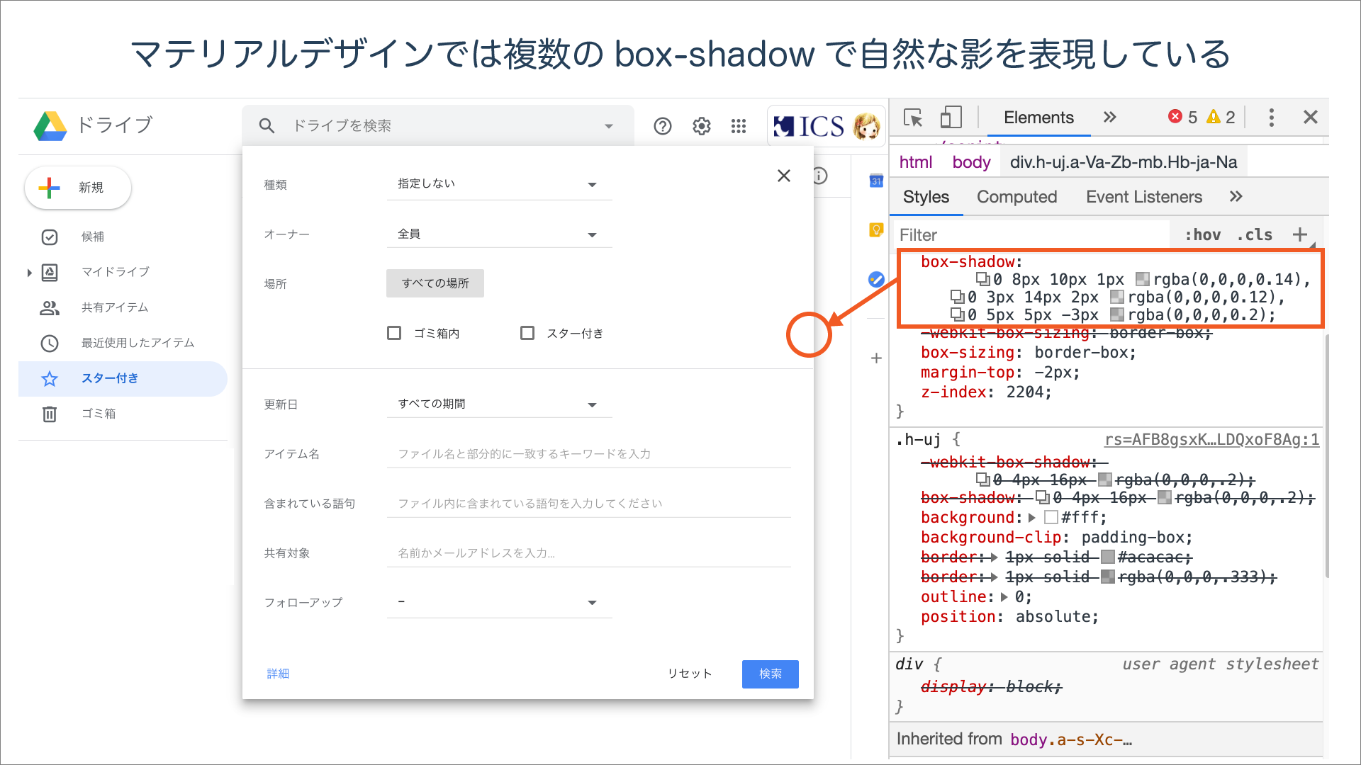 The image above shows the shadow applied to a Google Drive dialog as displayed in developer tools. It is a subtle shadow, but you can see that it is composed of three
 box-shadow values in order to look natural.
box-shadow alone can’t reproduce this! Original shadows using pseudo-elements
box-shadow is simple, but precisely because it is simple, there are many things it cannot do.
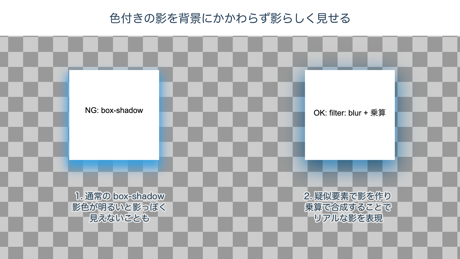
In the image below (left), a light blue box-shadow is cast over a checkered background.
Depending on the style, that may be acceptable, but doesn’t the version on the right look more realistic as a shadow?
Creating realistic shadows with pseudo-elements
box-shadow simply applies a blur to a box of the specified color, so depending on the combination of shadow color and background, it may not look like a natural shadow.
To make it look more natural, you can use CSS filter and mix-blend-mode.
(Note: filter and mix-blend-mode, which are explained in this section, are not supported in IE.)
.box::after {
  /* Create a box of the same size with a pseudo-element and place it behind using position: absolute */
  content: '';
  display: block;
  position: absolute;
  z-index: -1;
  top: 0;
  left: 0;
  width: 100%;
  height: 100%;

  /* ① Fill the pseudo-element box with the shadow color */
  background-color: rgb(42, 159, 226);
  /* ② Blur it with a blur filter */
  filter: blur(15px);
  /* ③ Adjust position and size */
  transform: translateY(10px) scale(1.05);
  /* ④ Composite with multiply */
  mix-blend-mode: multiply;
}
① Fill the pseudo-element with the shadow color, ② blur it with a blur filter, ③ adjust its position and size, and ④ finally composite it using multiply.
Compared with box-shadow, which takes only a single line, this is clearly more cumbersome. On the other hand, it gives you the advantage of free customization, such as adjusting the pseudo-element’s shape and size or using different filters.
Let’s look at a few examples.
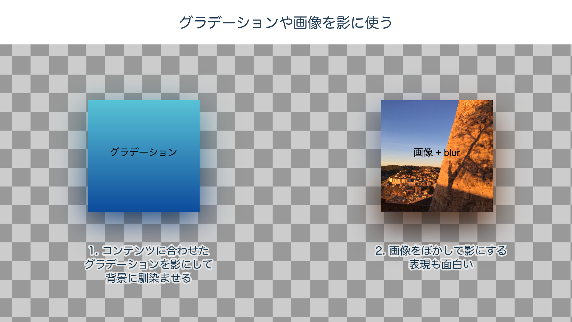
Using gradients or images as shadows
Unlike the shadow color in box-shadow, the background of a pseudo-element can be anything you like, including gradients and images. By blurring that content into a shadow, you can create memorable shadows that match your site’s color scheme or background image.
For more on mastering gradients, see our previous article, 1歩踏み込んでみる! CSSグラデーションのマニアックな世界.
Try changing the blend mode
For an ordinary realistic shadow, multiply is the best choice, but trying different blend modes can produce much more striking effects.
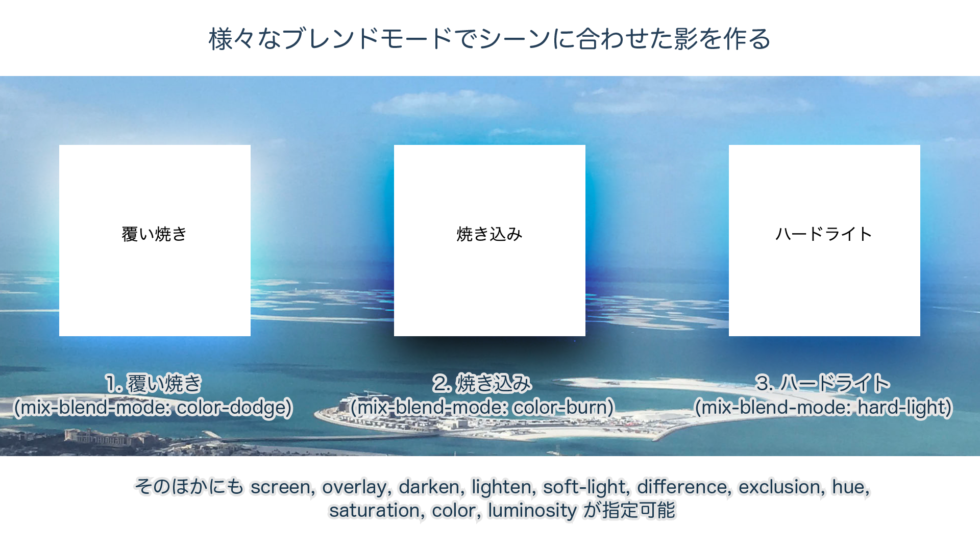
As in the example above, you can use color-dodge to create a glowing effect, or color-burn and overlay to produce vivid shadows. Depending on the combination of background and shadow, a wide range of expressions becomes possible. For more on blend modes, also see our previous article, CSSのブレンドモードが素敵! mix-blend-modeを使いこなそう. It explains the full list of blend modes and where to use them, complete with examples.
Another kind of shadow: drop-shadow
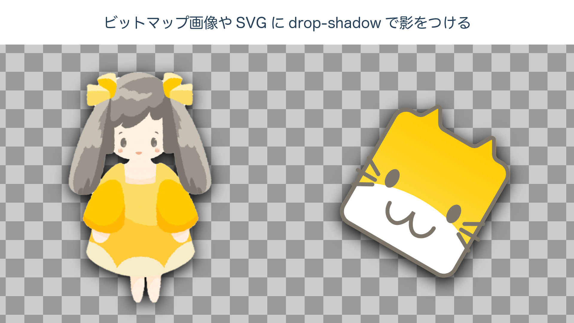
There is one more shadow technique you should not forget: drop-shadow. While box-shadow applies a shadow to the rectangular area surrounding an element, drop-shadow generates a shadow that follows the element’s actual rendered content. That “rendered content” includes everything from bitmap images and SVG to text and child elements. When you want to “apply a shadow to exactly what is visible,” use drop-shadow.
It looks a lot like box-shadow, but is it slightly different? How to write drop-shadow
Because drop-shadow is a type of CSS filter, its syntax is slightly different, but you can set parameters similar to box-shadow.
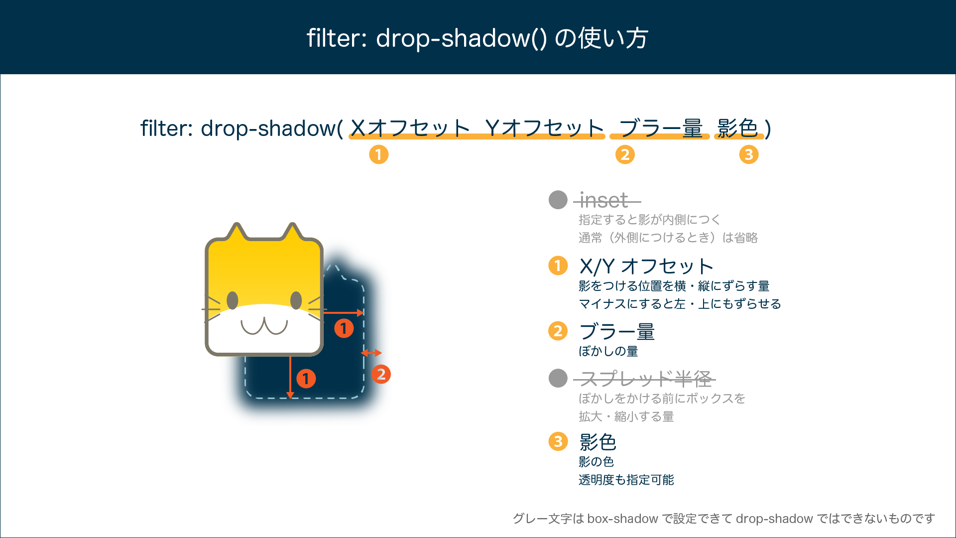
However, there are several differences you need to be aware of.
- Even with the same numeric values, the appearance of the shadow does not match
box-shadow. This is true even when the shape is just a simple rectangle. That is because the calculation method for the blur amount differs between box-shadow and drop-shadow. With the same value,drop-shadowappears more blurred. - The
insetkeyword available inbox-shadowcannot be used withdrop-shadow. - The spread radius, which can be specified as the fourth numeric value in
box-shadow, cannot be used withdrop-shadow. In major browsers, specifying it at all—even as0—causes the entiredrop-shadowto be treated as invalid, so you should not specify it. drop-shadow(as a CSS filter) cannot be used in IE. (There were methods using proprietary extensions such asfilter: progid:DXImageTransform.Microsoft.DropShadow, but those are beyond the scope of this article.)
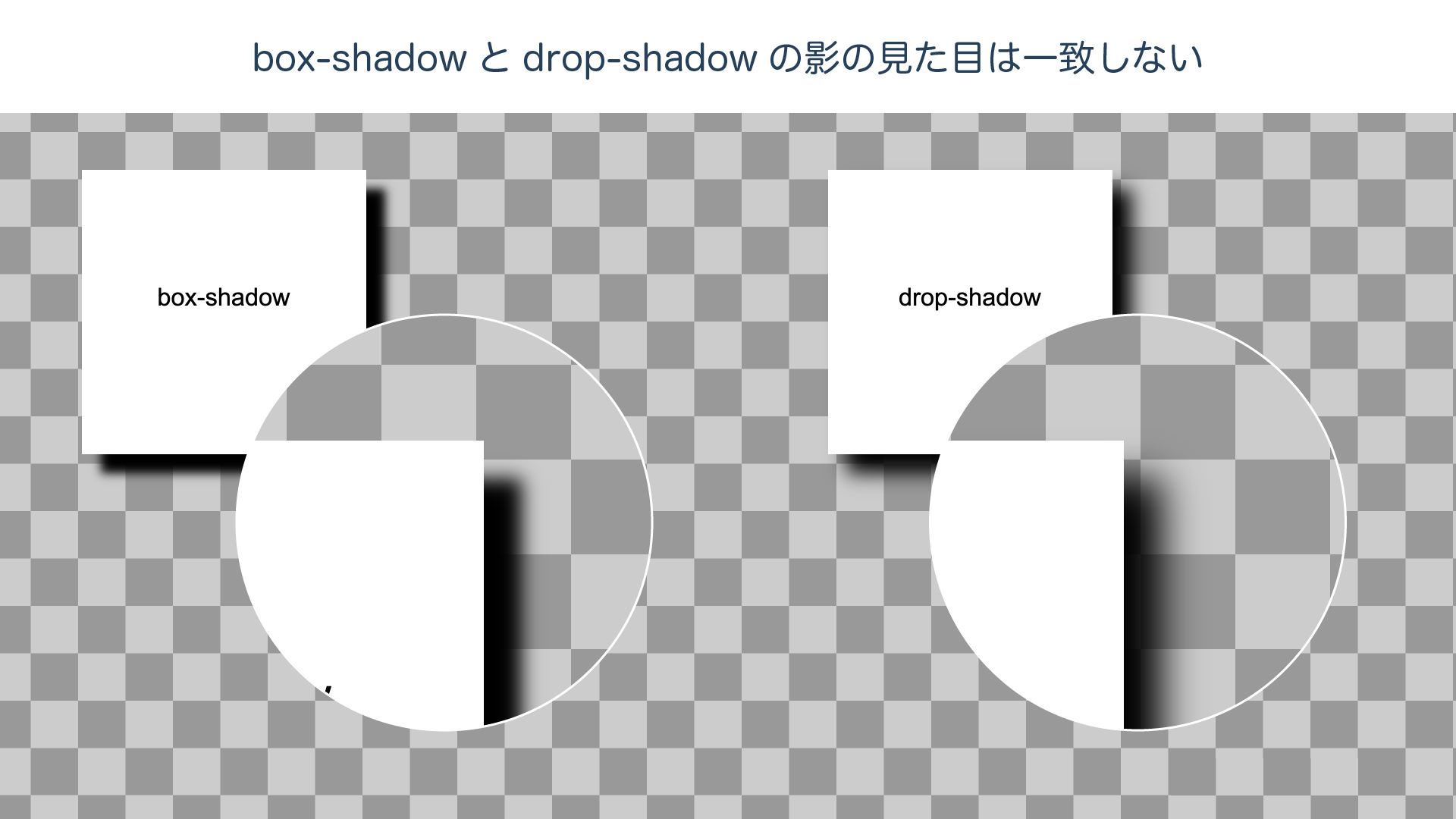
The figure below compares box-shadow and drop-shadow with the same parameter values. They look similar, but they are not simple substitutes for one another, so caution is required when a high level of fidelity between design and implementation is important.
If overlapping shadows are causing trouble, solve it with drop-shadow
drop-shadow is handy for images and SVG logos, but that is not its only use case.
The following example is a loading spinner created with CSS Animation. It is animated by rotating eight circles (<span> elements).
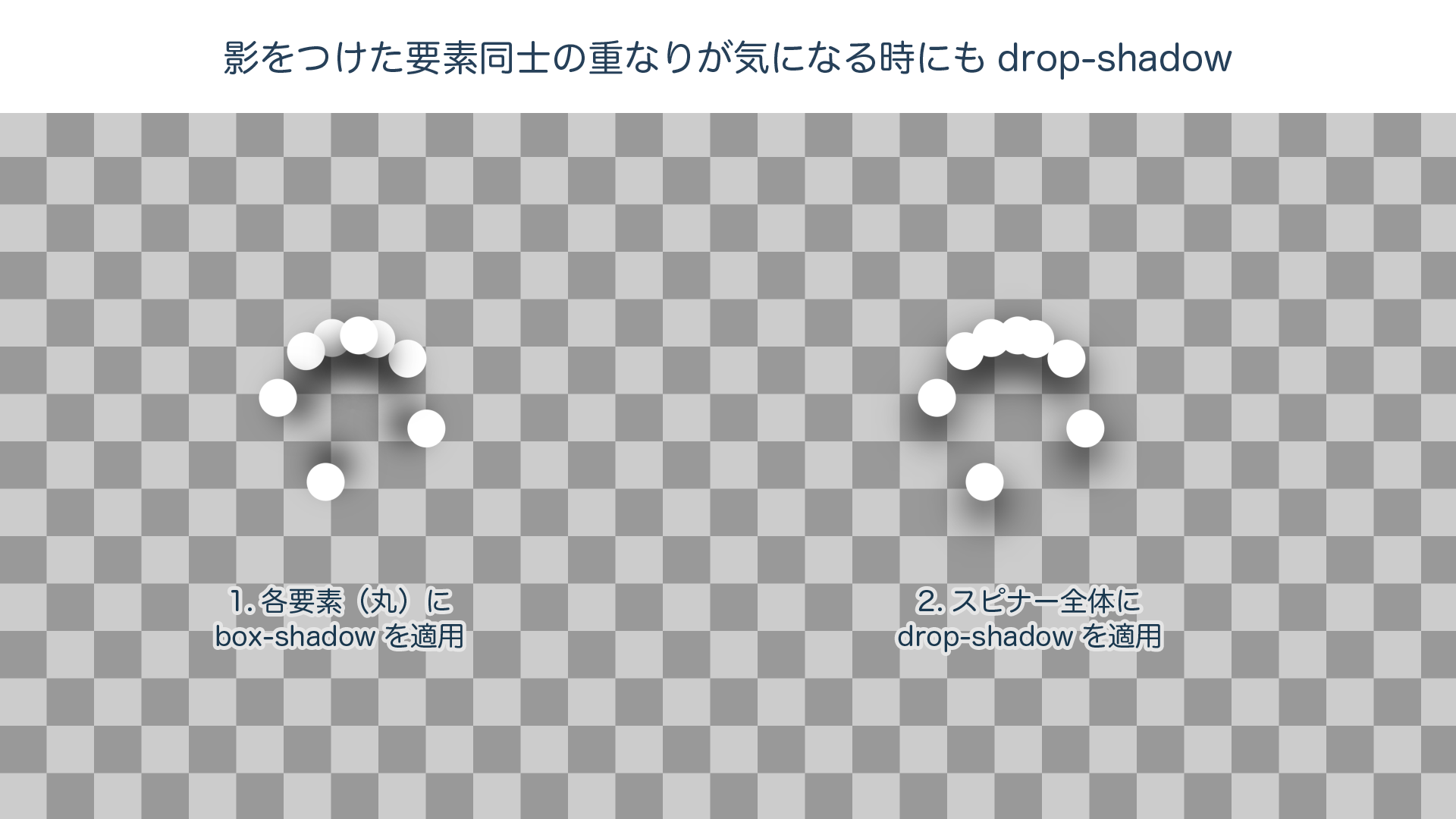
Of the two spinners, the one on the left uses box-shadow. There are several issues worth noticing.
- Each individual circle gets its own shadow, so overlapping circles do not appear connected as a single shape.
- Because the shadows rotate along with the circles, the shadow angles become inconsistent.
By contrast, the spinner on the right uses drop-shadow applied to the spinner as a whole. By applying a single shadow to the rotated group of multiple <span> elements, you can see that the issues above are avoided.
“I applied box-shadow to elements placed close together, and now the shadows overlap!” In a case like that, drop-shadow may solve the problem.
The dark side of shadows: trouble and workarounds
box-shadow and drop-shadow are easy to use and support a wide range of expressions, but because they involve complex internal rendering calculations, trouble often comes with them. In this section, we will introduce issues that tend to occur especially when shadows are combined with animation, along with key points for avoiding them.
Trouble: shadow animation feels slightly choppy (Safari)
There are many cases where you may want to use box-shadow to create a soft floating effect when an element is hovered. In situations like this, if you animate box-shadow with transition without much thought, the shadow animation may appear slightly choppy, as though the frame rate has dropped.
This phenomenon mainly occurs when the rendered area of the shadow changes, for example by changing the blur radius of box-shadow. The rendering will not be exactly the same, but if smoothness is more important, you can avoid the issue by keeping the blur radius fixed and animating only the opacity.
/* 1. Change the shadow blur radius with transition */
.box1{
  transition: box-shadow 2s ease-out, transform 2s ease-out;
}
.box1:hover {
  box-shadow: 0 15px 10px 5px rgb(0, 0, 0);
  transform: translateY(-10px);
}

/* 2. Change only the shadow opacity with transition */
.box2{
  transition: box-shadow 2s ease-out, transform 2s ease-out;
  box-shadow: 0 15px 10px 5px rgba(0, 0, 0, 0);
}
.box2:hover {
  box-shadow: 0 15px 10px 5px rgba(0, 0, 0, 1);
  transform: translateY(-10px);
}
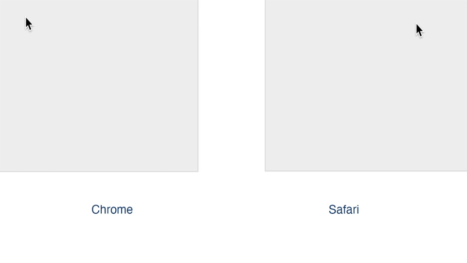
Trouble: when a shadow appears on hover, the surrounding area gets clipped (Safari)
Hover-related issues can also occur with drop-shadow.
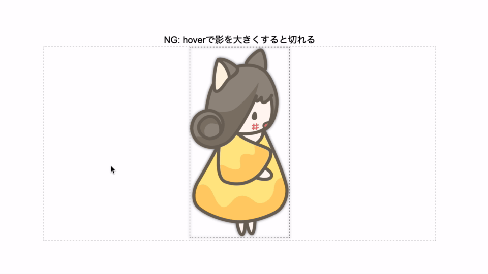
In Safari, it appears that when drop-shadow changes, redrawing is performed only inside the element’s box. It is a bit cumbersome, but you can work around the issue by wrapping the element you want to shadow in a box with sufficient padding, and then applying drop-shadow to the outer box.
.ok {
  display: inline-block;
  font-size: 0;
  padding: 100px; /* Give enough padding to the element receiving drop-shadow to create sufficient space for the shadow */
  filter: drop-shadow(0 0px 3px rgba(0, 0, 0, .9));
}
.ok:hover {
  filter: drop-shadow(0 10px 60px rgba(0, 0, 0, .9));
}
Trouble: the shadow disappears only during animation (Safari)
This is another issue that occurs in Safari.
We created a hamburger menu icon by animating three bars (<div>) with CSS Transitions. When a drop-shadow is applied to the icon as a whole, Safari fails to display the shadow only while the animation is in progress.
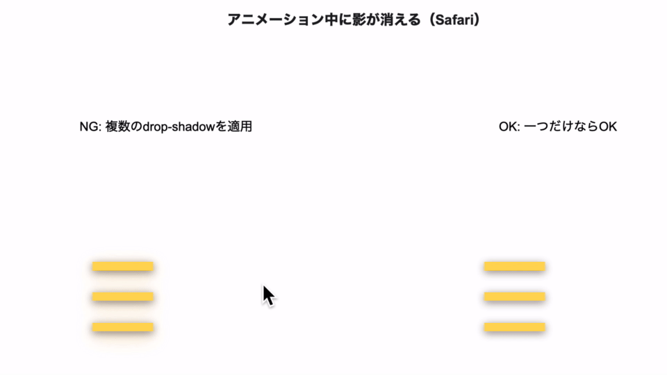
This issue occurs when the following conditions overlap:
- Multiple child elements are animated with
transition: transform - Two or more
drop-shadoweffects are applied to the parent element
The technique of layering multiple shadows is used frequently in Material Design, so if you casually copy and paste a shadow style, you may accidentally run into exactly these conditions.
Trouble: adding many shadows makes animation heavy (Chrome/Firefox)
Finally, here is a performance issue that occurs in Chrome and Firefox. Let’s apply shadows to 100 <div> elements and rotate them with CSS Animation. We will try the following three shadow approaches:
- Apply
box-shadowto each element - Apply
drop-shadowto each element - Apply a single
drop-shadowto all 100 elements together
Since the exact numbers vary by environment, we will only present a summary of tests performed at the time of writing on an iMac (iMac 5K, 27-inch, 2019) using the latest OS and browser versions available then.
| Browser | 1. box-shadow on each | 2. drop-shadow on each | 3. grouped drop-shadow |
|---|---|---|---|
| Chrome(80) | Fast | Extremely slow | Fast |
| Safari(13.1) | Fast | Moderate | Fast |
| Firefox(74) | Fast | Fast | Slow |
As you can see, the trend differs significantly across browsers. In particular, Chrome’s drop-shadow dropped below 10 fps with 200 elements in the environment above, which is far below a practical level.
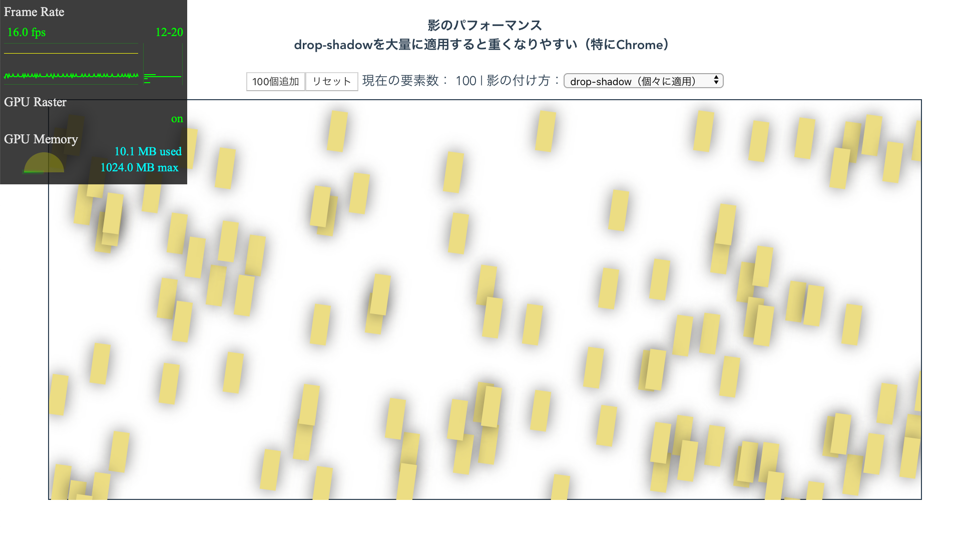
As a general tendency, Safari handles animations smoothly once they are offloaded to the GPU, whereas Chrome tends to suffer delays when dragged down by the CPU. That said, these tendencies vary depending on the environment and browser version, so when displaying complex animations, there is no substitute for carefully checking behavior in the main target environments. At this point, using box-shadow is the safer choice for shadows on complex animated elements.
Conclusion
In this article, we introduced a variety of shadow techniques and expressions using CSS filters such as drop-shadow and blur, in addition to the commonly used box-shadow. There are important points to watch out for, especially when combining them with animation, such as browser differences and performance issues. Still, if you use them appropriately and with care, CSS alone can achieve highly sophisticated visual effects. Master shadow techniques and try creating the kind of expression that could become the next trend.